2015 was the year that UX disciples the world over proved themselves to be the singular champions of free thought in design. Slack’s outstanding UX propelled the startup to unicorn status amidst a flurry of competitors, responsive design flourished and gave birth to a new era of mobile friendliness and device agnosticism, and the web as a whole experienced a shift in consciousness as sites became easier to use, apps became more intuitive to navigate, and services became all the more delightful and engaging to interact with.
I am proud to say that the field has finally come of age and found itself. At long last, UX Evangelists, Digital Empaths, and Interaction Designers have risen to the highest echelons of the creative class to further the bleeding edge of technology, design, and user delight.
To architect the experiences of tomorrow, you must first design the interactions of today
With UX Evangelists like Tobias van Schneider, Jennifer Aldrich and Chase Buckley behind the wheel, we are steering towards a brighter future. A future where little big details bring about user delight at every corner, where device agnostic pixel perfection is the norm, and where simple day-to-day experiences engage, excite, and stimulate users in new and innovative ways.
So where do you fit into all of this? To architect the experiences of tomorrow, you must first design the interactions of today. It is not enough to look in front of you; 2016 is already here. You must look ahead, to the future—to 2017—where the real paradigm shifting trends of tomorrow lie in wait:
1. Failure Mapping
“It’s fine to celebrate success but it is more important to heed the lessons of failure.” — Bill Gates.
Journey-maps and user flows are the bread and butter of UX design — they provide the basic framework for understanding user touchpoints across the full cycle of interactions with your product or service. There’s just one problem: They’re designed with the ideal user in mind. What about the non-ideal user?
Erroneous usage of products and services will skyrocket with the arrival of new users.
Over half the world’s population will be online by 2017, and the enormous influx of new users will bring about a disproportionate amount of digital-novices, such as the elderly and the Global South, who we’ll need to specially design for. Similar to journey-mapping, the practice of failure-mapping will allow UX designers to better understand, anticipate, and model non-ideal scenarios, allowing us to better handle incorrect usage of products and services.
2. Micro-Mini Interactions
The internet was abuzz with talk of microinteractions in 2015—a term which refers to single task-based interactions with a product, like setting an alarm, liking a comment, or pressing a login button. Every time we open Facebook or visit LinkedIn, we are subconsciously engaging in dozens of microinteractions—many invisible, too small to even notice.
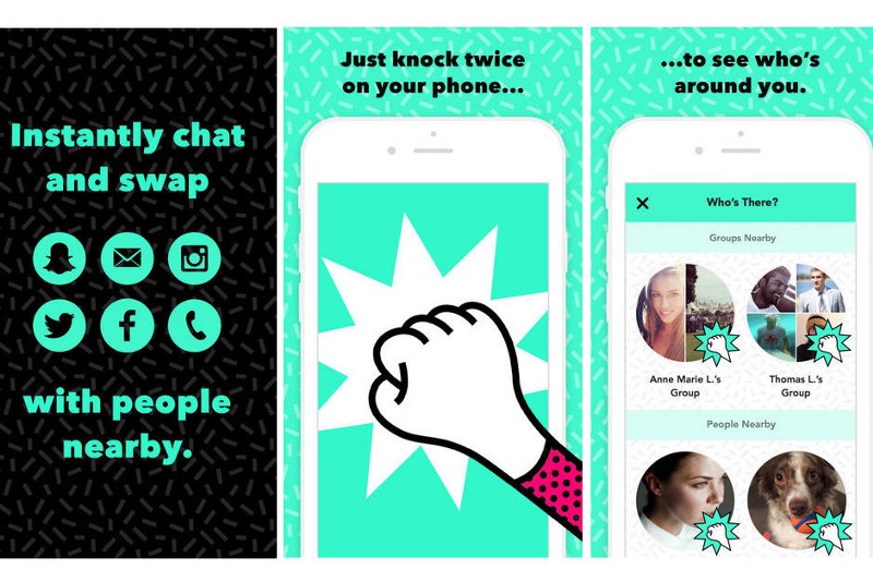
With the world of apps and services becoming increasingly more granular and specific — we have Yo for sending Yo’s, Vine for sharing 6 second videos, and Knock Knock for making new friends, we’re moving towards further atomization of microinteractions, where individual interactions are being broken down into even smaller segments within a greater interaction. I call these Micro-Mini Interactions — the multiple, microscopic interactions nested within a micro-interaction — and by 2017, we’ll be passively engaging in thousands of micro-mini interactions every time we take out our phones:
Microinteraction: Pairing two devices together using bluetooth.
Micro-Mini Interaction: Toggling the bluetooth setting on.
Microinteraction: Controlling an ongoing process such as music volume.
Micro-Mini Interaction: Swiping the volume incrementally to the right.
Microinteraction: Connecting with someone on LinkedIn.
Micro-Mini Interaction: Tapping the ‘Connect’ button on a user’s profile.
The microinteraction of knocking twice in Knock Knock allows you to see who’s around you—but Knocking just once? A mini increment of a micro interaction.
Micro-mini interactions are fast on their way to everyday use, the implications of which are tremendous in scope. Firstly, the ways that we as users and consumers experience devices will change greatly; every touch, scroll, pinch, zoom, tap, click and so on will be rich with unique animations and feedback – attention devoted to the most minute of interactions will create far more engaging experiences for us all. Likewise, designers will find new ways to capitalize on newfound user-engagement, both in terms of designing new features around these “interactions within interactions”, as well as devising new interfaces for the abundance of new interactions that the apps of tomorrow will bring!
3. Proliferation of Weather Apps
For better or worse, weather is an integral part of our world. It impacts our every experience, however subtle, and is thus an omnipresent variable in the way we experience everything else in our lives – including the apps on our phones. Rain or shine, we take great delight in tracking its course and planning accordingly. While weather patterns of the past have remained fairly consistent, mitigating the need for constant, synchronous weather tracking, the dramatic climate shifts of the near-future will bring about extreme environmental conditions that necessitate the need for ever more vigilant weather tracking—a trend that app developers have only just begun to address. Anomalous climatic events — from hurricane winds to extreme humidity, will have users checking their devices far more often in search of up-to-date climate information.
2015 was a record year for weather apps, but the demand for them will only continue to skyrocket. As El Niño sweeps across Silicon Valley this winter, we’ll see even more UX designers shifting their attention to the pressing issue of climate change and the beautiful mobile apps used to visualize its course.
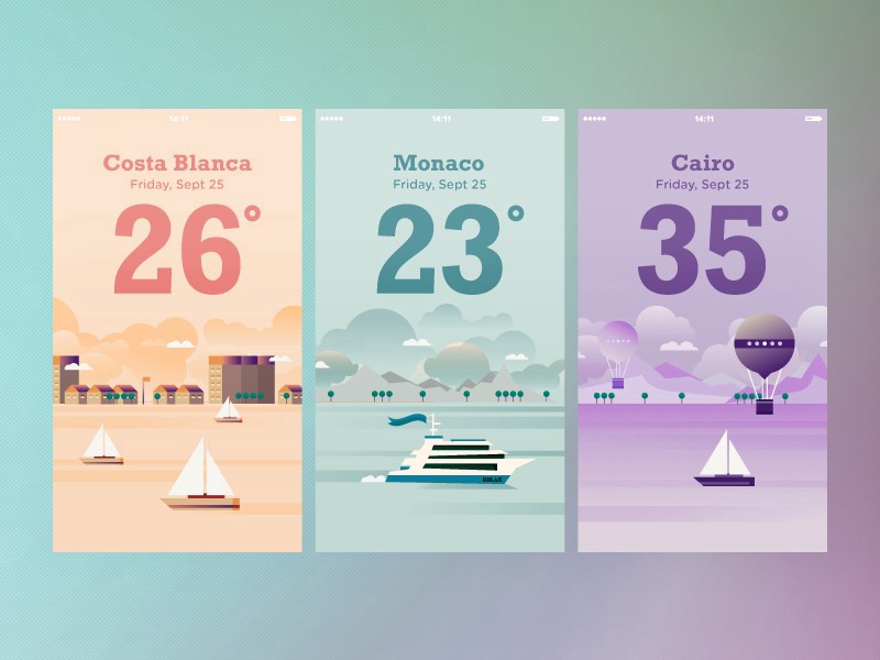
From Monaco to Cairo, beautiful weather apps will help users to visualize the inclement weather conditions of tomorrow.
4. Tamagotchi Gestures
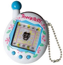
In discussing the high maintenance of mechanical watches, author William Gibson cites the allure of the Tamagotchi Gesture:
“They’re pointless in a peculiarly needful way; they’re comforting precisely because they require tending.”
As our products become increasingly anonymous, autonomous, automated and homogenous, we’re starting to feel a pushback from users. The greater UX community has been observing calls for an earlier time—the era of the mechanical watch—where objects had personality and flourish, even at the expense of functionality and precision. As advocates for the User, we designers have a responsibility to heed their feedback.
More and more product designers are deliberately invoking the Tamagotchi Gesture in their work—crafting personality and charm by imbuing their products with a certain obsolescence, incompleteness, and fragility. A good example of this is Twitter or Amazon—whose respective services harken back to a simpler time, where things didn’t always function as we’d envisioned, and weren’t always pretty, but provided comfort and delight to users precisely because they required such tending. Even though they may not be the most visually compelling, information-hierarchically sensible, or even pleasant to use most of the time, we still adore them despite their faults. By 2017, if not earlier, UX practitioners will be implementing the Tamagotchi Gesture throughout their work, bringing about the much needed human touch to the products of the future.
5. Hapnotic Feedback
Haptic feedback refers to the use of the sense of touch in a user interface, such as a virtual keyboard, whose individual keys provide tactile feedback when pressed. Haptic technology has grown increasingly more sophisticated with the proliferation of high-end mobile devices, and is expected to become even more advanced in the next two years thanks to the decreasing costs of Electro-Active Polymer Actuators (EAPs).
These advancements have enabled interaction technologists to develop new and exciting ways of modifying user-behavior through subtle haptic cues, like using a sequence of subtle pulses and vibrations to direct a user to a “purchase now” button in the event that they are stalling on a particular product’s display page, or to dissuade a user from exiting a screen by creating the sensation of a pleasant texture on the page.
Likening the modification of user behavior to a form of subtle hypnosis, interaction designers are referring to this new form of tactile interface element as Hapnotic Feedback (Haptic + Hypnotic = Hapnotic). While the psychology behind Hapnotic feedback is still in its infancy, you’ll be sure to notice it in the coming months as designers begin to discover its extraordinary potential.
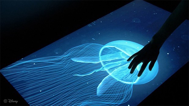
At Disney, researchers developed an algorithm that can translate information culled from depth maps of virtual surfaces into dynamic tactile experiences.
6. De-Linearity
Greater simplicity does not always mean greater usability. Nevertheless, 2015 became the year of simplification for apps and services—navigation menus narrowed in, interactions became compartmentalized into step-by-step processes, and users were constantly placed on rails, forced to interact with content in a fixed order along a linear path.
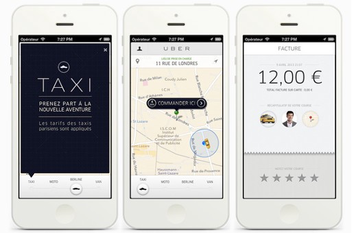
Although well executed, Uber is the perfect example of constraining the user:
- Set a Pickup
- Receive an ETA
- Pay Driver
- Rate Driver
Instacart is another example of single-path linearity:
- Select Grocery Store
- Select Items
- Purchase Items
- Rate Delivery
Users might enjoy these overly-simplified systems for now, but in the words of Ian Fenn, UX Evangelist:
“Poor design teams deliver the UX people ask for. Great ones deliver the UX that people need.”
We’re already witnessing a pushback from users against these linear experiences — users don’t want to be herded from one screen to the next like cattle. The future is about affording the user with maximum agency over their experiences, and as advocates for the user we must give them just that. By 2017, we will honor the intelligence of the user by finally designing for de-linearity; users will be given more paths to navigate through, more decisions to make throughout each process, and more divergent ways to complete each touchpoint.
7. Optimized Interstitial Anxiety
A common phrase amongst serious Interaction Designers, interstitial anxiety refers to the momentary state of tension a user experiences between an action (clicking a button) and a response (moving to the next page). High latency and load times between action and response can trigger this brief experience of anxiety, during which the user is momentarily left in the dark — powerless and confused — caught between seams.
If left unaddressed, this anxiety can quickly build up to create a poor user experience that will drive the user away from your product.
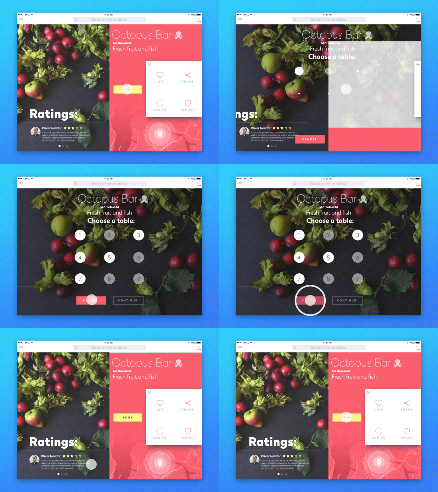
But clever designers are instead learning how to channel this anxiety, or heightened state of emotion, to their advantage. By creating transition elements that allude to the next screen in the sequence, users are permitted to momentarily preview, and thus anticipate, rather than worry, about what will happen next onscreen:
In the example above, the transition animation between slides helps provide a seamless experience between action and response: the temporary-pause bounce-motion of the modal helps the user to subconsciously adjust for the transition between page states.
8. Migration from Design Evangelism to Design Proselytism
Design evangelists advocate for the use of good design, both in principle and in practice, with the ultimate goal of converting non-designers into design-thinkers. They extol the virtues of design-thinking to the uninitiated, so that they too might pursue best practices in their personal and professional lives.
While I’m in full support of design evangelists and everything they do to further the cause of good design, I’m afraid that mere advocacy alone is simply not enough to convert others to the practice of design thinking. From technology evangelists to marketing evangelists to sales evangelists and so forth, too many parallel industries with conflicting messages exist for us to truly communicate our message and see it implemented in the workforce. Even worse, our message is becoming abstracted, reduced to bullet points and slide shares, our ideas included solely for the benefit of others’ SEOs.
Fortunately, there’s a growing trend, online and off, of designers who are standing up for themselves and their craft. These designers are not just advocating, but championing, the power and elegance of a design oriented world. These designers are no longer just evangelizing good design by spreading the word — they are emphatically pressing their design thinking onto the world around them, and by 2017 their message will be even louder and more poignant than it is today.
9. Age-Responsive Design
Responsive design is all about adaptability — restructuring your content to the respective device of the user. This is only the first step, though — far more will be done to truly meet the user where they’re at. Just as sites are already reformatted to adapt their layout to a wide range of devices, so too will they be able to adapt their content and structure to a wide range of ages.
Online advertising has already been tailoring its content to the specific interests of the user for quite some time, and soon sites will be doing just the same; an 8 year old and an 80 year old don’t read the same books or watch the same television, so why do they share the same online experience? Websites should not be one size fits all.
Children will experience different interfaces than adults.
By 2017, an abundance of metadata will inform age-specific adaptations on websites:
- Navigation Menus will expand and contract depending on the perceived competency of users (with their metadata and browsing histories helping to shape their perceived web-literacy) those with difficultly will be presented with stripped-down interfaces to make it easier for them to interact the limited feature sets they are already familiar with.
- Font-sizes and spacing will naturally increasing to accommodate the eyesight of the elderly.
- Color schemes will change; the young will experience more saturated hues; the old more muted palettes.
10. Digital Trust Design
“Engendering the feeling of trust in a product is among the chief roles of any good UX designer.”
Ask any CEO, Marketer, Salesmen or Designer what the most important factor in a successful business relationship is and they’ll give you the same answer: trust. The same is true of a user’s relationship to a product. Engendering the feeling of trust in a product is among the chief roles of any good UX designer. However, the significance of trust in digital products has yet to be fully realized.
With growing concerns over security and data, trust is harder than ever to build and maintain on the web — the vast majority of Americans don’t trust the internet whatsoever, presenting product owners with a glaring dilemma.
As data-breaches jeopardize more and more product-user relationships, identifying new channels for establishing trust is critical to brand differentiation and success. By 2017, the arms race for digital-trust-building will be in full swing, and a new breed of designers will be tasked with architecting trust on the web.
11. User Offboarding (Sunset Moments)
“A good product is like a cinematic masterpiece.”
User Onboarding —, the process of locking in new users by providing them with must-have experiences early on — has been an area of intense focus in product design. However, onboarding’s counterpoint, User-Offboarding, has been ignored by many — but not for long.
A good product should be just like a cinematic masterpiece:
- First there’s the opening introduction (user onboarding) — the opening hook that draws you in; the user interacts with a lovely animation or a delightfully simple interface or even a free chest of gems.
- Then there’s the plot itself (the product experience), where the protagonist deals with whatever turning points or discoveries come their way — the user finds an item they’d like to purchase — maybe its out of stock — maybe they add it to their cart and proceed to checkout.
- Then there’s the climax (the feedback rush) — the protagonist saves the day or gets what they want — the user purchases the pair of boots in their cart.
- And finally, there’s the resolution — the protagonist gets married or walks off into the sunset. In product terms — this is the essential User Offboarding moment — it’s what happens when the purchase is completed — when the message has been sent — when the article has been liked and shared.
As designers strive to create more holistic start-to-finish, cinematic experiences, we will begin to spend much more time curating these final off-boarding “sunset” moments.
12. Brokered AI Networks
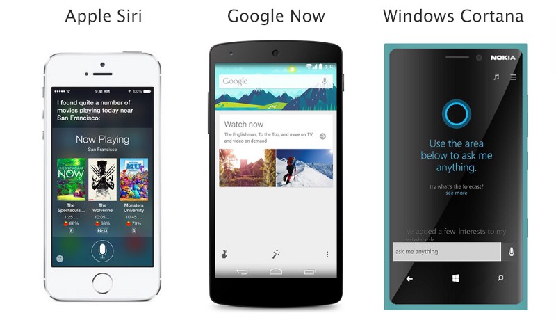
Artificial General Intelligence is still the stuff of science fiction — but lesser, more practical AI’s, virtual assistants and digital concierges are right at our doorstep — most notably Siri, Alexa, Cortana, Google Now, Jibo, M, Clara, Amy and S Voice.
“We’re beginning to find that our intelligent helpers aren’t being so ‘helpful‘ with one another”
These personal “intelligent” assistants are entering our lives at a staggering pace — everyone that owns a smart phone has access to at least one of these AIs, and the world is coming to terms with the reality that AI is here to stay. As we begin to welcome multiple AIs into our lives, owning Apple’s “Siri” and Amazon’s “Echo” and x.ai’s “Amy”, for example, we’re beginning to find that our intelligent helpers aren’t being so “helpful” with one another.
Simple activities like setting alarms, scheduling reminders, answering questions or controlling smart switches are being contested between multiple AI’s designed to fulfill the same tasks. The smart helpers are not designed to negotiate any division of labor amongst one another, leading to redundancy, contradiction, and overall dyisfunction when their original purpose was to simplify things. Individual AI companies are unlikely to cooperate with another in this competitive arena, leaving it up to designers to broker these heated relationships between artificial intelligences.
In the next year, product designers will begin to focus their efforts on brokering these strained relationships, building systems that establish a clear division of labor and rules for cooperation, rather than competition, between virtual AIs and assistants.
13. Textile Design
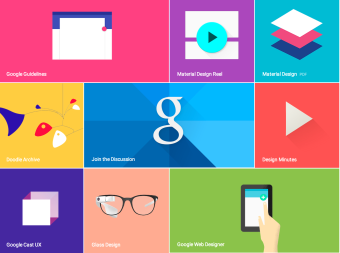
“Material Design will find that its brought pen and paper to a gun fight — its fundamental architecture is totally unequipped to handle the robust and multi-dimensional web of tomorrow.” — Chase Buckley
Google’s Material Design has been showing up in trend forecasts and predictions since 2013, but it didn’t truly makes its debut until 2015 when it became the mainstream norm for web design.
However, that is all that is subject to change. Soon.
Also known as “quantum paper,” Google’s Material Design language is the digitally evolved form of physical paper itself, incorporating many visual metaphors from its analog equivalent. One of its chief designers, Matias Duarte, explains:
“Unlike real paper, our digital material can expand and reform intelligently. Material has physical surfaces and edges. Seams and shadows provide meaning about what you can touch.”
But paper is not the be-all end-all medium — physically or digitally — and while the virtual metaphor of material design has helped a generation of Eastern European designers find themselves, its time is coming to a close.
By late 2016, we’ll start to see the return of skeumorphic elements throughout the design world, accompanied by other visual metaphors beyond the flat and narrow scope of paper. And as augmented and virtuality reality enter the mainstream, Material Design will find that its brought pen and paper to a gun fight — its fundamental architecture wholly unequipped to handle the robust and multi-dimensional web of tomorrow.
Designers are beginning to call this interweaving of multiple design metaphors, aesthetics, technologies and dimensions “textile design” — where the fabric of the web will be rewoven, colorful and anew.
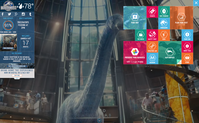
The Jurassic World website is an excellent example of Textile Design — the interweaving of multiple design metaphors, aesthetics, technologies and dimensions.
Conclusion
If you place a frog in a pot of water, and set that pot of water atop a lit stove, the frog will sit completely still. Even as the water transitions from mild to warm to uncomfortably hot, the frog will sit still, ignorant to the gradual changes around it. Then, still, as the water goes from hot to boiling, the frog will sit still, unaware of the dramatic shift in the pot, until at last the frog is no more. But if you were to take that same frog, and place it in an already boiling pot of water, it would leap out immediately – aware at once of the danger ahead.
Though perhaps not so desire, the design world at large must confront its own metaphorical pot. The world around us is changing – there is no doubt about that – yet the inexorable march of time and technology is at times so profound, so alien, and so overwhelming, that we often retreat to our safe spaces – of comfort and ritual and practice – rather than embracing those changes head-on as they come. It is only by forecasting the future (the mysterious, boiling pot that it is) – pen and tablet in hand – that we may gain control of its advances. As design-thinkers, makers, and doers, we must be the second frog – the frog who leaps ahead – and prepare for the innovations just around the corner.
Thank you for reading.
Image of man working on touchscreen interface courtesy of Shutterstock.


