Save
Our 2-year-olds can use it. It’s a brilliant entertainment device. But what sort of business potential does the iPad offer? Several companies have shown interest in mobile payment systems from startups like Square to mega-corporations like Visa. But what is the iPad’s user experience in a real-world, business environment?
By now, one thing we know is that the iPad is not simply a larger iPhone, nor is it a smaller computer. Developers have been quick to port their apps from the iPhone to the iPad to ensure they don’t miss out on this trend, but there are big differences in the underlying specs and form factor of the iPad that make this a fundamentally different user experience.
Lucky for us, Bolt | Peters likes researching UX, and we thought this topic deserved a little investigation. So we conducted an observation of 14 customers over three months at our neighborhood coffee shop, Sightglass, that just happened to be an early user of Square on both the iPhone and the iPad. We observed and recorded those customers’ mobile payment interactions with the Square app, and interviewed select customers. Our first study was in December 2009 (with the iPhone) with a follow-up in April 2010 (with the iPad).
Two important business considerations came from our studies: (1) speed kills (in a good way), and (2) shared is the new private. If you’re thinking that nothing statistically valid can come from observing such a small sample of interactions, the Internet is chock full of data supporting that behavior repeats over a very small sample, and that we can safely extract patterns to much larger audiences, as long as we’re not talking about opinions. We were definitely not observing people’s opinions about the iPad or iPhone; we are strictly interested in how they accomplish the simple task of paying for coffee.
Speed Kills
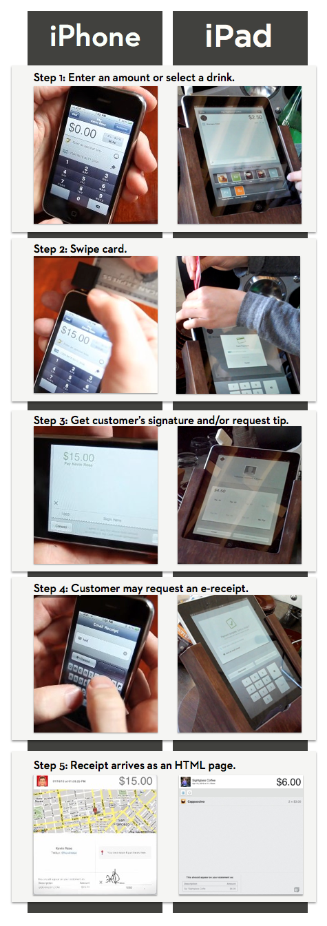
In our observations of mobile payment transactions at Sightglass, the time it took to complete a purchase using Square on the iPad was more than twice as fast as using Square on the iPhone. In one direct comparison, it took 20.5 seconds to complete a purchase with the iPad, but 44.1 seconds on an iPhone 3G.
As slaves to our digital devices, we find that the physical world is constantly competing for our attention. Seconds matter here. This hasn’t been an issue with computing until very recently; usability scientists in the 90‘s claimed 8 to 15 seconds was the maximum time someone would wait for an interaction using a desktop computer (see Shackel’s Acceptability Paradigm). But with any kind of portable device, seconds mean the difference between a seamless user experience and pocketing the device to pay with cash or talk to a stranger.
A 100% increase in speed is a huge deal. It means the merchant was effortlessly ringing up customers one after another with fewer clicks and less down time on the iPad. There was more time to prepare other customers’ drinks and less time spent hunched over a handheld device waiting for the transaction to complete. Keep in mind that for Sightglass, a boutique coffee kiosk, the iPhone as a point-of-sale system was still superior to accepting cash only; they had no other cash register.
We all have heard by now that the iPad’s 1GHz processor is light years ahead of the current iPhone, although this has changed now that Apple has gotten back all its “stolen” 4G iPhones and released them to the public. And while it seems obvious, this speed in the iPad makes for more than just a casually better user experiences and positive outcomes for business prospects. It’s the first time that seconds are a fundamental part of user experience in almost a decade of personal computing.
Shared is the New Private
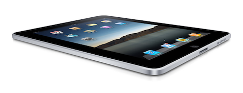
The form factor and physical affordances of the iPad also change the nature of the game. The iPad is not pocket sized, it has a large screen (1024 x 768 at 132ppi), and it naturally lays flat on the table as opposed to resting upright or being tucked away in your hand. All of these factors place the iPad squarely in the realm of a shareable computing device.
Notice how easy it is to view content on iPad. The screen can easily be viewed by 3-4 users sitting around in a circle or gazing over the shoulder. An iPhone with its 480×320 screen would be squinted at by neighbors, or would simply be passed around and handled individually.
And as a shared device, the iPad invites social interaction.
This actually proves to be somewhat of a pain point in the user experience of Square on the iPad, as customers are drawn to interacting with (or at least observing) their payment transactions. Yet iPad users today are now largely removed from the transaction, apart from providing their credit card as a form of payment.
After that, the merchant drives the interaction. Since the iPad Square app doesn’t require customer signatures anymore, we observed merchants skipping over the (optional) tipping screen time and again. When asked about this, merchants said it was too awkward to ask aloud, “And would you like to add a tip to that?” One time the transaction proceeded so quickly that a customer commented at the end, “This is great! But where do I tip?”
Part of the reason for this shift in experience is that Sightglass’ iPad is more like a cash register than a hand-held mobile device. This is made possible, in part, by a custom wooden holder that was specially designed for Sightglass. The holder keeps the iPad upright and angled in such a way that it’s readable and easy to interact with by people standing at the counter. Plus it swivels and hides all the ugly cords and stuff.
Take a look at the side-by-side comparison of a mobile payment transaction on the iPhone versus the iPad, paying attention to all the open space surrounding the iPad.
It’s interesting that customers want to engage with merchants during payment, but don’t quite know what their role is supposed to be. Around normal cash registers, customers would never step behind the table and complete their own transaction. With the iPhone Square app, customers were required to complete their own transaction. And now with the iPad, do the customers step up and add their own tip—entering the private space of the merchant and cash register—or stay clear of the transaction altogether?
We observed one telling interaction that illustrated how the affordances of the iPad-cum-cash-register can lead to some awkwardness. In this case, the merchant swiped the customer’s card (per usual) but immediately stepped away from the iPad to prepare another customer’s drink. This left the payment process in limbo, and made the paying customer wonder what would happens next.
After a moment or two, the customer glanced down at the iPad and noticed that the transaction had paused on the screen asking for a tip. He looked around, hesitated, and then gingerly reached over and pressed the $1 tip button. He did the same on the next screen, where he entered an email address for a receipt, only stepping closer to use the iPad keyboard. Throughout this episode, his body language spoke of his social curiosity for the iPad mixed with the social taboo of entering the domain of the merchant.
Now, this is just one example of how the physical affordances and social invitation of the iPad can lead to awkward user experiences, especially for customers involved in mobile payment transactions. At the same time, customers were not involved in most of the transactions at Sightglass, making the user experience for the merchant quick, painless, and efficient.
Cyd Harrell is UX Evangelist at Code for America, where she gets to spend all day helping create better experiences for citizens. She encourages like-minded UXers to apply for the 2014 CfA Fellowship. Before its acquisition in June 2012, she was VP of UX Research at Bolt Peters in San Francisco.
Nate Bolt
Nate (@boltron) is fascinated by the personal, social, and cultural role of technology, and how research and design can transform those roles. After pioneering and directing the User Experience department at Clear Ink in 1999, which included the construction of Natural Environment and Remote Observation laboratories, Nate co-founded Bolt | Peters. He now serves as el presidente, where he has overseen hundreds of user research studies for Sony, Oracle, HP, Greenpeace, Electronic Arts, and others. Beginning in 2003, he led the creation of the first moderated remote user research software, Ethnio, which is being used around the world to recruit hundreds of thousands of live participants for research.
Nate regularly gives presentations on native environment research methods in both commercial and academic settings, and is the co-author of Remote Research, a book on remote testing. Working with faculty at the University of California, San Diego, he created a degree titled "Digital Technology and Society," which focused on the social impact of technology. He also completed a year of communications studies at the Sorbonne in Paris, where he was jailed briefly for playing drums in public without a license.
Brynn Evans
Brynn (@brynn) is obsessed with the intersection of social networks and human behavior. At first she shunned social psychology, finding real joys in neuroscience and dissecting brains. But after a 6-year stint as a neuropsychologist, she switched to understanding how people act and behave (with each other!) in the real world. And when Digg and Facebook and Twitter entered the scene, her work dovetailed again into social interaction design. Today she's the Social Interaction Lead and UX Researcher at Bolt | Peters.
In her free time, Brynn enjoys drawing comics and overbooking herself with community events. She runs the Overlap SF meetups and gives out mini-grants to awesome local projects with the Awesome Foundation in SF. She's a judge and advisor to the betacup design competition, which deals with the growing problem of drinking (too much) coffee out of non-recyclable paper cups. Brynn gives talks and workshops on social search, and if you get her talking, she won't shut up about her love for Japanese green tea.


