You are looking at a list of 18 proposed features for your product. Flat out, 18 are too many to include in the initial release given your deadlines, and you want identify the optimal subset of these features.
You suspect an executive’s teenager suggested a few. Others you recognize from competitor products. Your gut instinct tells you that none of the 18 features are game changers and you’re getting pushback on investing in upfront generative research.
It’s a problem. What do you do?
You might try what many agile teams and UX professionals are doing: applying a method that first emerged in Japan during the 1980’s called the ‘Kano Model’ used to measures customer emotional reaction to individual features. At projekt202, we’ve had great success in doing just that. Our success emerged from revisiting Kano’s original research and through trial and error. What we discovered is that it really matters how you design and perform a Kano study. It matters how you analyze and visualize the results.
We have also seen how the Kano Model is a powerful tool for communicating the ROI of upfront generative research, and how results from Kano studies inform product roadmap decisions. Overall, Kano studies are a very useful to have in our research toolkit.
Kano Basics
We uncovered the Kano Model while researching ways to measure delight. Back in 1984, Noriaki Kano, a Japanese academic and consultant, disagreed with the then accepted theories on retaining customer loyalty: by addressing customer complaints and extending the most popular features. Kano intuited that retaining loyalty was far more complicated. He did what all researchers do: defined hypotheses and devised a study to substantiate these theories. Kano’s work was subsequently leveraged and extended in the U.S. by Quality Management consultants. The more we looked at how this 25-year-old approach was being applied today in market research and by agile teams, we sensed a lack of rigor and were compelled to go back and learn from these original researchers to ensure we applied the method correctly.
We translated Kano’s original paper from Japanese. We discussed the relative merits of the different statistical analyses published by the Center for Quality Management with UX statistician Jeff Sauro. The net result is total confidence in our approach to using this method.
Before we talk about performing a Kano study is important to understand Kano’s hypotheses. He theorized there are five different emotional responses to features, ranging from dislike to delight, Unlike his contemporaries in 1984, he felt customer loyalty correlated to the emotional response ‘profile’ of product features—getting just the right blend that included surprising users and giving them features they didn’t know they wanted until they experienced them.
Then he conducted a study with 900 participants to substantiate that these emotional response types exist and can be reliably measured.
Kano’s Five Emotional Response Types
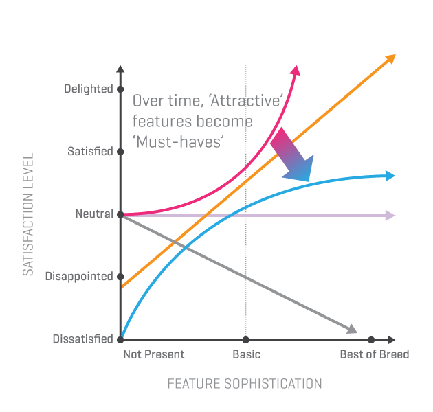
Kano visualized the five emotional responses as curves on a graph, where the y-axis is the emotional response and the x-axis the level of sophistication of a feature. The intensity of the emotional response is driven by how fully present and sophisticated the feature is.
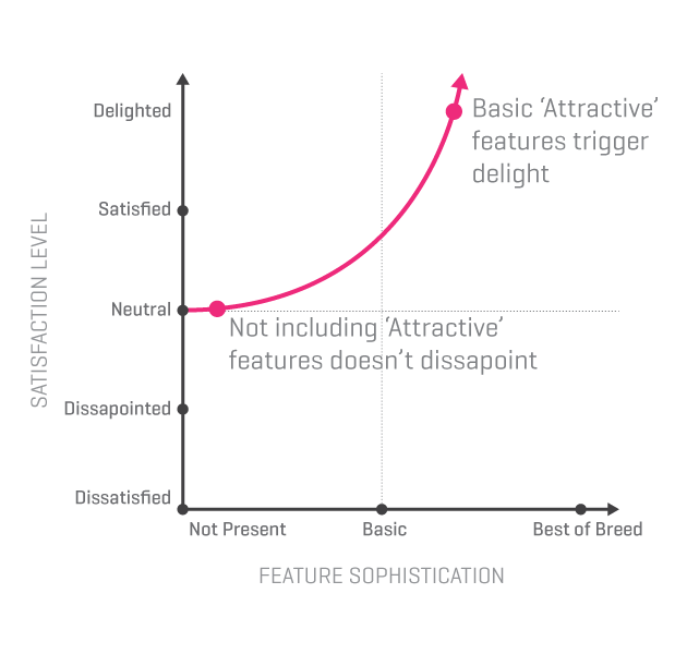
Attractive features
Attractive features trigger feelings of satisfaction and delight when present, but users are not dissatisfied if the feature is not included. Attractive features are unexpected and address previously unmet needs. The best way to discover these types of features is through generative research. These features are key to generating positive buzz about products.
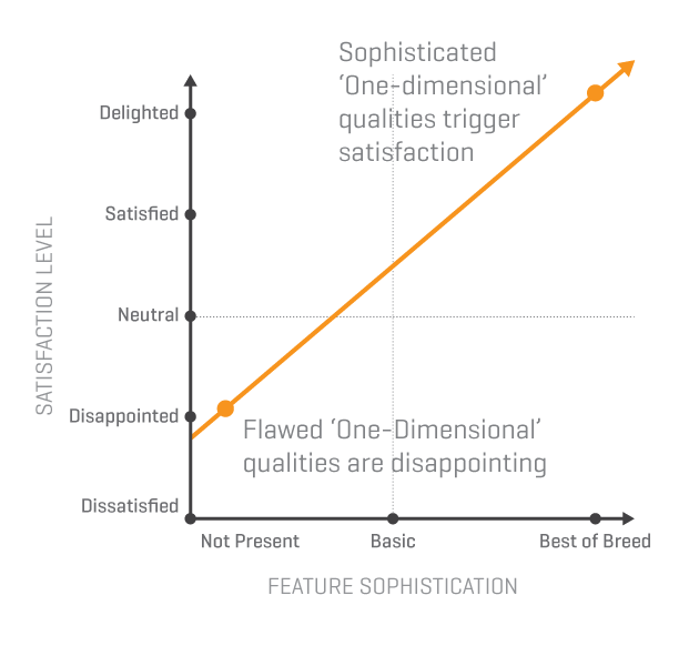
One-Dimensional features
These features result in satisfaction if present and dissatisfaction when they are not. This linear relationship between feature sophistication and emotional response is true primarily for product qualities like ease of use, cost, entertainment value, and security.
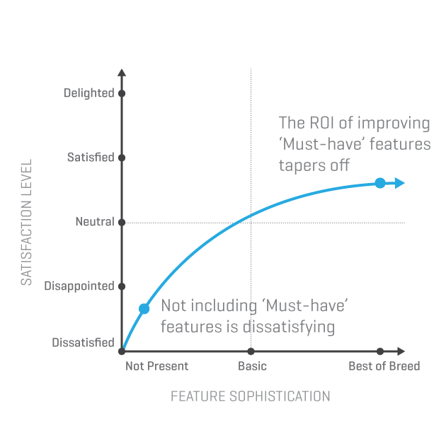
Must-Have features
These features are ones that customers expect the product to contain. There is a limit to the emotional benefit gained by embellishing and enhancing must-have features.
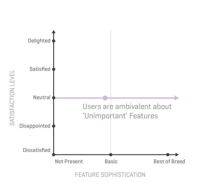
Unimportant features
Users are ambivalent about unimportant features, they simply do not care if they are included or not. The ROI for these features is low.
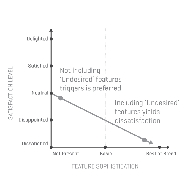
Undesired features
Including undesired features negates the positive impact of Attractive and One-Dimensional features.
Change Happens
Kano theorized customers’ perception of satisfaction changes over time. Features that trigger delight today will, over time, come to be what all customers expect and request. Of the five emotional responses, it is the Attractive feature curve that morphs into the Must-Have curve. In addition, the definition of ‘best-of-breed’ is constantly changing, impacting where a given feature falls on the x-axis.
Measuring Users’ Reactions
Kano survey questions—two per-feature
We were eager to try out Kano’s ideas on our projects. The basics are straightforward: explain or demonstrate a feature, ask the user how they would feel if the feature was present, and then ask how they would feel if the feature was not provided, or not as fully present. These positive/negative question pairs are related to the two different points on the graph, and knowing the two points enables determining which emotional reaction the user is experiencing to a given feature.
The responses listed below are not designed to offer a simple rating along the emotional response scale, but to foster a sense of expectation.
- I like it
- I expect it
- I’m neutral
- I can tolerate it
- I dislike it
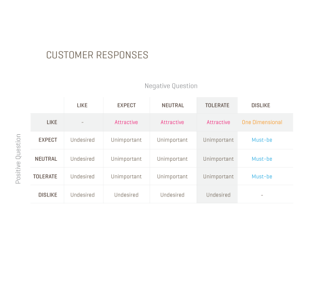
Kano evaluation table
The responses to each of the two questions allow you to identify the reaction category. Kano provided an evaluation table.
In the example shown below the highlighted row shows the response to the first, positive question. The highlighted column shows the selection for the second, negative question. The intersection of the row and the column contains the category type for this feature, in this case Attractive.
Analyzing Kano Data
Quantitative analysis triggers powerful conversations with clients. These conversations leverage qualitative findings to understand the ‘why’ behind these numbers.
Persona traits emerge from Kano results
Not everyone reacts the same way to different features. While not a big surprise, finding patterns in these differences yields useful insights. We begin our analysis of the Kano data by identifying, if possible, different personas. We then subset the data into persona groups. This allows us to build reaction profiles for each persona. We examine the differences in reactions between the personas for each feature.
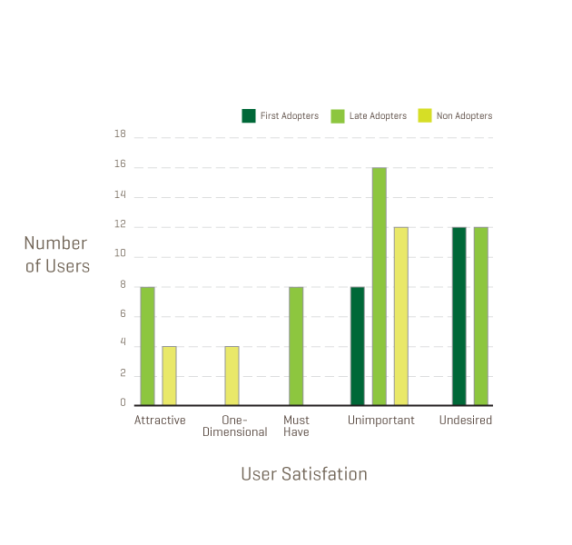
We found in several studies that users’ reaction to the software’s core feature is a litmus test for membership to a persona group. For example, in one study, we saw the following responses to a core feature.
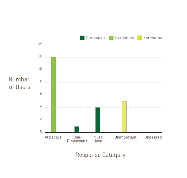
First Adopters (dark green) are individuals who perceive a need for this software. One-Dimensional qualities and Must-Have features are ones users request and expect. We assigned membership to the ‘First Adopters’ persona for these individuals who we believe are the most likely to purchase the software in the near future.
Late Adopters (bright green) are individuals who find the core feature to be ”attractive and unexpected.” We hypothesized that this group, while interested in the software, will delay purchasing until the concept is more mainstream.
Non Adopters (yellow green) are not interested in the core feature and will not use this software in the foreseeable future.
Filtering results by personas yields actionable insights
When we filtered the results for the rest of the features by these three persona groups, we noticed differences in how the different groups responded to some features. This quantitative data grabbed the client’s attention and persuaded them to reevaluate certain things, including features the first adopter group disliked.
The following data shows one of the features that the first adopter persona group was not interested in and in fact would trigger negative reactions. Since the first adopter group was critical to ensuring the product’s adoption at launch, the client decided not to pursue the feature that this group disliked.
Seeing the big picture—comparing features
To answer our initial question about which features to include, we constructed visualizations that allowed us to compare and rank user responses for all features. To accomplish this task we turned to methods first reported in 1993 by the aforementioned CQM. CEOs and senior executives from seven major New England companies who wanted to study together founded CQM in 1989—implementing cutting-edge management practices to accelerate performance improvement. In their report on the Kano Method, they compile experiences and advances from a variety of practitioners.
Of the various methods reported, we recommend three.
The first is a supplement to the Kano questionnaire itself. In addition to the two questions asked per feature, the user is also asked to indicate how important the feature is. This ranking is on a nine-point Likert scale ranging from ‘Not at all important’ to ‘Extremely important’. This additional measure, suggested by John Hauser of MIT, helps focus attention on the most important results from the Kano study.
The second method is statistical analysis of Kano results that permits comparison of the results across different features. Suggested by Bill DuMouchel, it allows calculation of the standard deviation and hence perceptions of what differences are significant.
None of the methods we read provided a compelling visualization to grasp the Kano results when taking the feature set as a whole. So we experimented, and devised the following visualization of the DuMouchel analysis.
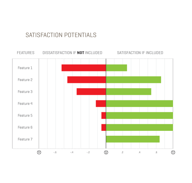
This stack ranking shows the set of features, with the potential for dissatisfaction on the left and the potential for satisfaction on the right. The ordering shows the features at the top that have the greatest potential for dissatisfaction if not included.
Many features have similar potentials for satisfaction on the CQM analysis and delight in the Kano results. The conversation with the client includes tradeoffs such as complexity and dependencies. In this manner the results inform the decisions.
Making Decisions
Smart money is on One-Dimensional and Attractive Features
In relation to Kano’s graphs, the two categories that can trigger satisfaction and delight are the ‘Attractive’ features and ‘One-Dimensional’ qualities. Think about the most successful products on the market today—they capitalize by emphasizing these types of features.
Apple has captured the hearts and minds of customers by investing in features that delight users. For example, laptop power cords with magnetic connections break away easily to prevent damage to equipment—definitely not a must-have functionality. In addition, Apple invests heavily in ‘One-Dimensional’ qualities of elegant design and ease of use.
The question is, how are these game-changing features discovered?
Investing in generative research
‘Attractive’ features are typically ones users do not know to ask for. When these features appear in the market and generate buzz, competitors are quick to copy. The features that delight users today become what they demand and expect tomorrow. But how are these trend-setting features discovered?
In a word: research.
One of the most exciting uses for Kano is supporting a dialog with clients about the primary of role generative research in product success. In generative research we observe users interacting with technology in situ. We witness unmet needs, which are opportunities to make a difference and delight users.
Investing only in the design of expected features limits the ability to win the hearts and minds of users.
ROI of improving existing features
As we learned by reading the translation of his original research publication, Kano set out to prove that customer loyalty cannot be earned and retained simply by improving existing features customers have come to expect. The Kano graphs not only demonstrate why this is true, they can also be used to evaluate the ROI (in terms of user satisfaction) of improving existing features.
A current feature exists as a point on one of the reaction graphs. Increasing feature sophistication moves the point along this curve. The change in emotional response depends on the reaction graph this feature sits on. For example, enhancements to must-have features may pay off by reducing customer dissatisfaction, but the ROI for continued improvement tapers off dramatically. Knowing where a feature sits as a point on one of the five graphs enables analysis of the ROI for improving the feature.
Net Promoter Score demystified
The popular Net Promoter Score is a customer loyalty metric developed by Fred Reichheld of Bain & Company. It comprises the average number of users that promote a product minus those the average number that discourage others from using a product. While useful in predicting success of a product or service when compared to competitors, in and of itself this measurement does not provide guidance on how to improve. Kano results provide a method for understanding the contribution of individual features to the Net Promoter Score. Why is this true? Customers promote products that trigger feelings of delight and satisfaction. Customers discourage other potential customers from using products that are dissatisfying. Understanding how features contribute to these feelings of delight and dissatisfaction allows product managers to make smart choices to increase their net promoter scores.
What Do You Need to Know to use the Kano Model?
How many users to test
Our studies have included as few as 12 users and as many as 24. The goal is to include enough users to perceive differences with statistical confidence. The number of users required to accomplish this goal depends on two key factors:
- The diversity of the people included in the study
- The granularity of differences you are attempting to measure
Although a Kano study requires more participants than popular discount usability methods that provide insights from five or six participants, we have identified ways for administering the survey and analyzing the data that ensure quality insights at minimal cost. As in all research methods, the number of participants needed depends on the granularity of differences that you want to detect. Large differences require fewer users. Depending on your study goals, you may want to look at results across different persona groups, or you may simply be interested in measuring within a given group of individuals.
Conducting a Kano study
In numerous conversations with clients and others in the UX community, we believe how the study questions are administered matters. The best results stem from allowing users to experience features (wireframes with scenarios will work) and record their reactions immediately. Text descriptions or graphical illustrations that take features out of usage context yield less definitive results.
When the Kano study is done correctly it can generate results with associated statistical confidence levels in a straightforward manner. The checklist of best practices includes:
- Recruiting criteria to ensure users truly represent the target end user, or alternatively grouping results into different persona groups based on response to key product features.
- Performing statistical analysis so decisions are based on confidence levels of significant differences.
- Providing meaningful opportunities for users to experience (rather than simply read about) features.
- Measuring users’ reactions immediately after experiencing a given feature.
A Passion for Sense-Making
At projekt202, we embrace design research to deliver solutions that make sense. We are constantly improving and expanding our research toolkit. Our approach to performing Kano studies provide a significant edge in understanding the nuances of related qualitative data.
We researched and experimented with the Kano methodology and data until it made sense and formed a powerful lens to understand our users better. At times it felt like an archeological investigation to get back to the original vision and expertise for a method that has lost its impact because of the lost rigor in the approach taken. Our modified version of the Kano Method has become a reliable tool to assist in answering our client’s strategic questions about where to invest their design and development resources, impacting both their success and bottom line.
It’s always rewarding to see clients become excited about research. Its even more rewarding when the research results in successful products and great user experiences.
Gears image courtesy Shutterstock