Flag

We stand with Ukraine and our team members from Ukraine. Here are ways you can help

Get exclusive access to thought-provoking articles, bonus podcast content, and cutting-edge whitepapers. Become a member of the UX Magazine community today!

Home ›› Content and Copy ›› Don’t Make Your Members Feel Small #wtfUX

Don’t Make Your Members Feel Small #wtfUX

by Josh Tyson
2 min read
Share this post on
Tweet
Share
Post
Share
Email
Print

Save

Are sites slighting members by giving “Sign Up” buttons more prominence than “Sign In” buttons?

The world is full of poorly designed experiences. Let’s identify them, share them, and shrink their numbers. Here Daniel Brown muses on the perceived slighting of members in favor of those who haven’t yet signed up for certain services:

This isn’t so much an example as a trend I don’t understand.

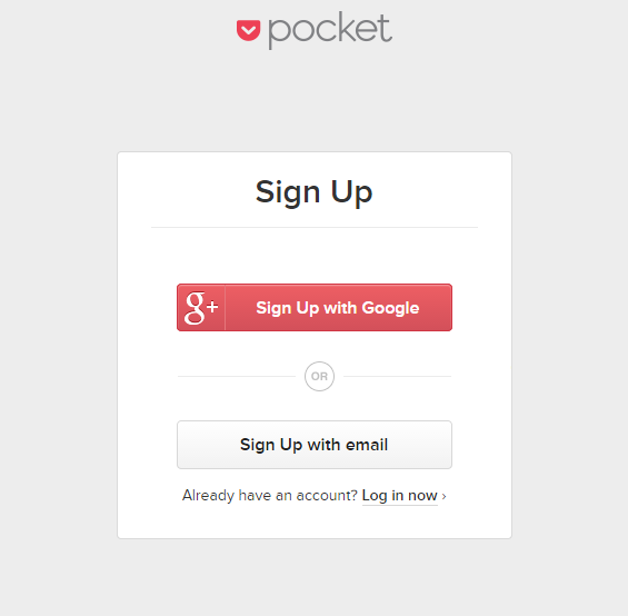
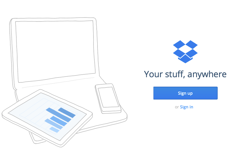
Many sites now emphasize “Sign Up” over “Sign In”—and not in a subtle way. The “Sign Up” buttons are generally huge, obvious, and welcomingly green.

Meanwhile, the “Sign In” function is often just a text link dwarfed by the larger “Sign Up” button or tucked away in a corner waiting to be found.

Spotify sign-in

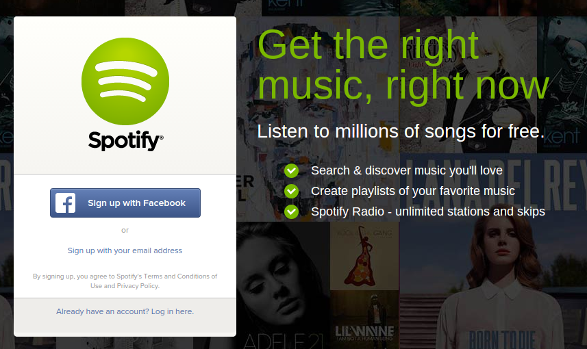
Spotify, at the moment anyway, is among the worst offenders.

Pocket sign-in

I understand wanting to increase your installed base quickly but it’s also important to make those that may have already paid you money feel welcome.

Dropbox sign-in

In no other service industry is this approach used. It’s a little like a restaurant offering new customers a red carpet and champagne as they are escorted into the restaurant while long-time patrons are told to enter through the kitchen and past the restrooms.

Evernote sign-in

You could argue that many users come to these services routinely using the same device(s) and aren’t required to login with every visit. But Brown does raise an interesting idea: maybe even if it’s not always for the benefit of members, login pages can make more of an effort to promote membership as something special. Food for thought.

Keep these coming. Send them to us via Twitter or Facebook using the hastag #wtfUX or email them to: [email protected] with “#wtfUX” in the subject line. Include as much context as you can, so we get a full understanding of what the f%*k went wrong.


UPDATE:

tumblr sign-in

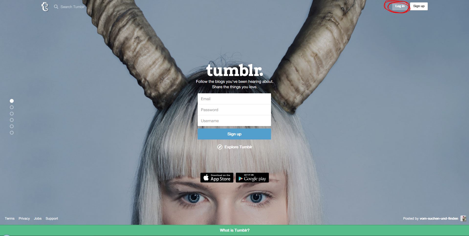
Here’s another example of a diminished sign-in on Tumblr from Andrea Barabás.

iCloud sign-in

And here’s an example of ample sign-in real estate from Tobias Horvath.

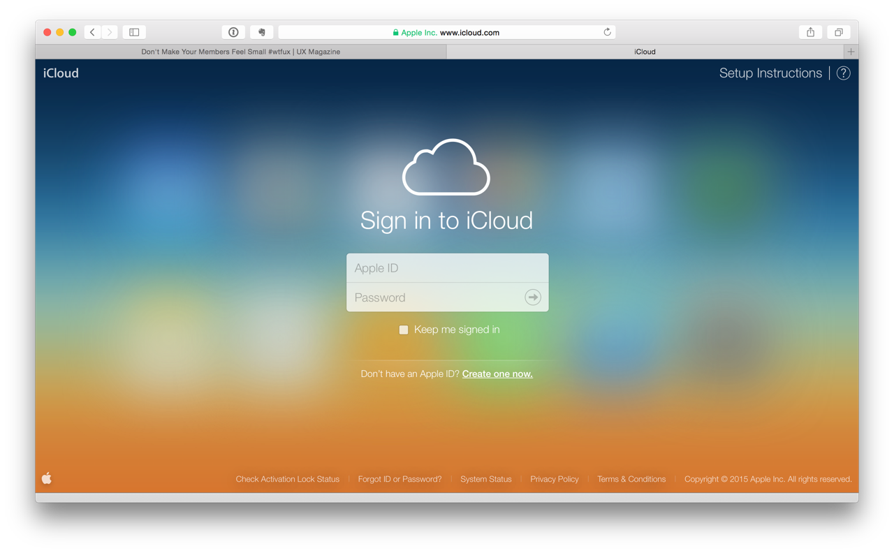
Couldn’t help but send this major counter-example. This is how it should be.

True. The icloud.com website is not Apple’s primary way to gain new users, but it’s so refreshing going there. If I go visit a service that requires me to login to use it, all I want is to be able to login instantly.


post authorJosh Tyson

Josh Tyson
Josh Tyson is the co-author of the first bestselling book about conversational AI, Age of Invisible Machines. He is also the Director of Creative Content at OneReach.ai and co-host of both the Invisible Machines and N9K podcasts. His writing has appeared in numerous publications over the years, including Chicago Reader, Fast Company, FLAUNT, The New York Times, Observer, SLAP, Stop Smiling, Thrasher, and Westword. 

Tweet
Share
Post
Share
Email
Print

Related Articles

AI is changing how designers work — speeding up workflows, sparking creativity, and taking care of the tedious parts. But it’s not here to replace designers — it’s here to amplify their insight, empathy, and impact.

Article by Nayyer Abbas
AI Boosts for UI/UX Designers: Fast Growth with Smart Tools
  • The article explores how AI transforms UI/UX design by automating repetitive tasks, speeding up workflows, and enhancing creativity across ideation, prototyping, and research.
  • It argues that AI empowers rather than replaces designers, freeing them to focus on insight, empathy, and strategy while maintaining ethical and user-centered design.
Share:AI Boosts for UI/UX Designers: Fast Growth with Smart Tools
5 min read

AI didn’t just change work — it removed the starting point. This piece explores what happens when early-career jobs vanish, and why the most “future-proof” skills might be the oldest ones.

Article by Pavel Bukengolts
AI, Early-Career Jobs, and the Return to Thinking
  • The article illustrates how AI is quickly taking over beginner-level jobs that involve routine work.
  • The piece argues that the skills that remain most valuable are human ones, like critical thinking, communication, big-picture understanding, and ethics.
  • It suggests that companies must decide whether to replace junior staff with AI or use AI to help train and support them.
Share:AI, Early-Career Jobs, and the Return to Thinking
5 min read

Learn when to talk to users, and when to watch them in order to uncover real insights and design experiences that truly work.

Article by Paivi Salminen
Usability Tests vs. Focus Groups
  • The article distinguishes between usability tests and focus groups, highlighting their different roles in UX research.
  • It explains that focus groups gather opinions and attitudes, while usability tests observe real user behavior to find design issues.
  • The piece stresses using each method at the right stage to build the right product and ensure a better user experience.
Share:Usability Tests vs. Focus Groups
2 min read

Join the UX Magazine community!

Stay informed with exclusive content on the intersection of UX, AI agents, and agentic automation—essential reading for future-focused professionals.

Hello!

You're officially a member of the UX Magazine Community.
We're excited to have you with us!

Thank you!

To begin viewing member content, please verify your email.

Get Paid to Test AI Products

Earn an average of $100 per test by reviewing AI-first product experiences and sharing your feedback.

    Tell us about you. Enroll in the course.

      This website uses cookies to ensure you get the best experience on our website. Check our privacy policy and