The concept of responsive design—the practice of creating digital experiences that adapt to seamlessly deliver content suited to the device context of the user’s operating system, screen size, or orientation—has been around for quite some time. For a variety of reasons, more companies are now giving responsive design serious consideration. The implications of moving to a responsive approach of creating adaptable designs can seem overwhelming, but the benefits can be significant. For example, one Siteworx customer went from less than three percent mobile page views to over 10% by making their website more mobile-friendly (not even optimized).
When to Consider Responsive Design
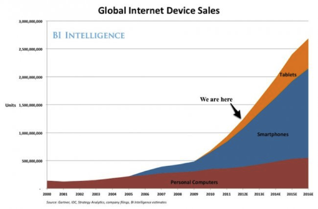
It’s important to understand how consumption of online content is used and what’s really happening in a responsively designed site. Users are consuming more content on mobile devices than ever before, and that consumption will only continue to grow. According to IDC, mobile web browsing will soon eclipse desktop browsing in the U.S. and worldwide. This consumption of mobile content isn’t just happening on the go; 93% of people are now using their mobile devices to browse the Web from their homes, according to a study from Google.
Designing for mobile devices isn’t a new concept either; brands have been investing in mobile applications for years. But native apps aren’t the only way to take advantage of native device features. Geo-location, notification (sound & vibration), accelerometer, and other app-like capabilities can be achieved through a mobile web interface. With a responsive design approach, web content can be adapted to any device thanks to CSS media queries and the fluid application of grids and images.
What Happens Behind the Scenes
The main development methodology behind responsive design is the use of media query functionality in CSS3. Media queries target not only certain device types (e.g., Android vs. iPhone), but actually inspect the physical characteristics of the device that renders the page. For example, the code below “asks” the device if its max horizontal resolution is equal to 480px:
 <link rel="stylesheet" type="text/css", media="screen and
(max-device-width: 480px)", href="iphone.css" />
If it is 480px, the device will load iphone.css. If not, the link is ignored. You can also include media queries in CSS as part of an @media rule:
@media screen and (max-device-width: 480px) {
    body {
        background: red;
    }
}
The above code will make the background red if the device has a maximum horizontal resolution equal to 480px.
Using these media queries, developers can enforce certain style rules based on pre-determined breakpoints (mobile/tablet/desktop screen sizes). Developers can also use non fixed-sized fonts like em measurements or percentages instead of using pixel sizes. This allows the fonts to be flexible and base their size on the screen resolution of the device.
What Does Responsive Design Mean for Your Content Strategy?
Responsive design may sound like a “nice-to-have,” but with mobile devices evolving almost on a daily basis (e.g., the new iPad’s improved screen resolution) creating custom designs for each device (the traditional approach to designing for mobile devices) could end up being more work and more expensive. As next-generation versions of each device emerge, you’re going to have to create new designs for those devices while maintaining support for the legacy versions. Otherwise your digital assets could quickly become obsolete.
A responsive website—one site, one content base, and one code-base—can adapt to new screen sizes or devices as new products come online.
It’s important to note that, contrary to popular belief, a responsive design approach does not involve putting all of your content in front of the reader. Responsive design is about putting the right content in users’ hands according to the context of their interaction. This requires a content strategy that guides how you will deliver only what is absolutely necessary (whether it’s content or functions) at the appropriate points in the user’s journey based on the device. This isn’t just a technology change; it’s also a change in the way you plan and design experiences. It flips the paradigm of traditional web design on its head: instead of building a web framework and fitting content to it, content comes first.
Five Tips for Adopting Responsive Design
Creating a responsive website isn’t about starting from scratch and rebuilding your digital presence. It’s a case of adhering to a streamlined effort, both in your content strategy and in how you deploy the content. At Siteworx, we often advise organizations to adopt a small-scale approach, prioritizing pages (sometimes starting with just the home page) and building out from there. Prioritizing the content on each page allows the organization to determine what content is essential for a given device context. For many websites, only about 10% of a page is essential content; putting that essential content onto mobile is key for mobile visitors.
Building a responsive website involves all levels of digital design, from the front end to the back end. Ultimately, responsive design is driven by content and the imperative of creating a better experience for users. As a team prepares to build and execute a responsive website, here are some tips to remember:
- Plan for a change management phase and gain stakeholder buy-in. Responsive design is a little different from the way people are used to approaching digital projects. It’s important to plan for responsive design at the very beginning of the design process, not just at the implementation phase. By socializing this new paradigm in advance, you’ll more easily open doors to operational and cultural buy-in, while establishing a framework for managing change.
- Start with the smallest device, since this represents the smallest environment that you’ll design for. As your content strategy evolves, you can creatively scale your efforts.
- Focus on key-content. Use metrics to help understand how content is being consumed, by whom, and why, as well as what content is missing. For example, if users are coming to your e-commerce website on their mobile devices to access order histories or track shipments, can you provide that content in a way that is readable? Even simple log-in screens can be hard to navigate on websites that haven’t been optimized for any mobile device.
- Communication between front-end and back-end development. Responsive design deployments often center on front-end development and tools such as CSS, HTML5, and JavaScript. However, responsive design is a large undertaking and it’s critical to understand how the back end will behave as the presentation layer is manipulated. For example, what happens when you have media queries for larger viewports or multi-column views? Siteworx is currently exploring the use of client-side tools, such as Ajax, to inject content depending on the viewports required.
- Work in an agile environment where you are able to prototype and test. Agile includes everyone on your team. For example, at Siteworx our responsive design team includes content strategists, visual designers, UX designers, and front-end developers who work collaboratively throughout the design process.
The Bottom Line
Responsive design introduces complexity and can therefore take longer than traditional design. But with a content-centric approach, proper planning, and the ability to test and measure, a responsive approach can help brands significantly reduce their costs and future-proof their digital investments.