Save

Recently, a representative from a company reached out to me with an interview task. They wanted me to address a challenge where some users receive so many messages that it’s hard to manage them all. I decided to share my tasks and deliverables with you. 🙌
“The inbox is full”
Happens when users, get too many matches and messages. This makes replying feel like work instead of fun. As a result, they might miss good matches because their inbox is too full.
Based on research and quick brainstorming sessions I came up with HMW questions and possible solutions.
How might we prevent good matches from getting lost in an inbox full of conversations?
- Implement a priority inbox that surfaces messages from users who match certain criteria, such as high compatibility scores or mutual interests.
- Send notifications reminding users about good matches (Daily, weekly, bi-weekly, etc).
How might we make replying to messages feel less like work?
- Add quick actions to tag conversations with labels like “Potential Match,” or “Not Interested” to organize their inbox better.
- Deploy AI-powered assistants to help manage conversations by providing suggested replies or highlighting key points in messages, icebreaker prompts, etc.
How How might we help users, manage an overwhelming number of messages?
- Allow users to set filters based on various attributes (e.g., age, location, interests, having badge) to prioritize which messages they see first and categorize messages into different tabs like “New Matches,” “Favorites,” “Unread,” and “Others.”
- Give users the option to temporarily hide their profile from new matches to manage their current interactions better.
Organize Chat Page
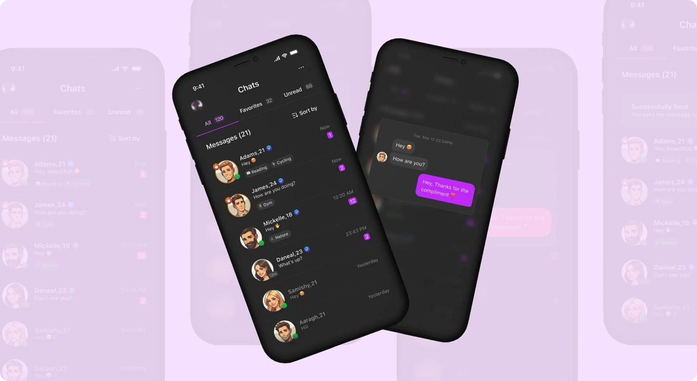
For some users, long lists of chat options can be overwhelming, making it difficult to decide who to talk to. This mental overload may lead them to abandon the app. One way to assist them is to clean up the environment by organizing information by default, allowing users to customize the chat options they want to see.

Tabs
The following tabs could be useful for classifying incoming messages:
- All: Displays all chats.
- Favorites: Shows all active chats or those marked as favorites.
- Unread: Displays chats that haven’t been opened yet.
Badge System
Implementing a badge system to effectively classify users based on their app usage history, success rate, user feedback, and report status would be beneficial. For example, users with high engagement and excellent performance can be awarded a Crown badge, while those who have completed the verification process can receive a Verified badge. These badges will promote their profiles and encourage other users to earn them, thereby increasing successful engagement.
Showing the matching hobbies can also make it easier for the recipients to decide who to text to and what to talk about.

Sorting Options
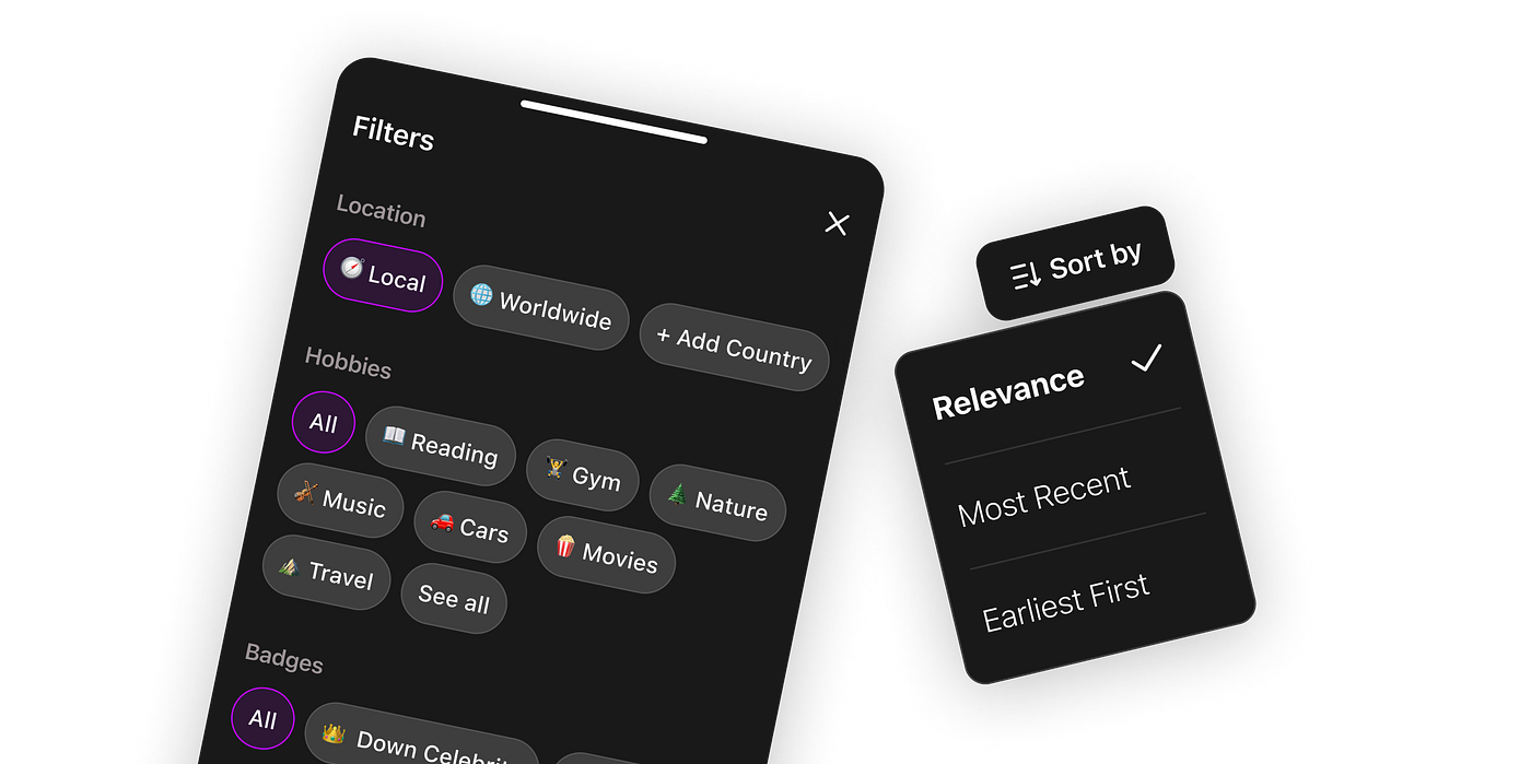
The relevance could be the default sorting option — the system should group, classify and prioritize messages in the following way:
1. Users with Crown Badge: Prioritize those who are online, share similar interests, and have texted most recently.
2. Users with Verified Badge: Prioritize those who are online, share similar interests, and have texted most recently.
3. Others: (Details to be defined as needed)
This approach ensures that the most relevant and active users are not overlooked.
Filtering
!Only in case there is a huge list of messages (The number can be defined based on stats and research), Allowing users to filter chat options based on location, hobbies, badges, or online status can be a useful tool for browsing the relevant chats they are most interested in.


Hide Profile (Edge case)
If users find it overwhelming to respond to exceptionally numerous chat options, they may prefer to temporarily hide their profile. This will help them concentrate on their existing chat options and sort them out first.

Quick actions & Shortcuts
Some users may struggle with opening chats one by one. Suggesting preview messages through shortcuts, like a long press (a familiar action for social platform users), could help. Additionally, allowing them to send automatically generated messages (either set by themselves or by AI) would make it easier to break the ice and respond promptly.


Notifications
Notify users at a customized frequency to keep them engaged with relevant messages that match their hobbies, interests, and preferences. This will make notifications more valuable and less spammy. Both in-app and system notifications can be utilized to achieve this.

The ideas are still in the early stages and could benefit from discussion and fine-tuning. However, I hope that you’ll find the article helpful for your ongoing projects. Feel free to use it for any social app dealing with a high volume of messages. Let’s continue improving together! ⭐️
Khatia Gagnidze
Khatia is a designer with over 6 years of experience in product design, specializing in fintech, eCommerce, blockchain, banking, social network, and other industries. She has successfully designed, UX audited, and conducted research both remotely and on-site for companies worldwide, including in Australia, Singapore, UAE, France, and the USA.
- The article provides strategic solutions for managing message overload in social apps, aiming to enhance user experience and engagement.
- The author suggests various methods to prevent good matches from being lost and to make replying to messages less burdensome.


