So you want to build the next smash hit iPhone app? Extraordinary design is key to getting the attention of users and of Apple, so if an app exudes a stench of mediocrity, Apple won’t feature it and app shoppers probably won’t download it (even if they do, they won’t share it with others). The following are ten common iPhone app design and usability mistakes that can shatter hopes of success on the App Store.
1. Information Overload
 Clutter is scary. Since most people download apps out of impulse, their commitment level is dangerously low—easy come, easy go. Unless users are already highly motivated to figure out an airplane-cockpit-esque interface, most won’t try; they’ll close the app and move on to the next one.
The GPA interface to the right is actually very easy to use if you take the time to understand what is going on. However, it has an overwhelming number of elements on the screen so users perceive it to be complicated and quickly bail.
Kill clutter:
- Embrace the constraints of a small screen! Zero in on doing one or two functions in an amazingly focused way.
- Strip out features that are not absolutely essential to the functioning of the app. Less is more.
- Break the interface up into logical screens and don’t try to do too much on one screen. Though minimizing the number of taps required for a function is always optimal, sometimes functions are easier to understand if they are split up into multiple screens.
- Only display UI elements that are essential for a given screen to function.
- Padding and whitespace are your best friends.
2. Just Read the Manual, Stupid
This app might look overwhelming at first…

But we’re in luck: the developer provided a contextual user manual!
 Only one problem: iPhone users don’t read manuals.
Users don’t study an app—they muddle through it. If they can’t understand it after a few minutes or seconds of muddling, they’ll probably give up and move on.
Some apps like Weightbot and Outside use the “tour” technique, providing a brief run down of the app’s functionality for first time users. This can be effective if the tour is short and highly engaging. Still, don’t depend on it; many users will skip the tour and jump right into the app.
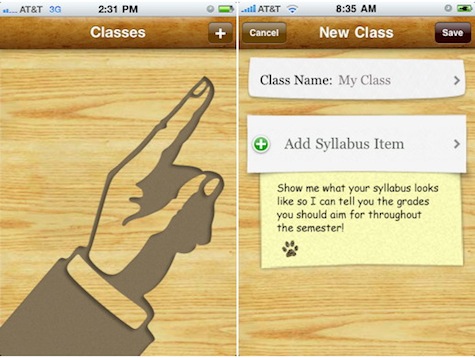
Screenshots from my app, Grades.
Instead of a depending on a manual, provide dead simple cues throughout the app that show users what the app does and how to use it. Graphical instructions (left) are best because users tend to avoid reading. If you must use words, written instructions are most effective in context (right) rather than in a manual. Your job is to show the user the next obvious step if it is not already apparent in the UI itself (which is the best-case scenario). Throw some humor or personality into instructions for bonus points.
3. Registration Screens
People’s first interaction with a new web application shouldn’t be an interrogation.
– Luke Wroblewski
The same goes for iPhone apps. Too many apps force users to jump through hoops—registration or login screens, generally—before providing any value. This is acceptable for apps such as those for Facebook or LinkedIn, which are mainly downloaded by folks who are already using the service, but unless users are extremely motivated to use an app, many won’t care enough to give before they receive.
First consider if the extra data or functionality is really worth the risk of requiring users to register. If it really is worth it, think about ways to provide value to the user before scaring them away with a login screen.
Further reading:
- UseIt: iPhone Apps Need Low Starting Hurdles, by Jacob Nielsen.
- UX Magazine: How UX Can Drive Sales in Mobile Apps, my interview with the Vikas Reddy and Jeff Powers. Specifically, this part found a little over halfway through the interview.
4. Neglecting Mental Models
A mental model is “an explanation of someone’s thought process about how something works in the real world.” (Sorry, Wikipedia’s definition was simpler than Don Norman’s.
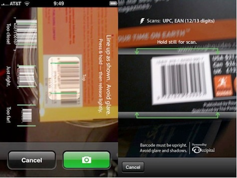
RedLaser version 1, vs. RedLaser version 2.
RedLaser version 1 allowed users to search the Internet for deals by snapping a photo of a barcode on virtually any product. It was a great concept, but didn’t capture users’ imaginations—it didn’t work the way bar code scanners work in the real world. A few simple tweaks changed everything.
The RedLaser team found a way to sense bar codes without having to snap a picture, making it work just like a regular bar code scanner—a familiar mental model. Hold your iPhone up to the code and, beep, you’ve got it. It clicked. It’s not an abstract app that compares prices on products, it’s a barcode scanner, on your phone! That was remarkable enough for users that word-of-mouth alone carried Redlaser version 2 to the top of the charts and kept it there for months. Read the whole story in my interview with the RedLaser guys.
Mental models matter.
Further reading:
- UX Magazine: The Secret to Designing an Intuitive UX: Match the Mental Model to the Conceptual Model, by Susan Weinschenk
5. Breaking Conventions
 Creativity is important, but designers should know why a rule exists before you break it. Apple took a lot of time to figure out how to build great touch UIs, so you are doing yourself a great disservice to ignore their standards. If an app UI breaks conventions too frequently, it may feel foreign on the iPhone.
To avoid breaking conventions:
- Use an iPhone or iPod every day. Designing with conventions in mind will eventually come naturally.
- Read Apple’s Human Interface Guidelines (HIG) and periodically do HIG checkups on your app.
- Write native code. Code in Cocoa and Objective-C rather than using tools like PhoneGap to code in HTML, CSS, and Javascript. PhoneGap is a great tool for developers to build iPhone apps with web technologies. There’s nothing strictly wrong with using PhoneGap, except that it makes apps that generally don’t feel as snappy as native apps. But the worst convention-breaking apps are usually developed using these kinds of technologies. Apple makes it hard (although not impossible) to break UI conventions when coding with their native technologies, whereas PhoneGap makes it very easy not only to break conventions but also to use standard UI elements in very non-standard ways. In addition, oftentimes tools like PhoneGap make it harder to do things like animate between screens—a convention that native apps get automatically.
Important: this absolutely does not apply to certain genres like games and entertainment, where users expect and crave a completely custom experience.
6. Overdoing It
Apps like ConvertBot, Postage, and Camera+ show how a beautifully crafted, custom UI filled with metaphor and magic can make for incredible user experiences where part of the fun is figuring out how the interface works. They each have a pronounced personality. However, unless you are the next Mark Jardine or Wolfgang Bartlme, proceed with extreme caution.
The problem is, developers envision the UI on the left, but often end up with the one on the right: 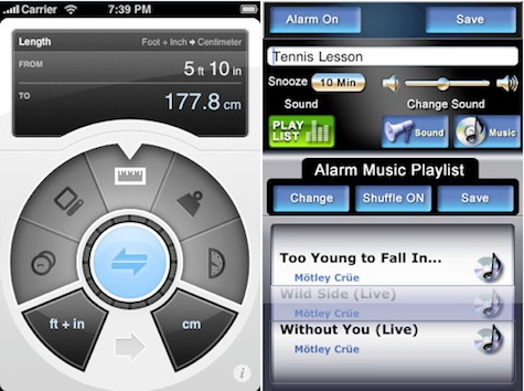
In general, know your limits as a designer and try to strike a good balance between convention and branding a unique, enjoyable experience.
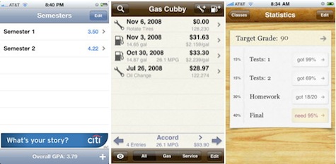
My GPA, Gas Cubby, Grades
MyGPA uses the system defaults with little customization, from the controls to the colors. Looks fine—just a bit boring.
Gas Cubby modifies the look of the default controls. It has a unique look with custom colors, textures, and graphics, without overdoing it.
Grades uses a more ambitious drawer/paper metaphor with standard, albeit customized, controls.
Don’t be a drone, be creative. Go the extra mile to make every interaction, transition, and error message fun and unique but also be realistic about your own ability to execute those concepts. A simple design, perfectly executed, trumps a poorly executed custom design.
Further reading:
- Smashing Magazine: iPhone Apps Design Mistakes: Over-Blown Visuals, by Alex Komarov.
7. RIP Basic Graphic Design Principles
Why don’t these apps look professional?
Great design has a lot to do with subjective taste, but there are some basic principles that, if followed, ensure an app will look professional. If ignored, disaster ensues.
Contrast: Both of these examples have poor contrast between the background and the content.
Repetition: The last two rows in the lefthand example break the font size pattern, and the righthand example doesn’t have much repetition at all—it lacks patterns in fonts, spacing, colors, and alignments.
Alignment: Left alignment generally looks more professional than centered alignment (lefthand example) or no alignment (righthand example).
Proximity: Very weak spatial groupings (especially in the righthand example).
For easy recall, you can use the, ahem, somewhat inappropriate acronym. You can figure it out yourself.
Aside from the basic principles, Mike Rundle points out that there are other execution-related details like uneven padding, blurry edges, and broken patterns that make a design wrong, objectively.
Further reading:
- Think Vitamin: How CRAP Is Your Site Design?, by Mike Rundle
- The Non-Designers Design Book, by Robin Williams
8. Forgetting to Design for the Mobile Context
Okay, so saying “the mobile context” is a bit misleading. There are a plethora of contexts a mobile app may be used in: at the store, during class, while driving, in the bathroom (you know its true)… the list goes on. Figure out which contexts the app will operate in, and design with them in mind. If the app caters to folks at the wheel, better make sure your controls are obvious and huge or you may end up with scathing reviews posted directly from the ER.
Though contexts vary, there are some general mobile design principles that are often ignored:
- Design big, bold, and minimal. Folks generally aren’t paying full attention to the interface and are often using it while doing something else. They don’t see the interface, they see a blur. Make the important elements pop.
- Beef up the font size. Don’t let the simulator deceive you; fonts look much smaller on the actual device. Be careful not to limit testing to retina-display devices like the iPhone 4. Smaller fonts look great on retina displays but absolutely fail on older devices.
- Do one thing really well and trash the other features. If you’re porting a desktop app or website to mobile, don’t just optimize for mobile; rethink the entire experience.
- Our fingers are very big and imprecise so make targets big.
- When designing forms, don’t forget the digital keyboard is going to take up about half the screen when the user taps on the first field.
These mockups have two things in common: they are both beautiful and they both fail when the digital keyboard slides up.

Further reading:
- Tapworthy, by Josh Clark, chapters one, two, and three.
- Smashing Magazine: iPhone Apps Design Mistakes: Disregard Of Context, by Alex Komarov.
9. Being Lazy
 You want to include a feature. You’re running out of time but something is better than nothing so you build it the lazy way, planning to make it better later.
Almost all the advertised functionality in the MyCharlotte (pictured right) app really just links to websites that open up within the app, some of them not even optimized for mobile. The result: a dismal rating on the App Store.
“That info is on a webpage somewhere. Just display it in a webview inside the app!” Or, “Let’s just put all that info in a big .png image and utilize the phone’s pinch-to-zoom interaction to let the user pan and zoom around find what they are looking for!”
Not a good idea.
Don’t sacrifice perfection at the altar of a feature that can probably wait. You may think users will appreciate the extra feature, but consider this: users cannot hate a feature that doesn’t exist but they certainly will complain about a feature that was poorly implemented.
Also, as the RedLaser guys pointed out in my interview with them, it is a lot easier to get publicity for version one of an app than for version two, so don’t use the old “we’ll make it better later” excuse.
10. Not Doing Usability Testing
 If you forget everything else, don’t forget this. Even the best designers are often amazed at how things they thought were dead simple completely baffle users. The best part is that usability testing doesn’t have to be expensive or complicated; you can gain tremendous insights from informally testing an app on friends, family, and coworkers.
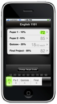
By showing an early Grades mockup (pictured right) to classmates, it was clear that nobody could figure out what that bottom bar represented. After trying out many variations, we eventually realized that the bottom bar was too much of a distraction from the main interface.
There are lots of great tips for conducting usability tests but one of the most important is to let the users do the talking, and let them figure things out on their own. Interact with them just enough to get them started and to keep them going, but remember that you won’t be there to help them in the real world.
Conclusion
Building a successful iPhone app is no small undertaking, and steering clear of these ten mistakes is just part of the equation. A solid idea and solid marketing are also extremely important. This list comes from obsessive observation of hundreds of iPhone apps as well as first-hand experience of designing and programming apps. It should help you design an app that stands out from the rolling sea of mediocrity in the App Store and becomes loved and shared by myriad happy users around the globe. Though this list covers some of the more important design issues, there are plenty of other important mistakes to avoid. Please discuss, elaborate, and add to the list in the comments.