Flag

We stand with Ukraine and our team members from Ukraine. Here are ways you can help

Home ›› Interaction Design ›› Page 3

Interaction Design

Read these first

A case study on how rethinking visual design and gamification elements based on target audience’s needs can become a game-changer.

Article by Zsofia Paszternak
How We Helped a Language App Reach Its Target Audience With Visual Design
  • Xeropan was built to help to master a language thanks to engaging game elements.
  • Despite a well-thought UX design, app-store conversions and retention ratio were not satisfactory.
  • After a discovery phase, UX studio found out that the major issues arose from failing to attract the target audience as the game elements met the needs of younger users.
  • Reinventing visual components and testing multiple prototypes allowed to find the right balance between a clear design and gamification. 
  • Improved UI became a key element to greater user experience and product satisfaction.
Share:How We Helped a Language App Reach Its Target Audience With Visual Design
8 min read

When deciding on your app’s login method, choosing between security and user convenience is a balancing act. Here are best practice login options and their metrics.

Article by Joseph Russell
App login design: Choosing the right user login option for your app
  • When deciding on your app’s login method, choosing between security and user convenience is somewhat of a balancing act. This article explores some options and the pros and cons of each.

  • There are 4 common options to consider when designing an app login screen: an email with password login and registration UX, social and third-party login UX, mobile login and registration UX, multi-factor login and registration UX.

    • Password login. Passwords are common but it can be hard for the user to remember all passwords. That is why security breaches could be caused by using password managers and using the same password for various apps/sites.
    • Social login and third-party login. Users are grateful for having one less password to memorize, and developers happy with high conversions and all the data they receive asses to. This method is mobile-friendly and free to use. But developers have to rely on the 3rd party security and expect to lose users who do not trust social media.
    • Mobile number login. The mobile number tends to be a much more unique identifier, and this method doesn’t require the user to remember passwords. On the other side, mobile numbers could change, and migrating accounts becomes complicated.
    • Multi-factor authentication (MFA). Its main strength is security. You can find temporary pins, third-party authenticator apps, retina, biometrics, or fingerprint, among MFA methods. Often, it requires a second device that can be stolen.

    Read the full article for a more in-depth breakdown of each login option.

Share:App login design: Choosing the right user login option for your app
9 min read

If there’s one thing I learned over five years in an AI leadership role with a Big 4 Consulting Firm, it’s that the popular view of Conversational AI misses the point.

Article by Jordan Ratner
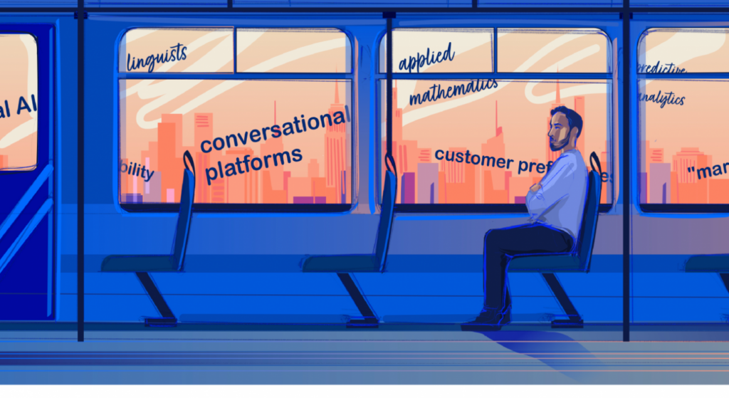
Share:The Problem with How Organizations are Thinking about Conversational AI – an Insider’s Guide
12 min read

8 design recommendations for search bar & autosuggest patterns

Article by Pranava Tandra
Best Practices: Designing autosuggest experiences
Here are some best practices recommended for the search bar & autosuggest patterns based on the analysis of user-typed queries & query formulation from about 50+ search bars.
  1. Scoping. Allow scoping if your app has multiple types of entities. Please note that scoping is not a mandatory step in the search workflow. It is only used to aid faster contextual suggestions.
  2. Autocomplete. Add Autocomplete as the top suggested item.
  3. Advanced Search. Give advanced search capabilities if your website/app has a huge volume of information and a dedicated search results page.
  4. Recent Searches. Always present recent search queries, especially in Zero State. To ensure high-quality suggestions in zero states, it’s better to have a threshold. It means a query needs to be executed several times before it ends up as a potential suggested term.
  5. Shorter suggestion lists. Limit suggestions to less than 10 list items. It is also recommended to avoid using the scroll paradigm in search suggestions.
  6. Grouping Suggestions. Always add labels and visual grouping for diverse information types.
  7. Enable conversations. Introduce conversational search experiences. Leveraging NL models to introduce voice inputs and question-answer framework can save a lot of time.
  8. Autocorrect & Clear queries. Assist with typos, erase queries, and suggestions. Additionally, provide users with an option to clear their search results in the search bar and equip them to remove their previous searches.
Read the full article below to get a breakdown of each of these best practices and learn about the research and concepts behind them. 
Share:Best Practices: Designing autosuggest experiences
6 min read

How can we use design to prioritize human interaction and spend less time on our screens?

Article by Tyler Berg
Staying Human in the Age of Big Tech
  • It’s important to evaluate tech’s continued development with a critical eye and define what overreach is and isn’t. UX designers have to use a human-first mindset in their work.
  • Users should be given control of how much screen time or application experience they want to consume. However, many services don’t give that choice using addictive technologies like endless newsfeed or autoplay.
  • When adopting technology to new mediums, it’s vital that we keep two things in mind. One: Are we creating technology for technology’s sake? And two: how does this impact current societal habits?
  • We need to consider the nuances of everyday life and consider the physical and digital realities for how the designs we create are used.
Share:Staying Human in the Age of Big Tech
6 min read

As we careen into the era of conversational AI and hyperautomation, closed systems create bad experiences that stifle innovation and opportunity

Article by Josh Tyson
Share:Open vs Closed: a Critical Question for Designing and Building Experiences
8 min read

Did you know UX Magazine hosts the most popular podcast about conversational AI?

Listen to Invisible Machines

This website uses cookies to ensure you get the best experience on our website. Check our privacy policy and