Save

The problem
In the fall of 2019, Xeropan’s CEO reached out to us because, although he was receiving great feedback on his product, his conversions in the app stores weren’t living up to his expectations. Additionally, he had the feeling that his ratio of paying customers to total users could be improved.
Discovery
In order to solve the problems at hand, Antoine, our researcher, first needed to understand the causes of these problems.
To increase conversions, he had to explore which part of the funnel could be improved and what was the problem in the first place, so he decided to ask potential users to find the app, download it and play around with it while leading him through their impressions, thoughts, and questions.
To find a way to increase the ratio of paying users, Antoine also asked participants what difference they saw between the free and premium plans, in terms of value. Also, he questioned them about their willingness to pay. He then asked them about past experiences where they had paid for a similar service, to understand the motivations that triggered the buying decision.
Findings
The most important findings from this discovery phase were the following:
- The segment of users that are more willing to pay are young adults who need to learn English for traveling or professional purposes
- The first impression our target audience had was usually that the app was designed for a younger audience than them, which led them to believe that probably the content of the app wouldn’t be suitable for their age group’s needs
- However, when interacting with the product, users loved the exercises, describing them as fun and a useful way to learn English
- Users that were willing to pay perceived the price as reasonable, but it became clear that the difference in value proposition between the free and premium plans had to be emphasized more
Ideation & Preference tests
The company wanted to act on this right away, so UX studio set up a two-person team: Dóri, a skilled UX researcher, and myself, a UX designer with a strong background in visual design. Together, we came up with a one month experiment.
Our hypothesis was that the main reason people don’t connect with the design is because of the too-powerful presence of the main character (or mascot), Professor Max, and a very colorful and playful storyline about his time travel adventures. Since this story was the first impression users would get after downloading the app, they could rightfully think that the lessons were not serious enough.
We asked testers on UsabilityHub to give us their feedback on the original version and three modified versions. We conducted Five Second Testing to ask about their impressions of Professor Max. After that, we showed them the App Store mockups and asked the following questions:
- What kind of app do you think it is?
- Who do you think are the users of this app?
Parallelly, we conducted in-person interviews with prototypes, where we asked the same questions and tried to understand the reasons behind the answers.
01 – Original version
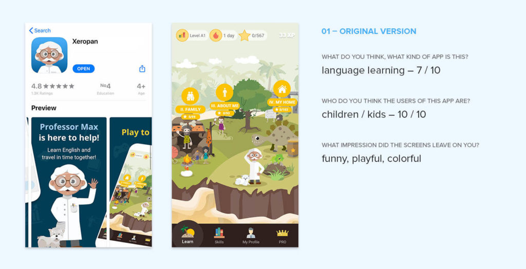
Reactions:
- “Professor Max: It doesn’t look like you will learn English. I would prefer a skyline of London, something that evokes the English language.
- Looks childish, not professional, not serious” “Is it for kids?” “Looks cartoonish, I think it’s for kids.”
- “Einstein.” “Medical app.”
02 – With a younger professor teacher

Changes:
- Professor Max became young and more professional-looking, more teacher-like.
- As the users found the island distracting and hard to navigate because of the many details, we started with removing elements. To make the level topics more visible, we changed their colors and connected them with a line to guide users’ eyes.
Reactions:
- This smaller iteration didn’t make that much of a difference in terms of how the users perceived the design: they still said it was childish, but the estimated age of the target audience got a bit older.
03 – Without the story
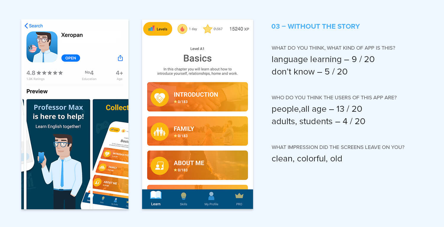
Changes:
- Professor Max lost his cloak as we tried to make him look like a young teacher.
- We left out the concept of the island and time travel but kept the colors and style of the original interface.
Reactions:
- The estimated age of the target audience got significantly older: “people, adults, professionals.”
- But respondents got confused about what the app was exactly for. “I think it’s more for business people” “This white professional guy… I wouldn’t think of language learning.”
04 – Full redesign with story
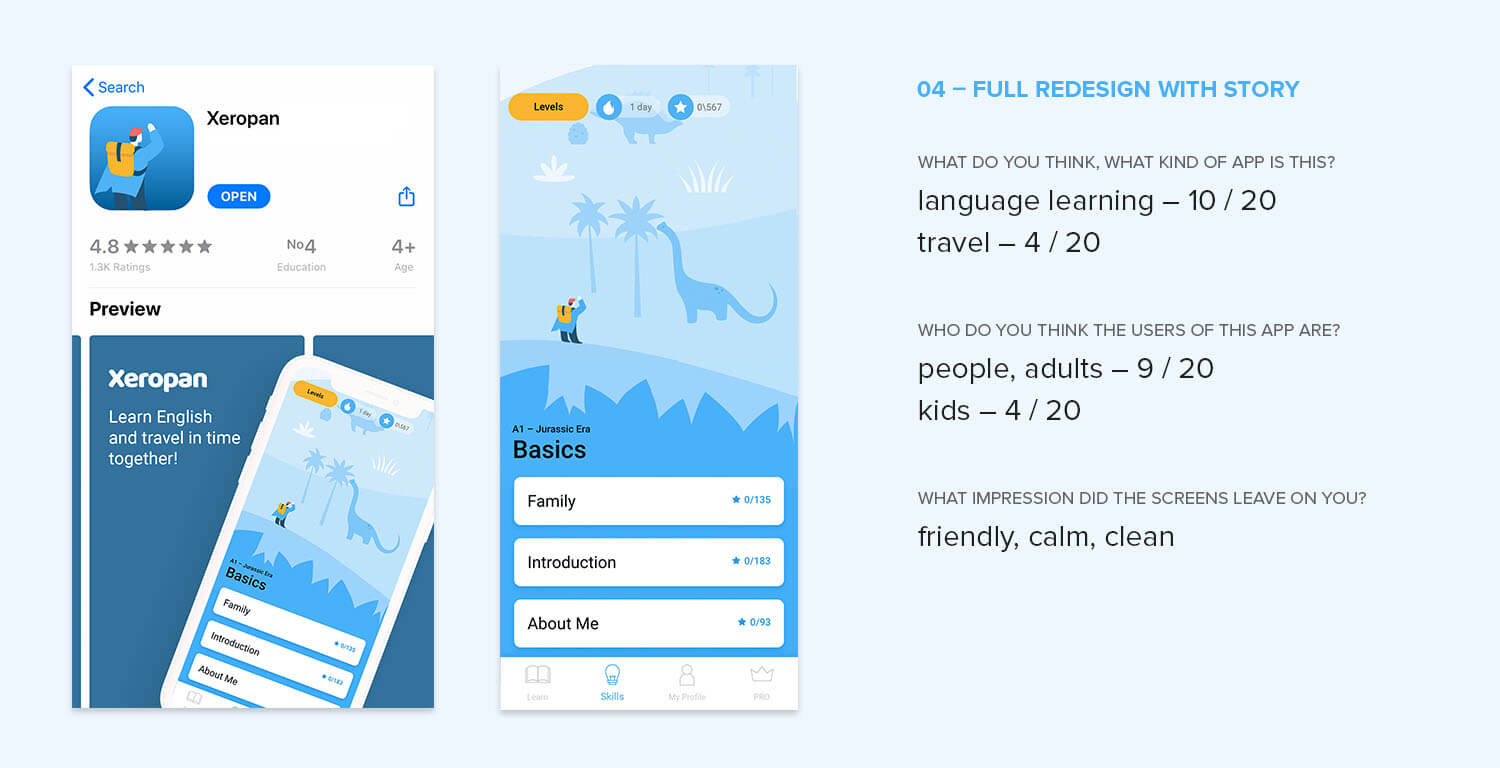
Changes:
- We decided to bring back the gamification element (the concept of time travel and the character) but made the design more simple and clean, not so childish.
- We changed the professor to an explorer character to fit the story better.
Reactions:
- The estimated age of the target audience got to a general level: “people.”
- More respondents understood that the app is for language learning. However, it also gave people the impression that the app was travel related.
The redesign
Based on the results of the preference tests, we consulted with the client and decided to continue the collaboration. We chose the last concept, the fully redesigned version, and agreed on a 3-month long project plan during which we would redesign the main screens of the application, develop a new visual language and help Xeropan implement them with illustration and imagery guidelines.
The goal
The goal of the redesign was to improve app-store conversions and retention by adapting the visual language and value proposition to the people who were most willing to pay for the product while keeping the gamification and story aspects of the app.
Creating a new visual language
The setup
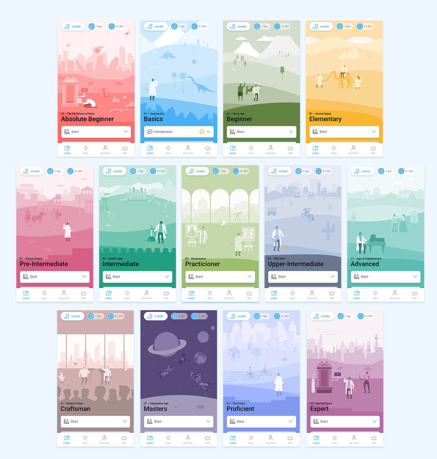
When you first download the app, you’re presented with an onboarding where you can select your language, goals, and current English level, and get introduced to the story. The app has 13 levels based on language difficulty. Most people downloading the application are beginners; they start on level 0 or 1.
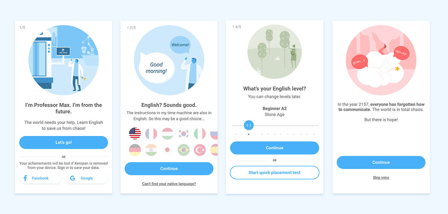
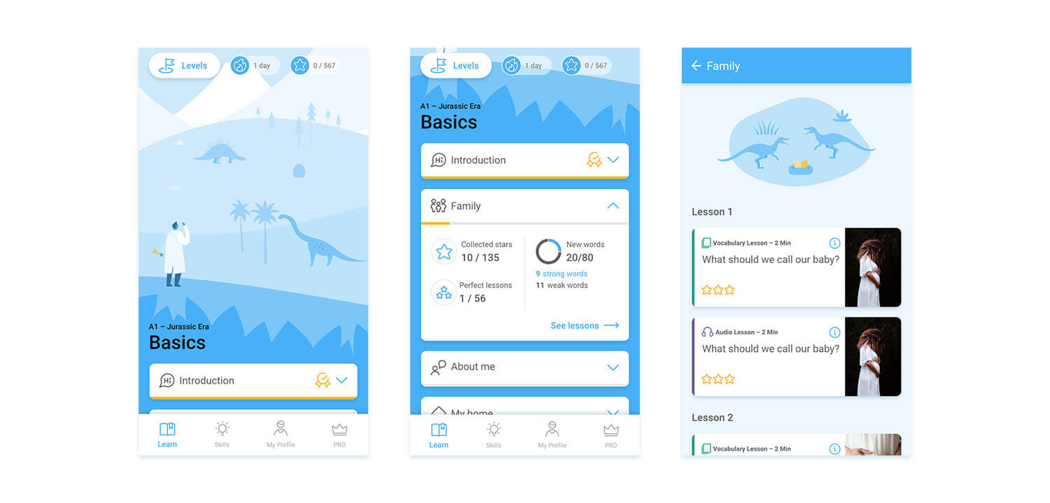
Since we didn’t want to change the structure of the lessons, we had to build around them. Obviously, the most significant change happened on the level screens:
- The illustrations became much simpler: instead of a noisy children’s book story, we painted a friendly, spacious, and calming scene using metaphors, a simple color palette, and lots of negative space.
- We changed the layout from horizontal to vertical. Users often got lost in the previous version, as it was hard for them to find where they’ve left off their studies. Now with auto-scroll, the app always shows you where to continue.
- Instead of simply writing out the name of the topic, we wanted to motivate users more to continue their studies. We designed detailed topic cards for them where they can see their progress.
We emphasized the difference between the levels with colors: we wanted users to realize on which level they are at the moment quickly. Color schemes helped us guide them visually.
Introducing a new content type
We met with users who thought the story was motivating and liked the playfulness of the app as well as people who only focused on completing the lessons with a perfect score (3 stars).
To motivate both user groups a bit more and to help them connect with the topic of the levels, we came up with Bonus lessons they can unlock after collecting a certain amount of stars.
To give an example: In the first level, the Jurassic Era, bonus lessons teach you about dinosaurs, the Big Boom, and the Jurassic Park movie. You can unlock them one-by-one by completing the “regular” lessons of the level. Since they are not obligatory, the story is not forced on everyone, but it engages those who are motivated by it.
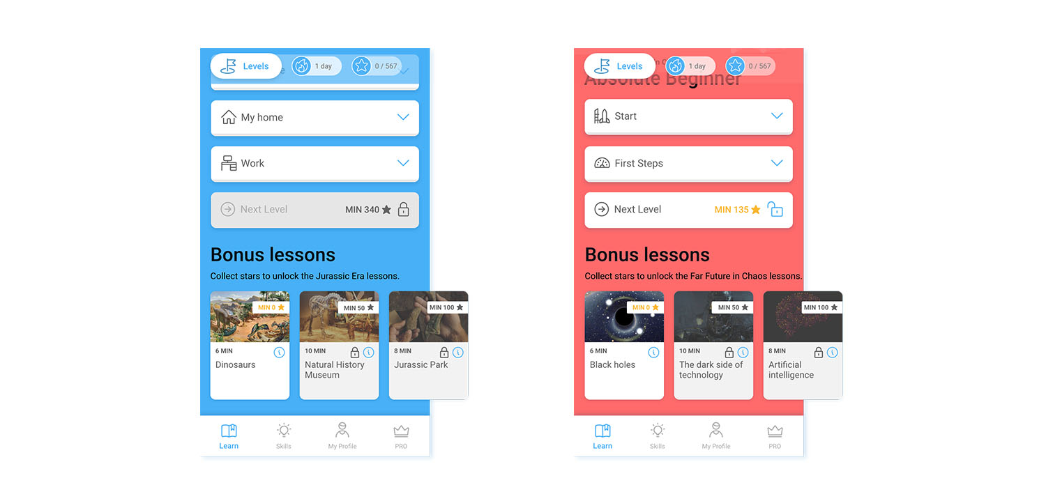
These topics are not final: to test our idea we came up with some placeholders until Xeropan’s content team took it over
But what will the existing users think?
When we chose the new design, we based our decision on the reaction of the potential target audience. But to make it successful, we had to be sure existing users can get used to the change as well.
Towards the end of the three months, when most of the main pages were in the prototype already, we invited the biggest fans: people who’ve been using Xeropan for years and saw all the changes that happened previously in the app. We were super excited and somewhat nervous to hear their opinion.
- When we gave them the prototype, their first reaction was a shock. Compared to the live version, they described the proto as “less colorful, more serious, clean and… different.”
- After browsing a bit and checking the topics and the lessons, they got relieved: they saw that the structure of the lessons stayed the same, and they were able to find all the important pages easily.
- When we asked them about the level screen (which was previously a busy island with horizontal scroll), they said that the new version was much easier to navigate, and they could see their progress better.
- They also mentioned that “now it doesn’t look like it is for children anymore” (and that is the biggest compliment they could give to us).
All in all, even though older users need some more time to get used to the new design, we felt the interviews were a great success: we were confident that we solved the problem we were hired to solve. We found the border between childish and gamified and managed to push Xeropan to the right side: now, it is truly a playful way to learn languages for both children and adults.
Conclusion
Usually, when we have to redesign a product, the structural and navigational problems are far more important to solve. But this time – since we tackled those problems in our previous collaborations with Xeropan – we had the chance to test them again and fine-tune them while working on the new UI.
Changing a couple of buttons and simplifying the Profile section might seem like a small thing, but we often forget that user experience is never finished. Going back and improving on our previous decisions is just as important as redesigning something from the ground up.
Half a year passed since the release of the new design so we asked Xeropan’s CMO if they’ve noticed any change in app downloads and retention? He said:
“It is quite hard to separate the design-related changes from other, external effects (the release happened in the summer when a lot of people were “set free” from home due to covid). It took us some months to reach and exceed the download numbers we had in the spring. However, we do see a 3% progress in the Day 1 retention numbers and a 5% decrease in trial cancellations on iOS platforms.”
One more very interesting feedback we got from Attila, the CEO is that “comments regarding the childish look&feel completely disappeared since the release of the new design”.
All in all, we think that the collaboration with the Xeropan team was a successful one, and we cannot wait to hear your thoughts and feedback! Feel free to try it for yourselves and let us know what you think!
Zsofia Paszternak
A product designer with a background in visual communication and over 5 years of experience in UX/UI and product design.
- Xeropan was built to help to master a language thanks to engaging game elements.
- Despite a well-thought UX design, app-store conversions and retention ratio were not satisfactory.
- After a discovery phase, UX studio found out that the major issues arose from failing to attract the target audience as the game elements met the needs of younger users.
- Reinventing visual components and testing multiple prototypes allowed to find the right balance between a clear design and gamification.
- Improved UI became a key element to greater user experience and product satisfaction.


