Save

Here are some best practices recommended for the search bar & autosuggest patterns based on the analysis of user-typed queries & query formulation from about 50+ search bars.
- Scoping. Allow scoping if your app has multiple types of entities. Please note that scoping is not a mandatory step in the search workflow. It is only used to aid faster contextual suggestions.
- Autocomplete. Add Autocomplete as the top suggested item.
- Advanced Search. Give advanced search capabilities if your website/app has a huge volume of information and a dedicated search results page.
- Recent Searches. Always present recent search queries, especially in Zero State. To ensure high-quality suggestions in zero states, it’s better to have a threshold. It means a query needs to be executed several times before it ends up as a potential suggested term.
- Shorter suggestion lists. Limit suggestions to less than 10 list items. It is also recommended to avoid using the scroll paradigm in search suggestions.
- Grouping Suggestions. Always add labels and visual grouping for diverse information types.
- Enable conversations. Introduce conversational search experiences. Leveraging NL models to introduce voice inputs and question-answer framework can save a lot of time.
- Autocorrect & Clear queries. Assist with typos, erase queries, and suggestions. Additionally, provide users with an option to clear their search results in the search bar and equip them to remove their previous searches.
Read the full article below to get a breakdown of each of these best practices and learn about the research and concepts behind them.
Over the last couple of weeks, I carried an exhaustive study on about 50+ search bars and analyzed their behavior that helps users achieve their goals. The search bars analyzed were across operating systems, communication apps, e-commerce apps, social media apps, and cloud storage apps on the web, desktop, and mobile. It has been understood that queries entered in search bars are primarily used for navigation, finding information, obtaining answers, and quickly completing tasks.
Structurally, a search box is a text box with placeholder text, an icon, and sometimes a button. When a query is entered, the text box typically rolls down a drop-down with a list of suggestions. Queries are entered in the search box to request or retrieve information. In mechanisms where QF (Query Formulation) is in place, it transforms the original keyword query submitted by the user in the search bar to better express the query’s underlying intent. The QF principle is to enhance the quality of the ranking presented to the user in response to their query. Hence, autosuggestions are generated based on user queries and QFs.
Here are typical search bar interaction states—
- Default State
- Hover — Search bar lights up
- Click for Zero State — Dropdown containing recent searches.
- Start Typing Query — Dropdown containing autosuggestions.
- Hover on autosuggestions — Contextual Actions may be shown.
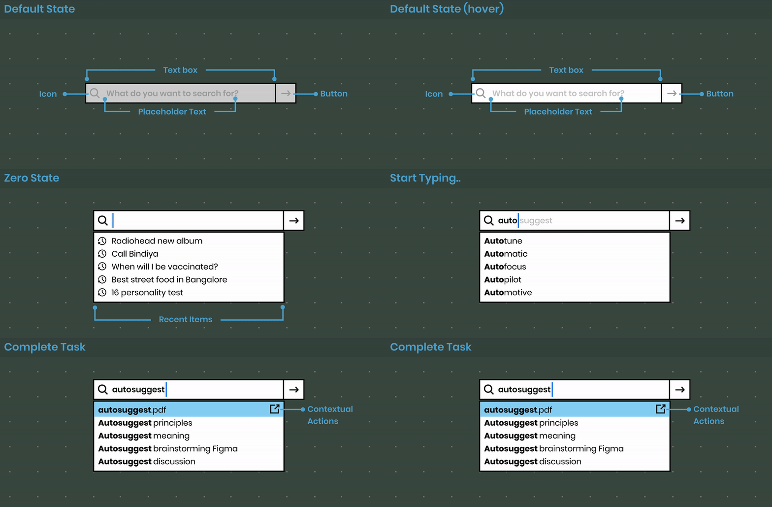
States of Search bar
Here is a list of best practices recommended for the search bar & autosuggest patterns based on the analysis of user-typed queries & query formulation:
#1: Scoping
Allow scoping if your app has multiple types of entities.
Scoping can be useful to refine and filter by “kind” in the primary level. This helps users zero in on the navigation to find the relevant piece of information. Using scope bars or tags to filter results within the Search bar helps users narrow the search results. It is extensively used in communication apps and e-commerce websites. Please note that scoping is not a mandatory step in the search workflow. It is only used to aid faster contextual suggestions.
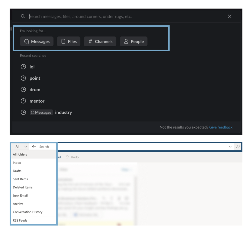
Scoping: Slack allows users to choose the type of information they’re looking for. Outlook also allows scoping by providing a dropdown to choose from folders to search from.
#2: Autocomplete
Add Autocomplete as the top suggested item.
Autocomplete helps users save time. Autocomplete basically the topmost suggestion shown in the search box, most likely based on your previous searches, or maybe has maximum relevance to searches you have previously conducted. It is extensively used in mail applications and search engines. In search engines, autocomplete is broadly applied based on what’s trending in a situated area or country. The Mac OS Spotlight search also does a great job of surfacing autocomplete suggestions.
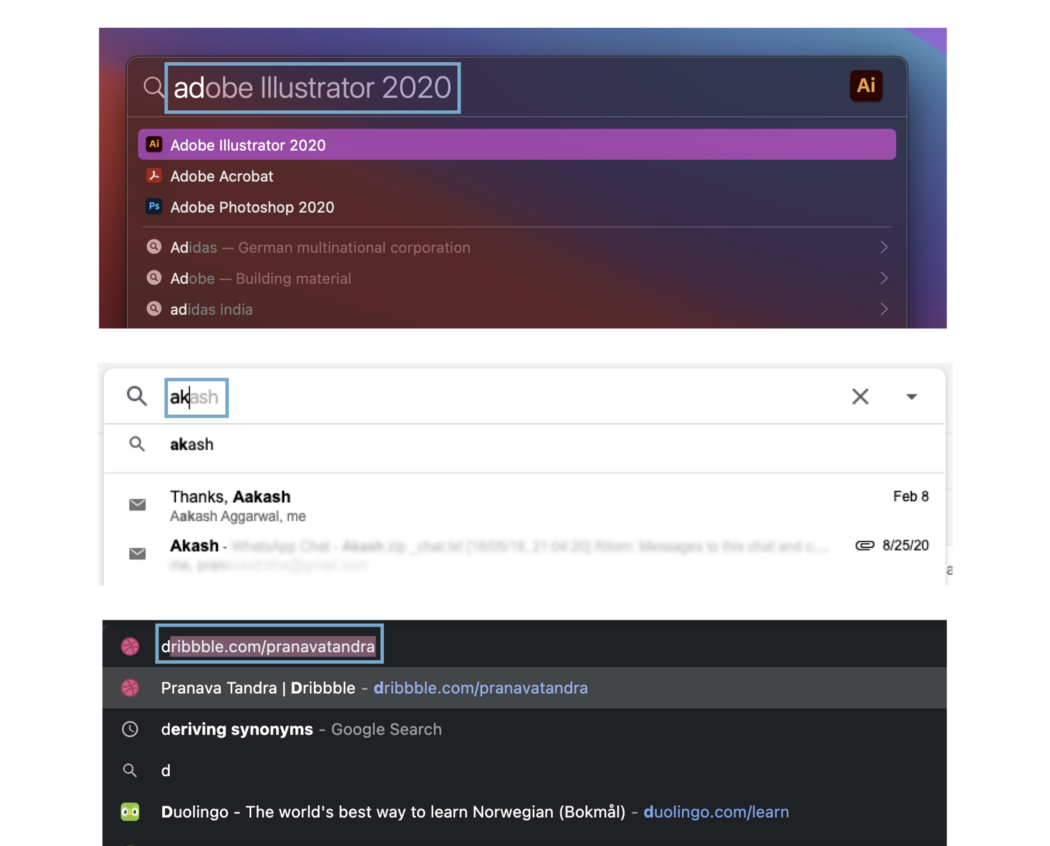
Autocomplete: Screenshots of Mac OS, Gmail, and Google Omnibar leveraging autocomplete to predict the top suggestions
#3: Advanced Search
Give advanced search capabilities if your website/app has a huge volume of information and a dedicated search results page.
Advanced search is a lot like scoping, except that it can be instrumental in searching for something in a specific location. It is almost like a scoped and filtered search, yet much more powerful. Provide the ‘Advanced Search’ option for a product with a complicated site map, a lot of information, or numerous functionalities. Also, adding an advanced search option creates a smooth transition into Search Pages. Websites such as Google Drive and Outlook provide an accordion icon within the search bar to indicate advanced search options.
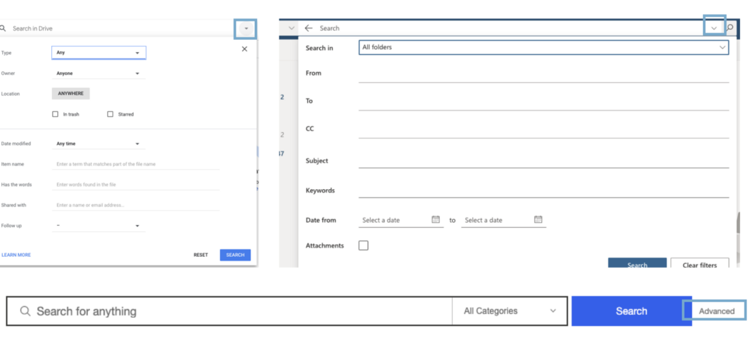
Advanced Search: Google Drive, Outlook Web, and eBay all provide advanced search options
#4: Recent Searches
Always present recent search queries, especially in Zero State.
In communication apps, showing recent queries, files, people is imperative as prior searches and visitations speed up users’ search. A good-to-have practice in enterprise environments is not to show query typos in recent searches and instead show target information. It is also essential to place the last typed query at the top for suggestions. Additionally, to ensure high-quality suggestions in zero states, it is recommended to have a threshold. A threshold means a query needs to be executed several times before it ends up as a potential suggested term.
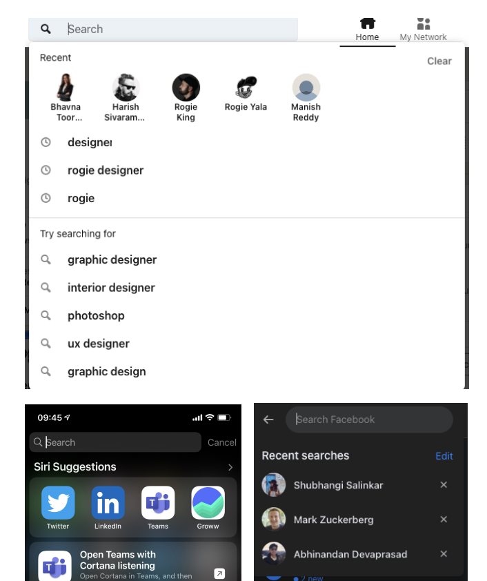
Recent Searches in Zero State: LinkedIn and Facebook showing recent searches. iOS uses QF and threshold to surface recently searched and used apps in its zero states.
#5: Shorter suggestion lists
Limit suggestions to less than 10 list items
It is observed that a shortlist of 7–9 items on average is used to help users quickly sift through information items in autosuggestions. Hick’s law also states that — the time it takes to make a decision increases with the number and complexity of choices. So, showing a list with less than 10 items and refining autosuggestions with every keystroke can be a good practice to follow when designing. It is also recommended to avoid using the scroll paradigm in search suggestions.
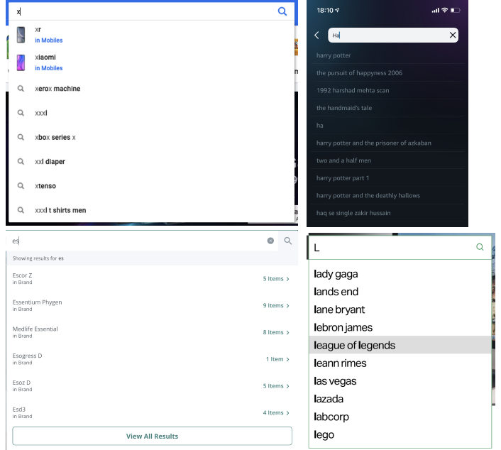
Shorter suggestion lists Examples of Flipkart, Prime video on iOS, PharmEasy, and TechCrunch Pinterest, showing lists with 8–11 items as suggestions.
#6: Grouping Suggestions
Always add labels and visual grouping for diverse information types.
Headings, labels, metadata, and visually styling different kinds of items in the suggestions list can help people scan information faster, particularly for desktops. This basically highlights the differences between information types, effectively lowering the visual noise.
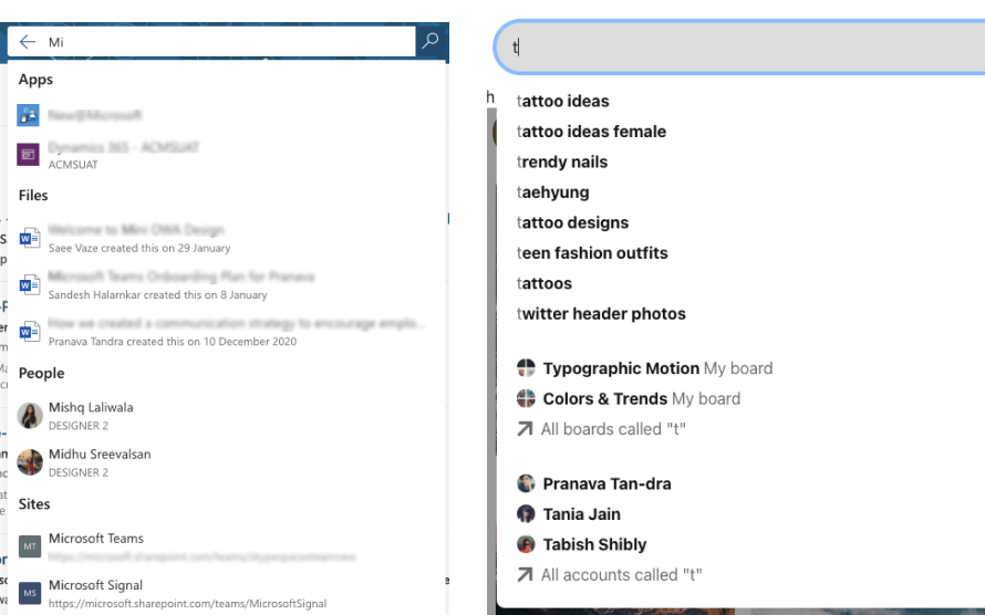
Grouping Suggestions: Office.com and Pinterest adding labels and grouping content respectively to show different information types.
#7: Enable conversations
Introduce conversational search experiences
Leveraging NL models to introduce voice inputs and question-answer framework can save a lot of time. This also means allowing users to complete tasks by providing users with accurate suggestions by utilizing keystroke analytics. Search engines and operating systems, by their voice assistants, surface answers in autosuggestions to help users reach their information with the least number of clicks, which is also extensively prevalent in mobile devices.

Enable Conversations: Top — Youtube and Bing have added the voice search functionality into their search bar. Bottom — Microsoft Teams doubles up as a command bar that allows users to place calls. There are also several other actions a user can do using the command bar. Google generates answers as autosuggestions to questions by implementing powerful QF.
#8: Autocorrect & Clear queries
Assist with typos, erase queries and suggestions
Tolerate and autocorrect typos, always allow users to correct errors where possible or necessary, and make suggestions for alternatives. This is vital in designing search boxes for e-commerce websites. Additionally, provide users with an option to clear their search results in the search bar and equip them to remove their previous searches.
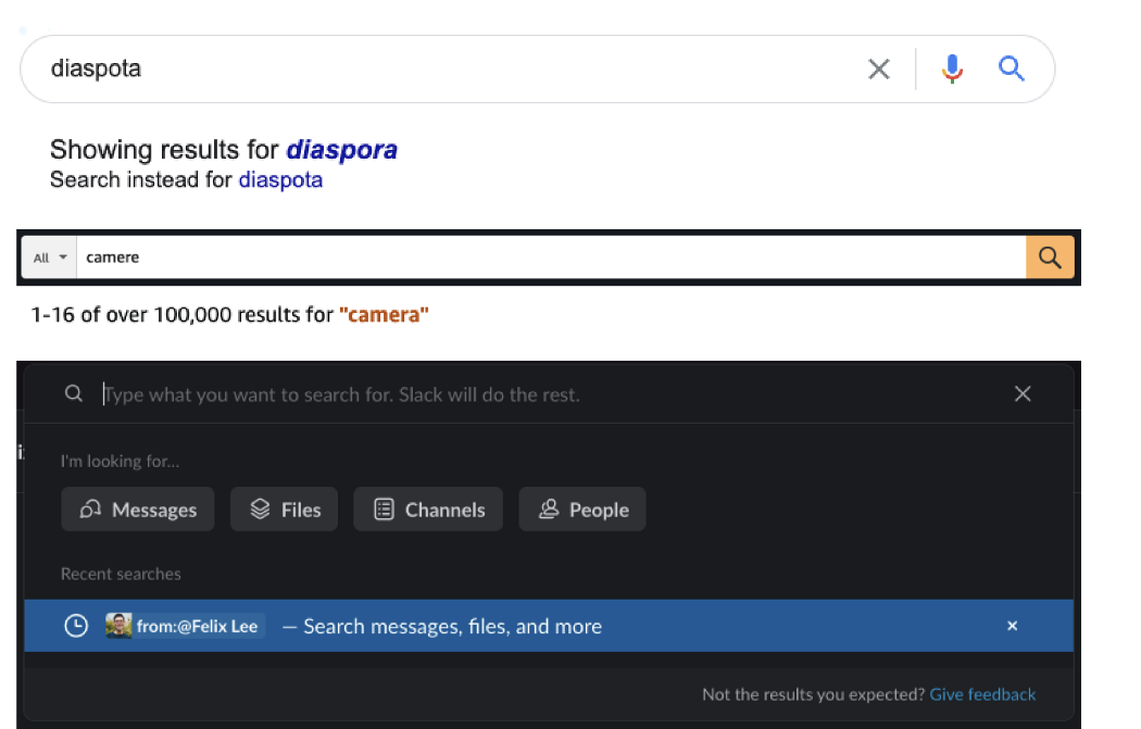
Autocorrect queries: Google and Amazon performing autocorrect after a query is entered. Example of how slack allows users to remove recent searches by providing the X button in the search bar and against suggested items.
Conclusion
Following some of the above-mentioned recommendations can help design autosuggestions that can enhance search usability and quickly obtain relevant results. This is significant since search is an essential part of most websites and applications today. I also recommend you go through Baymard’s UX research article on Auto-complete; I found it useful to validate my observations. Furthermore, This PDF on Wikimedia explains the query formulation process in detail for beginners.
Pranava Tandra
Pranava is a product designer deeply interested in processes and measures that support scalable solutions for design challenges. She currently designs search experiences for Microsoft Teams.
- Scoping. Allow scoping if your app has multiple types of entities. Please note that scoping is not a mandatory step in the search workflow. It is only used to aid faster contextual suggestions.
- Autocomplete. Add Autocomplete as the top suggested item.
- Advanced Search. Give advanced search capabilities if your website/app has a huge volume of information and a dedicated search results page.
- Recent Searches. Always present recent search queries, especially in Zero State. To ensure high-quality suggestions in zero states, it’s better to have a threshold. It means a query needs to be executed several times before it ends up as a potential suggested term.
- Shorter suggestion lists. Limit suggestions to less than 10 list items. It is also recommended to avoid using the scroll paradigm in search suggestions.
- Grouping Suggestions. Always add labels and visual grouping for diverse information types.
- Enable conversations. Introduce conversational search experiences. Leveraging NL models to introduce voice inputs and question-answer framework can save a lot of time.
- Autocorrect & Clear queries. Assist with typos, erase queries, and suggestions. Additionally, provide users with an option to clear their search results in the search bar and equip them to remove their previous searches.


