As an industry, we’ve worked to established many new practices and tools for nimble design teams, from A/B testing to measuring bounce rates and CTR performance. But a lot of these methods require engineers or some amount of technical know-how to execute, and they take place only after something has been launched.
The judicious application of “dumb data” can streamline your workflow and improve your designs
What many people don’t know is that there are some unexpected applications of data to consider earlier in the design process, which you, the designer, can do yourself. They’re not fancy, and you don’t need to know how to write SQL queries. The judicious application of just-enough “dumb data” can streamline your workflow and improve your designs in surprisingly useful ways.
Here are a few examples of how to do so. (Warning: non-statistically-significant numbers ahead.)
Understanding User Behavior
Let’s say you want to understand what types of content people are interested in. I lead design efforts at Polyvore, a site people use to get style and outfit inspiration, but what is their underlying motivation? Do they need outfit ideas for everyday work outfits? Special pastel goth outings? Dream brunch dates with One Direction?
Like any other product with a search box, we have a wealth of outfit queries available. Looking only at the most popular queries loses out on the long tail, while building a fancy machine-learning bayesian thingamabob is too expensive. With dumb data to the rescue, you easily can do this using brute force and Google Spreadsheets.
In your spreadsheet, label a few hundred randomly pulled queries, farming some of this work to your friendly teammates. You’ll quickly get a sense of what the major categories are, and from there, you have a better understanding of what people want to do.

This can be applied to all sorts of content at scale that computers can’t parse. I’ve used this type of data bucket diary study activities, brand sentiment, video search intents, and more.
Beefing Up Experience Maps
When experience mapping, it’s all too easy to make assumptions or get into wishful thinking mode about how users interact with our products. A quick check into click rates from page to page will keep the team honest (User Flows in Google Analytics). At Polyvore, we like to pair the map artifact with a flow diagram that visually shows how likely it is that users actually make it into the next step of the intended experience.

Starting Scenarios and Storyboards
In addition to collaborating with user research, you can sleuth through referrer and landing page data (again in Google Analytics, along with second page parameters) to identify why people come to your site. Using a hypothetical hotel site example, if most people visit from web search, they probably want to learn more about the accommodations. On the other hand, a visitor from Travelocity has already seen photos, read reviews, and is probably ready to start booking. These deductions give you a better starting point and more confidence in creating scenarios and storyboards.
Creating Realistic and Engaging Designs
Wireframes are an essential concepting tool for the interaction designer, but they can hide layout problems if used for too long. Product teams also tend to have a hard time visualizing the end product, potentially leading to major revisions late in the game. I’ve found that it’s best to move onto using real text and images as quickly as possible, but it’s important to choose the right sort of content to illustrate your ideas.
Take 15-20 minutes to collect a set of realistic images and metadata by running searches or looking at existing page content. So, that means no “lorem ipsum text” (not the right feel, doesn’t fill out space correctly) and no cherry-picked imagery (obscures visual design issues and besides, that’s just cheating!).
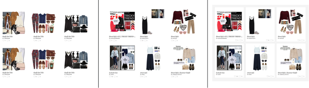
L: clean white look with perfect data M: realistic data R: visual container for realistic data
These are just a few scrappy ways that you can use easily available data to improve your design process. Having been lucky enough to work at tech companies that value analytics, these are the methods I’ve figured out over time. What are some of your tips on incorporating data? Feel free to share in the comments below.
Image of young archer courtesy Shutterstock.