Save
The broken telephone game is played all over the world. In it, according to Wikipedia, “one person whispers a message to another, which is passed through a line of people until the last player announces the message to the entire group. Errors typically accumulate in the retellings, so the statement announced by the last player differs significantly, and often amusingly, from the one uttered by the first.”
This game is also played inadvertently by a large number of organizations seeking to define software and UI requirements, using information passed from customers, to business analysts, to UI/UX designers, to developers and testers.
Here’s a typical example:
- The BA or product owner elicits requirements from a customer and writes them down, often as a feature list and use cases.
- The use cases are interpreted by the UI/UX team to develop UI mockups and storyboards.
- Testing interprets the storyboards, mockups, and use cases to develop test cases,
- Also, the developers will try to interpret the use cases, mockups, and storyboards to actually write the code.
As with broken telephone, at each handoff of information the original content is altered. The resulting approach includes a lot of re-work and escalating project costs due to combinations of the following:
- Use cases don’t properly represent customer requirements.
- UI/UX design is not consistent with the use cases.
- Incorrect test cases create false bugs.
- Missed test cases result in undiscovered bugs.
- Developers build features that don’t meet customer needs.
The further down the broken telephone line the original requirements get, the more distorted they become. For this reason, UI storyboards, test cases, and code typically require a lot of reworking as requirements are misunderstood or improperly translated by the time they get to the UI and testing teams.
How Can We Reduce the Broken Telephone Effect?
The good news is that there are some reasonably simple changes we can make to our processes and deliverables that will decrease the Broken Telephone effect. The following techniques share the goal of reducing handoffs and translations.
Interview the customer with cross discipline teams
One technique is to involve the BA, UI/UX, and quality assurance people directly in the elicitation process with the customer. Some may even make a case for including the lead developer as well. Having all disciplines represented during the interview process lets all parties hear requirements directly from the customer, reducing the reliance on BA documents alone. An equally important side benefit is that each discipline brings a different perspective which can lead the interview process down different paths of conversation and requirement gathering.
For example, the QA resource may ask more questions about the requirements related to edge or error conditions than the BA or UI/UX resource. Putting a UI/UX member in front of the customer will give them a chance to understand features that are frequently used to manage the cognitive load of the end user.
Combine and evolve use cases, UI mockups, and UI storyboards into an “integrated deliverable”
One key approach to reduce the Broken Telephone effect is to avoid creating use cases, mockups, and storyboards as separate deliverables by combining them into one “integrated deliverable.” To create this integrated deliverable, start with the use case and attach UI mockups to each step. This automatically creates a UI storyboard that has the same steps (including main and alternate flows) as the use case, so they don’t get out of sync. Also, since the UI mockups are attached to each step you know they will be consistent with the purpose and requirements outlined in the step.
Often, new requirements or changes to existing requirements emerge, and if your storyboards and mockups are separate from the use cases, the original use cases are not updated. This creates confusion for your developers, testers, and stakeholders. Combining your use cases, mockups, and storyboards into one integrated deliverable makes it much easier to keep all three in sync, dramatically reducing the potential for conflicting requirements.
The integrated deliverable approach encourages the collaborative and combined authoring and review of use cases and UI/UX design by your BA and UI/UX teams, resulting in more accurately defined and understood requirements.
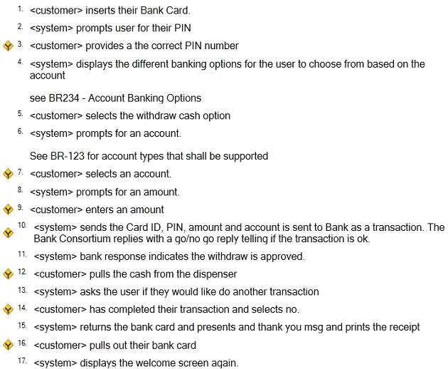
To bring this concept to life, here’s an example that starts with the use case defined by the BA or product manager, without any mention of UI-specific requirements.
Use Case: ATM Cash Withdraw
The steps with the Y-shaped symbol beside them are steps with alternate flows.
Alternate Flows


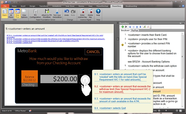
When the UI/UX team starts attaching UI mockups to each of the steps, a UI storyboard is created that uses the same exact main flow and alternate flows as the use case. A UI storyboard expressed in terms of a main flow and alternate flows has the benefit of reducing the number of traditional linear storyboards. If you were to create traditional UI storyboards for each of the unique paths through the use case above, you’d have 11, with duplicated steps across them. UI storyboards with main flows and alternate flows reduce rework and errors that pop up in linear UI storyboards.
You can do this in Word by inserting UI mockup images created in a different UI mockup tool, but keeping the UI mockups up to date in the will become time-consuming and error-prone. To make this process easier my company created a product called PowerStory—a plugin for PowerPoint designed to combine use cases with UI mockups, evolving the use case into UI storyboards that support main flows and alternate flows.
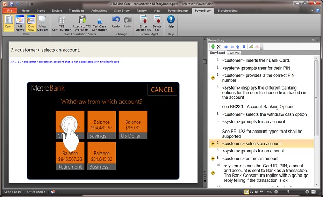
In the following screen shot you will see that PowerStory adds a panel specifically designed for creating main flows and alternate flows of use cases, and associates the steps in these flows with typical slides in PowerPoint.
As before, the steps with the Y-shaped symbol beside them indicate an alternate flow. When you hover over the icon you can view and enter the alternate flows associated with that step.
PowerPoint is an extremely powerful tool for creating UI Mockups that can support more UI design ideas than typical wireframe mockup tools, especially with plugins like PowerMockup and Microsoft’s upcoming storyboarding plugin.
Write use cases and UI storyboards with testing in mind
Test cases typically include a “user action” followed by an “expected result.” If you spend a little more time up-front defining which steps are “user actions” and which steps are “expected results” when creating your use cases and UI storyboards, you can save your testing team some time. Use cases are well suited for this approach by defining the principle actor for each step as done in the sample use case above. Any step where the actor is a system should be classified as an “expected result” step for the test case, and any step where the actor is an end user should be labeled “user action.”
One of the test cases that would be derived from the combined use case defined above is shown below, following the rule that a step with an end user actor is an Action and a step that has a system actor is an Expected Result.
Automate the creation of your test cases directly from your use cases
Although this will make it easier for the testing team to create test cases manually, the real advantage is using tools like PowerStory, which will automatically generate a test case for each of the 11 unique user interaction paths of the example use case above.
Using tools that will automatically generate test cases from your use cases and UI storyboards will save you a significant amount of time and money typically spent by your testing team creating manual test cases. In the context of this article, it also eliminates a handoff and link in the Broken Telephone effect. When QA teams are interpreting requirements and translating them into test cases, they might misunderstand requirements and create the faulty test cases and/or miss requirements and their corresponding test cases.
Key Points to Take Away
Developing software requirements, UI designs, and test cases can mirror the broken telephone game we all played as kids. Every time we pass information on, it gets changed and misinterpreted, leading to increased project costs and the delivery of the wrong solutions to your customers. Following the steps outlined above, you can reduce the Broken Telephone effect and follow a more streamlined process to clear and lucid product development.
Blue telephone image courtesy Shutterstock
Martin has spent the past six years in the requirements definition and management space, first as CTO of Blueprint Software and now as CEO of PowerStory. Prior to that, Martin held CTO positions in other startup’s starting in 2002. Martin also has extensive experience selling and delivering large system’s integration projects while working for EDS, Accenture, and Deloitte Consulting for the first 10 years of his career. Martin was also a founder of eMersion, which was an eBusiness Consulting company which was later sold to Deloitte Consulting.


