Flag

We stand with Ukraine and our team members from Ukraine. Here are ways you can help

Get exclusive access to thought-provoking articles, bonus podcast content, and cutting-edge whitepapers. Become a member of the UX Magazine community today!

Home ›› Consumer products ›› My Mailbox Overfloweth but I Don’t Have Time for Your Unsubscribe #wtfUX

My Mailbox Overfloweth but I Don’t Have Time for Your Unsubscribe #wtfUX

by Josh Tyson
2 min read
Share this post on
Tweet
Share
Post
Share
Email
Print

Save

It’s easy to accidentally subscribe to a company’s newsletter. It’s often very, very hard to get off their mailing list.

“Don’t you love the way companies find you and spam you daily the moment you make a sideways glance towards one of their products?” Indrani Stangl asks us. It’s a good question. It’s all too easy to get sucked into a newsletter situation. Some of them are good, many of them are all kinds of blight. Here, Stangl goes deeper into the unsubcribe dilemma.

My inbox, like everyone else’s, is brimming with newsletters, offers, coupons, and other nonsense. Why I would take the time to read a newsletter by a staffer at ‘Nothing Bundt Cakes’ (don’t get me started on ridiculous company names) or the place I purchased dog poop bags from, is beyond me. Generally speaking I filter these directly into my trash file, but every once in a while, enough is enough. I take the time to click the ‘unsubscribe’ link that is in .00001 type at the very bottom of their message.

Then starts the drill. Login to update your preferences (login? I didn’t even know I had an account!), click (or unclick) a million boxes, and try to find the hidden ‘save’ button. Once you have navigated this malarkey, you get a message like this.

AT&T unsubscribe

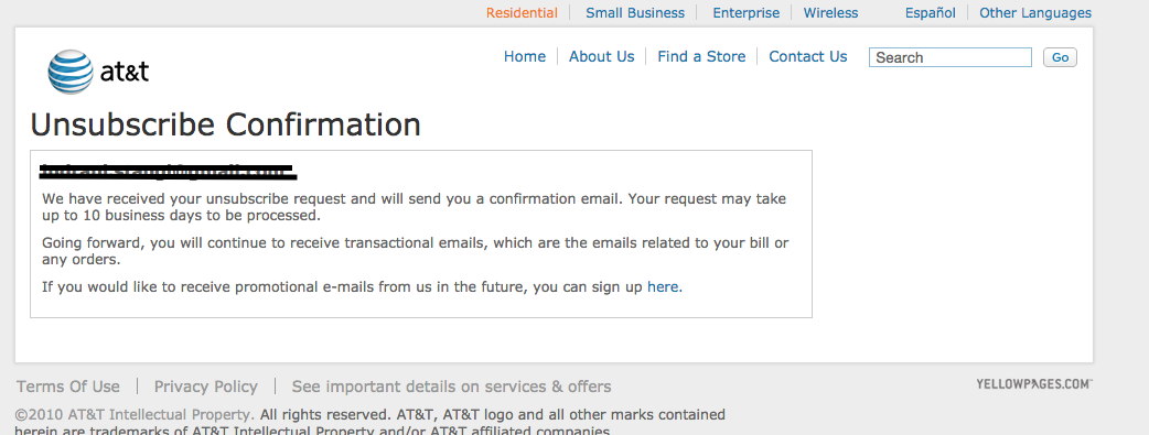
Really? It takes up to 10 days to process the request?

Sure enough, they continue the spam-apolooza hoping I will forget I unsubscribed in the first place. I don’t know how much time I waste with every click of the ‘trash’ but I am sure it has accumulated to a couple days off my life. At least. Days I can never get back.

Keep these coming. Send them to us via Twitter or Facebook using the hastag #wtfUX or email them to: [email protected] with “#wtfUX” in the subject line. Include as much context as you can, so we get a full understanding of what the f%*k went wrong. Image of overstuffed mailbox courtesy Shutterstock.

post authorJosh Tyson

Josh Tyson
Josh Tyson is the co-author of the first bestselling book about conversational AI, Age of Invisible Machines. He is also the Director of Creative Content at OneReach.ai and co-host of both the Invisible Machines and N9K podcasts. His writing has appeared in numerous publications over the years, including Chicago Reader, Fast Company, FLAUNT, The New York Times, Observer, SLAP, Stop Smiling, Thrasher, and Westword. 

Tweet
Share
Post
Share
Email
Print

Related Articles

Take a hard look at the fine line between good design and digital dependency.

Article by Tushar Deshmukh
Designing for Dependence: When UX Turns Tools into Traps
  • The article reveals how digital products are no longer just tools. They’re engineered to keep you hooked, often without you realizing it.
  • It challenges designers to ask: Are we building products that serve people, or ones that quietly exploit them?
  • The piece highlights that ethical design isn’t about removing persuasion. It’s about being honest and giving users the freedom to walk away.
Share:Designing for Dependence: When UX Turns Tools into Traps
8 min read

Find out how design leaders can build a more inclusive digital world from the ground up.

Article by Pavel Bukengolts
Championing Accessibility: a Path to Inclusive Design Leadership
  • The article highlights that designing for accessibility isn’t about following rules. It’s about making sure no one gets left out of the digital world.
  • The piece explores how building accessibility from the start, with the help of AI and the right mindset, makes the result better for everybody.
Share:Championing Accessibility: a Path to Inclusive Design Leadership
4 min read

Discover how a simple comprehension test reveals if mobile content is too hard to read.

Article by Paivi Salminen
Why Reading on Mobile Is Uniquely Challenging
  • The article explains why mobile reading is harder: small screens and distractions make people miss information even when it’s there.
  • It introduces the cloze test, which removes words to measure real understanding: comprehension drops from 39% on desktop to 19% on mobile.
  • The piece argues that mobile content needs simpler language because the real question is: Does this make sense when life gets in the way?
Share:Why Reading on Mobile Is Uniquely Challenging
4 min read

Join the UX Magazine community!

Stay informed with exclusive content on the intersection of UX, AI agents, and agentic automation—essential reading for future-focused professionals.

Hello!

You're officially a member of the UX Magazine Community.
We're excited to have you with us!

Thank you!

To begin viewing member content, please verify your email.

Get Paid to Test AI Products

Earn an average of $100 per test by reviewing AI-first product experiences and sharing your feedback.

    Tell us about you. Enroll in the course.

      This website uses cookies to ensure you get the best experience on our website. Check our privacy policy and