Save

During my first week at Ironhack’s UX/UI Design Bootcamp, we jumped right into our first UX design project — Wicked Problems. The term Wicked Problem was first used in 1973 by design theorists Horst Rittel and Melvin Webber to describe social or cultural problems that are difficult or impossible to solve because of their complex nature.
My teammate Dave and I (together we are Devious Designs) decided to focus on the Wicked Problem of immigration for our design challenge.
I was drawn to this problem specifically because immigration is an issue that has affected me personally through many of my family members and friends from my home country, Ethiopia. I am a child of an immigrant. It took some of my family members 10+ years to be able to call the U.S. their home. I have seen the struggle and hardships that they’ve endured as a direct result of the immigration process for my entire life, so this issue is something that is very close to home for me.

Addis Abeba, Ethiopia
The Design Thinking Process
My teammate and I approached this problem through the Design Thinking lens, which I will refer back to throughout this case study.
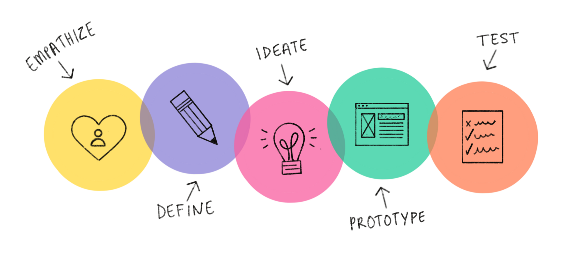
EMPATHIZE
On the first day of the 4 day sprint, we focused on empathizing with users through user research. The goal of the empathy stage is to “learn about the audience for whom you are designing.” This step is extremely important because it ensure we are solving a problem that actually exists in people’s lives.
Our instructor, David, stressed the importance of gathering research from the user group to validate or invalidate our assumptions and reduce risk, which will ultimately help us avoid designing something that doesn’t matter to our user group. We gathered qualitative and quantitative data through surveys, interviews and secondary research.
Surveys
We started our research by sending out a Google Forms survey to people within our network who fit into our user group, in addition to posting it on a Reddit page for immigrants coming to the U.S. The survey was focused on job searching and employment for immigrants. However, the data we received did not entirely validate our assumption that people who come to the U.S. have difficulties finding a job. I quickly realized that although most people in our survey found it difficult to find a job as an immigrant in the U.S., there are more pressing issues that they are dealing with.
Interviews
We gained most of our valuable insights from the interviews conducted via Zoom. One of my interviewees guided me through the general process that she went through to come to the U.S. and become a permanent resident.
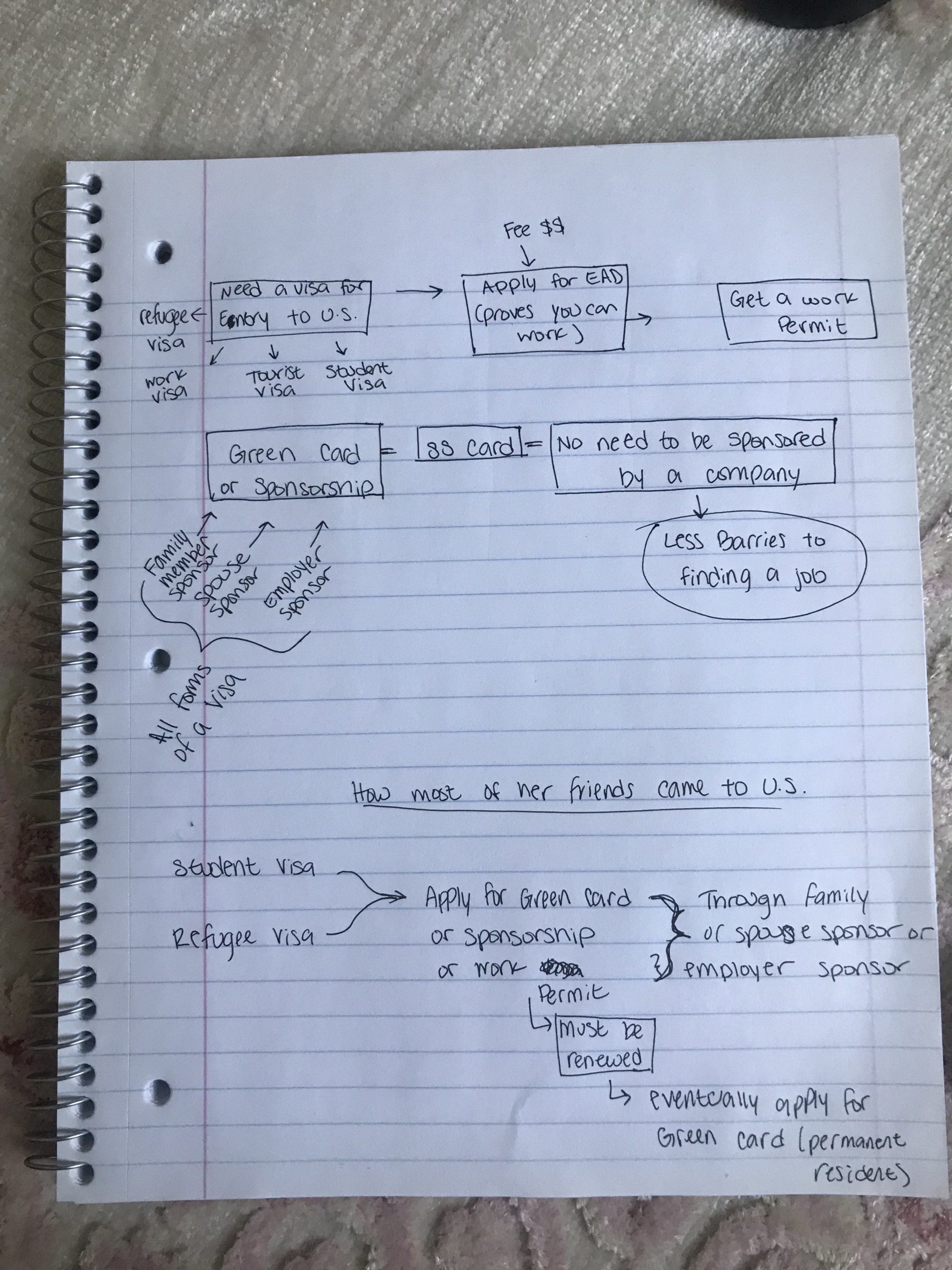
She explained that although the process seems easy and streamlined, there was a lot of uncertainty and doubt involved with each step. She had to do some learning on her own to fully understand the requirements and procedures involved, which caused her a lot of frustration.
Given the sensitive nature of this topic, people don’t feel comfortable sharing their immigration experience with others, especially if they are still in the middle of it. However, my interviewees were close friends who are immigrants, so they all felt comfortable sharing their struggles and pains with me. And they all described the immigration process as confusing, difficult to understand and frustrating. Although I know it isn’t usually ideal to interview family or friends for research, interviewing people I am close to worked in my favor in this situation.
“Finding a way to immigrate to the U.S. is hard, but staying in the U.S. legally is even harder.” — Quote from an interviewee.
Dave and I collectively conducted 5 individual interviews by the end of the first day. Although we felt that we should have done more interviews, we collected several pieces of valuable insights that led us into the next stage of the process.
DEFINE
After we gathered our research, the next step we took on the second day of the sprint was to synthesize and analyze our data to turn it into actionable information. The goal of the define stage of the Design Thinking Process is to “create a point of view that is based on users needs and insights.” We used several useful tools to help make sense of the data that we collected.
Affinity Diagram
Using an affinity diagram helped us organize and cluster our information into different groups based on their relationship to one another. After categorizing our data, we assigned category names to each group. I would usually use sticky notes for this step, but since we were collaborating remotely, we used Miro (one of my favorite collaboration tools!) to create the Affinity Diagram.
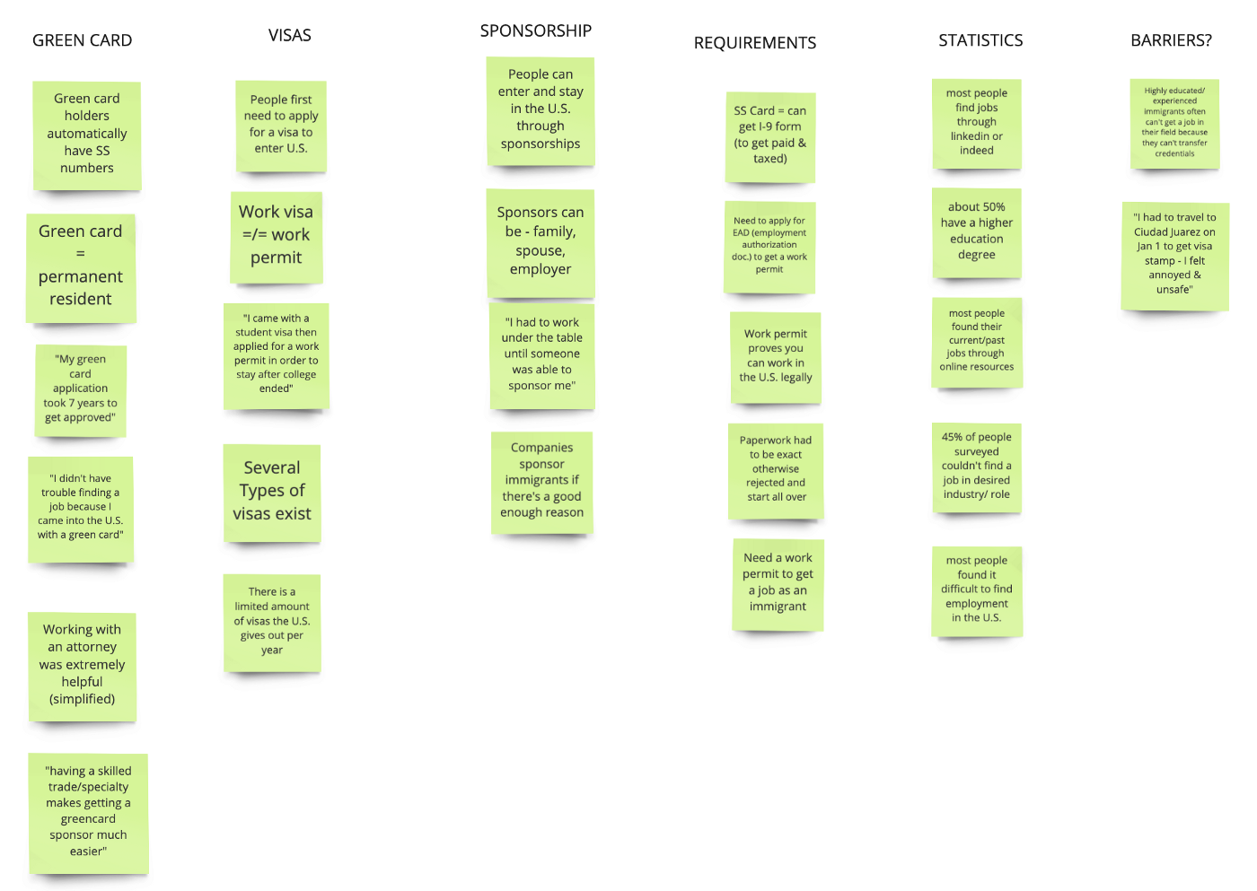
We organized the insights based on different aspects of the immigration process. Our Affinity Diagram indicated that there are several steps and micro steps that users have to take within the immigration process, which were often the causes of the frustration and confusion.
Empathy Map
Next, we put together an empathy map of our users to better understand their mental models and perspectives.
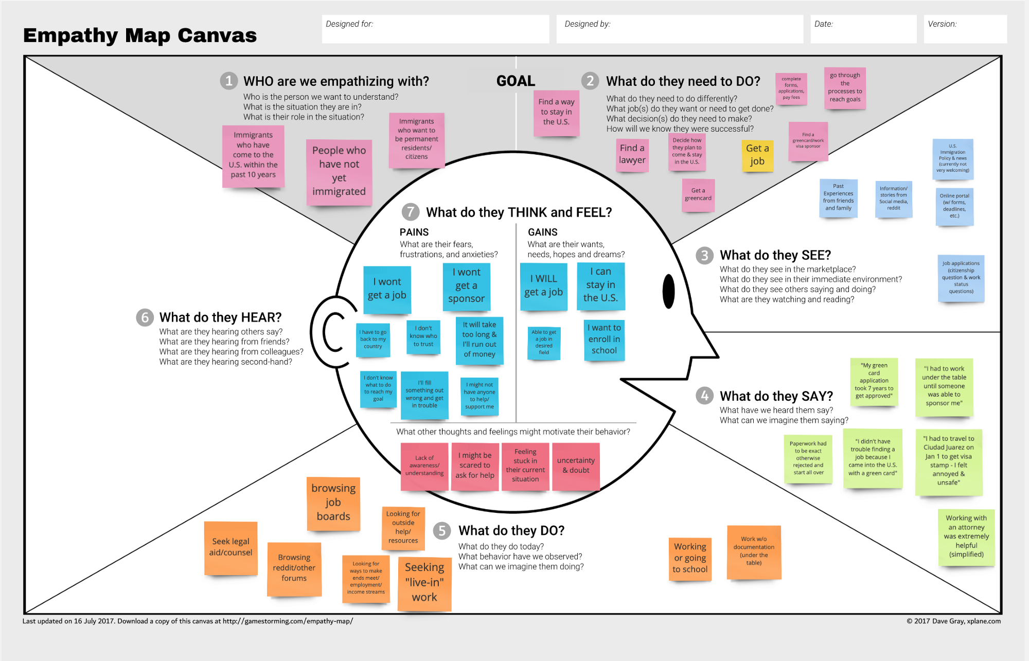
Our users gains involved getting their dream job, enrolling in school or simply being able to stay in the U.S. All of these wants and dreams are hindered by the barriers that the immigration process enables. The pains are often fears that our user group endures because of the uncertainty that surrounds these processes.
It’s the uncertainty of not knowing what one may need to do in order to reach their goals in addition to the unknown unknowns. It’s the confusion around the government websites that the users have to navigate and interpret. It’s the anxiety of waiting months or even years for applications or documents to be approved to move on to the next step. And it’s the looming fear of getting denied and having no choice but to go back to their country of origin.
Persona
We used our synthesized data to create a persona for our user group. The persona helped us summarize our findings, focus more on a few needs and align our strategy to a specific user type. Personas ultimately helps UXers make product decisions “by providing us with a precise way of thinking and communicating about how groups of users behave, how they think, what they want to accomplish, and why.”
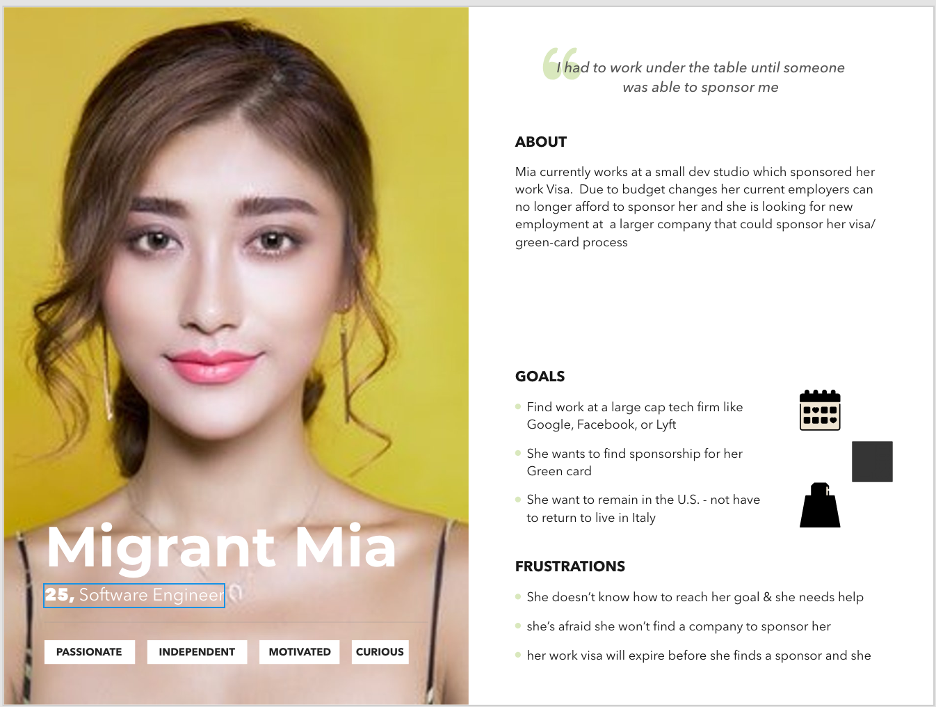
Migrant Mia is from Italy and wis currently a software engineer in the U.S. that has sponsorship through her employer. Since her employer can no longer afford to sponsor her work visa, she’s looking to work at a bigger company that can sponsor her.
Her goals are to work at a company like Google or Facebook that can sponsor her for a Green card and remain living in the U.S. However, she fears that she won’t be able to find a company to sponsor her and that her work visa will expire before she finds a sponsor.
As-Is Scenario
The As-Is Scenario map is meant to capture the user’s current flow as-is. We started off by brainstorming individually, asking ourselves; what is the user doing, thinking and feeling? Then we combined our sticky notes and placed them in order of the user’s journey. Lastly, we created phases to break down the user’s experience into three large stages.

This part of the process was essential to understand the user’s current immigration experience and ultimately prepared us for the Journey Mapping stage.
Journey Mapping
This was my favorite part of the Design Thinking Process. I am a huge fan of stories and story telling, so I thoroughly enjoyed creating this journey map. Using Adobe XD, we created a journey map for Migrant Mia.

First we created a low-fi version of the user’s journey on Miro
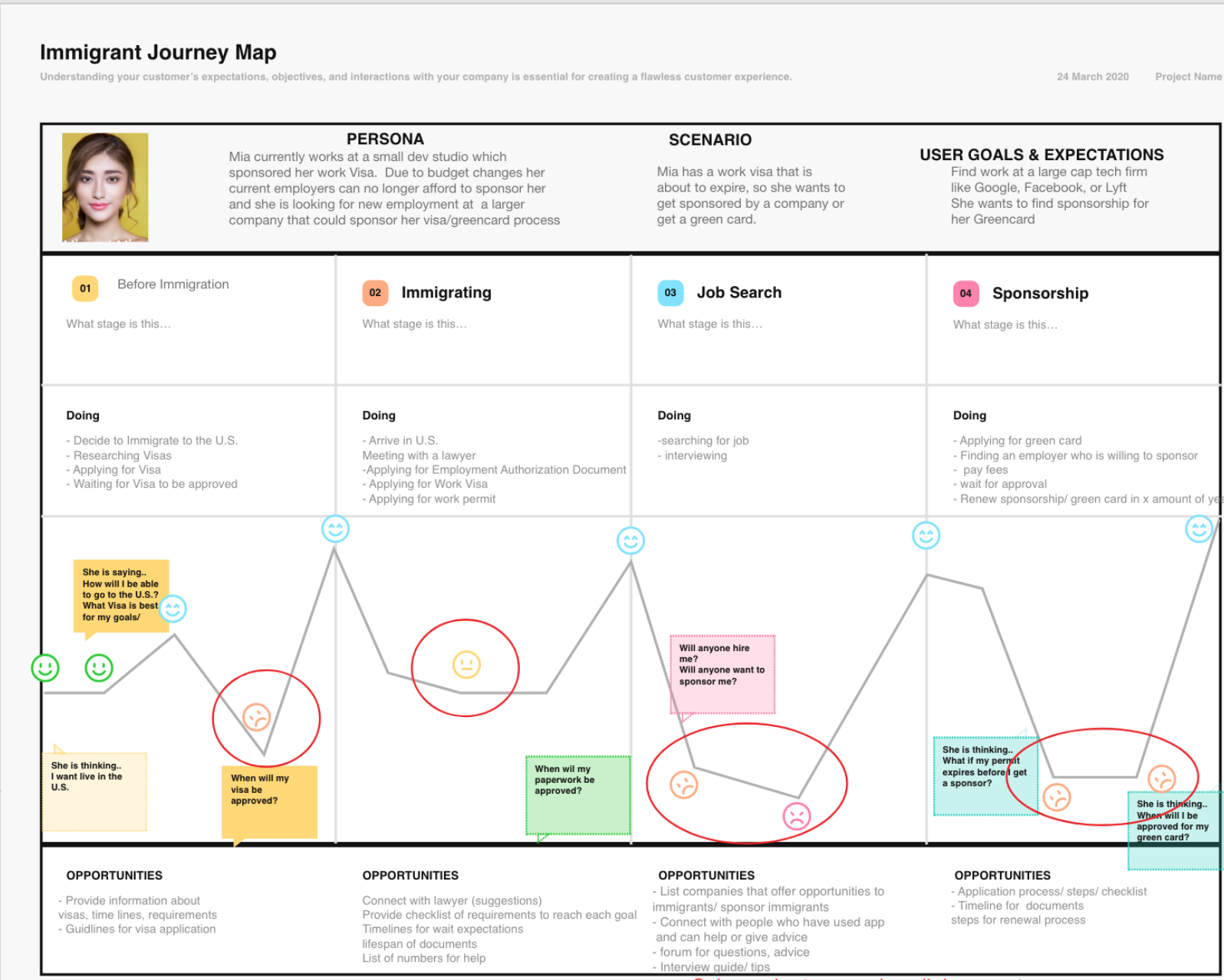
The final version of the Journey Map
We included the persona description, the four stages of the user’s experience, and their actions and corresponding thoughts/emotions. After attaching emotions to each step in the process, it was clear to see where the users experienced low points, which are circled in red.
We identified the main pain points — tracking deadlines, time consuming & complicated process, and unsure of who can help/who I can trust. From there, we listed some opportunity areas where our product could add value to our users’ experience.
Problem Statements
At the end of the define stage, we developed the pain points into problem statements. Here are our two problem statements that we decided to focus on:
- Young adults who want to immigrate to the U.S. need a way to plan their immigration process because they may lack awareness of the different ways to immigrate to the U.S.
- Immigrants who have applied for a Visa need a way to keep track of approval timelines and documents because the process of applying for EAD, visas, and permits causes confusion and frustration
IDEATION
This was also one of my favorite steps in the Design Thinking Process. We began by creating HMW(How Might We) statements that address each of the problem statements that we created in the previous stage.
HMW…
1.…help young adults who are interested in moving to the U.S. become more aware of the various immigration options so that they can plan for their immigration to the U.S. effectively
2…. assist immigrants by reducing confusion and frustration related to keeping track of the EAD, Visa, permit process?
Brainstorming
We executed several short brainstorming sessions both individually and collaboratively using the time-boxing method — a time management technique. After coming up with as many ideas as we could within the allotted time-boxes, we started mind-mapping to build off of each other’s ideas.
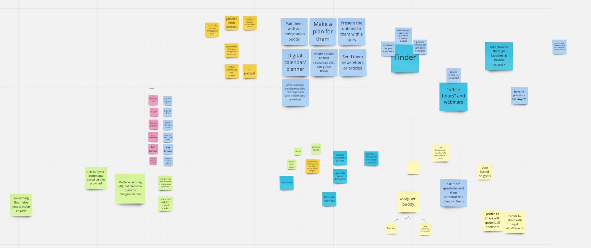
The brainstorming stage was definitely nerve-wrecking at first, but embracing the idea that there are no bad ideas during this step truly helped me come out of my shell and take advantage of this exciting process. After diverging and coming up with as many ideas as we can, it came time to converge with the MoSCoW Method.
The MoSCoW Method
The MoSCoW Method is a feature prioritization technique that categorizes our ideas into four quadrants — Must Haves, Should Haves, Could Haves and Won’t Haves. Must Haves being the mandatory features that are key to solving our users problems.
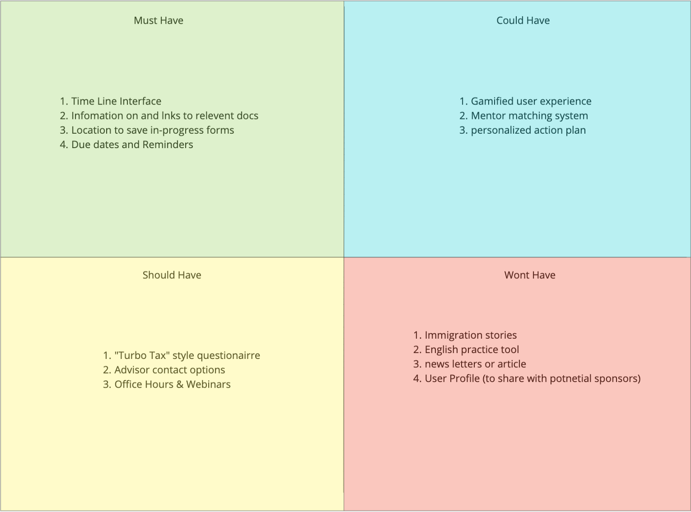
We decided to include four key features in our Must Haves — a timeline interface, information and links to documents, a drive to save relevant forms/documents and notifications for due dates.
The Minimum Viable Product
This stage was the defining moment of our entire process. With our key features refined, we were finally ready to create our MVP! We decided to call our product WorldWide Welcome.
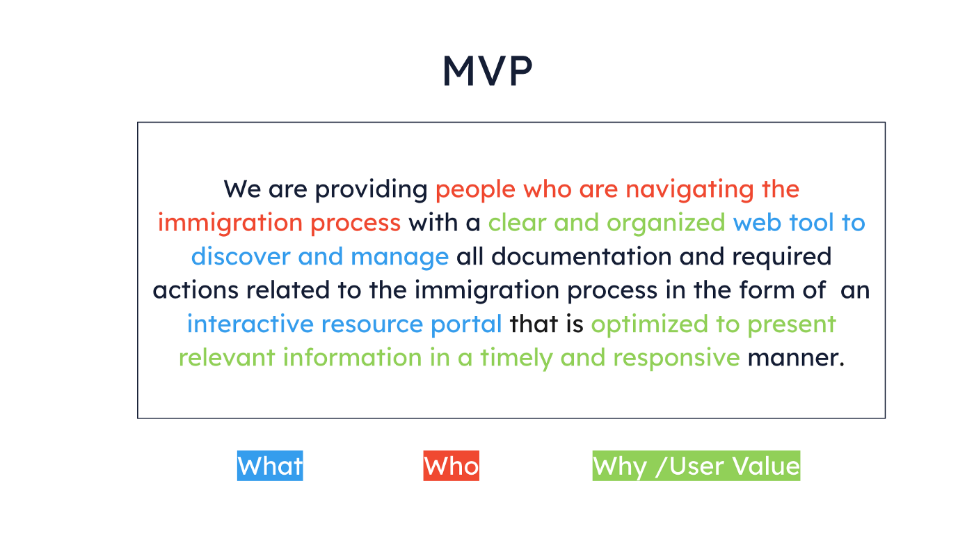
In red is who we are creating for, in blue is what we are creating and in green is why we are creating it.
Low-Fidelity Prototype
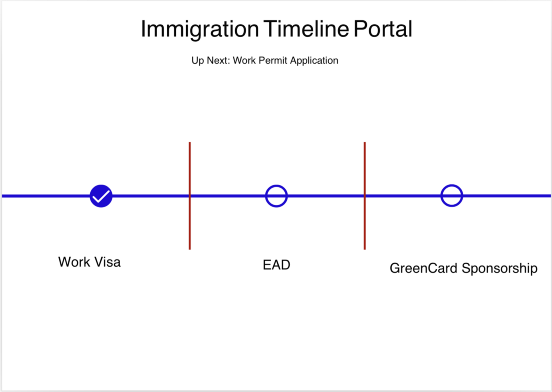
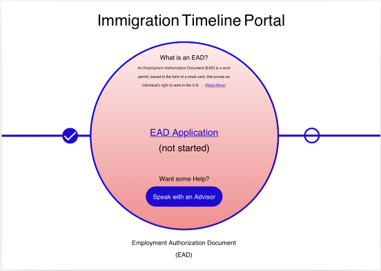
Our prototype consists of a timeline feature that guides the user throughout the entire immigration process. At each step in the process, the user is presented with a short description of the step, documents required, links to other sites/resources and a choice to speak to an advisor for help.
Metrics
We will know if WorldWide Welcome is successful through these success metrics:
User Satisfaction
- Referrals to others
- More satisfying immigration experience
- Less confusion & uncertainty around the immigration process
User Goal Completion
- User flow Completion Rate
- Reach goals & milestones
Site Use Data
- Average return per user (over month/quarter/year)
- % of repeat vs. total visitor count
- Time on Task (average time on site per visit)
And we will know if our site isn’t useful to our users through these failure metrics:
- Discontinued use
- Low satisfaction ratings
- Does not make immigration experience more satisfying
- incomplete journey
- Site Bounce Rate
- Complaints
Knowledge Gaps
As a UXer, there are bound to be things that we don’t know. The term unknown unknowns comes to mind — things that can’t be anticipated or predicted. For Devious Designs, some knowledge gaps include:
- Unfamiliarity with the immigration process
- Having to disregard much of our survey results (invalidated assumption)
- Not knowing enough about other possible constraints that immigrants may experience
Takeaways
There was so much that I learning during this 4 day sprint!! First things first, I learned a lot about making mistakes. I’m somewhat of a perfectionist, so sharing anything that is less than perfect is definitely hard for me. But the purpose of this sprint wasn’t to end up with a perfect solution, it was to learn from our mistakes and prepare for future projects with real stakeholders.
As David would say — “Fail fast and fail early.”
Some other key takeaways:
- Focusing on an invalidated assumption will lead to a product that is not valuable to the user
- Interviews often bring in key insights
- Mapping the users journey is essential to understanding their needs & pain points
- Metrics guide next steps & iterations
- Move the project forward with time-boxing!
Although the current constraints of COVID-19 made it a little more difficult to collaborate and stay present throughout the week, I’m grateful for the tools we have that enable us to connect and collaborate with each other and for my awesome cohort and instructor.
This first week at Ironhack was both an exciting and nerve-wrecking experience. I’m eager to see what the following weeks will bring and I’m looking forward to the next design challenge!!
Thank you for reading and comment below if you have any questions or feedback! Feel free to connect with me on LinkedIn as well!
Delawit Assefa is a UX/UI Designer in the Washington D.C. Area, a recent first-generation college graduate looking for new opportunities. She is passionate about user-centered design, problem-solving, and storytelling through different mediums and is looking forward to creating meaningful experiences and bridging the gap between technology and human experiences through design in her career.


