Save
Communicating thoughts and ideas can be one of the biggest challenges in an industry that relies so heavily on visual interpretation. If you’re working on an idea by yourself, with a colleague or a client, it’s one thing to see an idea in your mind and another to get it out for others to evaluate. As a UX designer, sketching is a daily necessity. It’s one of the most valuable tools you can wield.
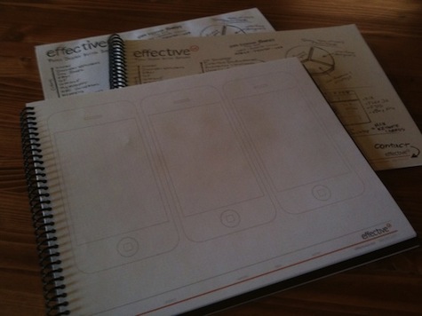
In my office, I’ve watched co-workers use EffectiveUI-branded sketchbooks to draft and scribble ideas for years. The books’ grid- and dot-bearing pages take the guesswork out of sketching for specific device-monitor dimensions—whether it’s a mobile or desktop browser window. These sketches have been our primary means of communicating with clients. Our teams collaborate to sketch initial ideas, scan each page into our computers, prepare sketching documents into folders and email them to project stakeholders for review. It’s a workable process, though by no means perfect or particularly eco-friendly.
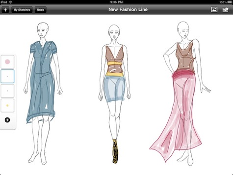
With the introduction of the iPad, a new opportunity presented itself. We could take our successful sketchbooks and make something even more useful by bringing all the things we love about sketching and marry them with a wonderful digital device that was roughly the size of a sketchbook. This idea set in motion a project that would bring forth a sketchbook application for the iPad called Ideate.
There’s a lot of interest in iPad app design and development, and sketching is a subject very dear to the hearts of most UX designers, so I thought I’d share my experience with developing the Ideate concept and application.
Why take sketching—something that’s so simply splendid—and make it digital? Well, we wrestled with that a bit. Believe me, I love the smell of Sharpies as much as the next person. Give me a black pen and a highlighter and I can share ideas with the best of them. However, there are limitations that I kept experiencing using good ol’ pen and paper. Those were the things we were looking for. We weren’t looking to replace the sketching experience, but enhance it.
Every time I want to share a sketch I go to our copier/scanner, scan my sketch and email it to myself. I then email that on to someone. Or, I use my iPhone to snap a picture, but if lighting is bad, my sketch looks bad and that’s not good. It was this experience that drew us to making sharing sketches easy. The thought of sharing sketches right from my iPad to Flickr or via email really excites me.
Another thing I would do is draw out a template as a base for what I would be sketching and then make multiple copies to sketch on. For example, to accurately represent an idea for multiple states of a Web application I would draw out a Web browser, make copies of that and then sketch over those copies. The custom EffectiveUI sketchbooks alleviated some of this, but we thought it could be even better. As a result, we incorporated a wide variety of templates you can load as backgrounds and sketch right over them. Bye, bye copy machine.
For every design, there are always sources of inspiration. I always bookmark sites, take screenshots, clip magazines, and maintain my own little inspiration library. We wanted to bring this idea into Ideate as well. The Web is an infinite source of inspiration, so why ignore that? You can clip images from the web via Safari, bring in images from your Photo Library or access Clips that come with the application to use as reference, provide inspiration or add to your sketch.
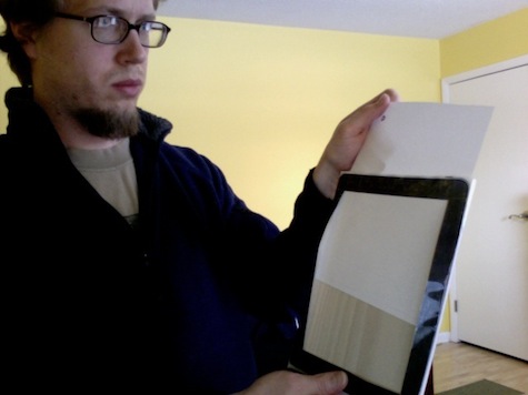
Designing and building an iPad application was particularly interesting, especially because we didn’t have access to the device. To get over this hump one of the developers, Jonathan Branam, fashioned a prototype of wood, paper, and boxing tape. Lo-Fi, yes, but also incredibly helpful. He also made it so you could slide different printed templates in and out. This prototype helped us make some valuable decisions, like the placement of the pen tray. It’s placed there so you can quickly switch between pens with your thumb (if you’re right-handed) as your sketching, but expect customization soon.
We had big ideas for this application and it shows because of how many features we cut, including some of the delightful animations that are so prominent in Apple’s own applications. The process was completely agile and while we cut features we made sure the application was still useful. One of the things that really helped make progress was relying on the user interface elements and guidelines Apple gives you to work with. They put a lot of thought into the interface behind the iPad, so we leveraged that as much as possible.
Thinking through and building an iPad application has done wonders to help me understand what it takes to make something for this new device. Will Ideate replace the familiar pen and paper? No. The application is another tool that can be used to support your own thought process. For myself, it’s been something I’ve been waiting for. Now all I need is an iPad.
Juan Sanchez
Senior Editor, UX Magazine
Juan Sanchez is an experience architect at Denver-based EffectiveUI, a leading provider of rich Internet applications. With a background primarily in print design, branding, and advertising, Juan’s skills have evolved toward web technologies including HTML, CSS, Adobe Flash and Flex. Juan earned his BA in Communication Design from California State University, Chico. Equipped with a creative eye and logical mind, Juan walks the line between designer and developer, with particular interests in user experience, usability, designer/developer collaboration and open-source projects.


