
Save
Part 3 of the “User Psychology Series.”
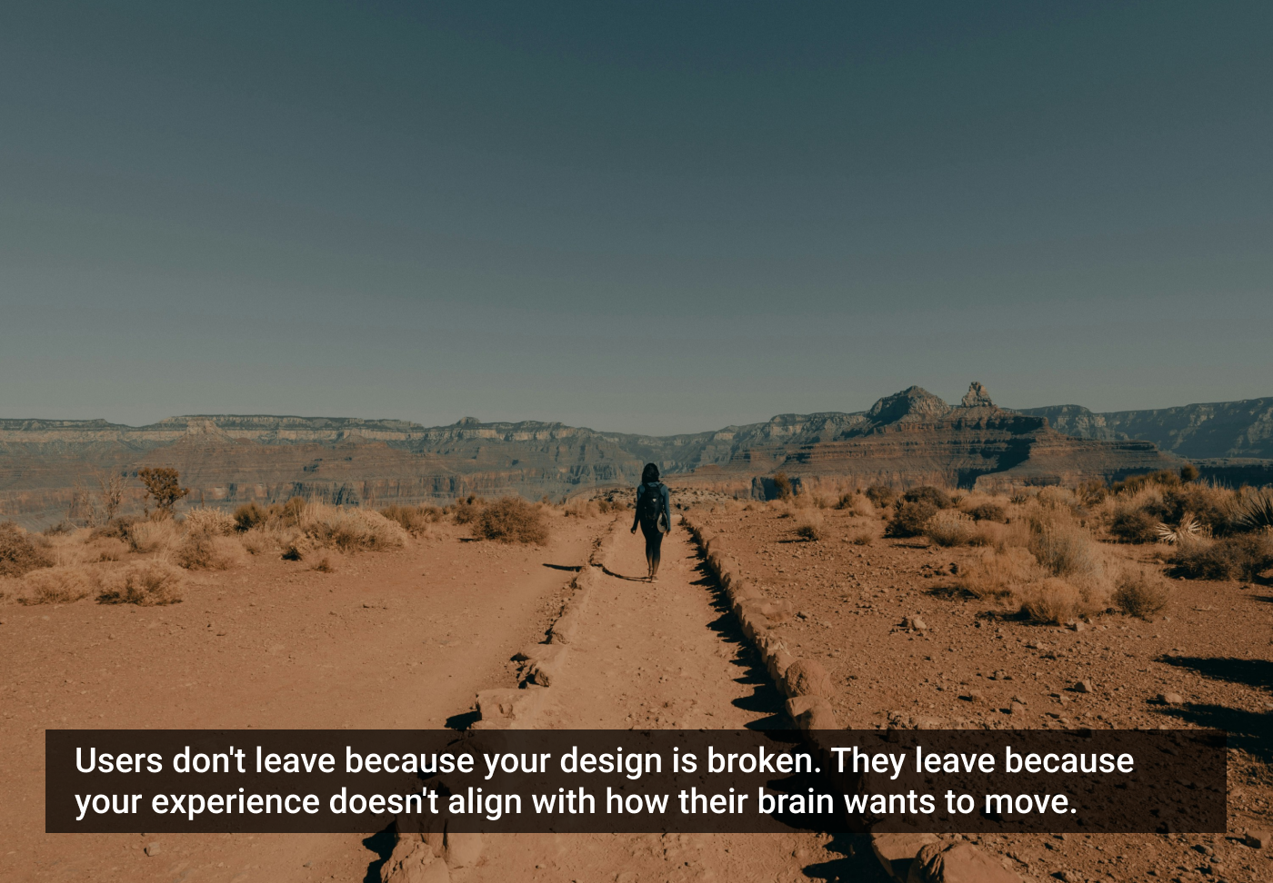
Every abandoned onboarding, every half-filled form, every stalled payment, every broken journey ultimately ends in a single question: why did the user drop off?
Teams immediately zoom into UI flaws — button placements, field labels, colors, spacing, and layout patterns. But years of cognitive and behavioral research reveal something far more important: users rarely drop off because of design decisions. They drop off because of psychological friction.
Friction is not a pixel problem. Friction is a mental interruption — a moment where the user’s brain decides: “This feels uncomfortable… maybe later.”
To understand drop-offs, we must understand the psychology that drives them.
The reality of drop-off: it begins before the exit
When a user drops off, they don’t decide consciously: “I am leaving now.”
The exit begins much earlier — in the first micro-moment of discomfort.
That discomfort triggers a cognitive chain reaction:
- Uncertainty → “Is this the right step?”
- Risk calculation → “What if I make a mistake?”
- Effort estimation → “This is going to take time…”
- Emotional resistance → “I don’t feel like doing this now.”
- Avoidance → “Let me come back later.”
- Drop-off → The journey silently ends.
MIT’s Cognitive Interaction Lab reports: “A drop-off is almost always emotional before it becomes behavioral.”
Users leave because something in the experience disrupted psychological flow.
Cognitive friction: when the mind must work too hard
The human brain is designed to conserve effort. When the product demands interpretation, calculation, or decoding, the brain raises a flag: “This requires work.”
Cognitive friction happens when:
- The next action isn’t clear.
- Information is out of expected order.
- The UI contradicts established mental models.
- Users must read too much.
- Decisions feel heavy.
- Too many options appear at once.
Example: Travel Portal Confusion. A travel website placed filters behind a small icon. Users couldn’t refine results early and dropped off at the listing stage.
Once filters moved upfront in plain sight, conversions increased by 28%.
Cognitive clarity improves momentum.
As Donald Norman said:
“The problem is rarely the user. The problem is the design that ignores how humans think.”
Emotional friction: the invisible force that pushes users away
Emotion is the dominant driver of behavior. No matter how logical the design is, a user’s emotional state dictates whether they stay or leave.
Emotional friction appears when users feel:
- Unsafe
- Overwhelmed
- Uncertain
- Rushed
- Pressured
- Out of control
When the emotional cost feels higher than the reward, the user exits.
Example: Loan Application Anxiety. A fintech app asked for income details early in the process. Users abandoned at 78%, not because the field was hard, but because the emotion of vulnerability surged before trust was built.
After moving this step later and adding reassuring explanations, drop-offs dropped by 40%.
Emotion is friction. Reassurance is the antidote.
Behavioral friction: when the flow breaks the habit
Users rely heavily on habit and repetition. If your flow breaks their expected pattern, friction increases instantly.
Behavioral friction happens when:
- A step breaks common industry patterns.
- Navigation differs from familiar apps.
- The order feels unnatural.
- Gestures behave unexpectedly.
Example: Password Reset Disorder. A platform asked users to set a new password before verifying identity. Users panicked: “Why am I allowed to change password without verification?”
Reversing the order fixed 90% of the confusion.
Breaking habits breaks journeys.
BJ Fogg reminds us:
“Behavior happens when motivation, ability, and triggers align. Break one, and behavior collapses.”
Interaction friction: the smallest but most visible layer
This includes:
- Vague icons
- Tiny buttons
- Inconsistent placements
- Low-contrast text
- Slow animations
These DO matter, but they rarely cause massive drop-offs alone.
Interaction friction is the symptom, not the disease.
Deep friction is always cognitive, emotional, or behavioral.
The friction stack: why users really drop off
In real products, friction doesn’t occur alone. It layers.
A typical drop-off stack looks like this:
- Tiny confusion → Slows cognition.
- Emotional doubt → Weakens motivation.
- Broken habit → Causes mental resistance.
- Unclear step → Amplifies uncertainty.
- Small UI issue → Pushes the user over the edge.
This layered friction pushes users out.
Stanford’s 2024 Friction Index Study shows:
- 91% of drop-offs happen due to stacked friction, not single issues.
- Reducing friction in just one layer improves completion rates by 18–29%.
- Improving the first meaningful action reduces abandonment by up to 53%.
Friction is not a design flaw. Friction is a psychological signature.
Users don’t drop off: their mind pulls them away
The human brain always chooses the path of least resistance. When friction appears, the product no longer feels like a “flow.” It feels like a “task.”
And tasks are avoidable.
Users drop off not because they are distracted. They drop off because the experience breaks the harmony with how their mind wants to move.
Users don’t drop off because they’re impatient. They drop off because friction interrupts the invisible cognitive rhythm that makes an experience feel safe, fluid, and psychologically predictable. And this rhythm has nothing to do with UI components — it lives entirely in the mind.
When users abandon a flow, they’re not “quitting your product.” They’re withdrawing from cognitive discomfort, from emotional uncertainty, from behavioral misalignment, or from a moment where the effort required suddenly exceeds the reward expected. And the truth is, most users cannot articulate why they dropped off — because the reason isn’t conscious. It is instinctive.
The human brain has evolved for efficiency. Every additional microsecond of hesitation is a threat. Every unexpected design pattern is a risk. Every moment of ambiguity feels like a cognitive burden. So the brain does what it has been trained to do for millions of years: it avoids.
This is why drop-offs happen in beautifully designed interfaces, in clean flows, in modern onboarding journeys. It’s not the visuals failing — it’s the psychology not aligning.
And this is where the role of a designer transforms. We are not just arranging screens. We are shaping cognitive pathways. We are reducing emotional resistance. We are smoothing behavioral patterns. We are designing not for the visible journey, but for the invisible mind that interprets that journey.
After 25+ years studying human behavior inside systems, one truth stands uncontested: users do not leave products. Users leave friction.
And until we understand friction scientifically, we cannot design experiences that keep users psychologically engaged.
Users do not leave because they don’t understand your interface. They leave because the experience doesn’t understand their mind.
Until we design with friction science — with cognition, emotion, expectation, and mental flow at the center — we will continue losing users not to competitors, but to the human brain’s instinct for self-preservation.
Friction is the enemy of momentum. Understanding friction is the beginning of conversion.
Further reading:
- “Thinking, Fast and Slow” (Daniel Kahneman)
- “Predictably Irrational” (Dan Ariely)
- “The Design of Everyday Things” (Don Norman)
- Behavior Model Research (BJ Fogg)
- Friction & Cognitive Load Studies (Nielsen Norman Group)
- Decision Drop-Off Research (MIT Human Dynamics Lab)
- Emotional Friction Patterns (Stanford Behavior Design Lab)
- Customer Experience Index (Forrester, 2024)
- Listen, Understand, Conceptualize, Yield (LUCY UX)
The article originally appeared on LinkedIn.
Featured image courtesy: Clay Banks.


Tushar Deshmukh
Tushar A. Deshmukh is a seasoned UX leader, entrepreneur, and founder of UXExpert, UXUITrainingLab, UXUIHiring, UXTalks, and AethoSys — ventures dedicated to advancing human-centered and ethical design. With over 25 years of experience in design and development, he has mentored thousands of professionals and shaped digital transformation initiatives across industries. He now also serves as the Design Director at SportsFan360, where he brings his deep expertise in UX psychology, usability, and product strategy to craft next-generation fan engagement experiences.
- The article explains that users don’t abandon products because of bad design, but because of psychological friction that makes them uncomfortable.
- It identifies four types of friction: cognitive, emotional, behavioral, and interaction.
- The piece emphasizes that designers must focus on cognitive pathways and mental flow, not just visual interfaces, to keep users engaged.


