With the rise of “flat” design that has been talked about to death, I’ve been considering whether or not texture, realism and, to use the vernacular of the masses, “skeuomorphism” still has a place in design, and if so, where. Are the pitchforks against realistic details warranted, and should we join the rallying cry to commit widespread texturecide?
What’s the Opposite of Flat?
First, I’d like to define this “anti-flat” style of realism a little bit. What do we typically see? Texture, depth, lighting, and tone are typically concepts associated with this style of design. Lots of detail (some might say illusions, Michael) incorporated into a rich space make users think they’re looking at something else. But why would anyone want to do this? Wouldn’t a white screen with clean type be better? Maybe, but not always.
A Lesson from the Movies
I went to school for industrial design and have an ongoing obsession with props and sets. You know, movie stuff. My dream long ago was to be a production designer on-set, building worlds that appeared real to an audience. In that industry, detail is everything.
In order to maintain an illusion, every little thing must be taken into account or the fantasy will be broken (watch the Lord of the Rings special features to get an idea of the painstaking work this requires). The elements you create as a production designer support a fiction, a short-lived fantasy that people want to believe, but it needs to be complete from end-to-end to work. Audiences want to get lost in these make-believe worlds, if only for a little while.
The video game and film industries make a ton of money using skeuomorphic design almost exclusively
Here’s where I may be losing you. You may be asking, “Ok, but what the hell does this have to do with skeuomorphism?” Well, it’s all about creating an illusion, and although flat is on the upswing, there are two main arenas of marketing where it will never work.
Enter Entertainment Marketing
The video game industry, once a small, niche market, has become the most profitable entertainment industry, overtaking even films in annual revenue. The game industry came in at $67 billion in 2012, while the film industry came in at $34 billion for theatrical releases.
Compare this combined $100+ billion (with a “b”) with the totaled 2013 earnings of Google, Apple, and Microsoft (the apparent champions of flat design) and you get something like $97 billion. Neck and neck, right? For now. The video game industry alone is expected to reach $87 billion dollars a year by 2017, but I’m not trying to make the point that one style of design is more profitable than another.
What I am saying is the video game and film industries make a ton of money and use skeuomorphic design techniques almost exclusively. A dead style of design? I think not.
Why it Works
As I said before, realism and skeuomorphism are about creating a fantasy. When you are selling a movie (typically blockbusters) or a video game, you are selling a fiction, and each fantasy world is unique; it has a story, a feeling, an experience. Like designing the set for that movie, or the interface for that game, every element must exude the feeling of the fantasy and fit the world. You simply can’t do that with flat design the way you can with realistic skeuomorphism. You can’t sell the movie Cloudy with a Chance of Meatballs 2 with Helvetica and white space, nor can you sell Infinity Blade with flat icons.
Consider the summer blockbuster The Avengers:
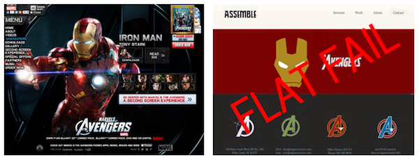
Not quite the same punch as the hyper-real look of the official site, huh? Please forigve the comp I hacked together from Google images!
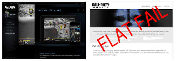
The military-tech look of the Call of Duty brand comes through on the site. A flat version doesn’t have that dramatic Tom Clancy future warrior feel, does it?
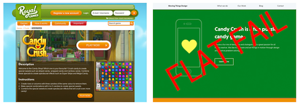
Candy Crush makes you want to eat the icons, not little pieces of paper.
Conclusion
Granted, my poorly hacked examples are an exaggeration, but you get the idea. Flat design may be aesthetically appealing to more minimally inclined designers, but in some instances it won’t do the subject justice—or help sell the product. These are emotional concepts that require visceral, emotional connections. We must feel it to want it.
While flat design is good for frequent, task-based interaction, it’s not a universal design tool that can be used when selling emotion, fantasy and escapism. Different jobs require different tools, so before you trash all your texture folders and sell your Wacom, consider what you are designing for. Are you introducing a user to a fictional world? If so, you might want to dust off those realism techniques—they are far from dead.
This article originally appeared on the Elevated Third blog. Lead image copyright Blizzard Entertainment, Inc.