Flag

We stand with Ukraine and our team members from Ukraine. Here are ways you can help

Get exclusive access to thought-provoking articles, bonus podcast content, and cutting-edge whitepapers. Become a member of the UX Magazine community today!

Home ›› Business Value and ROI ›› 6 Key Questions to Guide International UX Research ›› Five Signs of an Advanced E-Commerce Site

Five Signs of an Advanced E-Commerce Site

by Gil Remy
4 min read
Share this post on
Tweet
Share
Post
Share
Email
Print

Save

There are certain user-centric features that put some retail sites ahead of the rest.

There are basic features that make up the skeleton of every self-respecting e-commerce website out there: product sorting, add to cart, guest checkout, and order tracking.

Then there are those features that are more recent developments used only by the e-commerce elite—sites that are pushing the boundaries of the online shopping experience.

Here are five telltale features that separate the “men” from the “boys.”

1. Advanced Suggested Search Results

When users type in a search field, it’s nice to give them some suggested autocompleted searches, but it’s even better to show them some potential search results right then and there. Advanced suggested search results instantly provide users with images, category names, product details, and pricing without them having to click through to a search results page.

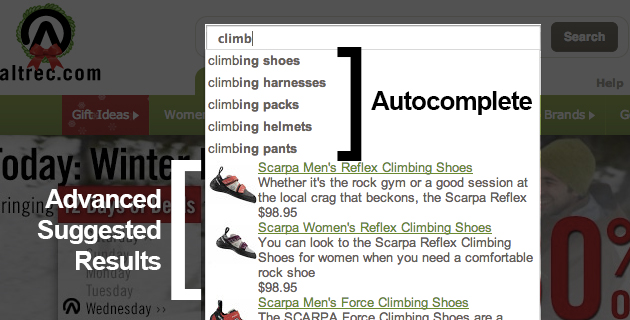
Altrec does this nicely, combining autocomplete and suggested results. With autocomplete, users still know that there are options other than the suggested results being shown next to, in this case, climbing shoes. At the same time, users become aware that if they do take the time to spell out what it is they are looking for, they will be instantly rewarded with a result.

2. Inline Field Validation

Frustration during checkout is likely to lead to lost transactions. And there are few things more frustrating for users than hitting the “Submit” button on a form to find out that a field was left invalid. With inline form validation, a checkout process comes one big step closer to eliminating frustration over invalid field data.

Along with the accompanying microdata that assists users through a checkout process, field validation helps reduce error rates and checkout abandons. An added benefit is the chance to build a rapport with the user through the messaging in either valid or invalid fields. As mentioned in Smashing Magazine’s “The State Of E-Commerce Checkout Design 2012,” address validation is not an ideal solution here. Sites that won’t allow users to process an order if the address validator mechanism or database insists that the address is invalid lose customers. Validate fields that can truly be validated, such as email addresses, credit card numbers, zip codes, etc.

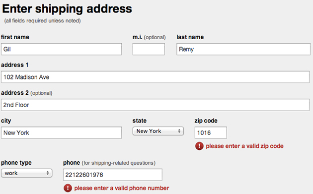
Target validates fields instantly.

3. Animated Shopping Carts

For some e-commerce websites, keeping visitors engaged in shopping, rather than sending them straight to checkout when they add an item to the cart, can lead to increased revenue per-transaction. That’s where the animated cart comes into play. It’s an effective way to give users the confirmation that their product has been placed in their cart and that they can easily checkout if they so choose, without requiring them to take any action to keep on shopping.

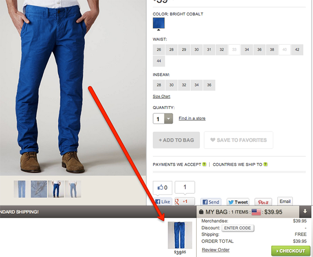
American Eagle opens a frame at the bottom of the screen when a product is added to the cart, with details on the transaction and a checkout button.

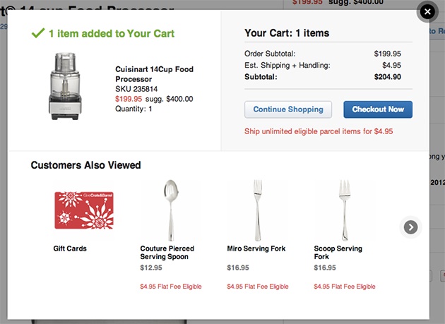
Crate & Barrel does a nice variation on that idea. The website shows the total in the cart along with other suggested items in a pop-up window.

4. On-the-Fly Inventory Tracking

Another source of frustration for users can be finding out that the size they are looking for is out of stock. A nice way to keep them aware of your diminishing supply is to provide that information on the product page. Along with informing users when products are going out of stock, if possible, inform them of when the product will be back in stock as well. This increases the chances that they’ll pre-order or sign-up to receive updates about it.

Here’s how Threadless handles their inventory data, down to the size, before a user even makes a selection.

5. Video Product Demos

There’s nothing like a live person demoing a product for an online shopper. When well executed, product tours can push an already good e-commerce experience to the next level by giving users an enhanced sense of confidence about their purchase decision.

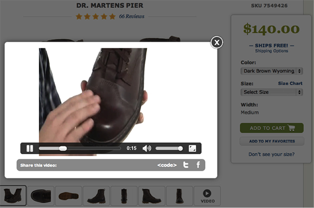
Zappos uses video to sell this pair of Doc Martens (as well as many other products).

Conclusion

These are just a few of the more recent features that users will increasingly expect to be part of their online shopping experience. They all use well-established technologies and none are particularly difficult to implement. Therefore, there’s really no excuse for not making them available on any e-commerce site striving for success. These features have shown to improve conversions and overall user experience and also help convey the feeling that the people behind the website care about their users and have put forth the effort required to deserve their business.

post authorGil Remy

Gil Remy
Gil Remy is an information architect and mobile GUI crusader at NYC digital agency, Blue Fountain Media, with an international background in Marketing and Project Management. He has over 13 years’ experience in taking projects from vision to completion through dynamic and effective team leadership and client management. He has worked for Grey Paris with clients including Nokia, BNP Paribas, and Honda and demonstrated his ability to identify, analyze and solve problems in order to increase customer satisfaction while maintaining a firm grasp of the company's constraints and goals. He is always eager to apply the right mix of no-nonsense approach, out-of-the-box thinking and diplomatic skills to every situation in order to get things done.

Tweet
Share
Post
Share
Email
Print

Related Articles

Struggling with PowerPoint’s design limitations? This step-by-step guide shows you how to build systematic design solutions, from mastering slide layouts to using sticker sheets for patterns. Learn to create polished, professional presentations with smart workarounds and helpful tips.

Article by Jim Gulsen
A Step-by-Step Guide to Creating a “Design System” in PowerPoint
  • The article gives a step-by-step guide to building systematic patterns in PowerPoint. It talks about the program’s limitations and gives essential tips like mastering slide layouts and customizing text settings.
  • It suggests using PowerPoint’s automated features carefully and advocating for manual workarounds to elevate quality.
  • The piece introduces creating sticker sheets for reusable design components and highlights strategies for successful workflows.
Share:A Step-by-Step Guide to Creating a “Design System” in PowerPoint
5 min read

Publishing in HCI and design research can feel overwhelming, especially for newcomers. This guide breaks down the process — from choosing the right venue to writing, submitting, and handling revisions. Whether you’re aiming for conferences or journals, learn key strategies to navigate academic publishing with confidence.

Article by Malak Sadek
A Guide to Publishing Human-Computer Interaction (HCI) and Design Research Papers
  • The article provides a guide to publishing in Human-Computer Interaction (HCI) and design research, sharing insights from the author’s PhD experience.
  • It explains the significance of publishing in academia and industry, offering an overview of peer-reviewed journals and conferences.
  • It breaks down the two main types of papers — review and empirical — detailing their structures and acceptance criteria.
  • The piece emphasizes strategic research planning, collaboration, and selecting the right venue for submission.
  • The piece also outlines practical steps for writing, revising, and handling rejections, encouraging persistence and learning from reviewer feedback to improve publication success.
Share:A Guide to Publishing Human-Computer Interaction (HCI) and Design Research Papers
8 min read

Accessibility isn’t just about compliance — it’s about inclusion. A deaf developer shares what UX designers need to know to create better experiences.

Article by Tamara Sredojevic
Designing for Deaf Users
  • The article talks about a deaf developer who shares insights on digital barriers, assistive tech, and inclusive design.
  • It presents a candid conversation on UX challenges, assistive technology, and advocating for better accessibility.
  • The piece dives into the challenges and solutions for creating truly accessible experiences.
Share:Designing for Deaf Users
11 min read

Join the UX Magazine community!

Stay informed with exclusive content on the intersection of UX, AI agents, and agentic automation—essential reading for future-focused professionals.

Hello!

You're officially a member of the UX Magazine Community.
We're excited to have you with us!

Thank you!

To begin viewing member content, please verify your email.

Tell us about you. Enroll in the course.

    This website uses cookies to ensure you get the best experience on our website. Check our privacy policy and