This is an excerpt from my new book, The Mobile Frontier, released by Rosenfeld Media. UX Magazine is also running a giveaway for five copies of the book. If you’d like to purchase this book or find others like it, visit our resource section.
The design and development of mobile devices outfitted with touchscreens has exploded since the release of the first iPhone in 2007, bringing with it the opportunity for users to experience firsthand the magic of touch interfaces. Sure, people may have had experiences with clunky touch interfaces on bank machines or train ticket kiosks before the iPhone came along. However, there was something so special and so right about the combination of a mobile phone and a touchscreen interface that it created a fundamental shift in mobile user experience. The trend in touchscreen mobile devices doesn’t appear to be stopping anytime soon.
Why? Touch interfaces feel so completely intuitive because the sense of touch is quite possibly the most innate and intimate sense we humans possess. Our sense of touch develops before all other senses in embryos, and it is the main sense that newborn infants use to learn about their environment (see Figure 8.2). It’s the sense that never turns off or takes a break, and it continues to work long after the other senses fail in old age. Throughout life, people use their sense of touch to learn, protect themselves from harm, relate to others, and experience pleasure.
What’s magical about touch interfaces is their use of the essential human sense of touch to guide people through technology experiences. They allow people to feel like they’re actually “touching” information. Unmediated, direct manipulation of digital content through touchscreens is as close as you can get to tangible experiences in the digital world.
One of the key challenges of creating touch interfaces is ensuring they are… well, touchable. While touch interfaces enable more intuitive and direct manipulation of information, there are three important design considerations to take into account when creating a mobile touch UI:
- Optimize for generous touch targets.
- Map the screen for touch.
- Lead with the content, not the interface.
Optimize for Generous Touch Targets
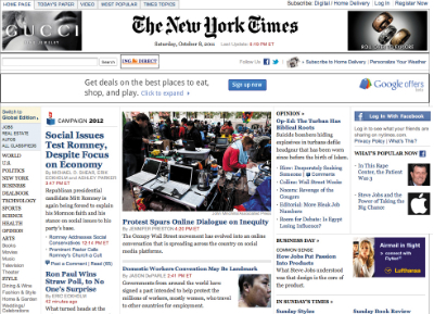
While touchscreens are great, fingers are . . . well, human. They’re often big, kinda clunky, highly variable in size, and less precise than a cursor. Unlike screen designs optimized for the PC with tiny hyperlinks of text or the “any size goes” approach to button sizes and icons that activate interactions in most screen-based software, the size of touch targets becomes an important design consideration for touchscreens. If the targets are too small, your experience will be so difficult to interact with that your users will want to kill you (see Figures 8.3 and 8.4). If the targets are too big, you’ll waste valuable screen real estate and run the risk of making your experience feel childish or unpolished.
 |
 |
| FIGURE 8.3: The New York Times PC Web site is optimized for the precision of the indirect interaction of a mouse.
|
FIGURE 8.4: The New York Times mobile application is optimized for mobile with generous touch targets. |
So how big should you make the touch targets on a touch UI?
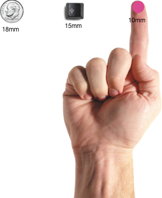
The MIT Touch Lab study of “Human Fingertips to Investigate the Mechanics of Tactile Sense” found that the average human finger pad is 10–14mm and the average fingertip is 8–10mm.
 |
|
FIGURE 8.5: Research indicates the average human finger pad is 10 x 14mm and the average fingertip is 8-10mm, making 10mm x 10mm a good minimum touch target size. |
That means the magic number is 10mm.
Most users can comfortably and reliably hit a 10mm by 10mm touch target. Different mobile platforms express this size recommendation differently, however.
For example, in the iPhone Human Interface Guidelines, Apple recommends a minimum target size of 44 pixels by 44 pixels (88px on retina display) or about 8mm round. Since physical pixel size can vary by screen density, Apple’s pixel specifications apply best to the iPhone’s 320 by 480 pixel, 3.5-inch display (164ppi). Since the release of the iPhone 4’s retina display (326ppi), Apple has updated these specs to points instead of pixels.
In the “Windows Phone UI Design and Interaction Guide,” Microsoft suggests a recommended touch target size of 9mm/34px, and a minimum touch target size of 7mm/26px. Since different phone platforms will have different guidelines, it’s best to check with the platform’s specifications and design accordingly. However, regardless of platform, a minimum touch target of 10mm x 10mm is a good estimate/rule of thumb to apply to all your touchscreen designs (see Figure 8.5). For desktop designers, this will feel ridiculously large—toy-like even! But have faith, it’s important to make touch targets easy for users to engage with.
 |
|
FIGURE 8.8: Touchscreen layouts should offer generous touch targets and accomodate the ergonomics of fingers and thumbs. |
Mapping the Screen for Touch
Unlike personal computer experiences, which involve many physical buttons like keyboard keys and mice with scroll wheels, most mobile touchscreen experiences involve a device that is nothing more than a flat screen of glass. While there are few physical buttons, the nature of touchscreen interactions is highly physical because interactions are explored through human hands. Subsequently, it’s important that your touchscreen layouts not only offer generous touch targets, but also accommodate the ergonomics of fingers and thumbs (see Figure 8.8).
Smartphones and the “Thumb Zone”
Smartphones are often used one-handed. Touchscreen interfaces must not only be aesthetically pleasing, but also should be organized for the fingers, especially the thumb. It’s the finger that gets the workout and the reason why most major interface elements are located at the bottom of the screen instead of the top.
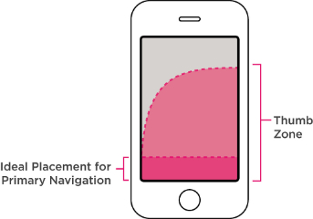
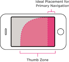
Interfaces designed for the desktop experience typically follow the design convention of placing major menu items across the top of the screen. The reverse is true of mobile experiences. Major menu items of your mobile experience should reside in “the thumb zone”—the screen area navigable using just a thumb (see Figures 8.9 and 8.10).
 |
 |
|
FIGURE 8.9 AND 8.10: Ideal navigation for the “thumb zone” placement. The thumb zone is slightly less important when a mobile device is in landscape mode since most users hold the device with two hands while the device is in this orientation. |
|
What About Tablets?
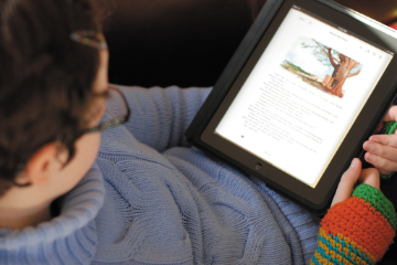
While they have many similar characteristics (few physical buttons and user interactions with a piece of glass), the ergonomic considerations for tablets are quite different than smartphones, mostly because one-handed use isn’t possible. Instead, people use tablets in a variety of ergonomic configurations. From curling up with it like a book, to holding it like a clipboard, to propping it up in a kitchen while cooking—the variety of ways people use tablets makes it difficult to recommend heuristics about navigation placement.
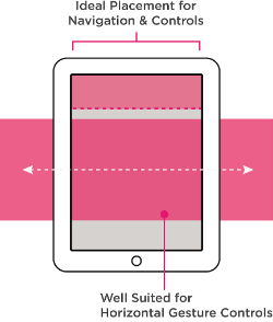
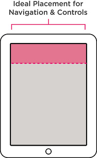
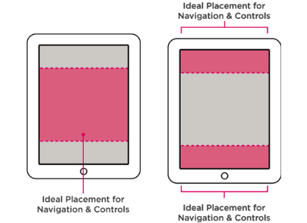
Instead, it’s better to think about the ways that a user will likely configure his body when using your tablet application. Then you can determine the area of the screen that makes the most sense, given the user’s typical stance during use, and you can place the primary navigation elements accordingly, as shown in Figures 8.11–8.16.
 |
 |
|
FIGURES 8.11 AND 8.12: Curling up. Tablet experiences that encourage the “curling up” user stance opt for navigation at the top and consider incorporating horizontal gesture controls. |
 |
 |
|
FIGURES 8.13 AND 8.14: The clipboard. For table experiences in which the user will often be holding the table like a clipboard, consider placing the navigation at the top where it’s easy to see. |
 |
FIGURES 8.15 AND 8.16: Multitasker. For active tablet experiences where the user will most likely be multitasking with other objects or devices, opt for placing the primary navigation at the top and/or bottom. Tablets used in this configuration are often resting on tables/desks/hard surfaces, making placement along the bottom of the screen a viable place for navigation and controls. |
 |
Lead with the Content, Not Interface Elements
 |
|
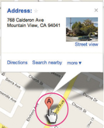
FIGURE 8.17: “The pointer” is a prevalent affordance in most GUI experiences, indicating clickable interactive elements. |
Unlike GUI interfaces that make users interact with mechanism-like elements such as scroll bars, buttons, and UI chrome (like the example depicted in Figure 8.17), NUI/touchscreen interfaces allow users to interact directly with the content. Instead of UI chrome, images and blocks of text can serve as triggers for interaction. Since most mobile experiences come with the built-in constraint of limited screen real estate, embracing this aspect of touchscreen UIs can buy you some much needed pixel real estate for your designs. This will require a fundamental shift in the approach and thinking of most designers. You’ll have to learn how to lead with the content, not the interface.
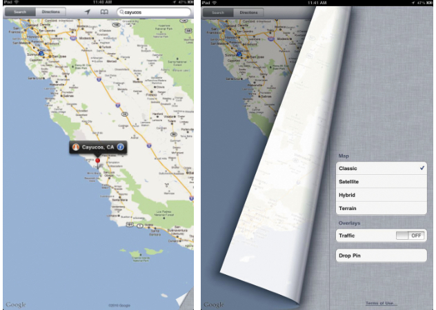
Leading with the content means creating screen layouts that focus less on iconography and buttons and more on the content itself (images, videos, and text). Text and images are given visual prominence instead of interface elements. Interfaces that lead with content make content the star by celebrating its richness and giving it greater scale within a screen layout, while de-emphasizing the weight and visual presence of the UI controls—sometimes even hiding them from view until an action, such as a gesture, triggers them to appear (see Figure 8.18).
 |
|
FIGURE 8.18: Content elements in a touch UI must often convey both a message and the affordance for an interaction. The folded corner on this iPad Google Map is a great example of a touch UI affordance. |
Part of learning to lead with the content requires designers not only to consider how a design element, such as a photo, communicates a message, but also how it can convey affordances for interaction. The mouse, prevalent with most GUIs, provides a lot of great affordances for interaction that designers can’t rely on when designing for touch.
Five Touchscreen Affordance Strategies
Banishing GUI elements from touchscreen experiences is no easy task. It requires subtle communication through design. I’ve identified five emerging strategies that when applied artfully and appropriately will likely make your work inviting to the human touch.
- Rely on real world metaphors, as shown in Figure 8.19.
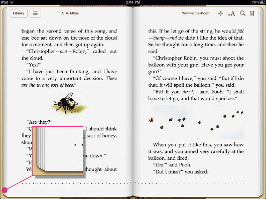 |
FIGURE 8.19: Many mobile applications rely on the book metaphor for navigating the experience. Screens are rendered like the physical pages of a book. This afforndance gives users an indication of how to interact with the screen. |
- Render subtle UI elements (see figure 8.20)
 |
FIGURE 8.20: The application Flipboard is a great example of an experience that leads with the content. The app provides subtle UI affordances but allows content to be the star of the experience. |
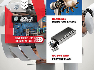
- Spell it out or provide directions, as shown in Figure 8.21.
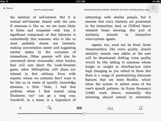
- Hide the UI elements until they’re needed, as shown in Figure 8.22.
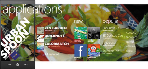
- Rely on visual clues (see Figure 8.23).
 |
 |
|
FIGURE 8.21: Some touchscreen applications simply take the direct route and spell it out for the user. This iPad version of Popular Mechanics Magazine incorporates instructions into the design. |
FIGURE 8.22: Several consumption-oriented mobile applications simple hide the touch UI elements. Tapping the bottom of the Kindle application makes the UI elements viewable. The UI controls remain hidden from view until they are needed, allowing the user to focus on the content. |
 |
|
FIGURE 8.23: Typography that spans past the viewing dimensions of the screen in the Windows Mobile UI is a great example of a touchable affordance. This affordance hints that there is more content, and scrolling right allows the user to access it. |


