Save
What holds attention determines action.
– William James
Have you ever been standing in an elevator waiting for the doors to close when someone down the hall calls out “hold the elevator?” What did you do? If you’re like most of us, you stuck your hand between the doors, risking life (well, maybe just limb) to keep the doors open. Why do we do this? We know there’s a Door Open button but we rarely use it. Why not?
The Door Open button doesn’t capture our attention; if we tried to find it to help the guy running down the hall, we’d be three floors down by the time we located it. Typically, the Door Open button is the same color, size, and shape as every other button, and its icon is similar to the Door Close button.
The one button that needs to be found quickly doesn’t pop out from the rest. Whoever designed the elevator buttons evidently wasn’t thinking about with human attention and what makes one thing more salient than another.
As frustrating as looking for a Door Open button can be, but it’s not like people have a choice to use different elevators in protest. Not so with websites. When potential customers come to a site and don’t find the products they’re looking for quickly and easily (it doesn’t pop out), a competing website is just a click away. So how do we make products or other items pop out on a site? And how do we make sure the right things pop out?
Human attention has some very interesting characteristics including pop out (yes, it is a scientific term meaning that attention is involuntarily drawn to an object). If we design a site that resonates with characteristics of attention, the site seems “intuitive” and people “just know” where to go next and what button to click.
There are certain visual treatments that will make an object pop out from the rest of the page. Color, combined with a difference in brightness,[*] is one of the strongest differentiators of objects. Differences in brightness alone (pink vs. red), shape, and size are also strong and get even stronger if they are combined. For example, a big red square among small green circles will pop out immediately. The small green circles, being homogeneous, are ignored and attention is involuntarily drawn on the red square.
We can exploit this characteristic of human attention when we want users to notice an item on a page. Our best bet will be making it different in color, brightness, etc., from all other items. Since pop out strength varies, we can create a hierarchy of objects on the page, leading the user sequentially through the items with more to less salience. The most salient item should have a combination of differentiators, then next fewer differentiators and the final a single differentiator. Note also that the strength of the difference can also be manipulated—for example, the comparative sizes of two objects can be greater or smaller. Because we have exploited a natural characteristic of human attention, the path we provide through the page will seem intuitive to the user.
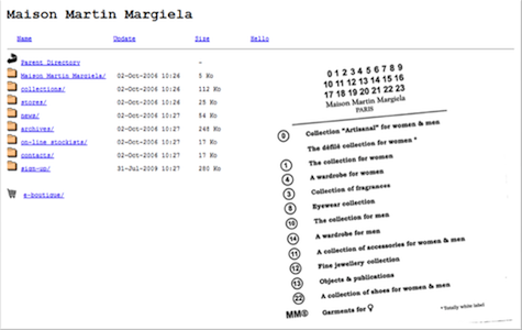
Among other problems, this site lacks a visual hierarchy and nothing pops out so the user doesn’t know where to go first. The only real differences in the text are the color and underline. Rather than apprehending immediately what they can do and where they can go, users must read through all of the content to understand how the site works.
But we can easily overdo it. Another characteristic of attention is its limited capacity; we cannot attend to everything around us at the same time. If a page is filled with images, buttons, and text that are different colors, shapes, and sizes, attention is overwhelmed. It is drawn in multiple directions at once—our gaze is pulled here and there as our system tries to decide what to attend to first.
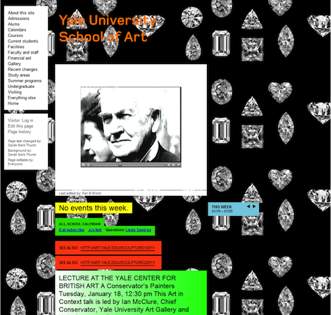
Capturing attention certainly can be overdone. Each element of this page has different characteristics (shape, color, motion) and they all compete with each other.
At the very limits of attention, we can only attend to a few items at one time, and doing so is extremely effortful. When attention is so stretched, we can easily miss the seemingly obvious, like a big red button or even an event. Repeated psychology experiments have shown that people attending intently to the main action in a basketball video will miss events like a gorilla walking across the floor! This phenomenon is called change blindness, and you can read more about it in Michael Grossman’s article on UX Magazine.
We can also willfully limit our attention capacity by focusing voluntarily on a certain visual dimension of an object. When looking for a redheaded friend in a crowd, for example, we “set” our focus to red hair and reduce the attention we pay to non-redheads. We can exploit focused attention on a webpage by assigning the same salient characteristic (e.g., a bold red header) to each product. In so doing, the user can focus attention just on the areas with bold red and let the rest of the page recede into the background. However, if some product headers are red and some are blue, the strength of focused attention is lessened and the opportunity to draw attention to a group of products is lost.
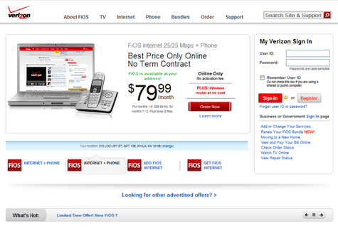
The Verizon site uses a bright contrasting color for its call-to-action (“Order Now”), but the same visual treatment is used on the FiOS logos. The logos and the call-to-action group together due to their visual similarity, so the drama of the call-to-action is diluted. Although it is difficult to see in a static image, the text to the right of “What’s Hot” accretes over time causing a sense of motion in the lower part of the page. Again, the user’s attention is pulled away from the call-to-action.
Although the ING Direct site looks somewhat dated, it has a clear visual hierarchy (products receive more attention than Help, Sign In, etc.). The home page also calls out each of the main products ING Direct is selling with an orange sphere, thus focusing customer attention on products.
Any discussion of attention and web pages would be incomplete without some mention of motion. Motion is the most salient of attention grabbers and it is the most pervasive—everyone has experienced the annoyance of something flashing on a web page. Why is motion so salient? Probably because it suggested a potential predator to our ancestors and only those who heeded the warning got their genes into the next generation.
Motion should only be used in the center of the user’s gaze, and then limited to video or informative animation. Motion should not be used simply to draw attention because attention cannot entirely be torn away; any video or animation should always have a mechanism for users start when their attention is focused on it and stop when they wish to focus elsewhere.
By exploiting the strengths of human attention and being mindful of its limited capacity, we can create websites that will get your products and services noticed, while also seeming intuitive to your users. When designing a site, keep in mind the following five tips for drawing attention—or, better yet, engage an agency whose UX analysts are knowledgeable about attention and other aspects of psychology and human behavior.
- Decide which is the most important item or object on the page—perhaps a login, product, or announcement. Give it a visual treatment such as a different color (remember brightness!), size, or shape to make it pop out. Users’ attention will be drawn first to that item.
- Use pop out on only a few items per page; don’t overwhelm the attention resources of your users.
- Use gradations of a visual treatment (size, color) to create a hierarchy of objects that will lead a user through the information on a page.
- Use motion sparingly and only where the user’s attention is focused. Do not employ continuous motion in one part of the page when you would like users to focus on multiple areas of the page.
- Enable focused attention on a group of objects such as products by using the same salient visual treatment on all of them.
And finally, be careful when putting your hand in an elevator door, another one is bound to be along soon.
[*]Whenever color is used as a defining characteristic, we should be concerned about users with limited color vision. Note that what I suggested above was “color, combined with a difference in brightness”. The human visual system has two different pathways: one that processes color and fine detail, and another that processes contrast (differences in brightness, e.g., black and white, grayscale) and motion. People with color deficits are unable to process colors, but see contrasting edges just fine. So if a color difference is complimented by a brightness difference, people with color deficits should be able to perceive an object without difficulty.
[ Return to article ]
Cassandra Moore
Cassandra Moore is the Director of User Experience at Piehead. With over a decade of experience in information architecture, user-centered design and usability evaluation, Cassandra is a true master at understanding how web audiences act, react and consume information. She began her career in information architecture at Microsoft, where she designed and tested new functionality for Microsoft Office, and has since led teams with deliverables to pharmaceutical, finance and eCommerce. Cassandra conducts user research, constructs taxonomies and designs navigation to create browser-based as well as traditional desktop applications that are built for the way people think and learn.


