Save
Most interfaces are designed for use on a desktop, or more precisely, from behind a desk. They assume you’re in a comfortable position, seated on a chair with screen and keyboard directly in front of you. Most times this assumption is appropriate because that’s what 90% of all system setups look like. It’s the standard home or office setup. But what if the setup is not standard?
Imagine a screen mounted to a wall in a hallway, displaying some general info like temperature, humidity, date and the likes. There’s no keyboard and, more importantly, no seat to get you comfortably positioned at the right distance from the screen. That wouldn’t help anyway, since the screen’s mounted at eye-height. You’d be looking up.
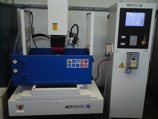
This kind of thing is common. Walk into any kind of factory and you’ll find lots of screens doing one thing only: displaying data for the technician (the user) to monitor. These technicians don’t have time to sit comfortably behind a desk and use a mouse for pixel-precise clicking to find the data they need. When they use the UI, they do it fast—really fast—because they have to get on with their job. For this combination of user and type of data, there is one perfect type of user interface: the dashboard.
Dashboard UI’s are designed to provide rapid contextual information regarding some higher task or goal, to which the majority of the user’s attention is directed. This stands in high contrast with regular desktop applications, where the UI is (usually) designed to fulfill a specific task or goal in itself.
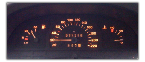
Dashboards are all too familiar. We’ve all driven a car and seen all the meters go up and down and then up again. A quick glance (mere milliseconds) is all it takes to see and understand the value it represents. Let’s take my own car as an example. It’s quite an old car with a dashboard of the same age, but that same dashboard is very usable. There’s no ambiguity about what gauge represents what value. Learn it once, and you’re done. View it once, and you’ve interpreted the data. It shouldn’t be any other way. After all, you must attend to the higher goal of driving safely to the destination. Continuously looking down at the dashboard is a great way to cause an accident.
Dashboards live a lousy life, though. They never get any fair amount of attention—just a mere glance every now and then. When they do receive some hands-on interaction, it’s only for a few moments and then they’re abandoned again. This is all because of that higher goal the user has to keep his focus on. The best we can do is to make those few moments of interaction and quick glances as useful as possible.
Dashboards are often viewed from a considerable physical distance. This distance imposes some restrictions on the dashboard’s appearance. Here’s a little experiment: open up any text document. After that, walk away from your desk and get some coffee. When you return, keep five or six steps distance from the screen and locate the fifth word of the second paragraph. How long did that take you? And how hard was it to locate and read the word? From a distance, 12 pt type tends to blend into the background, becoming barely legible. This means dashboards can’t feature small text, however pretty and aesthetically pleasing it may be. And the way text is displayed (font, weight, style, etc.) can only do so much. It all starts with the text itself. Repeat the experiment, but now try to read the second paragraph entirely. Chances are you have to put more effort into it than usual. Again. As old man Treebeard (yes, the one from Lord of the Rings) said, “You must understand, young Hobbit, it takes a long time to say anything in Old Entish. And we never say anything unless it is worth taking a long time to say.”
This quote embodies the exact opposite of what is usable in any dashboard. Short labels or microcopy don’t add simplicity: they remove complexity.
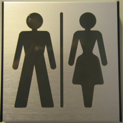
Maybe you don’t even need to use text. An icon can often just as easily convey what you’re trying to say. From a distance, icons are more easily distinguished than text. You’ve experienced this more than once already when looking for a restroom in a public area. You look around for signs showing the way until you see a symbol that resembles what you’re expecting to see. It’s only after you’ve noticed the symbol that you read the text (if there is any). In this case, the text only confirms what you already knew by noticing the symbol: the restroom is that way.
A gentle color scheme with low contrast might very well work on a regular desktop app. But for dashboard apps, especially ones viewed from a considerable distance, strong contrast helps the user to quickly distinguish the relevant portions from the backdrop. This doesn’t mean that the UI should look like a lollipop. Both colors may very well share the same hue. Features like tone and saturation of a color impact contrast. Smashing Magazine recently featured a great article covering color-aspects.
According to Wikipedia, dashboard interfaces “are used to display management information in an easy to read mode like a speedometer or heat gauge.” But why are these gauges easy to read? Showing your current speed in plain text is easy: it’s a number followed by the unit of speed. It’d have to be BIG type, though. But is the current value really what the operator wants to see? More often than not, operators don’t care what the current value is to the n-th decimal of accuracy. They want to know if it’s still in the acceptable area or not, and how (or if) it’s fluctuating. Analog gauges are versatile enough to show the actual value, trending, safe and unsafe ranges together in one glance. But text boxes…not so much. It’s true that, unlike text boxes, analog gauges need some initial learning (like its beginning and ending value), but once that’s learned and remembered, a quick glance is all that is needed to evaluate the value.
Dashboards consist of more than one gauge, meter, or graph, and they all need their own prominent spot on the page. Usually some are related, while others display some independent value. We could just place each item wherever there’s still some room on the screen, but that would get unusable. Instead, we need to look at the data itself to determine how they can be best placed in relation to each other. Using the “prägnanz” laws of Gestalt psychology, we can design screens that help guide the user to the data he wants. These laws deal with cognition, and how we perceive individual elements as a group. Take, for example, the Law of Proximity: “spatial or temporal proximity of elements may induce the mind to perceive a collective or totality.” In practice: adjacent elements in a dashboard are expected to share some common data source. The corollary to this is that we should avoid adjacencies or suggestions of visual relation between elements whose data is unrelated.
One of the advantages software dashboards have over hardware dashboards is the possibility to have multiple dashboard “pages” that change the data the gauges display. Using one screen, the operator can call one of many dashboards, each dedicated to a specific purpose. These can be awesome features with many uses, but as Uncle Ben so rightly pointed out, “with great power comes great responsibility.” How can we, as UI designers, provide the option to interact with the dashboard in a without distracting the operator’s attention to the higher goal?
Let’s say driver of a car wants to swap the speedometer with the odometer (or any other kind of meter, for that matter). One approach would be to tap the gauge. This action that would cause the gauge to loop through the various options. This could work in a desktop environment but would be very dangerous while driving the car. Tapping a gauge demands the driver’s attention be taken off the road ahead and put on the gauge and his finger. This causes sloppy steering and reduced attention to the outside world with all its hazards. Tapping would also mean his hand would be blocking his view of the gauge, so he can’t clearly see what he’s doing. One tap too many, and the driver has to go through the entire cycle again (and again, and again, and again…).
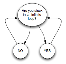
This example is about modifying a single gauge, but also applies to the multiple pages I referred to earlier. Looping through the available pages only requires on input, so you’d think practically no mistake can be made. But accidentally miss the screen you were looking for while looping, and you have to start all over again. This flaw can be solved by providing looping in two directions, but that comes with another problem: if the user does not know where in the loop he currently is, then how can he know which direction would be the shortest?
Navigation across multiple dashboard pages is a tough subject. There are lots of navigation controls available, but most of them are designed for desktop use. Tabs are an oft-used means of navigation, but they’re only useful if there are few of them. More specifically: any more than seven (plus or minus two) are too many. When the amount of tabs reaches that number, the time needed to locate the desired tab takes too long for comfort.
Hotkeys are another option. They provide fast switching between pages, but only if the user remembers the key combinations by heart. Hotkeys also require a keyboard, which, in the case of dashboards, isn’t always readily available. Even if a keyboard is available, there are only so many key combinations one can remember. Relying on a user’s memory is never a good idea. People forget stuff.
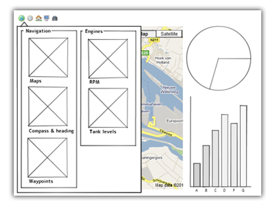
I recently had to tackle this problem in designing an application that monitors and displays data coming from equipment on yachts. A dashboard UI is the ideal way of displaying such data. One catch though: there’s a whole truckload of different data—too much for one page. So we had to devise a way for the app’s navigation across multiple pages. We decided on a drop-down window with labeled icons, each linking to its own screen. It takes up a lot of screen real estate, but it does have the benefit that every screen can be reached with a mere two clicks.
Locating the correct icon may take a while at first (especially if it doesn’t represent its target adequately), but adding the label provides a extra means of locating the desired target. And there’s another benefit: we can, again, use the prägnanz laws. Icons symbolizing similar or related screens can be grouped together. Use the drop-down window a few times, and both the icon and the group’s location in the window can be remembered. Note that we’re not relying entirely on memory here; unlike hotkeys, the icons are quickly discoverable should memory fail.
Unfortunately, I can’t show any actual screenshots (yet), but the mockup below show the general idea (the crossed boxes resemble the icons).
This solution isn’t perfect, as it requires some initial learning and remembering. However, once that’s mastered, the users are far less distracted by the UI while navigating the dashboard. The other options, tabs and hotkeys, would always impose a high degree of distraction, even after an extended period of using it.
Dashboard UIs are an interesting subset of interfaces, and there are some considerable differences between dashboards and desktops. The examples mentioned in this article show that principles that work in regular desktop interfaces don’t necessarily apply to all types of dashboards. As usual, knowledge of your user, her motivations, and her environment is vital when designing helpful dashboard interfaces. Sometimes an unconventional approach is required. After all, not everyone works behind a desk.
Theresa Neil recently wrote up a helpful article on screen layouts that includes dashboard layouts.
Max Steenbergen
Max Steenbergen is the resident UI & graphic designer for a Dutch company developing yacht-monitoring software. After graduating professional photography, he stumbled into the UI/UX field which turned out to be the thing he wanted to do all along. Being completely self-taught in the ways of user experience, interfaces and graphics, he's about to follow a 3-year course called Communication & Multimedia Design to gain more knowledge on the subject. He blogs about UI's and UX at https://face-value.tumblr.com Twitter: https://twitter.com/maxsteenbergen


