Save
In a world where people of all ages and backgrounds are spending increasingly more and more of their time navigating through software and web and mobile apps, providing an experience that engages and guides users is crucial for the success of the application.
While development teams spend countless hours designing the user experience, planning and coding features, and testing the application, they often overlook the importance of the information appearing within the application.
While this information is referred to, in its simplest form, as the user interface text, the integration between the user experience, the features and workflows comprising the application, and the text is what forms the “information experience.” A good information experience pulls all the components of the application together so that users can successfully and confidently move through an application. By providing the right information, you can improve the overall usability of your application, which in turn improves the satisfaction of your customers.
The good news is that most applications are already set up for integrating information. With planning and creativity, you can create a successful, positive information experience for your users.
Types of Information
Each content type in your application has a very specific role in the information experience and with planning and proper design you can maximize their effectiveness.
For example, landing pages and getting started pages help users understand the available features and select the options that best suit their needs, so your users can quickly understand what they need to do to get started and begin working.
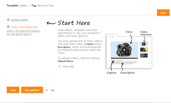
In the example below, the layout of the page and the text embedded within it provides an overview of the process and lets users know where they are in that process, helping them complete the task and move onto the next step. By adding simple instructional text and examples of user input, users easily understand the interaction and their chances for success are greatly improved.
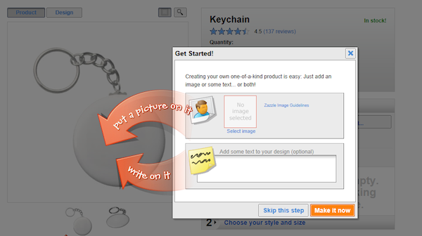
Guided tours and embedded instruction in the form of splash pages, callouts, or inline text help users get users get through a specific task or workflow. In the example below, you can see how embedding instruction takes away the guesswork by showing the user exactly where to click to get started.
Beyond that, by combining graphics with the right content, you can also introduce the underlying concepts and terms within the application.
While each label, text string, messages, and block of text in your user interface contributes to the overall information experience, where you place your text, the integration method you use, the amount of text you provide at each step in a process, and the lengths you go to to make sure and provide the right information at the right time all contribute significantly to a successful experience.
Five simple rules for creating an information experience
Rule 1: Understand your users
The type and amount of information a user needs depends on who they are and what they are trying to do. Unfortunately, and far too often, the development team—including the team member responsible for designing and crafting the user interface text—is unaware of a typical user’s needs and abilities, instead relying on assumption and generalizations.
And while there are some generalizations that may be helpful (e.g., network administrators tend to want “under the hood” information, while users of consumer products are not interested in how the application works), relying on generalizations is not a substitute for understanding typical user needs, scenarios, and abilities.
Creating personas is a popular method for learning about the characteristics of your main users and understanding their information needs. By identifying a few main or typical users and mapping their information needs to tasks and workflows, you can concentrate on creating the right information strategy and content for real users. Giving your personas a name and referring to them often while defining the content will help you stay focused on their actual needs.
Rule 2: Create a process for integrating the information
Just as developers have coding guidelines and processes, using a simple, systematic process for developing and implementing information into the application will help get the text integrated as part of the feature, instead of tacked on afterwards.
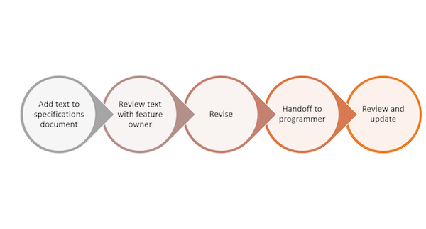
As you can see in the graphic below, your process may consist of few simple steps, but by implementing the information into a feature as part of a process, you’ll have time to review it in context and make improvements while there is still time in the development cycle.
Rule 3: Create content guidelines
Guidelines help ensure that the information experience is consistent throughout the application, improving the user’s ability to scan, read, and understand the information you provide.
Your guidelines should include samples and recommendations for:
- Writing tone and language, including samples of common text strings
- Typography used for different types of content, including font, color, and size
- Terminology used for terms specific to your application and for industry standard terms
- Content guidelines describing how each content type is written (e.g., callouts, popup messages, instructional text strings, input examples, etc.)
After creating the guidelines, be sure to make them available to the team so they can begin using them right away. And, if you make changes to the guidelines, be sure to let everyone know, including the QA team.
Rule 4: Map your content to user tasks
While the development team is focusing on designing, coding, and testing features, the information experience designer needs to focus on creating content based on tasks. It will be easier to provide the right content if you ask yourself these questions as you begin to design and create information for an entire workflow and for each single task:
- What is the user trying to do?
- What does the user need to know?
- How can I best provide the information?
And while some concepts require more explanations than others, remember that users scan text, so look for ways to provide the information they need without overloading the page. In the example below, you can see that by combining information and visuals you can create an effective message with very little text.
In the example below, the opposite is true: more text is definitely not better. Most of the information describes the feature, but is irrelevant for helping users understand which options to select.
Step 5: Evaluate the experience
Even the best planned and well-written text may not provide the right message, or may be confusing to someone looking at it for the first time. For this reason it’s important to review and evaluate the information experience as part of the overall user experience. Evaluations can be done informally with members of your team or with anyone who may be able to provide thoughtful feedback. Or, you can have a formal evaluation in the form of a usability study providing feedback from sample users.
Whatever method you choose to evaluate the information experience, the evaluation should improve the information experience by helping you:
- Validate the logic of the information flow as users move between tasks
- Identify information gaps (i.e., missing information)
- Identify and fix confusing or extraneous information
- Verify your information is written according to the guidelines you created
Conclusion
Creating the information experience and integrating it into the user experience requires planning and an understanding of your users. It also requires you to think about information needs in terms of user tasks and workflows.
By working together with your team, you can define the information strategy and create a successful information experience that helps users over the learning curve and through the various phases of their interaction with your product. A successful information experience improves the overall user experience and usability of your application, which leads to happy and loyal customers.
For more on information experience from Linda Newman Lior, check out her book, Writing for Interaction: Crafting the Information Experience for Web and Software Apps available from Morgan Kaufmann
Image of cats courtesy Shutterstock.
- Content and Copy, Content Strategy, Customer Experience, Data visualization, Design, Development, Flow and Immersion, Information Design and Architecture, Interaction Design, Interface and Navigation Design, Personas, Research Methods and Techniques, Usability, User Acceptance Testing, User Reported Feedback
Linda Lior is an instructional designer and has been working in the field of software development for over 20 years, focusing on information design and usability. She spent 10 years at Microsoft as a user experience researcher and technical writer, and is currently working as an information design consultant. She also gives courses and seminars in the field of information experience design, writing for the user interface, and user research


