Flag

We stand with Ukraine and our team members from Ukraine. Here are ways you can help

Get exclusive access to thought-provoking articles, bonus podcast content, and cutting-edge whitepapers. Become a member of the UX Magazine community today!

Home ›› Design ›› Biological Motion and Happy Interfaces

Biological Motion and Happy Interfaces

by Alex Faaborg
4 min read
Share this post on
Tweet
Share
Post
Share
Email
Print

Save

Using biological motion animation to create expressive, happy products and experiences.

Quick: which operating system do you think is happier, Windows or OS X? Even if you’ve already formed an opinion, you might still be wondering, “What kind of inane question is that?” After all, how could software possibly be happy? This is nonetheless one of the reactions I get when using products that are designed by Apple in Cupertino. It’s not specifically that the product is making me happy as much as I have this vague feeling that the product itself is somehow happy. The otherwise rational engineer in me knows this is silly, but it is perhaps nonetheless irrationally true.

If visual design speaks to the user’s aesthetics, and interactive design to the user’s cognition, then this seems to be something else. Aside from the notable exception of Don Norman’s Emotional Design, this is an aspect of design that we don’t often think about: playing to the user’s awareness of emotion.

Mac OSX Finder IconAs humans we have a tendency to anthropomorphize inanimate objects, particularly ones we spend a lot of time with. Perhaps any readers with a background in psychology can provide theories for why we exhibit this irrational behavior in the comments below. But regardless of why, it’s something we as a species do. We name our cars, we attribute gender to things that have none, and we think electrical outlets have faces (they look sad[1]). Even objects incredibly far from the depths of the uncanny valley can be a bit anthropomorphic—things like a file manager, or even a desk lamp.

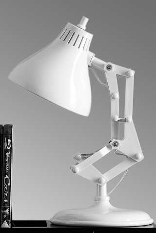
Pixar LampIn its very early days, Pixar put a lot of effort into trying to understand what properties made something appear alive. They spent a considerable amount of time intently studying the way animals and humans moved, and they quickly picked up a few basic properties. For instance, there are a lot of accelerations and decelerations in biological movement. This is true even if we are trying as hard as we can to move only at a constant velocity (e.g., when performing a very serious dance commonly referred to as “doing the robot”). If you take these properties of biological motion and apply them when animating a simple inanimate test object—say, a basic desk lamp—it magically becomes alive once you introduce acceleration and deceleration.

When the lamp looks up at you, it is suddenly looking at you; the bulb is an eye, the shade a head. If you get the lamp to jump up and down a bit, the next thing you know it’s the happiest lamp you’ve ever encountered:

Mac OSX icon bounceBut it isn’t just lamps. Why throw up a boring dialog box in the center of the screen when you can get capture the user’s attention with a jumping icon? The icon doesn’t have much to say (“replace the file on the server?”) and it looks like a tiny truck, but nonetheless the way it moves reminds us of the way a dog jumps up at you, drooling and completely happy.

Another aspect of biological motion is that we tend to decelerate before we collide with another object. This of course makes sense as we can’t move at a constant velocity even when we try to dance like a robot, and running into stuff at high velocities hurts, so it’s really best to slow down first.
iPhone scrollingThis is one of the things that struck me about the design of the iPhone OS scrolling model. It accelerates and decelerates, and if you pull something too far away, it is sure to slow down as much as possible before the collision. And while the iPhone and iPad application icons don’t bounce, they do have a sort of wiggle dance when you move them around.

These are all just animation primitives and simple physics models. When applied to software they are subtle, they don’t go nearly as far as to create a happy and curious lamp. But they manifest in ways that make products simply easier for us as emotional irrational humans to love (or at least makes it easier to occasionally forgive them).

Animation in software can serve a lot of important purposes. Animation can draw the user’s attention, help the user build a mental model of navigation events, and indicate changes in state. But beyond all of those very functional ways that UX designers can employ animation in their work, it can also impact users on an emotional level: it can make your product seem happy, and ever so slightly alive.


[1] By this I mean the North American 15 A/125 V grounded outlet looks sad. Just one tiny change in the initial design to the grounding socket and the entire continent could have been filled with happy outlets.

Pixar Lamp Photo by Matthew Cachia

post authorAlex Faaborg

Alex Faaborg
Alex Faaborg is a principal designer at Mozilla, where he focuses on the visual and interactive design of Firefox. He also contributes to Mozilla Labs, which explores the next stage in the evolution of the Web and its long term future. He has extensive experience in artificial intelligence, user interface design, and cognitive science and is a graduate of the MIT Media Laboratory.

Tweet
Share
Post
Share
Email
Print

Related Articles

Data visualization isn’t just about charts — it’s about telling a clear and compelling story. This article unpacks a wide spectrum of essential principles for making data easy to understand, honest, and engaging. Ready to transform complex numbers into meaningful insights?

Article by Jim Gulsen
The Ultimate Data Visualization Handbook for Designers
  • The article serves as a comprehensive guide for elevating visualization work, combining technical expertise with design principles to help designers transform raw data into meaningful insights.
  • It provides a point of reference for strategies, methods, and best practices to create more effective and impactful data visualizations.
  • The piece recommends tools and resources that design professionals can immediately implement to enhance the clarity and persuasiveness of their data storytelling.
Share:The Ultimate Data Visualization Handbook for Designers
23 min read

Discover how breaking down silos and embracing cross-functional collaboration can lead to smarter, more user-centered design — and better products for everyone.

Article by Rodolpho Henrique
Beyond the Design Silo: How Collaboration Elevates UX
  • The article explores how siloed UX design practices can hinder product success and argues for cross-functional collaboration as essential to creating meaningful user experiences.
  • It outlines the benefits of working closely with product managers, engineers, and stakeholders to align user needs with technical feasibility and business goals.
  • The piece provides real-world collaboration examples across research, prototyping, design systems, and accessibility to show how teamwork leads to more innovative and effective UX outcomes.
Share:Beyond the Design Silo: How Collaboration Elevates UX
4 min read

Designing for AI? Know what your agent can actually do. This guide breaks down the four core capabilities every UX designer must understand to build smarter, safer, and more user-centered AI experiences.

Article by Greg Nudelman
Secrets of Agentic UX: Emerging Design Patterns for Human Interaction with AI Agents
  • The article examines how UX designers can effectively work with AI agents by understanding the four key capability types that shape agent behavior and user interaction.
  • It emphasizes the importance of evaluating an AI agent’s perception, reasoning, action, and learning abilities early in the design process to create experiences that are realistic, ethical, and user-centered.
  • The piece provides practical frameworks and examples — from smart home devices to healthcare bots — to help designers ask the right questions, collaborate cross-functionally, and scope AI use responsibly.
Share:Secrets of Agentic UX: Emerging Design Patterns for Human Interaction with AI Agents
10 min read

Join the UX Magazine community!

Stay informed with exclusive content on the intersection of UX, AI agents, and agentic automation—essential reading for future-focused professionals.

Hello!

You're officially a member of the UX Magazine Community.
We're excited to have you with us!

Thank you!

To begin viewing member content, please verify your email.

Tell us about you. Enroll in the course.

    This website uses cookies to ensure you get the best experience on our website. Check our privacy policy and