Save
Website designers face issues of prioritization all the time: which type of site content is most important? What should a site’s navigational order be? Wear the black t-shirt today, or save it till Friday?
Website designers face issues of prioritization all the time: which type of site content is most important? What should a site’s navigational order be? Wear the black t-shirt today, or save it till Friday?
In designing for entertainment companies, the issue of content prioritization takes a challenging turn: which one of the multi-million dollar brands—the parent or the product—gets top billing? At Sisu, we have designed award-winning websites for a number of entertainment companies, including Sony, Nonesuch Records, and Paramount Pictures. We’ve also handled the promotional sites for entertainment companies’ TV shows and band websites. In doing so, we’ve learned a good lesson: designing for entertainment companies is nothing like designing promotional sites for the shows, bands, and movies they produce. A movie release is an exciting but (typically) short-lived experience, but the entertainment company’s Web presence needs to last for the long haul. The entertainment brand usually has decades of heritage to illustrate, and its business challenges are a complex bundle of requirements.
Most importantly, while the entertainment company’s website might strive to be as innovative and exciting as a band or movie website, at the end of the day it needs to serve as a powerful, extensible marketing arm for the company’s many properties. The company’s website must be a pedestal upon which its band and movie sites will shine.
The Pedestal
Entertainment companies are made up of a myriad of individual studios and companies, with several product lines and distribution methods, not to mention international divisions. In general, they are strong brands that have real emotional connections with their audience. The companies’ names—Paramount Pictures, Warner Brothers, 20th Century Fox—evoke a mental image of that brand and the properties that people have an emotional connection with. Paramount Pictures is The Godfather and stars swirling around a mountaintop, and 20th Century Fox is klieg lights and the Star Wars trilogy. When a users arrive at the company’s website, their expectation must be met with a rewarding experience that balances the brand’s heritage with the new properties that continue and enhance the company story.
Launchpad vs. Destination
Entertainment companies’ websites are portals, and as such they must perform a delicate balancing act. Many of them are designed not to drive their own traffic or to build their own revenue streams, but rather to drive users to the movie and band sites where users can find deeper information, make purchases, interact, and share. This presents several challenges: how “sticky” should the entertainment company’s website be? How much of the company’s story do we tell versus that of its properties? What content should live on the company’s website, on the band or movie’s website, on Facebook, or on other social networking sites?
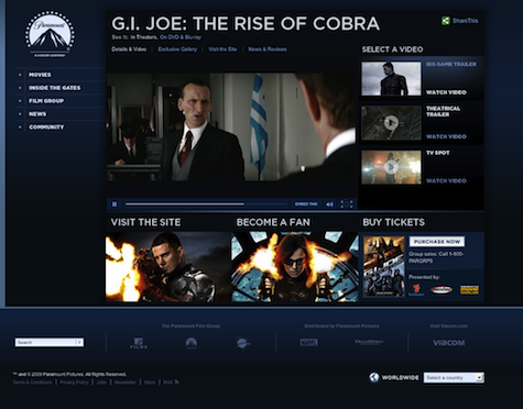
Both structures can work, and the right answer will be different for each organization and for each product as they age. Paramount Pictures’ films are in and out of theaters relatively quickly. While the films are in theaters, paramount.com offers basic information and trailers while pushing users out to the film’s promotional site and to ticket vendors.
When the film moves to home video and digital distribution, it is supported almost solely on paramount.com and thus the tool set changes: Paramount’s website offers a variety of ways to explore their film catalog, view trailers and other content, and, of course, purchase. Both short-term and long-term needs are supported via a framework that adapts to the changing needs of a single product, evolving as the product distribution method changes.
This leads to the greatest challenge of the large-scale entertainment website: managing the push and pull between the entertainment brand and the individual movie or band. In short, the corporate sites have to be the best pedestal they can be. Design elements, brand messages, and corporate iconography need to be true to the big brand and yet not overwhelm the products being featured. Remember that each movie or band has its own uniquely compelling brand elements. To do its job, the entertainment company’s website framework needs to provide intuitive navigation and put the movie or band in the best light possible.
Nonesuch Records achieves this by offering different levels of navigational tools for different users with different needs. You can search, drill down through different categories, and even explore a “think map” that visualizes the connections between different Nonesuch artists. While the website offers rich content, all of its elements serve to drive users to the core content: the artists’ stories and, of course, to buy an album.
Another benefit to creating a robust framework is longevity. Promotional sites may be relevant for three to six months; corporate sites can (and should) live for years. While paramount.com might not have the same short-term, powerful draw as the Iron Man movie website, it will be live for much longer and will serve a broader group of users. The framework needs to be rock solid from information architecture, design, and technology standpoints.
Hope for the Best, Ready for the Worst
Entertainment companies have great brands, but they also have access to spectacular content. The company site must have a structure that can handle that great content where it exists, and is prepared when it is lacking. While some artists and films have behind-the-scenes footage, blogs, reviews, images and more, others have little to no material. The information architecture must be planned to account for the best and the worst-case content scenarios. Where might it break? If you are missing the key art imagery, what’s your default image? How does missing content affect the layout?
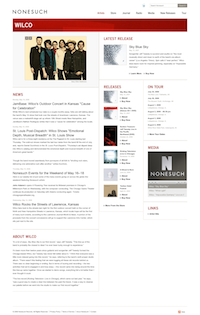
A nice bonus is that the website’s flexibility became a useful internal motivational tool. Nonesuch artists who originally had little content have provided more and now use their nonesuch.com pages as their main Web presences. The website can scale to accommodate new work and thus supports a broadening network of artists.
Making It Compelling
The entertainment mindset is to “wow” you and give you a great experience. That’s entertainment, right? Likewise, the websites’ functionality must cater to people’s innate interest in storytelling, and leverage innovation and technology. At the same time, the companies have real-world business needs. To be a true success, the website’s features must serve the corporate brand, its various properties, and the unique target audiences of each. All of this must be accomplished with ever-higher technological standards and, given today’s economic climate, ever-smaller budgets.
So how can it be done? First, rely on the aforementioned extensible website framework where new features can be phased in post-launch. Prioritize your wish list and compare it to your goals. Is a Facebook app worth 25% of your Q3 budget? If it extends the reach of your website dramatically, it just might be. Are there features that let the company tell its own story as well as that of the individual properties? Are you providing strong support for properties with no other means of promotion? Can your team move quickly to respond to urgent needs while planning for future rollouts?
Most importantly, we test if the final product will be an extraordinary experience, unique to the brand from the perspectives of design, content, features, and technology. Good functionality throughout the website and solid website performance will support the brand as much as any overt messaging. Features and content should draw the user in, and encourage them to learn more. Make sure the technology is stable for the end-user, is backed by a platform that is easy for your team to operate, and is open enough to scale with new features and content in the future.
That’s Entertainment!
The lessons learned from designing an entertainment site can be applied to a broader swath of sites: the same good sense of balance, flexibility and contingency planning required for entertainment sites serve as excellent guides for any site where the company brand and its products have divergent stories to tell. That being said, a winning entertainment site requires some razzle-dazzle, some old-time movie magic. The sites can be beautiful, with an intrinsic design value of their own that continues to build brand value, but they also must support their products and properties, telling their story and driving the business of entertainment.
Guild Copeland
With oversight over Production, Guild takes joy in Sisu’s amazing variety of projects – from enterprise-level website development and mobile design to viral marketing and brand development. He brings his experience and inspiration to bear throughout the project process, leading brainstorms, driving information architecture and making sure that projects are delivered on time and on spec. He has forged long-standing relationships with a host of enviable clients, including Sony, Paramount, the Hallmark Channel, Nonesuch Records, MySpace, Hearst Digital Media, and more. Previous to Sisu, Guild served as Director of Production and Director of Advertising at KPE, a respected website development firm focused on media and entertainment. Whether delivering a campaign for the newest movie or the build of an e-commerce site, his work resulted in great returns and happy customers at Mandalay Bay, Warner Brothers, Variety, Hasbro, M&M Mars, Sprint and more. Guild began his career as a policy wonk, working first at the D.C. Office of Senator Dianne Feinstein, then at the Center for Strategic and International Studies. He holds a B.A. from Yale. Visit Sisu: https://.sisumedia.com On LinkedIn: https://.linkedin.com/pub/guild-copeland/0/8b/b25


