Save

As a concept of a design-centered approach, critiquing is a process of eliciting and gaining feedback, irrespective of who it is coming from. It is important to understand that critiquing is not designing, nor is it a way to design by committee. Critiquing is not getting together a random group of people in the room, and letting them make the design for you.
No. Critiquing is about a way to make sure that each person in the room is as smart as the smartest individual in the team. This may sound surprising, or you might feel that its too fluffy to be practical — keep in mind, that through critique, you will be able to integrate the advice of all those individuals, who might be domain experts, or users, or team members who can contribute to the broader picture, or just a good samaritan looking out for you.
“He has a right to criticise, who has a heart to help.”
– Abraham Lincoln
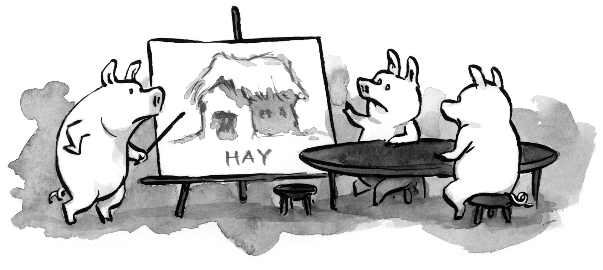
Adding to it is the fact, that critiquing is a great way to shield against stupid mistakes. For example, if the three little Pigs had received some constructive critique for the foundational design of their home (which they built out of hay), then they probably would not have been so unlucky to be blown away by the Big Bad Wolf.

All said and done, giving and taking critique is not necessarily easy.
The wrong way
Before you learn the correct way to do things, it is important that you understand all the wrong ways — so as not to make amateurish mistakes.
So let’s take for example that you are a content creator, and you come to your critic, and you decide to share a piece of work that you’ve created. Let’s say, it is a mobile app.
How not to receive critique
Suppose, the person tells you, “I do not think your menus are organised in a way that makes sense to me.” Or, “Your colour scheme is not bright enough. People who are colour blind will have trouble seeing this.” You, or the person who is receiving the critique can unknowingly hurt the design process by dismissing it all.
You might say something like, “Well, it’m my style. I am not going to change the colours.”
Or, “I am a hotshot programmer, I do not NEED to make things look good — my code will make sure it runs perfectly, and that is all that people want. Who wants nice colours anyway?”
Or even, “You don’t know what you’re talking about.”
This is wrong. Not only are you hurting the (possibly genuine) helping hands they lent out to you, but you’re also not getting to learn anything — nor will you be able to look at things from a fresh perspective in an unbiased way.
How not to give critique
A bad critic, similarly, could be snobby, or passive-aggressive and arrogant in his/her approach, saying something like, “If you knew anything about UX, you would have done a better job.”
Or, they might troll you, “My 1-year old could have made that in his sleep.”
Or, be mean, “You’re app is stupid anyway, I don’t know why I even bothered to give you feedback.”
Or just, “You’re hopeless.”
This happens unfortunately more than it ideally should. Another kind of wrong critique comes from people who aren’t really experienced in the particular domain. Last but not the least, there will always be some negative-Nancy, who will use fancy buzzwords to derail you and completely miss the point of the critique, with something like, “If you knew how to synergise your crowd-sourced cloud criteria cohesively with the bi-annual KPIs, you’d know why your app failed.”
Trust me, they themselves are unaware what would happen if you “synergised your crowd-sourced cloud criteria cohesively with the bi-annual KPIs.” Avoid such people.
More importantly, avoid becoming such people.

The right way
Now that you know all the ways you, or someone you know, could be doing it wrong — it is time to educate yourself about the right way to give and receive design-centered critique.
How to receive critique
It might just so happen, that the critiquer is not very good at giving feedback, and you realise that. Even then you should understand the critiquer’s standpoint, and find the justification behind the giving feedback. For instance, you might say something along the lines of, “You’re right about the colour scheme, I overlooked the fact that a majority of the users of this app could be colour-blind. Bit I think the menus have been well-designed, so I’ll probably stick to them.”
Remember when the critic told you that the colour scheme is “not bright enough”? Well probably, what he actually meant might be that either he is not personally fond of the colour yellow and blue which you used in abundance, or, he might be saying that the colour scheme would not go well with the primary users of the app (like for example, using a black and grey colour palette for an app aiming to improve environmental conditions). So, you need to probe deeper into the mindset of the person and find the root thought, the basis of her/his argument.
You need to stay prepared if you want to receive good critique, you need to vocalise and let people know exactly what kind of feedback you want (else, you might get feedback about changing the font, when you really wanted their opinion about the colour scheme and have already finalised on the font). And when critique does come your way, do not get defensive. Stay unbiased and take copious notes.
The point is not to prove that you’re right, but to understand everything else that is also right — sometimes, even more right, than you may be.
How to give critique
Giving feedback is also quite challenging. There are 3 main things to keep in mind in this case.
– Find something positive to say.
– Focus on the reasons.
– Give specific, actionable, suggestions.
A very useful method to adopt when trying to give design critique (or, any feedback, anywhere, anytime, for that matter) is something called the Compliment Hamburger technique.
The Compliment Hamburger technique
This is perhaps the easiest way, and the safest bet for you to give critique. Also it makes sure that the feedback that you provide is very specific and actionable.
The basic structure of the provided feedback comes in the form of layers. What you start off, is with the set of strengths of the work, because there’re always strengths to everything — no matter how few it may be. Secondly, you introduce to the recipient the areas for improvement, and also point out (is possible) how they can be worked upon. And you end of on a high note acknowledging the amount of effort that went into producing the product. Thus we have the somewhat negative comments sandwiched between the positive cushions that are more inclined towards building and maintaining a positive relationship.

Some people call this the Compliment Sandwich but it honestly does not matter, as long as you use this technique to help fellow designers make better design decisions, and consequently better products.
It is just so much simpler and easier for our tiny brains filled to the brim with ownership-bias, if during critique, not only is the problem pointed out, but also if a potential solution to the problem (or at least a nudge in the right direction) is handed out to the recipient.
Giving and receiving critique properly is something that is very useful in almost all imaginable jobs. For performance reviews, in academia, for code reviews, and for all similar events — the technicalities will change, but the core idea remains constant. With some conscious effort, critiquing will cease to be that awkward phase in design and development where people nod their heads without listening and greet each other with fake smiles. Critiquing is, and should always be, very human at its core.
“When people tell you something’s wrong or doesn’t work for them, they are almost always right. When they tell you exactly what they think is wrong and how to fix it, they are almost always wrong.”
– Neil Gaiman
Cheers!
I help brands, businesses or organisations solve problems and gain design direction that aligns with and satisfies their goals - in a smooth and enriching experience through ideals of lifelong learning, teaching and growing!


