Flag

We stand with Ukraine and our team members from Ukraine. Here are ways you can help

Get exclusive access to thought-provoking articles, bonus podcast content, and cutting-edge whitepapers. Become a member of the UX Magazine community today!

Home ›› Accessibility ›› Stop Helping Me, Google Calendar Autosuggest #wtfUX

Stop Helping Me, Google Calendar Autosuggest #wtfUX

by John Boykin
2 min read
Share this post on
Tweet
Share
Post
Share
Email
Print

Save

Had Google thought more about probability than about throwing in their existing technology just because they could, they would have left autosuggest out.

My client’s office in San Francisco has a corner called the UX area. Here’s what happens as I type “UX area” in Google Calendar as the location for a meeting:

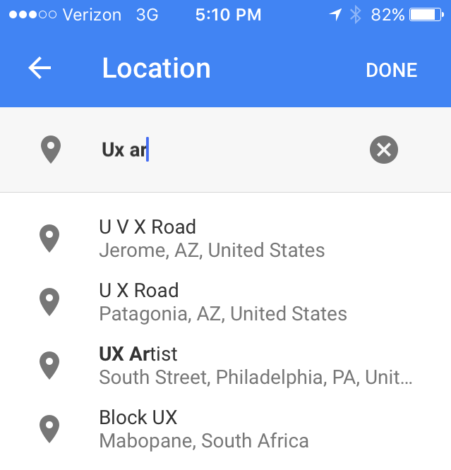
What are the chances any of those are what I mean?

Autosuggest, which is such a great help for searching the web, is a worse-than-useless distraction in a calendar app. Why? Probability.

Searching the web is likely to be an expansive activity: You often don’t know exactly what you’re looking for, so you will probably welcome a discovery from the far-flung universe of possibilities.

But creating an entry in your calendar is the opposite. It’s a narrow, personal, intimate activity. You know precisely what you mean and want. A calendar entry reflects the comparatively small circle of people and topics and places you personally deal with.

So your act of creating an entry in your calendar is highly unlikely to be helped by intrusions from the far-flung universe of possibilities. And even when Google Calendar autosuggests something theoretically useful like people from my contacts list or history, that only slows me down. I can finish typing “Mike Starbucks” much faster – even with my thumbs – than I can redirect my attention to an autosuggestion list that changes with every character I type, scan and scroll through the many misses to find a hit (if any), and then tap/click that listing.

And don’t even get me started about the times Google Calendar defaults to a prepopulated date in the past…

Had Google thought more about probability than about throwing in their existing technology just because they could, they would have left autosuggest out, making Google Calendar actually more efficient to use.

Keep these coming. Send them to us via Twitter or Facebook using the hastag #wtfUX or email them to: [email protected] with “#wtfUX” in the subject line. Include as much context as you can, so we get a full understanding of what the f%*k went wrong.

Image of man with phone courtesy of Shutterstock.

post authorJohn Boykin

John Boykin
John Boykin answers to user experience designer, information architect, interaction designer, information designer, and UX researcher. He’s been doing all of the above for over 10 years. Clients include Walmart, Macy’s and Bloomingdale’s, Blue Shield, Bank of America, Visa, Symantec, NBC, HP, Janus, Prosper, and Mitsubishi Motors. His site, wayfind.com, will tell you more than you want to know.

Tweet
Share
Post
Share
Email
Print

Related Articles

Take a hard look at the fine line between good design and digital dependency.

Article by Tushar Deshmukh
Designing for Dependence: When UX Turns Tools into Traps
  • The article reveals how digital products are no longer just tools. They’re engineered to keep you hooked, often without you realizing it.
  • It challenges designers to ask: Are we building products that serve people, or ones that quietly exploit them?
  • The piece highlights that ethical design isn’t about removing persuasion. It’s about being honest and giving users the freedom to walk away.
Share:Designing for Dependence: When UX Turns Tools into Traps
8 min read

Find out how design leaders can build a more inclusive digital world from the ground up.

Article by Pavel Bukengolts
Championing Accessibility: a Path to Inclusive Design Leadership
  • The article highlights that designing for accessibility isn’t about following rules. It’s about making sure no one gets left out of the digital world.
  • The piece explores how building accessibility from the start, with the help of AI and the right mindset, makes the result better for everybody.
Share:Championing Accessibility: a Path to Inclusive Design Leadership
4 min read

Discover how a simple comprehension test reveals if mobile content is too hard to read.

Article by Paivi Salminen
Why Reading on Mobile Is Uniquely Challenging
  • The article explains why mobile reading is harder: small screens and distractions make people miss information even when it’s there.
  • It introduces the cloze test, which removes words to measure real understanding: comprehension drops from 39% on desktop to 19% on mobile.
  • The piece argues that mobile content needs simpler language because the real question is: Does this make sense when life gets in the way?
Share:Why Reading on Mobile Is Uniquely Challenging
4 min read

Join the UX Magazine community!

Stay informed with exclusive content on the intersection of UX, AI agents, and agentic automation—essential reading for future-focused professionals.

Hello!

You're officially a member of the UX Magazine Community.
We're excited to have you with us!

Thank you!

To begin viewing member content, please verify your email.

Get Paid to Test AI Products

Earn an average of $100 per test by reviewing AI-first product experiences and sharing your feedback.

    Tell us about you. Enroll in the course.

      This website uses cookies to ensure you get the best experience on our website. Check our privacy policy and