Flag

We stand with Ukraine and our team members from Ukraine. Here are ways you can help

Get exclusive access to thought-provoking articles, bonus podcast content, and cutting-edge whitepapers. Become a member of the UX Magazine community today!

Home ›› Accessibility ›› ATM Interfaces, Multiples of 20, and Too Many Buttons #wtfUX

ATM Interfaces, Multiples of 20, and Too Many Buttons #wtfUX

by Daniel Brown
1 min read
Share this post on
Tweet
Share
Post
Share
Email
Print

Save

Dear ATM machine, if I can only take out money in $20 increments, why are you presenting me with 1,3,5,7 and 9 buttons?

According to this ATM machine, I must specify a withdrawal amount in increments of $20.

Even so, I am allowed to press the the 1, 3, 5, 7, and 9 keys (for whatever reason) and must specify that I want “00” cents despite the inability of any ATM machine to dispense coins.

ATM UX fail

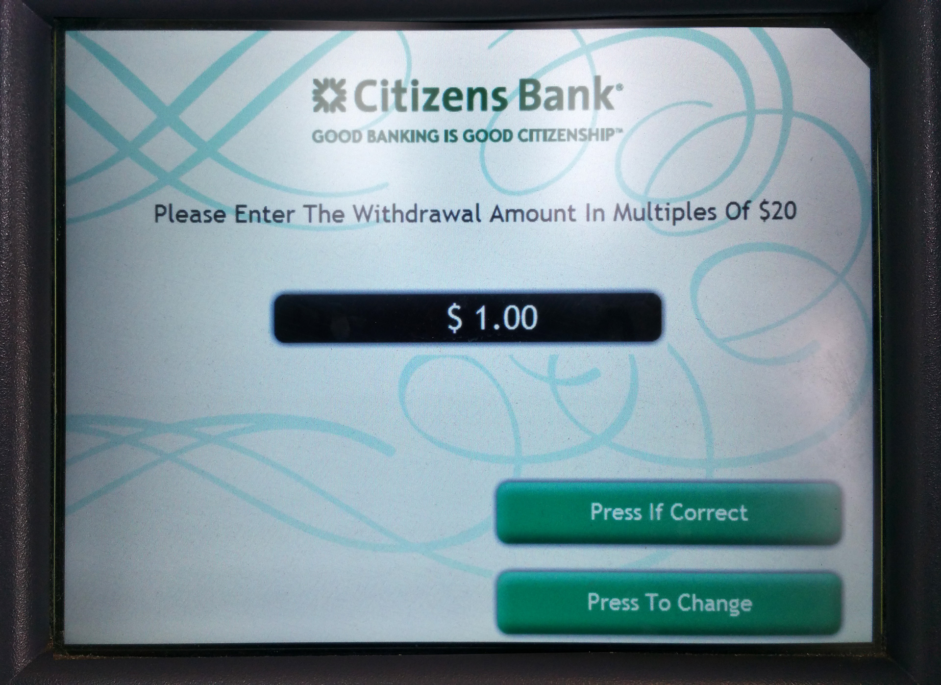
Machines that display presets of $20, $40, $60, $80, or $100 offer a single tap to achieve an effectively error-proof task. This machine requires unnecessary cognitive load and a gauntlet of error possibilities. Not to mention the Over-Zealous Capitalization In The Instruction Line.


Keep these coming. Send them to us via Twitter or Facebook using the hastag #wtfUX or email them to: [email protected] with “#wtfUX” in the subject line. Include as much context as you can, so we get a full understanding of what the f%*k went wrong. Image of $20 bills courtesy Shutterstock.

post authorDaniel Brown

Daniel Brown
Daniel has spent the past 20 years in software companies both large and small. From web design and development for a “boutique” web design firm to Evangelism for Adobe Systems, to helping budding startup companies get a foothold in the market, he’s worn a variety of “hats". Daniel has spoken at a variety of events worldwide including the Sundance Film Festival, Anderson Ranch Arts Center, Santa Fe Digital Workshops, and the Pacific Imaging Center in Hawaii on the topics of web design, digital imaging, photography, and user experience. Daniel currently serves as the head of the interface and user experience department at a small medical software company in Providence, Rhode Island.

Tweet
Share
Post
Share
Email
Print

Related Articles

Struggling with PowerPoint’s design limitations? This step-by-step guide shows you how to build systematic design solutions, from mastering slide layouts to using sticker sheets for patterns. Learn to create polished, professional presentations with smart workarounds and helpful tips.

Article by Jim Gulsen
A Step-by-Step Guide to Creating a “Design System” in PowerPoint
  • The article gives a step-by-step guide to building systematic patterns in PowerPoint. It talks about the program’s limitations and gives essential tips like mastering slide layouts and customizing text settings.
  • It suggests using PowerPoint’s automated features carefully and advocating for manual workarounds to elevate quality.
  • The piece introduces creating sticker sheets for reusable design components and highlights strategies for successful workflows.
Share:A Step-by-Step Guide to Creating a “Design System” in PowerPoint
5 min read

Publishing in HCI and design research can feel overwhelming, especially for newcomers. This guide breaks down the process — from choosing the right venue to writing, submitting, and handling revisions. Whether you’re aiming for conferences or journals, learn key strategies to navigate academic publishing with confidence.

Article by Malak Sadek
A Guide to Publishing Human-Computer Interaction (HCI) and Design Research Papers
  • The article provides a guide to publishing in Human-Computer Interaction (HCI) and design research, sharing insights from the author’s PhD experience.
  • It explains the significance of publishing in academia and industry, offering an overview of peer-reviewed journals and conferences.
  • It breaks down the two main types of papers — review and empirical — detailing their structures and acceptance criteria.
  • The piece emphasizes strategic research planning, collaboration, and selecting the right venue for submission.
  • The piece also outlines practical steps for writing, revising, and handling rejections, encouraging persistence and learning from reviewer feedback to improve publication success.
Share:A Guide to Publishing Human-Computer Interaction (HCI) and Design Research Papers
8 min read

Accessibility isn’t just about compliance — it’s about inclusion. A deaf developer shares what UX designers need to know to create better experiences.

Article by Tamara Sredojevic
Designing for Deaf Users
  • The article talks about a deaf developer who shares insights on digital barriers, assistive tech, and inclusive design.
  • It presents a candid conversation on UX challenges, assistive technology, and advocating for better accessibility.
  • The piece dives into the challenges and solutions for creating truly accessible experiences.
Share:Designing for Deaf Users
11 min read

Join the UX Magazine community!

Stay informed with exclusive content on the intersection of UX, AI agents, and agentic automation—essential reading for future-focused professionals.

Hello!

You're officially a member of the UX Magazine Community.
We're excited to have you with us!

Thank you!

To begin viewing member content, please verify your email.

Tell us about you. Enroll in the course.

    This website uses cookies to ensure you get the best experience on our website. Check our privacy policy and