
Flag

We stand with Ukraine and our team members from Ukraine. Here are ways you can help

Get exclusive access to thought-provoking articles, bonus podcast content, and cutting-edge whitepapers. Become a member of the UX Magazine community today!

Home ›› Business Value and ROI ›› 6 Key Questions to Guide International UX Research ›› Usability Tip: Don’t Make Me Search for Search

Usability Tip: Don’t Make Me Search for Search

by Tammy Guy
3 min read
Share this post on
Tweet
Share
Post
Share
Email
Print

Save

Proper size, color, and placement can have a big impact on the usability of your search field.

One of the best ways to learn what works and what doesn’t work when it comes to UI and usability is to look at as many samples as possible, testing out pages and evaluating how certain elements are being treated.

This usability tip begins with a look at Menu Pages, a very resourceful and well-known site allowing users to view restaurant menus online based on location, cuisine, and other criteria.
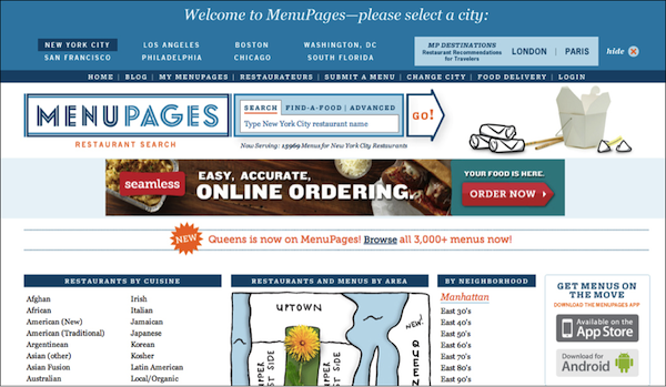
Search field on Menu Pages

I often use their site but the first time I visited it, I was not able to immediately locate their search function. Here are a few reasons why:

  1. Banner style design. The search function is nearly attached to the main logo and has a very similar border color, which makes the entire area appear as one continuous graphic element. In addition, while the entire content area of the site is on a white background, the search function has a blue background, which makes it appear more as a graphic and less as a functional element.
  2. Placement. Typically, the search function is found at the top right corner of pages, unless used as a main navigational site element is usually in the top-center area and presented larger to serve as a main entry point to the site. In this case, the search appears to be centered but because of its close proximity to the logo, and its small size (which you normally would see on the top right) it is difficult to find it and identify it as a main site function.
  3. Button design. Buttons should look like clickable elements and stand out enough for users to find them in a quick page scan. The Go button on the search function is too flat and does not look like a clickable element. Its shape adds to the overall banner style design of the top area and its colors don’t stand out enough against the site’s color palate.
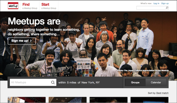
Search field on Meetup

By comparison, have a look at Meetup’s search function, which serves as a main entry point on the site, and is therefore is placed at the center of the screen overlapping their main brand banner. Its size, placement and color nearly guarantee that users will be able to locate it immediately and recognize that it’s a main navigational element.

Further, just to make sure to cover all ends, they placed another search function at the top right corner of the page (consistent on all their pages). The only enhancement I would recommend in this case is an actual search button as some users might feel confused and not know to click on the search icon or simply press enter to initiate the search.

Search field on Veer

Veer’s search function also serves as a main navigational element for the site. Its top placement, although not exactly centered, spans over nearly the entire area and is easy to locate. The clean white input field over a light gray background color combined with the bright orange Search button makes the overall area appear as a functional form, which immediately calls for action.

Share your screenshots of search fields done right and gone wrong on Twitter, Facebook, or Google+ using the hashtag #SearchForSearch. Include a brief explanation of why your example engages or fails to. We’ll add our favorite submissions to the gallery below.

post authorTammy Guy

Tammy Guy
Tammy Guy is the founder of a visual design and usability consulting firm focused on strategic brand planning, creative direction and diffusion of user experience problems by applying design theory and usability best practices in a rapidly changing Web environment. Her firm provides consulting services (e-commerce solutions, mobile apps and tablet experience) to clients from various industries such as fashion retail, commodity retail, pharmaceutical, insurance, financial services, social networking and others. Services include product evaluation, strategy and planning, creative development and direction and usability consulting. With more then 16 years of experience, Tammy previously worked as the Creative Director at LivePerson, Inc. and was a Design Group Manager at the Hertz Corporation where she art-directed all aspects of graphical application development for all customer facing websites. In addition, Tammy has been a frequent guest speaker with the Nielsen Norman Group for the past few years, teaching visual design and usability workshops. She also teaches similar design and usability courses with General Assembly in New York City.

Tweet
Share
Post
Share
Email
Print

Related Articles

Find out why slapping badges and points into your app doesn’t work and what six principles from real game design actually drive long-term engagement.

Article by Montgomery Singman
Gamification 2.0. Beyond Points and Badges: Designing for Players, Not Metrics. Chapter 2: The Solution
  • The piece argues that gamification fails when game aesthetics are borrowed, but game logic is not. Real game designers use six principles to bring real engagement: authentic mastery, meaningful choice, flow-calibrated challenge, rewarded exploration, self-expressed identity, and real social interdependence. The fix isn’t more mechanics; it’s making the experience itself worth repeating.
Share:Gamification 2.0. Beyond Points and Badges: Designing for Players, Not Metrics. Chapter 2: The Solution
5 min read

Learn how one product designer built a faster, sharper workflow where AI does the scaffolding, judgment owns the outcome, and nothing ships without a traceable why.

Article by Pavel Bukengolts
The Spiral Climbs: Ideas Are Expensive, Systems Are Cheap
  • The piece explores that design is no longer about designing screens but owning systems, bets, and outcomes. But the core judgment, empathy, and research are irreplaceable. I chain Miro, Figma, VS Code, GitHub, and Jira into one traceable loop from idea to learning. AI takes on the exploration and scaffolding. People own architecture, security, and accountability. A 48-hour operating cadence of small, measurable bets, linked artifacts, and documented decisions keeps speed honest.
Share:The Spiral Climbs: Ideas Are Expensive, Systems Are Cheap
6 min read

Discover why the points, badges, and streaks in your favorite apps aren’t really gamification.

Article by Montgomery Singman
Gamification 2.0. Beyond Points and Badges: Designing for Players, Not Metrics. Chapter 1: The Problem
  • The piece claims that most apps misuse gamification, copying superficial mechanics like points and badges that trick rather than motivate people, and that the experience itself is what truly drives engagement, just like good games do.
Share:Gamification 2.0. Beyond Points and Badges: Designing for Players, Not Metrics. Chapter 1: The Problem
4 min read

Join the UX Magazine community!

Stay informed with exclusive content on the intersection of UX, AI agents, and agentic automation—essential reading for future-focused professionals.

Hello!

You're officially a member of the UX Magazine Community.
We're excited to have you with us!

Thank you!

To begin viewing member content, please verify your email.

Get Paid to Test AI Products

Earn an average of $100 per test by reviewing AI-first product experiences and sharing your feedback.

    Tell us about you. Enroll in the course.

      This website uses cookies to ensure you get the best experience on our website. Check our privacy policy and