
As a Baby Boomer who is seriously interested in technology, I can’t figure out why more website developers and designers aren’t addressing the special needs of my cohort. Statistics show that Boomers have more disposable income than any other group. In fact, we were the largest band of tablet buyers last holiday season.
It stands to reason that developers who want to “follow the money” are racing toward Boomers. But they need to be aware that designs that work for Millenials just don’t cut it for us.
Privacy, Security, and Ease of Use
If developers and designers want Boomers to get onboard with their sites, they need to address our fears head-on. Remember, we are a generation that lived through Joe McCarthy’s Red Squad in the late ‘50s and the FBI’s tracking of Vietnam protestors in the ‘60s. It makes sense that, in a study conducted by Burst Media, “only 34 percent of Boomers were comfortable about privacy with Internet sites that customized content, but that number increased to 52 percent when they were presented with clearly stated privacy policies.” In other words, we’ll use your site, but first we have to trust you.
With that in mind, here are a few suggestions on how to assuage Boomers’ fears and get them engaged with your site:
Before and During Registration:
- Educate us. Make us watch the video before we can navigate the buttons. That’s right—force us. Put the video front and center. Maybe even with big bold letters that say “Watch this First for Easy Instructions.” Boomers tend to think we know how to do everything, and when it turns out that we don’t, we quickly label an experience as bad. Head us off at the pass. We may not know how to find the information we need, but we definitely know how to press play. Check out Dropbox for a great example of this idea in practice.
- Reassure us. Tell us in the video that you will need certain pieces of personal information and tell us why. Tell us in the video and on every single page that our information is secure. Tell us how it’s secure. Tell us in the clearest terms possible. Take a look at iubenda if you need help developing a privacy policy. Developers probably think is redundant, but Boomers need lots of reassurance that their data is safe. We understand why the personal information is needed—but tell us again that our data is secure.
- You only get one chance to make a first impression. Make sure the site gives us correct information the first time. Recently, I tried out a site that said it would track my bills. I linked my credit cards to the site and some of my bills appeared as “unpaid.” I know I paid them, so the site immediately lost credibility with me. When I contacted the site, a person gave me an explantion about their “datascapers or aggregators” but that was just too complex for me—the user. As far as we’re concerned, your service providers’ problems are your problems. Be open about your shortcomings. If you can’t make sure all of the information is accurate—tell us ahead of time. Tell us if the site is still in beta or infancy. That way we won’t freak out and badmouth your site when something doesn’t work right. Boomers still rely on peer-to-peer endorsements of products, so when we hear that “Steve’s brother’s wife tried the site and hated it,” we’re NOT going to bother trying it.
After Registration
- Once we get past registration, use static navigation menus. We don’t like pull down menus and scrolling lists. Our hands are not as steady as they once were and it’s harder for us to control the mouse.
- Make sure you differentiate between the text used for headings and text used for links. For the links, use bold blue or purple type and make sure the link color changes after a user visits it. Stay away from bright greens and lime yellows; they are too difficult for Boomer eyes to read.
- When a picture appears next to a link, make the picture part of the working link. It makes it easier for us.
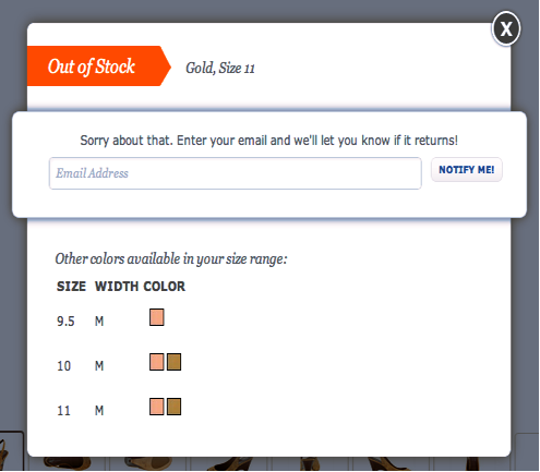
- If you must use pop-up windows, make sure they are large enough to fit all of the text so we don’t have to scroll. Think about Zappos: when a pop up occurs, it’s easy to read.
- Make sure all type is at least 12 points. Headlines should be larger. And avoid using fancy fonts. Yes, they’re pretty. They’re also impossible to read. Stick with a clean sans serif and let the content speak for itself.
Plenty of young developers and designers have terrific ideas for websites and apps that target the needs of we 78 million Baby Boomers. Take a lootk at LoseIt or My Medical. They have easy to follow instuctions and clean screens with clear fonts. They have created a user experience that is attractive to all ages. Develolpers and designers who show empathy to the physical and emotional challenges of Boomers are rewarded with our loyaty.
We are a huge group of people willing to pay for apps we can easily use. We talk amongst ourselves and share our technology discoveries with one another. We love technology. We’ve been using it since college, but our demands are high. We want apps and sites that are targeted to us to work for us—the first time we try them.
Coffee and laptop photo courtesy of Shutterstock