One of the main disadvantages of online shopping compared to in-store shopping is the lack of guidance. Walking into any retail location, customers may be greeted with a smiling face asking, “May I help you find what you’re looking for?” Online shoppers, on the other hand, are often forced to find their own way, and secretly wish for that smiling face to help them.
Visual designers have the power to change this scenario and pave the yellow brick road for users, creating a seamless and enjoyable browsing experience that can replace the smiling greeter at the door.
The yellow brick road is the users’ visual path. It allows them to follow a pattern to not only find their final destination, but also to always know where they are within the broader context of the site—no matter how many turns, bumps, distractions, and forks in the road they traverse along the way.
Visual paths guide users from one element to another, and allow designers to control how information is being perceived and in what order. Because readers can only absorb a certain amount of information at one time, it’s imperative to present content using a phased approach. Guide users through information-carrying areas that will help them determine which turns to take next in order to arrive at their final destination or, at a minimum, their next turn/action.
Designing Visual Paths
To begin designing visual paths, designers must label each page element (images, content, links, buttons, etc.) and determine the level of importance each has for the user. This sets the framework for the visual hierarchy and helps in making correct decisions when designing the overall visual path.
Let’s look at The New York Times’ cover page as an example.
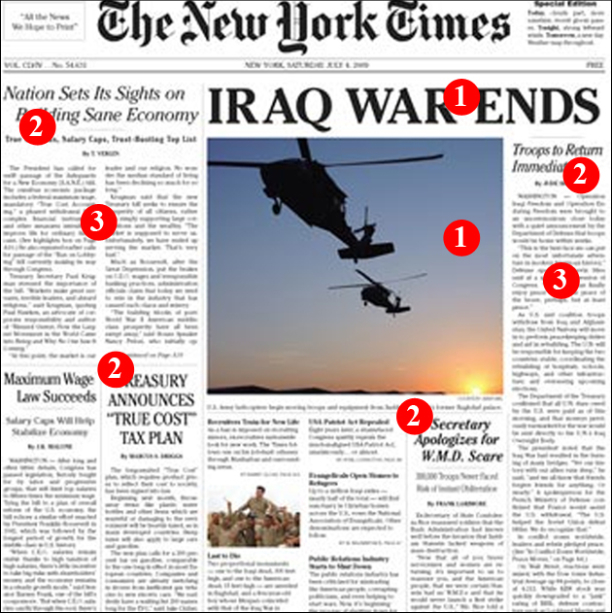
The page is made up of text and images, which are all set in different sizes, allowing readers to skip from one headline to the next and scan the overall composition prior to deciding which article to read in depth.
The designer of this cover page decided on the following visual path and hierarchy:
| Content | Heirarchy | Visual Path |
|---|---|---|
| 1. Main Story of the day | Most Important | Look here first |
| 2. Additional Stories | Important | Look here second |
| 3. Article Content | Important – For interested readers | Read if you are interested |
A composition may have elements that share the same level in hierarchy. In this case, it allows users to scan all the daily stories and decide which they will read, if any.
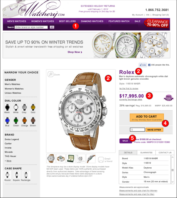
Case Study – Example Redesign of The Watchery
The image below is a product page from watchery.com. The page is busy and somewhat overwhelming, making it difficult for users to quickly scan and find imperative product information. The composition lacks visual paths, and throws users to various areas of the page without a logical flow.
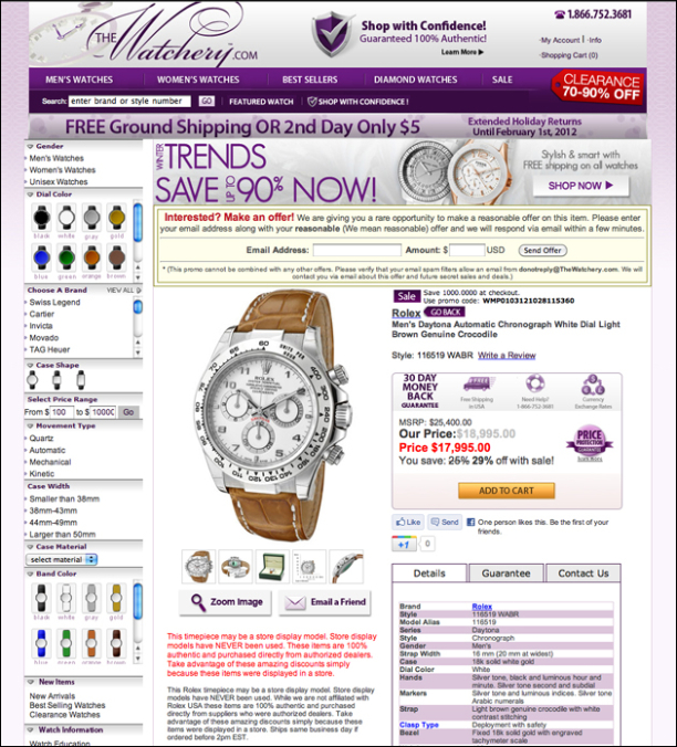
Using design fundamentals such as color, type, shape and grids, one can turn the current design into an organized, cohesive, and easy to absorb page that will in turn convert shoppers into buyers.
Since I’m doing hypothetical work on a sample site for this illustration, one of the constraints is that I have no background information regarding the project, including the business decisions that were made to incorporate certain elements within the composition. Therefore, I’m leaving most of the original page elements in the layout even though I am not convinced they should stay in. For example, considering this is a product details page, one could argue that the faceted search controls on the left hand side should not be on this page.
But the constraint adds to the challenge, and serves us well for what we’re trying to demonstrate in this exercise. Instead of making the redesign easy by removing elements, I will show that we can organize elements, create visual paths and clean up the composition while keeping most elements in.
Let’s take a look at the redesigned approach and discuss some of the main differences:
1. Color: Use one to two colors that will serve as a visual path.
Select a dominant color and apply it only to key areas that are high on the overall page hierarchy. That color should be used as a yellow brick road to guide the user from one information-carrying element to another.
The Watchery selected their brand color, purple, as their dominant color. Their composition includes purple in their navigation, banner ads, buttons, labels, icons, and even as a grid in the product details tab section. Because it is used on so many different element types with varying meanings and interaction behaviors (some are links, some are not; some elements are related to the specific product, some are general promotions; etc.), users are not able to learn and trust its behavior and meaning.
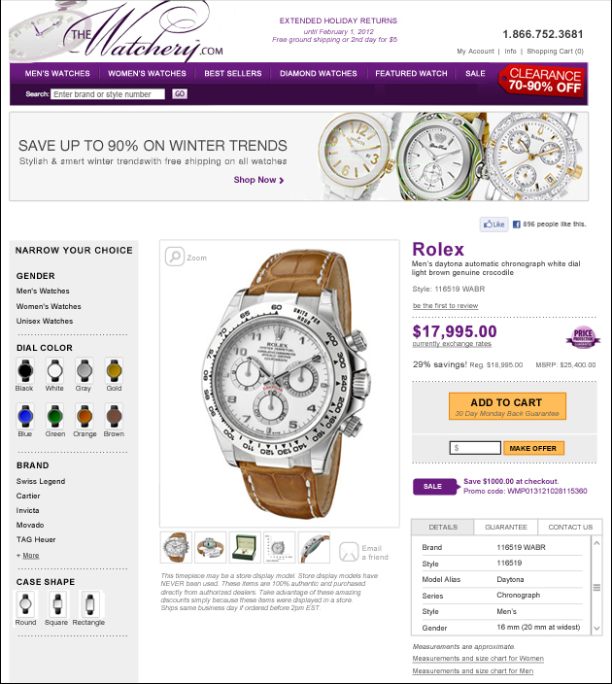
Redesign
The suggested redesign still utilizes purple as the primary color but limits the number of times it is used throughout the design. This allows the color to come to the foreground and dominate the composition with its strength rather than its abundance.
A secondary color, yellow (purple’s complementary color), is used to highlight the two key actions users may select on this page. The Add to Cart and Make Offer buttons appear in the foreground with their warm tones, helping users to find them quickly and easily.
2. Type: Use consistent font style, color, and behaviors to allow users to quickly scan the page.
It has been proven time and time again: online users don’t read. Confusing them with an array of font styles and colors will only push them away from the page faster. Omit information that is not necessary and reduce the number of font styles and colors used. Assign a behavior to type elements and be consistent.
Watchery.com has at least nine font styles in their design, with a confusing range of sizes, color, and behaviors.
Redesign
The suggested redesign minimizes the number of type differences, allowing users to quickly learn patterns and behaviors and concentrate on the important content.
Read more about design and consistency in my previous article, Think Outside the Box, but Don’t Forget the Box Exists.
3. Grid and shapes: Use modular grid systems supported by negative space for well balanced and organized design.
When all elements seem to lie in their intended positions, compositions are balanced and require no thinking from the user’s perspective, allowing them to concentrate on the content. Modular grids allow flexible layouts to come to life while keeping organization intact.
Watchery.com content appears unstructured, as information is separated by inconsistent background colors, shapes (content and banner borders, icons), and misaligned elements, causing users confusion and uncertainty.
Redesign
The suggested redesign opens up the grid, allowing white space to control the flow and separate elements. Fewer background colors and more consistent shapes clearly group elements together and indicate the hierarchy of information for users.
Once all elements are in place, a visual path is formed:
- Navigation
- Main product image and title
- Price
- Main calls-to-action
- Sales and promotions to apply during checkout
Items 1 and 2 may switch places depending on how users arrive at this page. If they arrive from within the site, the first item they’ll notice will most likely be the product image and title. Users landing on this page from another site (a Google search page, perhaps) will most likely notice the navigation and logo area first to understand where they are and what the site is about, and orient themselves.
Conclusion
This example redesign is just one of many possibilities for Watchery.com and isn’t a finished product, but it makes clear the advantages of paving a yellow brick road.
Prior to redesigning a page or site, one must consider general business goals and user personas to determine element hierarchy. Once the hierarchy is set, employing graphic design fundamentals will help give users a clear visual path and direct their flow through the page and site.