Save
Concerns about customer loyalty, fueled by recent online security breaches and mobile privacy snafus, have left software design and security teams at a crossroads. Both agree that building trust is central to achieving and maintaining strong customer engagement. However, exactly how to build that trust remains a heated point of contention.
For product designers, the self-proclaimed champions of the end user, trust comes through providing simple and intuitive user experiences. In their view, trust is built when users can easily perform a task and reach a goal, whether that goal is something as simple as sending an email, or as serious as e-filing a federal tax return. Security folks, by contrast, are the guardians of the enterprise. Their world is akin to a battlefield, run amok with counterfeit code, OS vulnerabilities, and brazen hacker exploits. The challenges they face are complex and unforgiving, and leave no room for error.
In the world of enterprise security, trust is earned through scrupulous attention to detail and a proven track record. Thus, the two camps stand in apparent contrast; one vying for better design, the other for security. Sadly, this misperceived dichotomy often leaves the user experience wanting, as businesses are forced to choose between building products that look nice, or products that are secure.
Must Safety Always Come at the Expense of the Design?
No. In fact, following best practices in UX design can actually make products safer. Imagine if you will, that your mother has asked you to recommend a web browser. Browser #1 hides its settings behind an unclear toolbar label, uses outdated selection controls, is written in archaic technical language, and provides no additional help or guidance for advanced options. Browser #2 uses a clear toolbar label, simple selection controls, plain language, supplemental microcopy, and contextual help for advanced options. Assuming the browsers provide comparable privacy and security functionality, which one would you recommend? Browser #2, of course, because the design is clean and intuitive, and your mother is more likely to understand how to use it as a result. The last thing you want is mom confusing cookies and pop-ups for something she’d find in the kitchen pantry—especially when they’ve come from a malicious website.
A Principled Approach
So how does a software development organization begin to think about security and design as complementary halves of a unified whole? When designing Citrix products, we rely on five core design principles to govern our development work. “By leveraging common heuristics and design patterns, we’re able to translate our principles into tactical ground rules and apply them to front-line design and development work, ensuring that our products and services are both well designed and secure,” Principal Product Designer Uday Gajendar says. While not an exact science, these five design principles guide our work companywide, from design and development, to leadership and administration.
The Five Design Principles
1. Make it simple.
Minimize the time, effort, and skill required to use your products and services. How?
- Reduce: Provide everything your user needs and nothing more. Disclose additional information in a progressive manner, taking care never to overwhelm your user.
- Organize: Suggest structure without enforcing it. Offer a default configuration or a logical starting point.
- Prioritize: Offer the most common choices first and emphasize the most important information.
Case Study: GoToMyPC
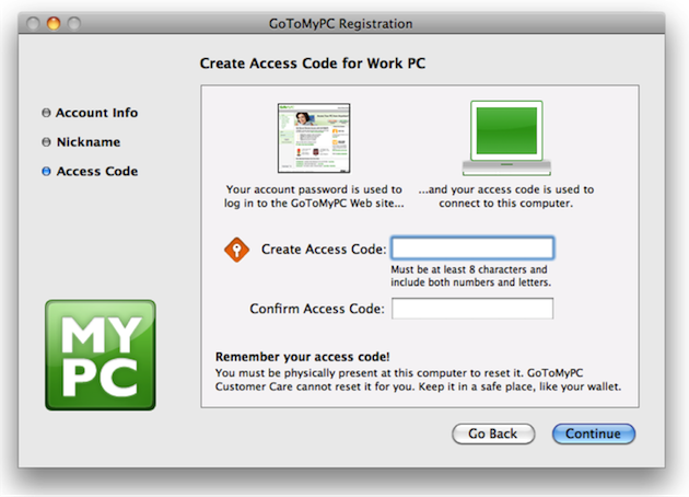
In the spirit of simplification, the Citrix GoToMyPC team improved both the visual and written language of the product’s registration and security code entry experience.
Building on a process of iterative design and user testing, the team introduced new iconography and supplemental information to help users understand the importance of creating—and remembering—a secure access code. While the team was solving a challenge that was largely usability related, the project required a close partnership between development and security teams, as the user experience was closely linked to the product’s secure access functionality. One of the improvements the team made was to introduce a conversational metaphor to the account registration narrative to help users understand the importance of protecting their access code. The text reads: Keep it in a safe place, like your wallet. “Our security strategists actually suggested that text,” Staff User Experience Designer Laura Martin, who worked-side-by-side with Security to design, test, and implement the changes, says. Other changes included replacing on-screen text with imagery where possible; using action-oriented verbiage for window titles and instructions; and adding new iconography to aid users in recalling their access codes when prompted later on.
The team’s efforts reduced customer support calls and, presumably, created much happier customers.
2. Focus on Human Goals.
Help your users do what they need to do, and loyalty will follow. How?
- Remember: Know your customers and help them achieve their goals, both as users and as people.
- Anticipate: Structure each interaction around how people think and behave.
- Forgive: Help users avoid, fix, and recover gracefully from mistakes.
Case Study: Citrix Account Lockout
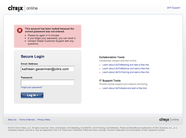
When the Citrix UX team for online collaboration and IT support noticed customers getting locked out of their accounts, they decided to investigate. “It used to be that users had to contact customer support,” UX Manager Elizabeth Thapliyal says. “But after talking to Security, we found out there was no reason they couldn’t just go ahead and reset.” So the team tested and eventually implemented a new customized bailout process to allow users to self-serve, based on their account type. In addition, the team introduced a tiered messaging strategy to deliver different levels of help based on how many failed login attempts users had accrued.
By attacking the problem from the user’s point of view, the team solved the account lockout issue and reduced customer support calls. Today, multiple Citrix products use this approach.
3. Inspire Delight.
Exceed your user’s expectations and they will become your evangelists. How?
- Provide: Delight fades quickly, so strive to provide persistent exceptional value.
- Appeal: Users share things that appeal to their senses, because things that look and feel better are better.
- Surprise: Never promise more than you can deliver. Instead, aim to deliver more than users expect.
Case Study: Citrix Receiver for iOS and Android
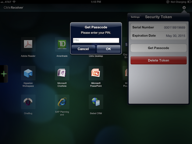
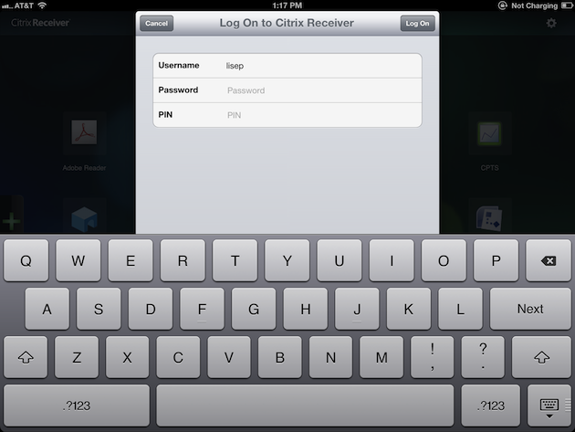
Delight—one of the great mysterious buzzwords of the twenty-tens. There are about as many opinions on this abstraction as there are UX practitioners, each with their own unique spin on the idea. Not surprisingly, delight is perhaps the most difficult principle to translate into practice. For the Citrix Receiver mobile team, delight came in the form of automation. Specifically, automation of the RSA security token entry process for the Citrix Receiver mobile app. Anyone who’s used a security token—physical keychain or software—to access a VPN or other secure networks surely understands the appeal of automating this process. For mobile Citrix Receiver customers, this was especially true. “The employee had to install the RSA app on the (mobile) device in addition to Citrix Receiver, and then perform 6 steps,” Lead Product Designer Lise Pilot says. “Usability studies validated our concerns that this process was more complex than it needed to be.” So the team worked closely with Citrix security architects and RSA engineers to automate the six-step process into a delightful one-step process.
“This cuts the entire manual process out and hides the complexity from users,” Pilot adds. By eliminating the other five extraneous steps, the team ostensibly reduced the chances of user error by more than 80%. “It was not only to [our] benefit, but to RSA customers as well,” Director of Product Management Robin Manke-Cassidy says. “We have received quite a bit of positive feedback from customers thanks to this change.”
4. Exhibit Craftsmanship.
Attend to the fit and finish of your product, because when users sense that something is well crafted, they’re compelled to trust the people who made it. How?
- Deliver: Make good on your promises. If a function looks available to users, make sure it is available to users.
- Persevere: Always consider the user’s point of view and choose familiar solutions to recurring problems.
- Pay attention: Details matter, both to your users and your credibility. So take the time to get them right.
Case Study: Desktop Director for XenDesktop
When the design team for Desktop Director (the XenDesktop web interface) was asked to redesign the in-product experience of allowing third-party technologies to access end-user machines, the team (naively) figured the project would be an easy slam-dunk. It didn’t take them long to realize that the project, with its complex technology, third-party dependencies, and myriad divergent stakeholder opinions, required much more than a quick spit and polish. Working closely with legal, security, and product development, the team began a process of updates and iterations to address the core problems of the user experience. The team first improved a series of security-related UI controls by replacing needless visual clutter with familiar iconography. This iconography was then carried through to a series of corresponding in-product security notifications to aid users in recalling the security preferences they had previously chosen. Next, the team improved the information architecture of a set of security preference panels, using re-ordered content and pared down copy to simplify navigation and allow for an emphasis on security, without compromising usability.
Additionally, the team added contextual help and supplemental content throughout the experience to educate and inform users about potential security risks at the point of need. Ultimately, the team succeeded in providing the context necessary for users to make informed decisions regarding third-party access to their machines, while also creating a user experience that was both visually appealing and familiar.
5. Deliver Unique Value.
Create a masterpiece that delivers cutting edge functionality. How?
- Fit: Make sure your products are effective, uncomplicated, and a perfect fit for the way your users think and work.
- Honor: Your brand identity is unique; design products that are clearly part of the same family.
- Align: Design products and services that respect and fit with relevant platforms, systems, and products.
Case Study: Citrix UX Standards
The UX Standards team at Citrix is taking a slightly different approach to security. The team has built a comprehensive design and component library for use in shaping Citrix products and services.
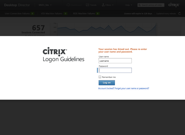
The library provides visual, interaction, and writing guidelines for designers, as well as interactive demos, code snippets, and design rationale for development teams. “We’re working with different groups, to make sure our guidelines are flexible enough as a baseline for our product designs,” Director of Product Design Todd Rosenthal says. For example, the team recently published a set of web logon guidelines addressing all aspects of the user experience. Best practices for authentication, error handling, and session timeout address issues related to secure access, while standards for imagery, writing style, and corporate logotypes ensure a coherent brand identity across product lines.
The team’s work has made serious inroads toward automating UX best practices across mobile, web, and desktop platforms by developing reusable UI components that incorporate all five Citrix design principles.
Things are Moving Fast
The news is littered with reports of online security heists, grandiose identity hold-ups, and bungled privacy agreements. Amidst the flurry, however, the fundamentals of good design—and security—remain unchanged. Developing and following a core set of design principles can help software development organizations debunk the common misperception that product security stands at odds with the design, and focus instead on building products that are both expertly designed and safe to use.
Door knocker image courtesy Shutterstock
Mike Maass leads an all-star team of UX writers and editors at Citrix.


