Save
I was recently fortunate to work on interactive storybooks for preschoolers and toddlers (ages 2–5) for the iPad and Android tablet platforms. Designing for young kids requires looking at things from a child’s perspective. I learned some important lessons by observing kids and reviewing applications while working on these projects.
Kids are curious and eager to explore. They tend to touch everything they see on the screen and notice things adults sometimes miss. For example, they don’t experience banner blindness; for them, a banner is an exciting opportunity to learn what will happen if they touch the screen. Most interaction problems for young users occur when they are forced to navigate away from what they want to do because they unintentionally trigger an action they did not intend to. Banner ads, a swipe gesture, or even a simple menu button are sometimes causes for aggravation for the young user and the observing parent.
Kids explore an interface by touching almost aimlessly on the screen, trying to discover as much as they can. A banner ad or a Facebook “like” button may work for some applications, but when designing for kids we must realize that banners link to pages toddlers cannot return from, and pressing “like” takes them out of the app and into to a browser with the Facebook page.
A Childproof Navigational Interface
A similar usability problem happens when a young user inadvertently touches a menu button. For UX designers and developers, making it easy to access menu controls at any point in the app is a normal part of making easy-to-navigate interfaces; for inquisitive kids, however, a menu button visible on all screens can sometimes be a source for frustration.
When designing for toddlers and preschoolers I recommend creating a “childproof” navigation interface to prevent children accidentally brushing or touching the menu while using the application. The idea is simple: design menu access for the parent only. Just like a childproof safety cap for a medicine bottle or other devices made safe for young children, we create a menu system that is childproof.
For example, a childproof app might require that a menu button be tapped once to change its color, and then tapped again after a short interval to activate the menu. This short delay gives the child an opportunity to divert attention to something else on the screen. If the child presses once without any rewarding feedback, he is not likely to press again. Another example is a banner type graphic that you must “pull” (swipe down) in order to see a menu, or even basic linear navigation flow without a menu to allow a focus on the tasks at hand with no unwanted interruptions.
Here are a few interesting examples of apps designed with kids in mind:
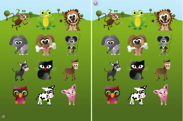
Heydooda! The kitty says: Hello animal kids
Tapping the home button in the lower left side will slide the button to the upper left side.
Bartleby’s Book of Buttons Vol. 2
Dragging the red banner down activates the menu.
Dragging the red arrow down displays menu options.
Basic linear navigation with no menu access
Gestures for Young Kids
Sometimes a swipe gesture is used to flip the page in interactive storybooks, but for young children trying to interact with the story, flipping the page may not be what they’re trying to do. For an inquisitive child, a swipe is sometimes a clumsy press or an attempt to move things around the screen; “next” and “back” buttons to change a page would be more effective in this case especially when combining other interactive elements on the page. Generally, I recommend avoiding any sensitive triggers when designing for young kids.
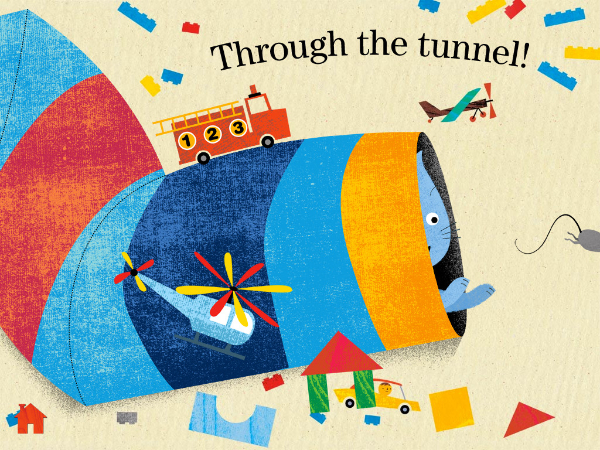
A Present for Milo app is a good example of a confusing experience for children using the swipe for navigation. Although it’s a fun book to read, tapping the interactive elements on the screen sometimes flips the page unintentionally and distract from the story.
Tapping the interactive elements on the screen unintentionally flips the page
Consider the Device
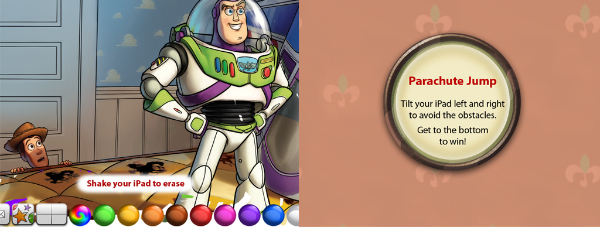
Accelerometers and young kids don’t go together. The tablet is an expensive device, so invoking accelerometer triggers as means to create interaction for kids should be avoided, as children don’t have a strong grip and tend to drop things. Shaking the device to erase a drawing or tilting a device up to play a game could be a cause for disaster.
Using the accelerometer could be dangerous.
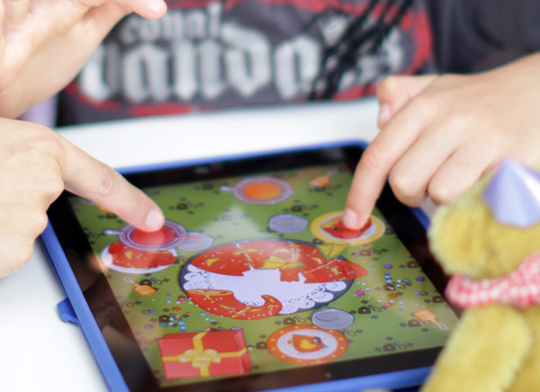
Kids love playing together, so applications for kids should allow multi-touch for a more enjoyable experience. For example, a drawing app should allow painting with multiple fingers to allow two kids to draw at the same time. Allowing multi-touch will also make the interface more forgiving when a child is holding the device. If the child is touching the corner of the screen with one finger and tapping with another, he would be frustrated when nothing happens because the application only allows for one-finger touch. Luke Wroblewski writes about this in his article Touch-based App Design for Toddlers.
Toca Boca Birthday Party Playtime
Toca Boca Birthday Party Playtime allows two participants to play at the same time.
Luke also writes about how interface elements sometimes intrude on the experience for young kids, replacing large, colorful buttons and appealing intuitive controls with a generic design that children cannot relate to. Here is an example:
Toy Story Read-Along presents kids with options they don’t understand.
Hush Little Baby – a setup menu kids cannot use
The iPad’s five-finger pinch-to-terminate gesture, or the four-finger swipe are definitely causes of frustration for young users. Additionally, the iPad Home button and the Android Menu Bar are not childproof, as they are always visible and invite a curious touch. Apps for kids should allow a quick return to the application in case these buttons are pressed. For easy recovery, avoid displaying a logo splash screen and menu each time the application starts.
Avi (@xgmedia) is the owner of IoT News Network, an independent resource for the Internet of Things. He is a longtime interactive and web design professional with thirteen years of experience. The author of Design-It-Yourself: Web Sites (Rockport Publishers, 2003), Avi has published several articles about user experience, he is an avid enthusiast of technology and is often invited to speak about emerging design and UX trends. Avi is currently working as an Independent UI/UX Consultant at his studio, XG Media.


