There has been a growing tidal wave of flat designs on the web, and recent trend reports have confirmed that they’re only increasing in popularity.
Of course it’s easy to dismiss flat design as yet another fleeting aesthetic trend.
But further investigation into this new philosophy reveals that flat design is a lot more than “just for looks.”
What is Flat Design?
Flat design can be seen as the more sophisticated and versatile cousin of minimalism. While flat designs look great when made within the restraints of minimalism, they can also handle a lot more complexity; these designs have a crispness and clarity that can only be achieved by stripping away three dimensional effects. In its essence, flat design has two objectives:
- Embracing the limits of the screen and working within those parameters rather than trying to disguise them.
- Using this newfound simplicity as a starting point for streamlining designs, and making websites faster and more functional.
Flat design doesn’t necessarily mean that anything hinting at dimensionality is out of place. For example, this website features an angled illustration with a clear perspective. But the overall trajectory of the trend is towards simplicity and minimalism. The buttons are plain fields of color with sharp corners. There’s not a drop shadow, beveled edge, or gradient to be seen.
Flat Design as a Response to the Problems of Skeumorphism
For every action, there is a reaction. And in the world of digital design, flat imagery is cropping up more, in part as a reaction against skeumorphism. But flat design is more than just an artistic treatment; it’s a response to the serious functionality issues that skeuomorphism presents.
What is Skeuomorphism?
If you’re unfamiliar with the term, skeuomorphism is the practice of incorporating the look of an object that was made in another material into a design: what was once functionality becomes ornamentation. The reference is meant to evoke a sense of familiarity when encountering a new concept/tool/app online. This principle of imitation is all around us; a plastic chair that duplicates the shape of its wooden original is a good example how it manifests itself in the real world.
In the digital world, skeuomorphism is often associated with Apple products, which provide a great example of how it often looks in digital design. Just take a look at Apple‘s dashboard design:
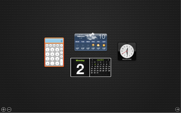
- The obvious components: The calculator, clock, and calendar are digital illustrations of their real-world counterparts.
- The subtle details: The drop shadows and beveled buttons, the textured background, and even the shuddering movement of the second hand on the clock are also made to mirror physical products.
The Problems with Skeuomorphism
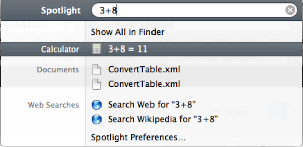
While there’s something to be said for the philosophy of skeuomorphism, there are a lot of issues that come with using it in digital design. For example, the analog clock featured in Apple’s dashboard is harder to read than its digital alternative, and it’s much more time-consuming to click the buttons on the calculator then it is to simply key them into the Spotlight function that also comes with Apple products. There are actually quite a few problems that arise with adhering to skeuomorphism:
- By sticking to standards that are irrelevant in a digital format, skeuomorphism limits creativity and functionality.
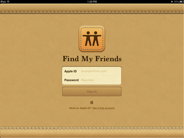
- Skeuomorphic elements look inconsistent when combined with less dimensional elements, and often the imitations don’t even make logical sense. For example, Apple’s Find My Friends app has a background that’s made to look like stitched leather. But this element has no relation to any real-world reference.
- Skeuomorphic elements can take up valuable screen space and loading time with functionless embellishments.
- They also tend to look wrong when combined with anything else that isn’t treated with skeuomorphic effects, limiting the entire design as well as any particular element.
The Solution Found in Flat Design
The response of flat design makes is to embrace the real limitations of the digital experience, and to do away with the imposed limitations of skeuomorphism. Anything on a screen will never truly look three dimensional, so why not embrace the beauty (and accompanying increase in functionality) that comes from stripping away illusory decoration?
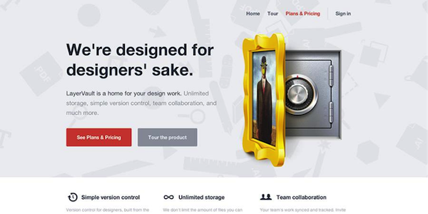
Example #1:
Example #2:
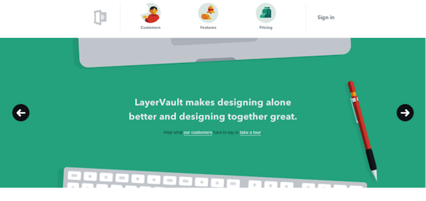
Take the above examples of LayerVault’s website: example #1, the older design, shows a very detailed and elaborate illustration in the skeuomorphic style, which as previously mentioned, looks wrong in combination with the flat, clean appearance of the rest of the site. Compare it with the flat illustrative style of the new design, example #2, and there’s no contest as to which is more compelling and functional. The original illustration is distracting without being informative, while the modified one guides the eye to important information without eclipsing it.
Flat Design Harmonizes and Builds on the Goals of Skeuomorphism and Minimalism
The elements that bring flat design beyond a passing trend into a lasting and comprehensive strategy are twofold:
- Flat design is tailored to fit an on-screen experience, as opposed to earlier styles which were made to mimic a physical experience.
- That tailoring lends itself perfectly to enhancing the user experience in a number of ways.
Flat design takes the best aspects of minimalism and skeuomorphism and makes them work together. Like skeuomorphism, flat design looks friendly and approachable to users. But it does this by presenting a clear and engaging interface, rather than disguising and warping that interface to mimic something familiar. Like minimalism, flat design strips down visual elements to expose their essential functionality. But it’s not as restrictive in the way it does this; as demonstrated above, the importance of ornamentation is recognized and utilized.
Flat Design is the Perfect Style for Great UX
Flat design not only reconciles the goals of minimalism and skeuomorphism, it also is uniquely adaptable to usability considerations. By shedding unnecessary styling, it makes for speedier pages, cleaner code, and easy adaptability. It also lends itself beautifully to every type of application; whether viewed on a desktop or a mobile screen, flat design is always legible and adaptable.
Flat Design is Endlessly Adaptable
Example #1:

Example #2:
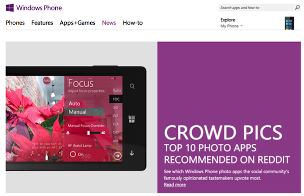
To see how simply and beautifully these applications can be integrated with each other, take a look at the design of Windows Phone, in examples #1 and #2 above. The company has chosen to be a key player in the movement away from a look that has been closely associated with Apple, and its decision is paying off in a great interface; bright color blocking is used in both to designate sections, and all the typography and imagery looks elegant and integrated.
Conclusion
Flat design has all the key attributes that make a site as functional as it is beautiful. It recognizes that a sense of familiarity is important to the user experience, but it creates this sense in a way that fits with the medium. At the same time, it’s able to adapt to new discoveries, trends, and ideas. Flat design brings us a step closer to a new paradigm of digital design, where the functionality and aesthetic are in complete harmony.
Image of linguine courtesy Shutterstock.