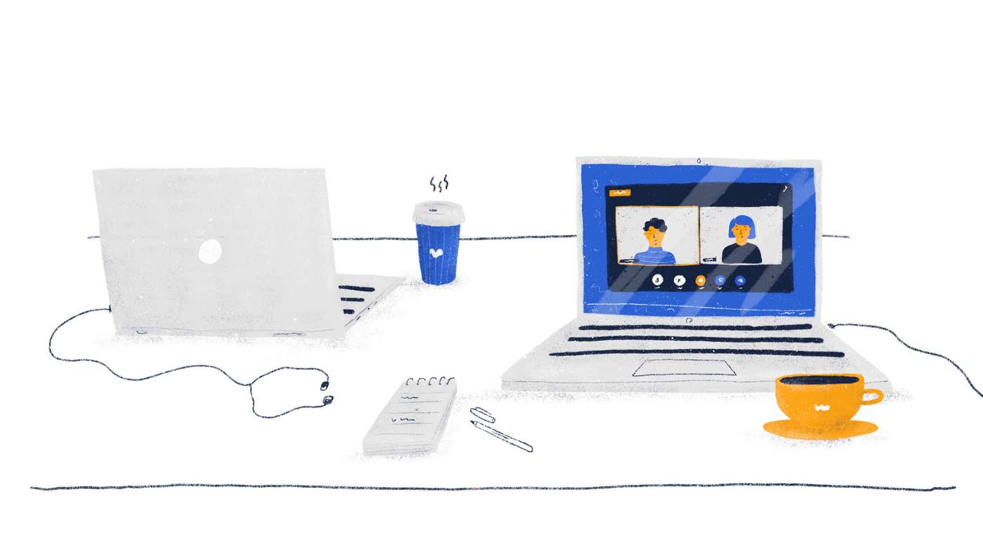
Zoom has seen overwhelming adoption as the COVID pandemic struck. Somehow, over the course of the lockdown, this product has become nearly synonymous with videoconferencing and became the central tool for social events ranging from classes to memorial services. It managed to become an indispensable asset that allowed people around the world to function amid those odd times.
The question that needs to be asked here is, “How did Zoom manage to take over such a huge share of its market?”. At the end of the day, there were so many competing products that were also more seasoned and well-rounded. The answer to this question is fairly straightforward — it’s easy to use.
When asked about Zoom’s success, Jason Fried, the CEO of Basecamp, said that “Zoom made sending a meeting link as easy as sharing a YouTube video.”
While this is true, we also believe that there are some considerable issues in the product’s overall experience, and this is exactly what we’d like to cover in this review. Below, we’ll discuss some user needs that we believe remain unmet and some potential solutions for them.
Okay, let’s dive right in.
Starting an instant meeting
Whenever you start an instant meeting, Zoom acts as if that was your goal — just sitting there, staring at your own face on the screen. Obviously, whenever someone attempts to arrange a meeting, the first thing they would do is invite participants. This bears the question, “Why not immediately prompt me to share the copy link?”. This is an additional action that the user needs to perform, which is kind of redundant.
Google Meet, for instance, has incorporated this feature, which eliminates a great deal of unnecessary friction that may confuse people that are using the product for the first time. This is especially important because of the overwhelming adoption the platform has seen in early 2020 — there are millions of people that are using Zoom for the first time. It would be reasonable to eliminate this potential confusion from their experience.
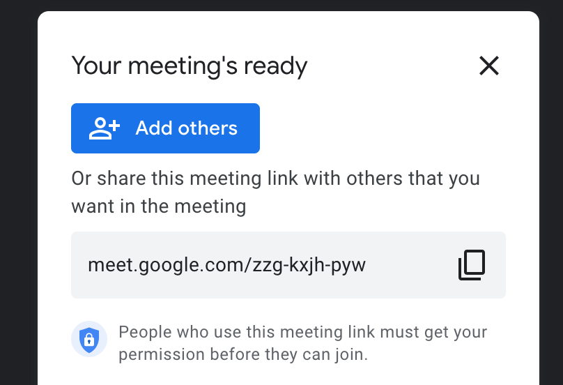
One fairly straightforward solution here is adding a popup to invite people if you join an empty meeting.
Opening Zoom links
It’s safe to say that a lot of people join meetings through links and links only. Every time someone opens a link on a computer, they’re greeted with this. 👇
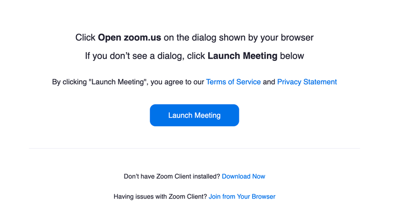
Every single time a person follows a Zoom link, their browser will ask them whether they’d like to open Zoom. In 99.9% of cases, users will answer positively, and unfortunately, they have to do this nearly-meaningless action again.
Plus, most of us have to struggle with having way too many tabs open in our browsers. This way, Zoom just adds to all that clutter, with no good reason for it.
Endless scroll
There are two problems with this Schedule Meeting popup. Let’s get the quick fix out of the way — the correct spelling is “Kyiv,” not “Kiev.”
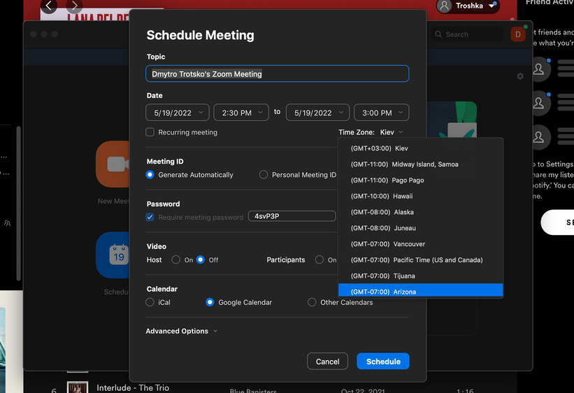
Now, on to the second problem — this never-ending drop-down menu. Of course, this type of menu has its benefits in the right scenarios. However, this isn’t one of them.
Because Zoom provides users with a humongous list of geographic references, it’s safe to say that having to spend 30 seconds on scrolling to find your city is pretty redundant.
✅ Fortunately, there’s a quick and easy solution to this issue — please, just add a search bar.
No, that’s not my name
Okay, story time: before using Zoom for work, a Ukrainian colleague of mine used it for university. He originally wrote his name in Cyrillic script, which was his intention at that point. Over time, his context of using Zoom changed — he started using it for work with an international team, which meant that he would have to change his name to Latin script. The problem is that he would have to do that manually every single time he joined a meeting, which is simply absurd.
And you may be asking, “ Wouldn’t it be easier to just go to your profile and change your name there permanently?”. Unfortunately, there’s a catch — he never organized meetings in Zoom; he only joined them. Basically speaking, he doesn’t even need to log in. However, every time he joins, the platform displays his name in Cyrillic script. Then, he changes it. Then, once the meeting is over, Zoom closes. Then the cycle continues.
✅ Solution: It would make a lot of sense to make name changes permanent to avoid situations like these.
When someone requests to join the call
Unfortunately, Zoom doesn’t provide users with a sound notification when someone attempts to join their call. As a result, this creates an odd sense of anxiety because you have to constantly check whether someone has requested to join the meeting or not. Often, people have to message each other outside the platform to request that they be let in. Again, this is a fairly redundant step in Zoom’s UX.
And this is kind of a weird one, to be honest. This is such an intuitive thing to add to your product — and other major platforms have done it too.
In case you’re worried about “Zoom bombing” and receiving a flood of notifications, this can be addressed fairly simply — instead of one notification per request, the sound cue’s parameters can be changed to one notification per a certain number of requests.
✅ Solution: Please, just add more sound cues.
Look and feel
Design standards are subject to continuous change. It’s safe to say that today this process has accelerated considerably compared to the early days of app design — and its rate will probably continue to grow over time.
Zoom’s interface already appears slightly dated, like it belongs to a different time, like it’s out of sync with current design standards.
✅ The solution here is fairly simple — Zoom needs a visual refresh to continue to appeal to its very broad audience.
Weird way to be logged in as a host
The whole flow of needing to be logged in as a host is slightly bizarre. You’re expected to launch the Zoom client before clicking on an event that you created yourself. Otherwise, the platform doesn’t recognize you as the host, and you even receive a notification that someone (you) is waiting for the host (you).
This causes a broad spectrum of reactions ranging from honest confusion to deep existential inquiry. Who am I really in this world? Am I an owner, or am I a guest? What is my real nature and identity? What’s it all for, anyway?
✅ Solution: Just make it work properly — all these questions are just way too taxing.
Integration with desktop and collaboration
One thing that Zoom might benefit from considerably is a better collaborative experience. Here are a few ideas that could address that:
- The reduced mode works fine, at least better than the browser-based alternatives, but it’s not perfect. For instance, if you were to minimize the screen, Zoom could have a floating window that would enclose the call’s participants.
- Zoom apps try to circumvent the integration challenges, but still, that doesn’t grant you a seamless experience. At this point, Zoom does integrate with some apps like Gmail and Miro, but there are many others that it lacks — Chrome is a big one.
- The call/collaboration experience is not really there.
The bottom line
Overall, Zoom has seen massive success over the last few years, and it would be wrong to say that it was without merit. However, the issues mentioned above can make the experience pretty clunky and odd at times.
Originally published on medium