
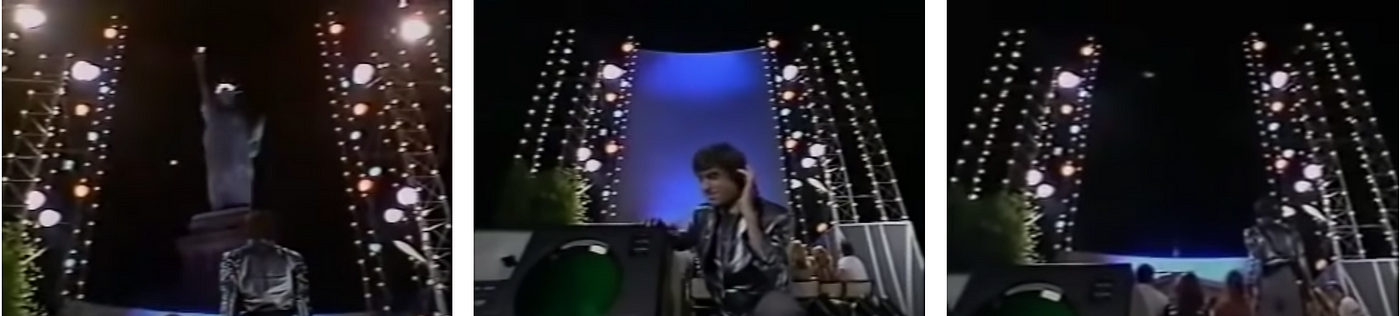
Forty years ago, David Copperfield, a renowned stage magician, made the Statue of Liberty disappear, in front of a stunned audience. He later repeated this magic trick with a Boeing 737! Needless to say that Copperfield did not really make the Statue of Liberty disappear, nor did the airplane. In reality, the audience platform rotated, very slowly, to shift the spectators’ perspective¹. In addition, Copperfield cleverly manipulated the attention of the audience. Moving curtains, a big screen with radar animations, flaring laser lights, and loud beats, all captivated the interest of the audience, to such an extent that they did not perceive the actual rotational movement of the stage². Managing the spectators’ attention is key to all magic acts; a skilled magician knows how to direct the audience’s gaze.
Here it comes! Manipulation of users’ attention is also the essence of UX design. In this respect, Jeff Raskin, who laid the foundations for Apple’s Macintosh interface, already back in 1979, coined the term Locus of Attention³. In his explanation of the locus of attention, Raskin stressed that we, humans, can consciously only pay attention to one thing at a time⁴. Compared to computers, we are serial information processors, as is cleverly exploited by magicians.
Of all the world you perceive through either your senses or your imagination, you are concentrating on at most one entity. Whatever that one object, feature, memory, thought, or concept might be, it is your locus of attention.
— Jef Raskin in The Humane Interface
Raskin not only emphasized the singularity of the locus of attention. He also emphasized our lack of volition when it comes to directing our locus of attention. If a loud explosion takes place in your vicinity, this is where your attention will be drawn to. Moreover, if you have to repeat a mind-numbing task, eventually your attention will wear off; there’s a limit to how long you can sustain directed attention. Therefore, Raskin preferred the word locus over the word focus. Focus wrongly suggests that you have full volition over what is your object of interest. Instead, locus includes not only those cases where you are actively paying attention to something, but also the cases where your attention is grabbed by whatever is roaring your senses, or the cases where your selective attention wanders off, despite your best intentions.
In sum, understanding and manipulating the locus of attention is crucial, not only for magicians but also for UX designers. After all, what is in the user’s locus of attention is what will be noticed. What is not in the user’s locus of attention goes unnoticed.
#1: Guiding the locus of attention
As a skilled UX designer, grabbing and guiding the locus of attention is really the core challenge you need to tackle. This is a two-stage process.
Firstly, ask yourself what should grab the user’s attention. What is the most common action/important message at this moment? And what should definitely not be in the locus of attention? When going through this, at first glance, deceptively simple exercise, UX designers should respect the singularity of the locus of attention. This is where the catch is; there can only be one primary action or primordial message to communicate. Of course, sequentially, several actions can be taken, and several messages can move into focus. But there is a sequence and hierarchy to any optimal task execution. Therefore the first task of any UX designer is to develop a genuine understanding of user needs and the hierarchy of tasks and actions, via thorough user research. Here, methods such as customer journeys and next hierarchical task analysis come in handy.
Secondly, it is your job to optimally design the user interface to grab the user’s attention. So the question becomes how to style and position UI elements to ensure that the user’s attention is on that primary action, that most common action, or that most important message. Here, a UX designer needs to draw on their knowledge of information processing and perception. Obviously, for this, a UX designer also needs a solid understanding of the basics of information visualization and user interface design, and how to play with, among others, contrast, size, position, and animation, to grab that attention. Methods like the squinted eyes test also come in handy to check your assumptions, next to the obvious usability testing, perhaps even including eye tracking, to verify whether a UI component really stands out.
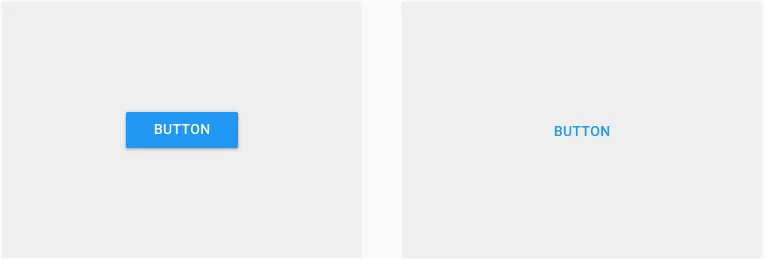
An excellent understanding and application of the Locus of Attention can be found in the floating action button⁵, or FAB for short, in the Material Design framework. It is not simply a gimmicky, round button. It comes with a mandate to style it with a contrasting color, and to sit on top of all other UI elements, immediately grabbing your attention. It also comes with the prescription that it should represent the primary action in an application; there can only be one primary action per screen⁶. So, with only one floating action button per screen, this is adhering to the singularity of the locus of attention.
While the specific UI styling of the floating action button may conflict with the UI design guidelines you have to follow, the principle behind it remains unchallenged and is now engrained in every design system. Every solid UI framework now comes with a distinction between at least primary buttons and secondary buttons, and with the understanding that primary buttons are to be used sparingly, for that one action per screen, that is most important.
To see this in action, it suffices to simply look at the home page of Twitter. What do you think is the primary action? Even with squinted eyes, when the entire page is blurred, it is immediately clear what button to press to execute the primary action of tweeting.

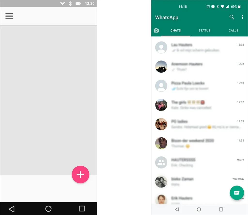
Similarly, with Trello, it is immediately clear what button(s) they want you to press. This time, there are two flaring buttons competing for your attention, but hey, both of them bring you to the same signup page.
#2: Holding on to the locus of attention
Sometimes you have no choice but to make a user wait. The system needs time to complete an action, for example, when uploading an image to the cloud, booting up an in-app service, processing data on a server… The fleetingness of the locus of attention implies that users’ interests will wane over time. Responsiveness is perhaps the number one usability rule; according to Google’s core web vitals, you have 2.5 seconds before your user will turn away⁷. Therefore, as a UX designer, in these situations, it is important to ensure that users sustain their attention, and that you can hold their locus of attention.
When you understand the singularity and involuntariness of the locus of attention, you can also use this to your advantage to ensure that users remain entertained while certain (boring) aspects of the interaction take their course. In particular, this can be useful to mask time delays. For example, similar to a magician, time delays can be masked, for example by progress bars and fancy loaders. So there is a motivation for fancy animations in spinners after all :- )
The more interesting the animation is, the more it will be able to hold the users’ attention and make time appear to go faster. Be careful, this is NOT a plea for neverending, cycling spinners that give no clue about the progress. These are just as boring and may make users turn away even faster. In this case, it is better to provide skeleton images⁸. Such grey boxes where the actual content will appear place shift the focus from the indicator that informs about the status of the content being loaded in, to the actual content —and progressively display the content as it is loaded in.
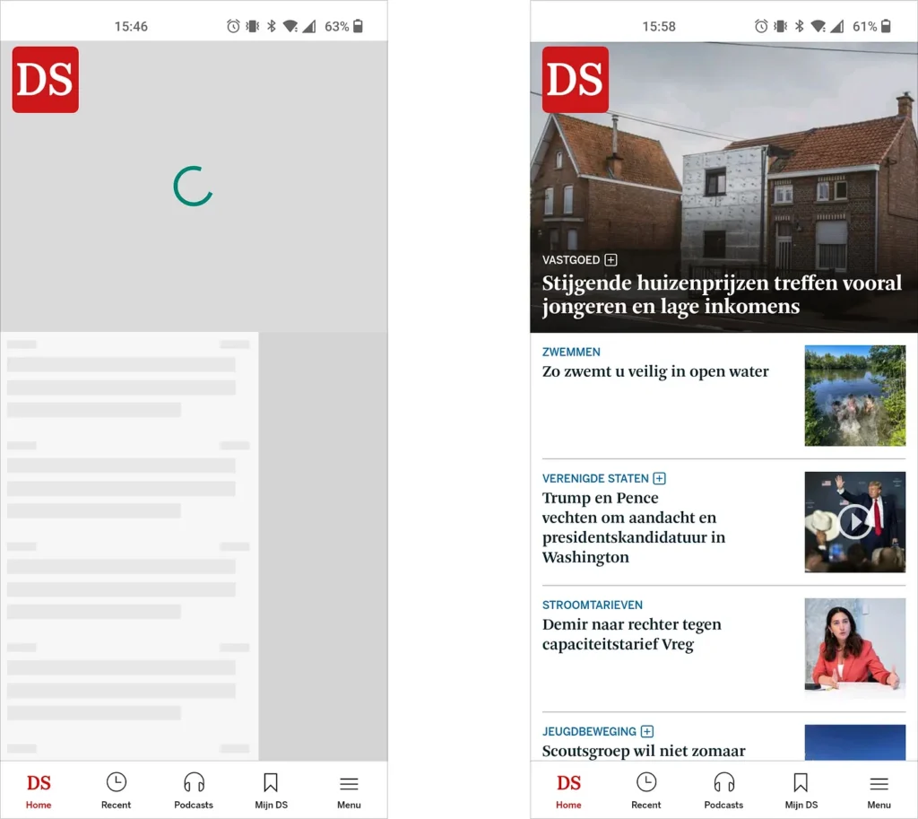
A clever study by Chung⁹ showed that skeleton pages are perceived as faster than blank pages (about 500 ms) or spinners (a couple of ms), and are also most preferred. He also found out that adding motion to skeleton pages further helps to decrease perceived duration. This brings us to another possible way to keep users’ interest: use blurred images that load progressively. This means that first a dominant color is displayed, instead of grey boxes, which gradually load content and bring it into focus.
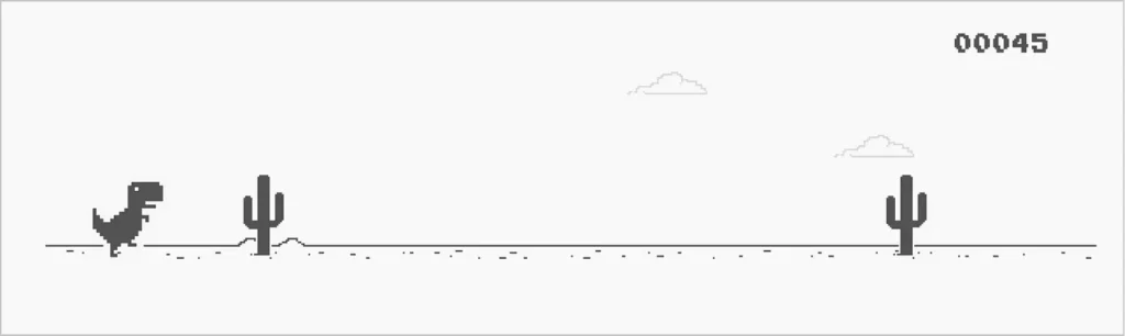
Finally, inspiration can also be drawn from gamification — the use of game elements in a non-gaming context. Most famous is perhaps the Dinosaur T-Rex Game in your Chrome web browser, to be played while being offline and waiting for your internet connection to pick up again.
#3: Relocating the locus of attention
Sometimes, a user’s locus of attention may be on a specific action. They may be in the middle of an on-screen maneuver, trying to locate that critical element they need to act on. The more critical an action, the more excited or anxious a user is, the more their locus of attention is focused on that specific item or action, and the less likely the user will notice what is happening outside their locus of attention. Among perception psychologists, this is known as selective attention⁴, and is illustrated in the video below. (If you are new to the experiment, be sure that you are in a place where you can watch the video with all of your (selective) attention. If you did already see it, don’t spoil it for others, and take the test again with full dedication. You will again be surprised.)
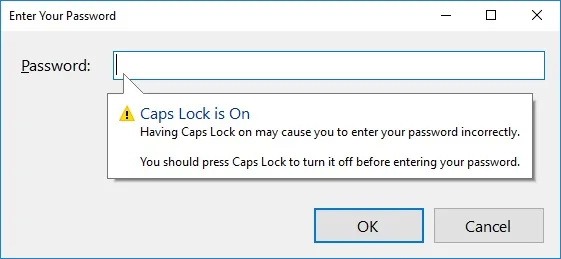
This selectivity/singularity of the locus of attention can pose serious challenges for a UX designer, particularly when things go wrong in the interaction. When something has happened or has been done that is of such particular importance, you may need to relocate the current locus of attention, from wherever it currently is, to that particular message or action the user should become aware of. Maybe the internet connection just dropped, maybe a server just crashed, or maybe the user accidentally activated caps lock mode. In this case, again, attention-grabbing UI elements are even more important, to help the user notice and understand what just happened. Here, really bold UI choices are needed, to relocate the locus of attention away from whatever the user is focusing on to that new piece of information. In this case, as a UI designer, don’t be a minimalist. Think of bright saturated colors, big UI elements, and animations, and preferably a combination of them. Moving elements in the periphery of the visual field are particularly useful to grab attention and relocate the focus.
Using such a dialogue window, popup, tooltip, or toast to inform you of a mode change can be of indispensable value. For example, a tooltip warning you that turned on caps lock mode (perhaps unknowingly) can help you understand why your password seems to be invalid¹⁰. Again, important is that such a tooltip, popup, or toast is able to grab and relocate the locus of attention. Next to bright, big, bold, moving elements, perhaps even more efficient, is to have that UI element simply appear right there in the current locus of attention, there on the screen where the user is gazing at.
#4: Joining the dark side: exploiting the locus of attention
From the prior examples, it is apparent that the singularity and the fleetingness of the locus of attention is not only something to reckon with, it can also be exploited. Among magicians, misdirection is understood as deceiving the audience by distracting their attention. Misdirection can happen in two different manners. Firstly, the audience can be led to look away, in order for them to not detect a specific move. Secondly, the audience can be misled to believe that a certain element or move has a specific causal effect when it really has none.
Obviously, in magic, this misdirection is benign and fundamental to the illusion. In UX, misdirection is most often problematic, definitely when intentionally implemented to trick people. Intentionally exploiting the locus of attention is known as an Evil UX strategy¹¹ or a dark pattern¹². Visitors can be misled to stare at a certain UI element, and not detect something else has changed. For example, signing up for some advertisement, or extra insurance that ends up in your shopping basket.
Users can also be led to believe that a certain UI element will have a certain effect when in reality it will result in a less benign action.
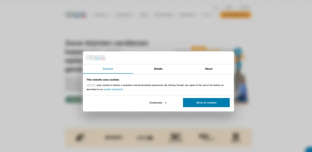
Dark patterns are all around us, from hidden unsubscribe links to primary actions to accept ‘all cookies’. Admittedly, there may be a grey zone, where marketing, advertisement, and persuasive strategies to have users sign up or keep them on board borders on user manipulation. Such dark grey patterns may still be legal. Still, in the long term, these erode the trust of users. And you may end up in the hall of shame of deceptive design.
Using the Locus of Attention for good: Satisficing
Clearly, understanding the limitations of our selective attention can be used to manipulate users and make them do things that benefit the company, but harm themselves. As a UX designer, it is important to be aware of the dark patterns, and those greyish patterns that are on the edge. Judge wisely whether you are really helping someone and truly facilitating the desired action, or whether you are tricking a user into unintentionally signing up for a service that was never aspired.
Nevertheless, a solid understanding of the workings of the locus of attention can be used to make interaction with digital interfaces so much easier, and not only when signing up for a new service. In fact, Steve Krugg would categorize designing with the locus of attention in mind as falling under his first law of usability: “Don’t make me think“¹³. He emphasizes (like many other researchers and UX evangelists) that we, humans, do not thoroughly visually scan pages for all of the content that is there, to then make a careful selection. Rather, we will click on the first link or button that appears to be more or less what we are looking for. This strategy is also known as satisficing¹⁴. And we satisfice all of the time; life is too complicated to constantly figure out what the best solution is. So is interacting with digital interfaces; it is too complicated to always scrutinize and figure out the absolute best link or button. Therefore, make it absolutely obvious what button is the best button to click, what message to skim, and what link to follow…
In sum, simplify digital interactions by designing for the locus of attention: by grabbing the user’s attention and guiding it to where it should be. This necessitates a deep understanding of your user needs and wishes (and not just company profit), and a skillful design of the user interface. Design with the locus of attention in mind, and it will greatly satisfice your users, both short and long-term.
REFERENCES
¹ SuperAmazingMagic. (2010, April 27). David Copperfield — Vanishing the Statue of Liberty. https://www.youtube.com/watch?v=823GNH4Rczg
² Blasner, D. (2019, September 13). Here’s How David Copperfield Made The Statue Of Liberty Disappear [IHeart]. Here’s How David Copperfield Made The Statue Of Liberty Disappear. https://www.iheart.com/content/2017-09-26-we-finally-know-how-david-copperfield-made-the-statue-of-liberty-disappear/
³ Raskin, J. (2000). The Humane Interface: New Directions for Designing Interactive Systems. Addison-Wesley Professional, chapter 2–3, p17–18
⁴ The locus of attention is strongly related to selective attention, which is the term used for all the processes that allow a user to select and focus on particular input for further processing while simultaneously suppressing irrelevant or distracting information. The power (or limitations) of selective attention is also illustrated in the famous experiment by Simons and Chabris where the viewer is asked to count the number of times a basketball is passed on, see https://www.youtube.com/watch?v=vJG698U2Mvo
⁵ https://material.io/archive/guidelines/components/buttons.html#
⁶ Babich, N. (2020, May 30). Floating Action Button in UX Design. Medium. https://uxplanet.org/floating-action-button-in-ux-design-7dd06e49144e
⁷ Web Vitals. (n.d.). Web.Dev. Retrieved 27 July 2022, from https://web.dev/vitals/
⁸ Shakir, S. A. (2018, October 5). Stop Using A Loading Spinner, There’s Something Better. Medium. https://uxdesign.cc/stop-using-a-loading-spinner-theres-something-better-d186194f771e
⁹ Chung, B. (2020, September 19). Everything you need to know about skeleton screens. Medium. https://uxdesign.cc/what-you-should-know-about-skeleton-screens-a820c45a571a
¹⁰ Patrick, B. T., & 08/22/2017. (n.d.). Windows Forms: Don’t Skimp on the Caps Lock Warning –. Visual Studio Magazine. Retrieved 27 July 2022, from https://visualstudiomagazine.com/articles/2017/08/01/windows-forms.aspx
¹¹ Sapio, D. (2020, May 18). 10 Evil Types of Dark UX Patterns. Medium. https://uxdesign.cc/10-evil-types-of-dark-ux-patterns-f5a408c43c62
¹² Brignull, H. (2021, June 6). Bringing Dark Patterns to Light. Medium. https://harrybr.medium.com/bringing-dark-patterns-to-light-d86f24224ebf
¹³ Krug, S. (2000). Don’t make me think! Mitp Verlags Gmbh. https://sensible.com/dont-make-me-think/
¹⁴ https://www.behavioraleconomics.com/resources/mini-encyclopedia-of-be/satisficing/