“Whoever best describes the problem, is the one most likely to solve it.”—Dan Roam
I had the recent honor of becoming an author in UX Magazine with my first published article: a review of the Fitbit Flex.
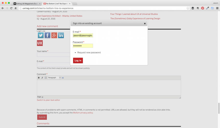
In passing, I mentioned to Josh Tyson (Managing Editor) some of the challenges I was having responding to comments on my article. As a result, he asked me if I’d be willing to do a review of their current social login/commenting system.
Not gonna lie, I hesitated at first because I didn’t want to be perceived as bashing a publication I respect greatly–and one that just had the faith in me to publish my work! He immediately put me at ease by expressing his interest in being transparent and vulnerable in order to make things better.
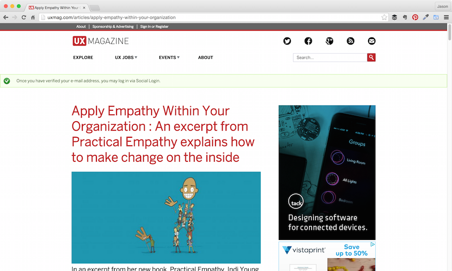
Here’s what I discovered in the process using Chrome for Mac/desktop: I began my critique at the article level since this is how most users would attempt to leave a comment.
Social Logins
Twitter was the first option. Here’s the steps I took:
- Clicked Twitter icon
- OAuth pop-up window (so far, so good)
- Custom loading screen via third-party
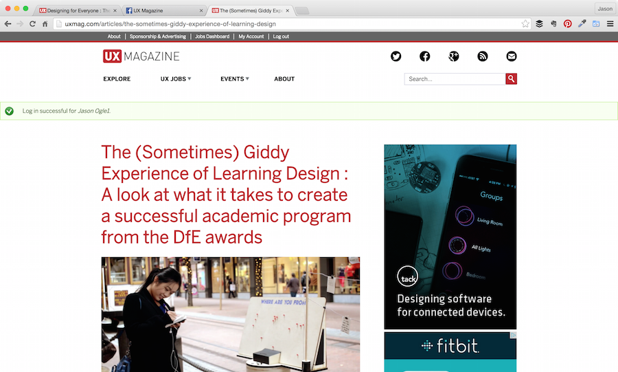
- Landed back at the top of the article page with some helpful user feedback that stated my account was created and my user name is “X”

1. Clicked Twitter icon
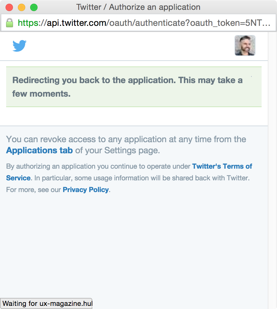
2. OAuth pop-up window
3. Custom loading screen via third-party

4. Landed back at the top of the article page
Biggest problem with this experience that I’m convinced could be lending to some loss in engagement is the bold text on 4. I landed back at the top. The ideal UX would be to jump me back down to the comment box with a blinking cursor so I could do what I intended to do all along…leave a comment.
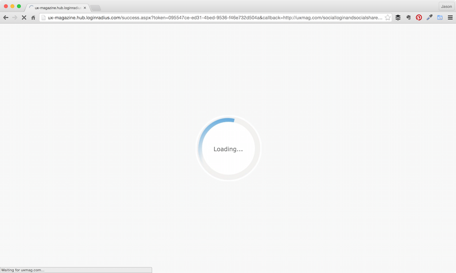
Here’s what happened when I did it Zuck’s way:
- Clicked FB icon
- Pop up for FB Connect > Okay (so far, so good)
- Custom loading screen via third-party
- Same result as Twitter: Landed back at the top of the article page with some helpful user feedback that stated my account was created and my user name is “X”

1. Clicked FB icon
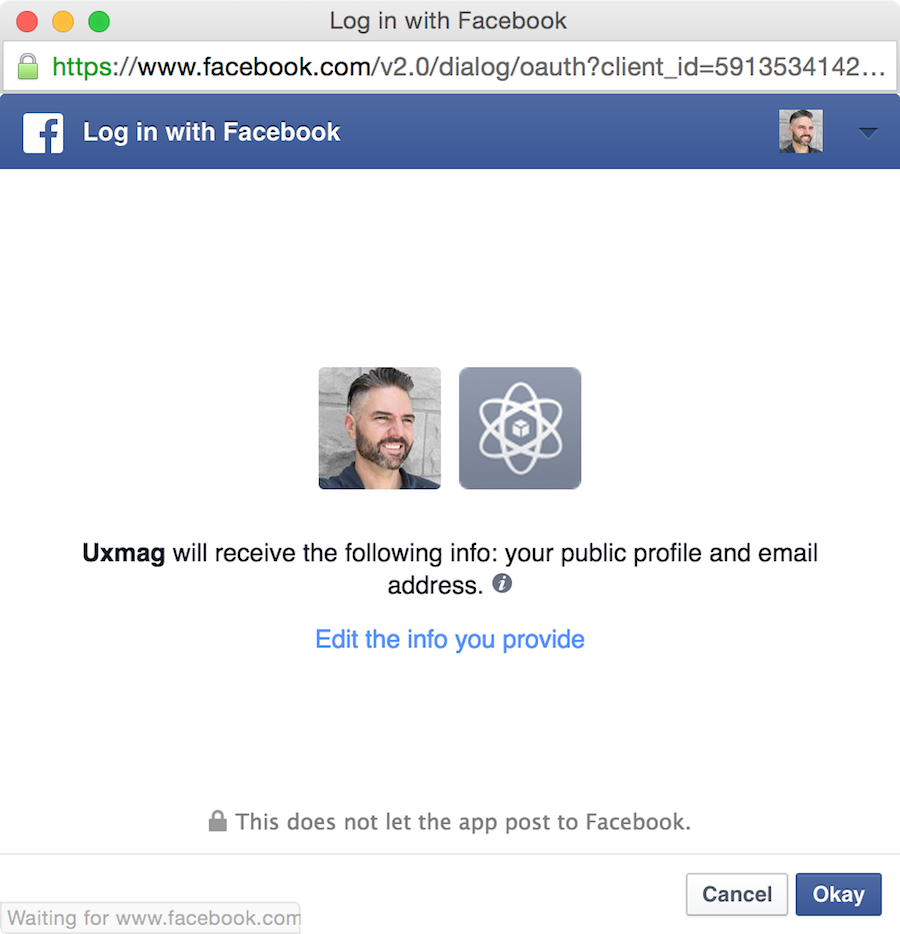
2. Pop up for FB Connect
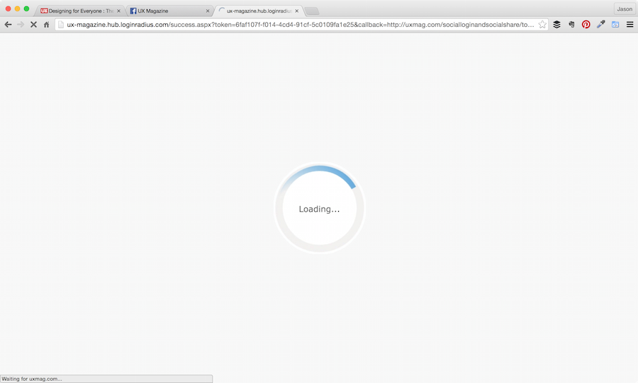
3. Custom loading screen via third-party
4. Landed back at the top of the article page
Couple of things worth noting here:
- Notice that the FB pop up screen icon for UX Mag is generic? It would benefit greatly in the trust department to replace that with the UX Mag logo (note: only FB Developer cardholders can do this).
- I clicked “Reply” to my FB comment I left, and it jumped me to the top of the screen that showed that my Login was successful. I had to scroll down to the bottom of the page again to actually reply.
After clicking Reply to my FB comment.
Google+
Now for Google’s social network on life support. This one was a real doozy:
- Clicked Google+ icon
- Pop up for Google+ > Allow (so far, so good…but stick with me)
- Custom loading screen via third-party
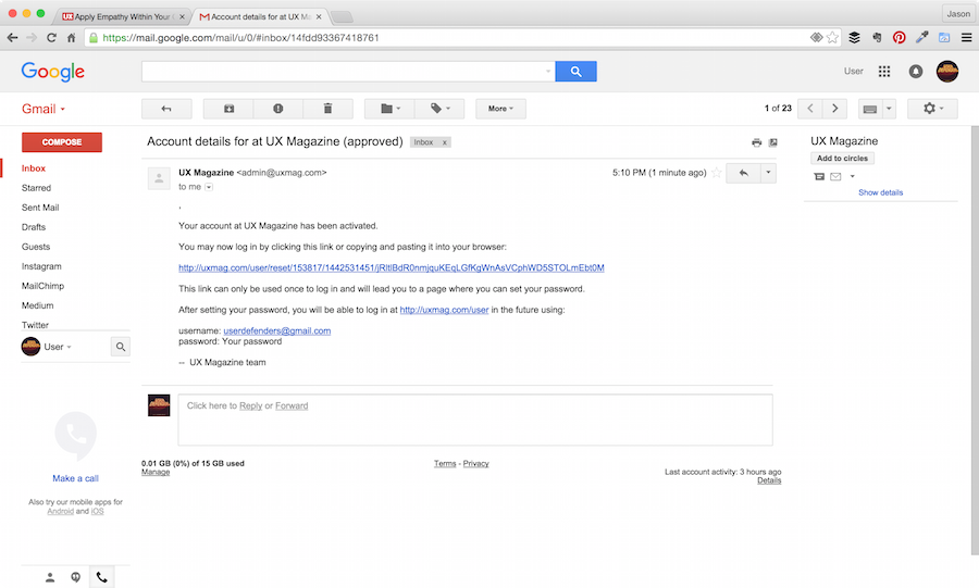
- Landed back at top of page again with user feedback message that stated: “Once you’ve verified your email address you can then sign-in”
- Had to leave and go to my Gmail account > Click verify link
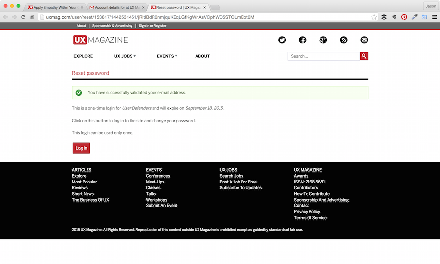
- Landed back at UXMag.com “Reset Password” page that confirmed verification but also told me other things like “This is a one-time login and will expire on xx/xx/xxxx. I was also being prompted to change password because that login can only be used once
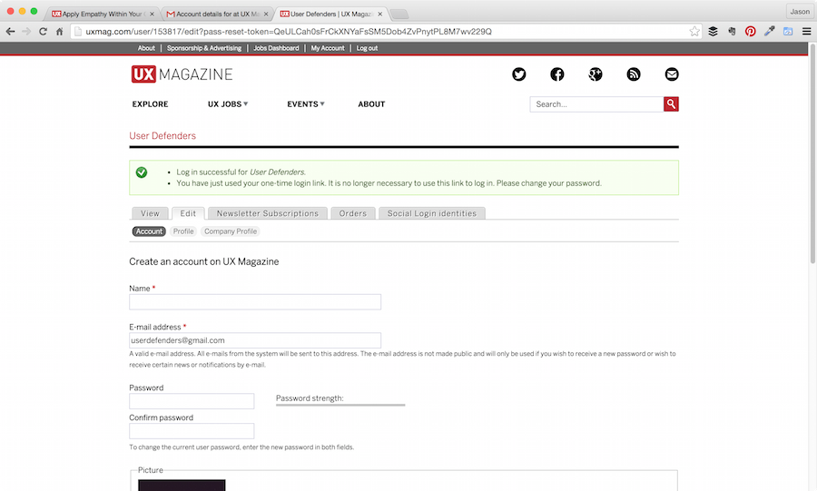
- Clicked “Log in” button
- Landed on profile page with helpful user feedback that said “Log in successful”, but now I have to change my password (chick chick, boom)
- Entered new password > annnnnd again to confirm
- Clicked Save button
- Same page refreshed with user feedback that said “Changes have been saved” (now what?)
- I had to go to the other tab of the article I originally wanted to comment on and refresh for my login and ability to comment to render

1. Clicked Google+ icon
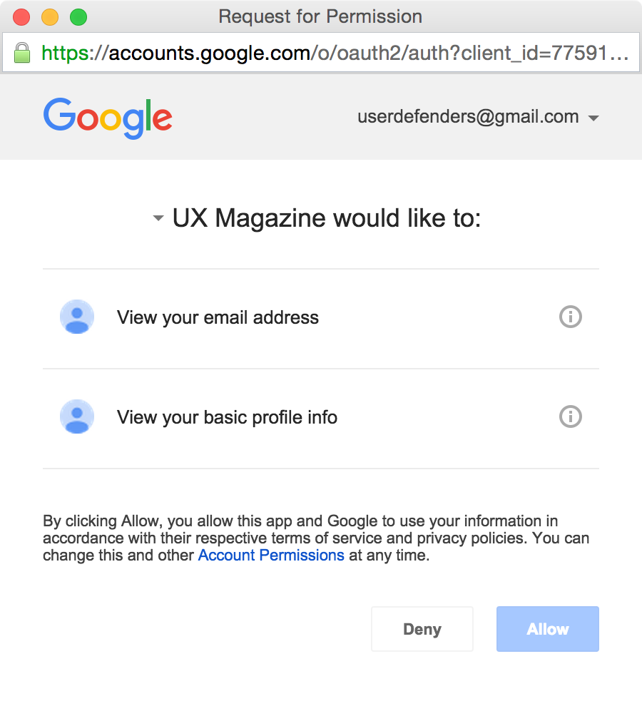
2. Pop up for Google+
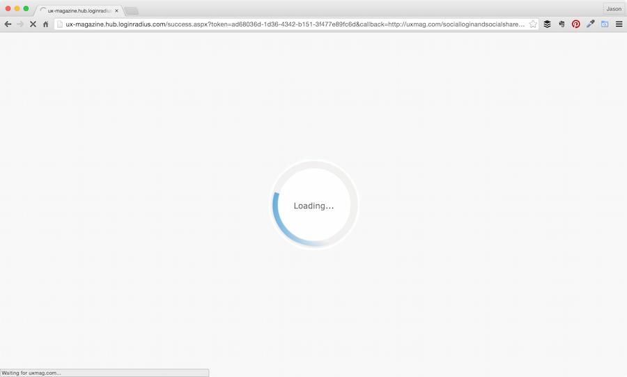
3. Custom loading screen via third-party
4. Landed back at the top of the article page
5. Clicked “Log in” button
6. Landed on profile page with helpful user feedback
7. Entered new password
8. Clicked Save button
9. Same page refreshed with user feedback
10. other tab of the article I originally wanted to comment on
Here’s how LinkedIn went down (no pun intended):
- Clicked LinkedIn icon
- Pop up for LinkedIn authentication/sign-in (thankfully pre-populated for me)
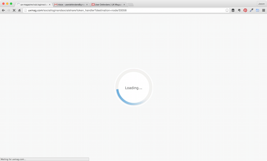
- Custom loading screen via third-party
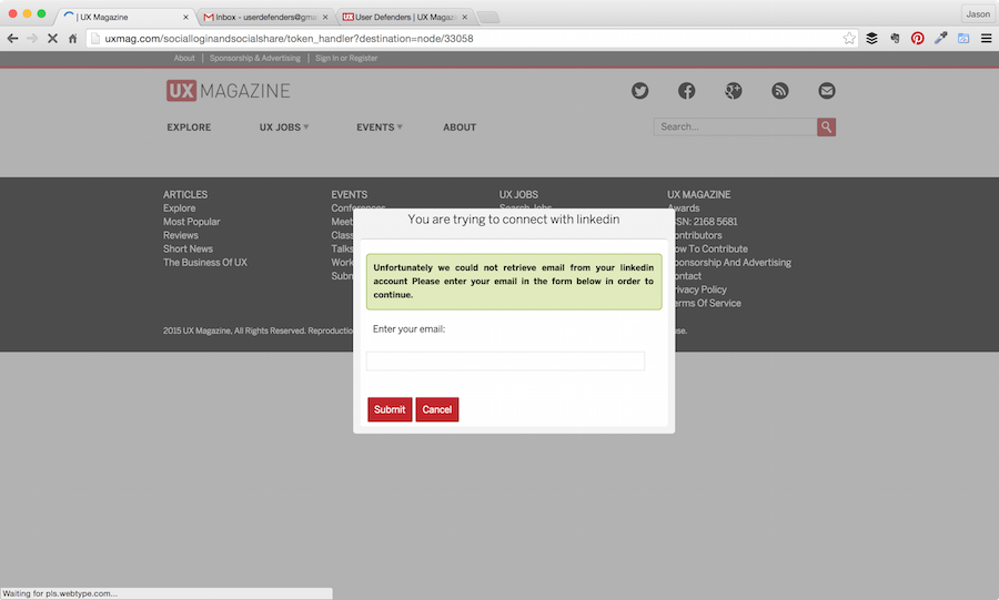
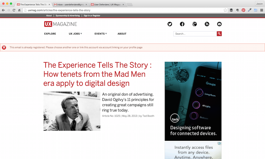
- Another popup (this time a modal) stating that “Unfortunately they (they being someone important I’d venture) could not retrieve email from my “LI” account and I must enter my email in the form below in order to continue
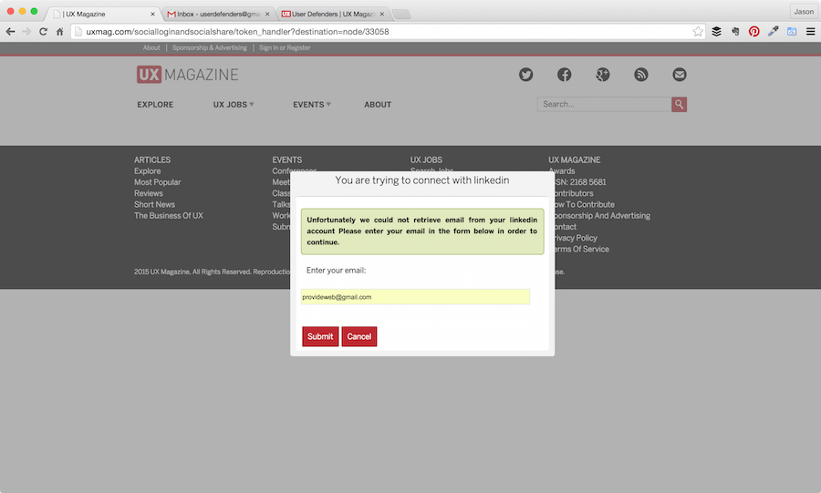
- Entered email
- Ended up back on article (everyone now, at the top of the page) with an error user feedback message that says, “This email is already registered. Please choose another one or link this account via account linking on your profile page.”
- No thanks (I’ll stick with the account I have)
1. Clicked LinkedIn icon
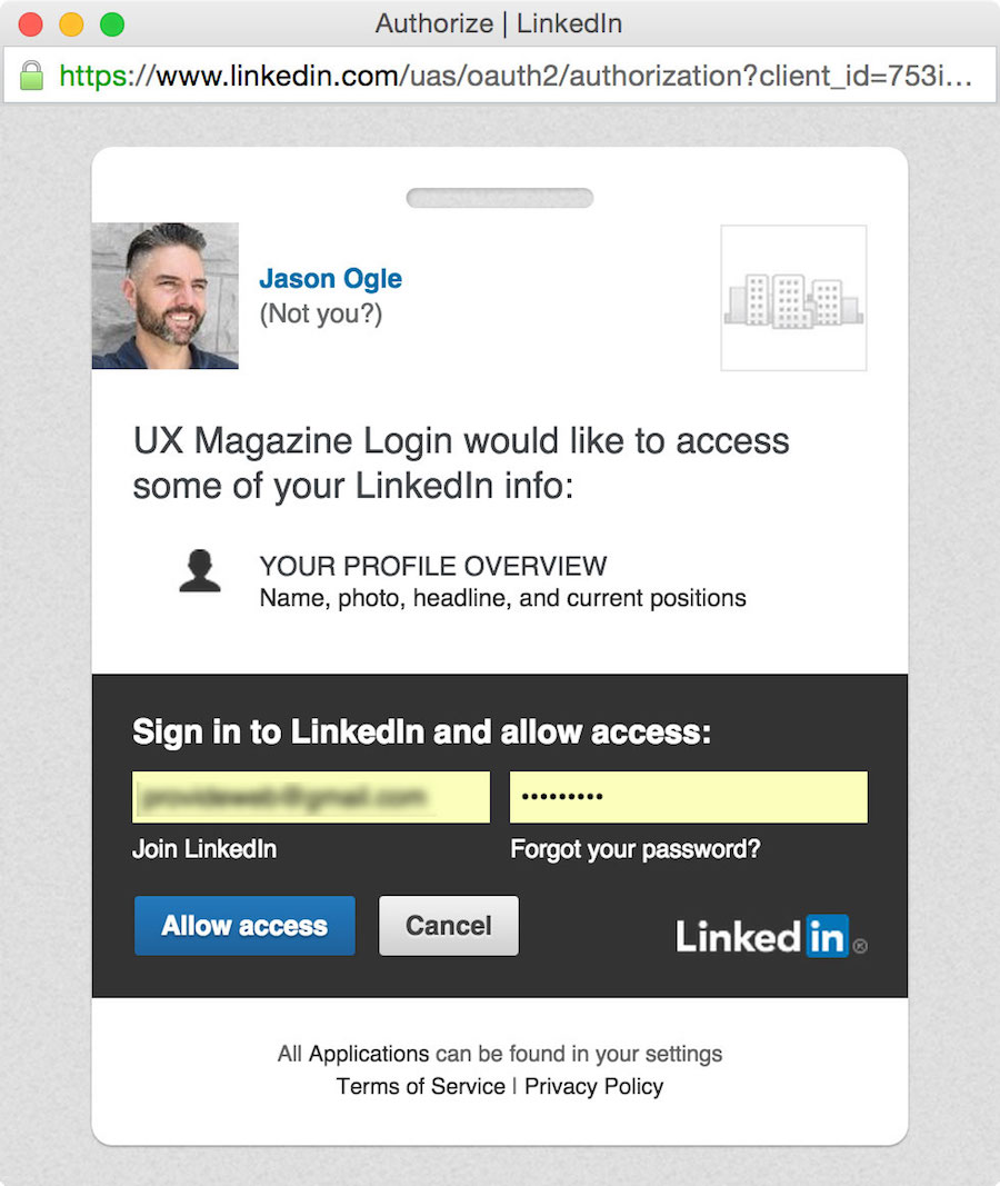
2. Pop up for LinkedIn authentication/sign-in
3. Custom loading screen via third-party
4. Another popup (this time a modal)
5. Entered email
6. Ended up back on article page
UX Mag
Not much to say about UXMag.com’s login other than I wished that icon wasn’t so lonely below the social icons. I see no reason why it couldn’t just fall in with the others at the end.
- Click UXMag icon
- Clicked Log in (pre-populated for me)
- Bam! Brought me right to a comment box with blinking cursor!

1. Click UXMag icon
2. Clicked Log in
3. Brought me right to a comment box
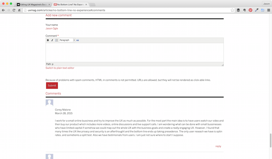
Commenting Experience/Engagement
One of the things I ended up noticing (that I wasn’t originally looking for) was the commenting experience itself. For the amount of traffic that UX Mag gets, I was a bit surprised to not see more comment engagement–especially on the four featured hero articles.
Here’s what I noticed:
- Article 1: 0 Comments
- Article 2: 2 Comments
- Article 3: 0 Comments
- Article 4: 3 Comments
I have some assumptions as to why this is:
1. Form Layout
It’s never good UX to say “Submit” on form buttons—too systemic
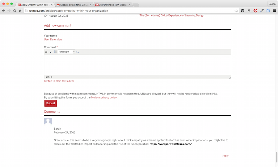
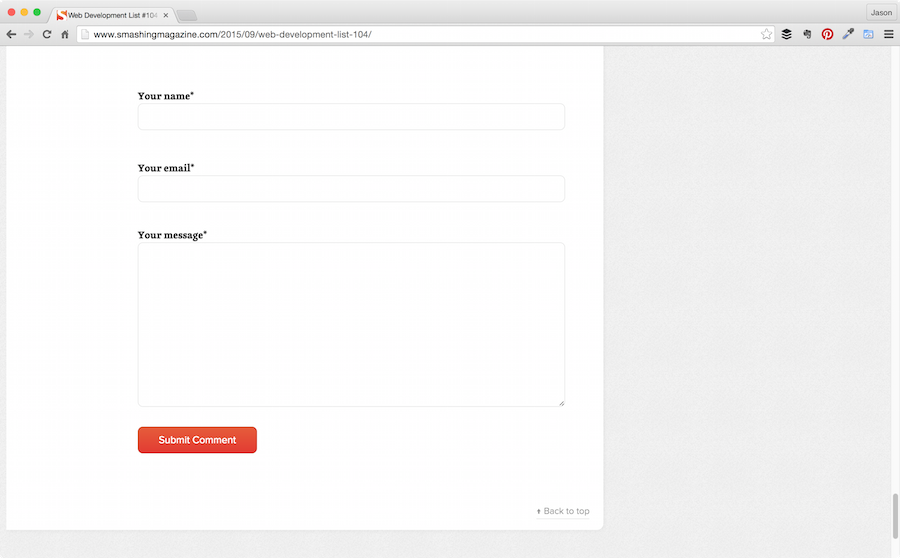
- The form UI feels condensed and the tiny Submit button is about 200 pixels below its intended contextarea (see what I did there?) I would suggest opening up the form UI and button a bit in scale (but bringing the submit button much closer to the comment box). Maybe round the edges, make it feel more friendly and inviting.
- I also wondered if the default “rich formatting options” were necessary or just more distracting? If necessary, are they really adding that much value, or are they just giving users more cognitive load away from the original task of simply commenting?
- Another possible distraction being the Switch to plain text editor link (Why?). If anything, I’d start with the plain text and give users the “Switch to rich text editor” option with all the distracting controls after
- There’s a somewhat scary disclaimer text that mentions spam directly above the Submit button. Wha? I just gave you my email address and now you’re talking about spam??
- There’s also another potentially distracting (albeit reassuring) text below the email field mentioning that user’s email will not be shown publicly
- “Submit” button has a real lack of the personality/voice demonstrated in other areas of UX Mag (see Empathy). Plus, it’s never good UX to say “Submit” on form buttons (too systemic). Instead, how about something that reflects what the user is actually trying to do, like…“Post Comment”?
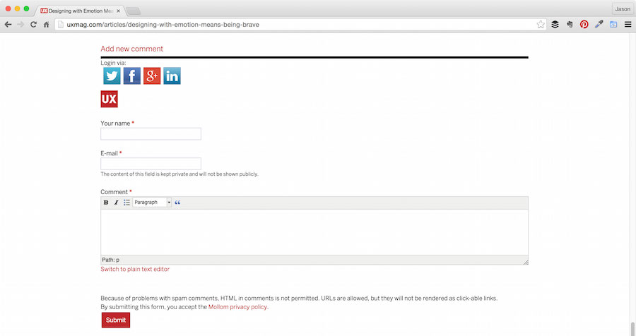
UX Mag comment UI
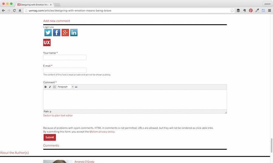
Smashing Mag comment UI
When you look at other similar high-engagement blog platforms, the comment section is pretty barebones. The objective is to remove as much barrier-to-entry as possible for the desired outcome. I believe UX Mag is trying to help a little too much with the simple task of commenting and may be actually subverting their own engagement levels in the process.
2. No Comment Count Indicator
Typically on large blogs, you’ll see a comment count indicator/hyperlink at the top of every blog article that can be clicked jumping the user down to the comments section. Adding this to each post (perhaps near title), could also potentially help increase engagement (as long as social login to comment accessibility fixed with it).
3. Author Notification System
One more assumption I had on lack of comment engagement was that there is no author comment notification system in place. I believe if each author was notified somehow (presumably through email) that someone commented on their article, authors would be more inclined to comment and help spark the conversation and thus help increase engagement/trust with their readers. [ED NOTE: We do have this feature enabled, but clearly need to check that it’s working.]
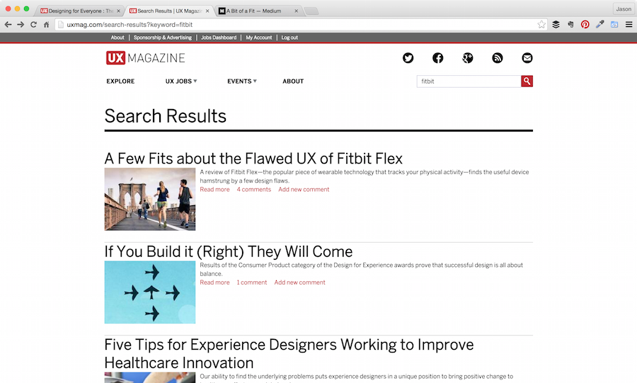
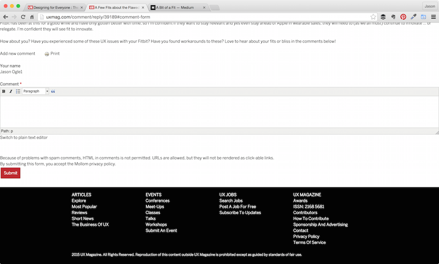
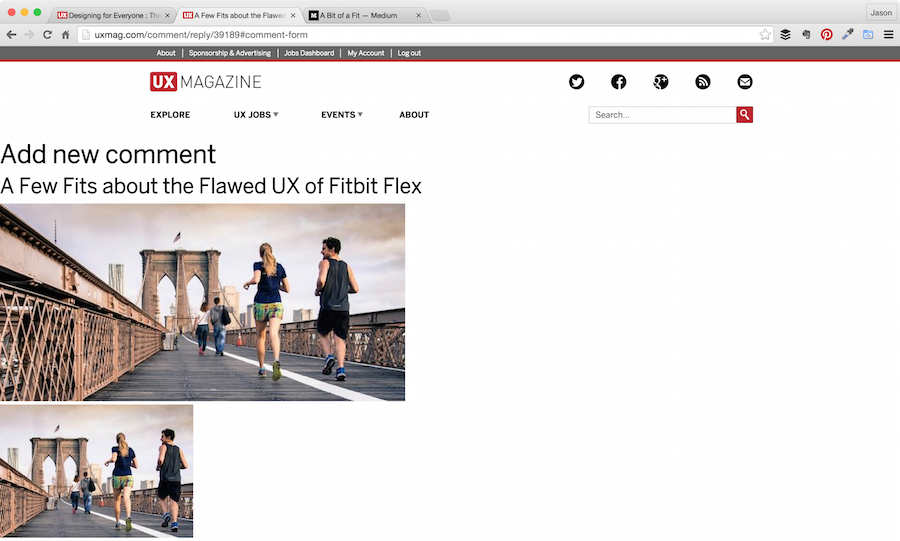
4. Search Results Comment Cluster
Something took me by surprise when I was doing my research for this. I conducted a search and in order to cover all my bases tried the “Add New Comment” link from the Search Results.

The margin of everything opens up to 100%. I instantly felt like that messenger dude in 300 with King Leonidas kicking my hind-quarters into the abyss!
Aaaaaaiiiieeee
Aaaaaaiiiieeee
Aaaaaaiiiieeee
Aaaaaaiiiieeee
Conclusion
The most important thing to consider is that nothing is truly broken here save maybe that Google+ (or minus) process … kill me now. Everything can still be accomplished; it’s just that in most cases, the user has to work a little harder to actually do so. I’d love to see UX Mag dig into to this further and evaluate some of the things I mentioned here. A/B testing could go a long way in this case to determine what’s truly working and what’s not.
I’m thankful to UX Mag for the opportunity to be transparent about the experience I had and their vulnerability in publishing it in order to introduce an accountability factor for affecting change here. This is a great example of UX leadership. Have any thoughts or suggestions on how to make this experience better? Love to hear about it in the comments!
Image of man with megaphone courtesy Shutterstock