Save

As designers, our job is to come up with elegant solutions to difficult problems. In doing so, we tend to work our way from broad ideas of possible solutions down into the finely crafted details. Knowing how to balance our time between doing exploratory work to identify potentially better solutions and really diving in deep to dial-in the details of a single solution is one of the skills that really makes a seasoned designer stand out.
The tools we use to do design have a big impact on the level of detail in our thinking. Different tools are suitable for different phases of the design process. For initial exploration, people often like to draw by hand, making rough sketches in their notebooks. Others use sketching or wireframing software, like Balsmiq, at this stage. For later in the design process, tools like Sketch or Figma are nice for making very detailed, pixel-accurate designs.
There is a general sense that sketching is good for exploring options. Sketches are fast to make and allow us to explore high-level concepts, like flow and information hierarchy, quickly and easily. And since they are easy to create, they are also easy to discard. Designers don’t fall in love with their sketches.
The downside of sketches is that they are often difficult to user test. Both users and executives tend to have trouble understanding the sketches and relating them to an actual product.
Users can more-readily respond to pixel-perfect comps of course. It’s easy for them to understand the flow when they can interact with the designs just like a real product. But these are time-consuming to make, which means that designers usually don’t make a lot of variations. The creation effort also makes a designer loathe to scrap them.
There is a belief in the design field that when you show a potential user pixel-perfect designs, they tend to critique small details, like the margins or the color of a button, and spend less time thinking about the overall flow. For a wireframe or sketch, these details are missing, and users give more high-level feedback on the overall design direction. In my experience, this is a mixed bag. Even when I’m making a sketch, I’m already committing dozens of design decisions to paper — the relative size of different areas, the information hierarchy, and even often the type of control being used. And while sketching is definitely faster than building pixel-perfect mock-ups, it still takes a long time to generate a complete flow for any moderately complex design.
To complicate things further, modern applications are often designed for multiple endpoints. We need to think about desktop, mobile, and even voice. There may be multiple brands or styles to consider, each with their own design system. When we work at the sketch level, we are often still locked into one of these and risk only exploring solutions that are optimized for a single endpoint.
What would be truly ideal is if there was a way of sharing a design that was faster than sketching, high-level enough that it did not tie us to any specific design detail, but realistic enough that we could actually compare and validate different design solutions with users.
Enter Narrative Design
Narrative design is a way of describing a design solution entirely with text. It’s telling the story of how the user would accomplish their job or task without reference to any particular platform or modality.
For example, let’s imagine you are working for a bank, and you’re adding a new capability to allow the user to make a direct payment to another individual. The narrative design might go something like this:
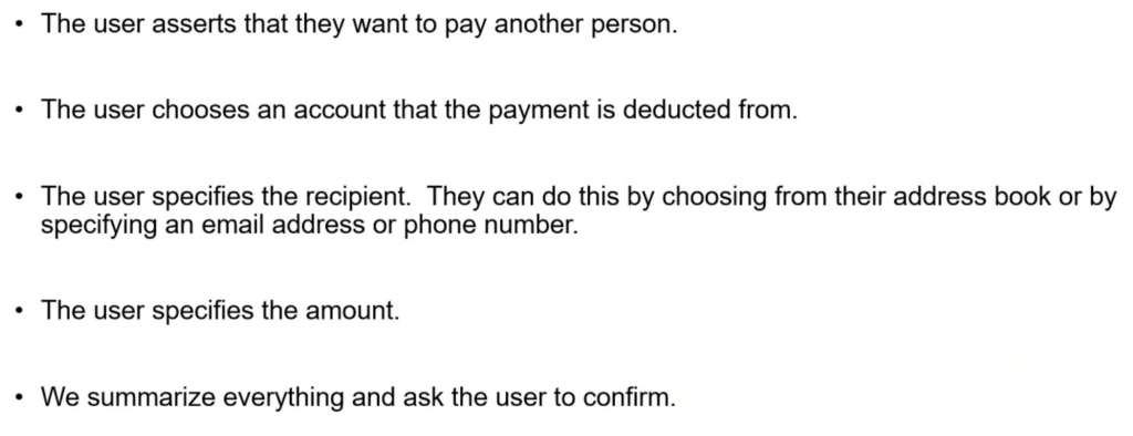
As you can see, narrative design is exactly that — a narrative. There is, of course, a little more to it than that. You may notice, for example, that the narrative has some particular language, using verbs like asserts, chooses, and specifies.
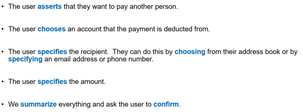
These highlighted special words are unique speech acts, and each one is chosen to represent a unique type of interaction. For example, “choosing” is selecting from a set of options, while “specifying” is for open-ended input. These same speech acts are implemented differently on different systems. For instance, on a website, a choice might be represented in a <select>, while in mobile, it might be in a pop-up list, and in a voice assistant, it might be read off in a numbered list. But the act itself is consistent, and in general the cognitive load of performing a particular speech act is the same, regardless of the platform. This fixed complexity enables us to evaluate the complexity of a narrative design quickly and easily.
One of the first places where we can start thinking about improving the design is in the selection of the speech acts. For instance, when someone is withdrawing cash from an ATM, we know that there will be limited denominations of bills. We also know that users probably aren’t too concerned with getting an exact amount to the dollar. Therefore, we might have the user choose from different common amounts (with a single tap) rather than specify the exact amount they want (with the numeric keypad). We can also combine these, in which case the narrative might be “The user can choose from 5 common amounts, or choose‘other’ to specify a custom amount.”
Every UI pattern ultimately implements some kind of speech act. So we have speech acts for asserting, confirming, consenting, warning, alerting, apologizing, suggesting, informing, and so on.
Narratives and concepts
Narratives can also be analyzed for concepts. A concept is something that the user needs to understand in order to properly follow the narrative. Let’s look at some of the concepts in the narrative we just discussed:
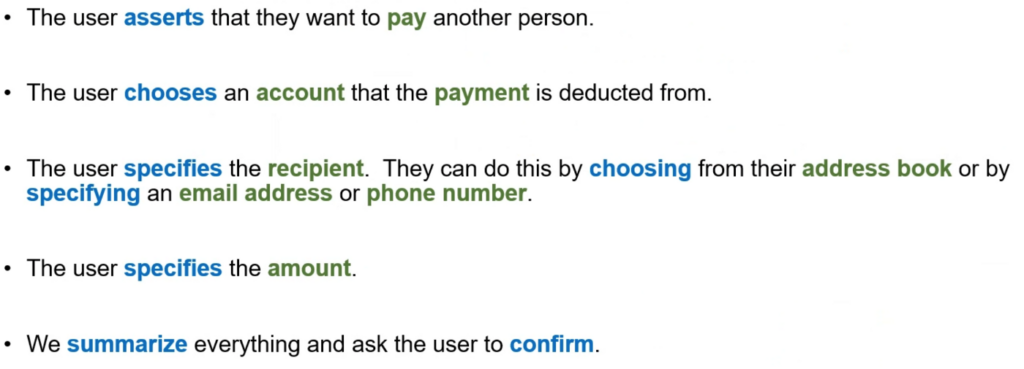
For this design to work, a user needs to understand the concepts of paying, an account, a payment, a recipient, an address book, an email address, a phone number, and an amount. By pulling these out of a design, we can do concept validation with users. We can find users and see if they understand these concepts. We can develop these concepts by identifying their properties, such as: an account has an owner, an account number, and a balance. By listing the concepts, we can also be sure that we keep track of any new concepts we are introducing.
As designers, we want to be very careful to control the concept space of our designs. Limiting concepts by reusing existing concepts the user already knows, and being mindful when introducing new concepts, is one of the best ways to keep a design simple and easy to use. When designing using graphical tools, it’s easy to accidentally introduce a new concept without intending to do so. In a narrative design, the concepts are easy to identify.
Concepts also work closely with speech acts when we are implementing a UI. For instance, what the user needs to effectively choose between different people might be quite different from what a user needs to choose between different bank accounts. In our design system, we can have different components for choose account vs. choose person.
Concepts also really help the content strategy team. The concepts can become the core lexicon of terminology that the product’s content is built around.
Obtaining Narratives from Users
Once you have a narrative, you can take it to users and see how they respond to it. Narrative designs are very easy for users to understand. You can have them review different narratives and see which one they prefer. You can also ask them to make their own narratives and compare that to the narratives your team makes. The results are often surprising.
For instance, in our payment example, we might find that when most of our users talk about making a payment, they specify the person first, then the amount, and only think about the account at the end, and then only if they have multiple accounts in the first place. Based on that, we might change our flow:
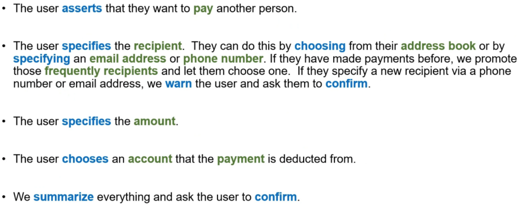
Compared to other design representations, changing a narrative or making multiple revisions is trivial — much faster even than making a new napkin sketch.
Narratives and Threats & Delights
In a previous article, I discussed the concept of threat in UX. Simply put, a threat is something that could go wrong with a design, no matter how trivial or unlikely. We gather those threats and categorize them based on how likely they are to occur and what the impact is if they do. We then try to improve the design to mitigate threats, especially critical ones.
Conversely, we also want to think about delights. Delights are the opposite of threats — something that could unexpectedly go right. Something the design can do to exceed the user’s expectation and go above and beyond. Like threats, we can think of delights in terms of frequency and impact. In an ideal world, every flow we make in our UI has some moment of delight.
One of the advantages of working with narrative design is that it gives an easy framework for assessing the threats and delights in a design separately from the threats and delights of the actual interface components from which the design is created. In a narrative design, we can go through the narrative sentence by sentence looking for threats.
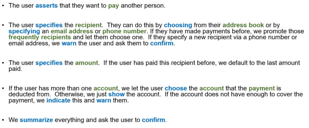
For example, in our narrative, we say “the user specifies the recipient”. What could go wrong? What if the user doesn’t know if they should use email or phone number? What if the user knows the phone number but types it wrong? What if the person they are sending the money to doesn’t want to give the user their phone number but still wants to be paid? These are all threats that can be evaluated. We can help mitigate some risks, by letting the user send from their address book and by checking that emails and phone numbers are valid. We might learn that users frequently send money to the same people, so we can warn the user if they’re sending money to someone new.
For some of these threats, we might address them by modifying our narrative, like this:

Not all threats need to be addressed. For example, we might decide that even though some people might not want to share their phone number to receive a payment, most people would be OK with that, and we won’t bother to change the narrative to support this edge case. If we decided it was a big deal, we could come up with a narrative to handle that as well. For example, the recipient could go to a special website to generate a one-time payee code and then share that code with the user. Ultimately, it is up to you as a designer to decide how serious a threat is and whether it warrants mitigation. The amount of mitigation spent in a clinical healthcare application where life and death are on the line will be very different than for a casual social networking site.
We can add delights in a similar manner. For instance, we might find from users that they frequently make payments of the same amount to the same person, such as a kid’s allowance or weekly fee to the gardener. We can add that into the narrative as well.
Narratives and developer validation
Another big advantage of narrative design is that the narratives are very useful for the development team to validate and estimate dev work against. For example, if you just tell the dev team that they are doing payments, they may think they only need a simple payment API. But if they see the narrative above, they can immediately see that they’ll need a lot more back-end work to implement this design. To know if someone has made a payment before, they are going to need to store information whenever a payment is made and be able to retrieve it quickly. To show the default payment amount for a payee, this information will need to be stored as well. A well-formed narrative will allow the engineers to understand the major needs and potentially push back before the team goes too far down a design path. For instance, they may say that storing that payment information is too expensive, or even might be restricted for legal reasons. Narratives can even be used to create the initial specification of a data schema that will drive your UI (see my article on design & graphQL.)
Other teams can also contribute to the narrative. Let’s say that at our bank, the fraud team raises the threat that the user might be getting scammed into making a payment to a bad actor. This team might have already stood up a service that can tell if a payment is suspicious given the amount and payee, but that service might take a while — 5 seconds or more — to execute. Based on this, and the knowledge that bad actors make up a very small % of the total payment volume, we could add that to the narrative, but place it at the end, when the user is more willing to wait.
The final narrative might be something like this:
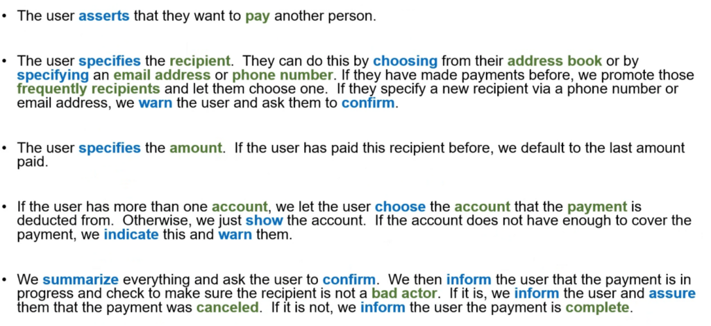
If you are working in a regulated space where there is a lot of compliance and review, such as banking or healthcare, narrative design can be a lifesaver. These teams can review and provide feedback at the narrative level, rather than waiting for near-final designs. This allows their feedback to be taken into consideration much earlier in the design process.
From Narrative to Detailed Design
Once the narrative is complete, validated, and approved, we can use that to build the detailed design. For this, we use the design system(s) on the various endpoints to construct the narrative. The exact same narrative could be used on the mobile app, the ATM, the website, and even the chat assistant. They use the same speech acts and concepts, and can even have the same threat profile and delights. It’s a great way to ensure consistency of the experience while giving each platform the ability to realize the speech acts and other patterns in the most effective native way.
Next steps — try it!
Now that you’ve been introduced to narrative design, I encourage you to try it in your own projects. Perhaps one of the best parts about narrative design is that it is so easy to get started with it. No special tools are needed. Don’t worry if you’re fuzzy on things like speech acts and formal concepts right now. You can start slowly and build those up over time. Let me know how it goes, and feel free to ask any questions.
Good luck!
I have worked in the computer field basically forever, since about 1982, from academic research to gaming start-ups to Fortune 10 software companies. My first computer was a Bell Labs CARDIAC. I still have it! I have extensive experience in China. I lived there for more than five years and am very knowledgeable about the software and interaction design industry there, particularly around mobile. I have worked for most of the large tech companies, including Apple, Microsoft, Facebook, and Google in a variety of innovation-focused roles, including social research, finance, and healthcare. I have formed several companies, including the social networking application Heard and the children's creative play company ImaginEngine. I also have done extensive consulting on UX design and architecture for many large and small companies including DeviantArt and Riot Games. In my down time I have a lot of hobby activities including fiction writing, performance poetry, Search & Rescue, and cinema.
- Narrative design is a way of describing a design solution entirely with text by telling the story of how the user would accomplish their job or task without reference to any particular design platform or modality.
- Narrative designs are very easy for users to understand.
- Working with narrative design gives an easy framework for assessing the threats and delights in a design separately from the threats and delights of the actual interface components from which the design is created.
- Narratives are very useful for the development team to validate and estimate dev work against.
- Once the narrative is complete, validated, and approved, designers can use that to build the detailed design.


