Save

There are a lot of definitions of user experience. All of them are different but have one common feature: each definition of user experience mentions the human element of it. For instance, the definition provided by Wikipedia is the following:
User experience (UX) is a person’s emotions and attitudes about using a particular product, system or service.
According to Nielsen Norman Group:
User experience encompasses all aspects of the end-user’s interaction with the company, its services, and its products.
This is why, to develop a successful user experience, the UI UX design company has to understand the person who is going to use it. This is where knowledge of psychology in UX design comes into use.
So, in this article, I would like to have a look at a few essential psychological phenomena and at the ways designers can use these phenomena in their practice. After all, psychology and user experience go hand-in-hand. Buckle up! This article promises to be very interesting!
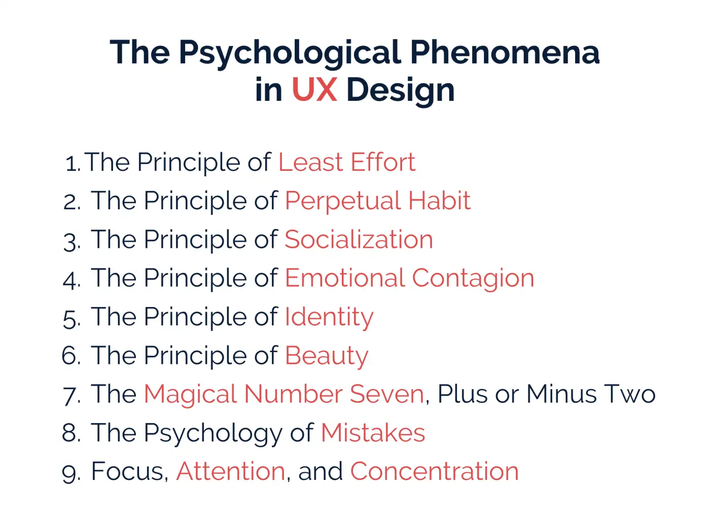
The Principle of Least Effort
The Principle of Least Effort is pretty simple and self-explanatory: people are looking for ways to complete tasks with the least possible effort. This principle applies not only to people but also to animals and even machines — the simplest algorithm is always the most attractive one. For example, if you have two paths that would get you from one place to another place, you will choose a shorter path given that they are equally safe and comfortable.
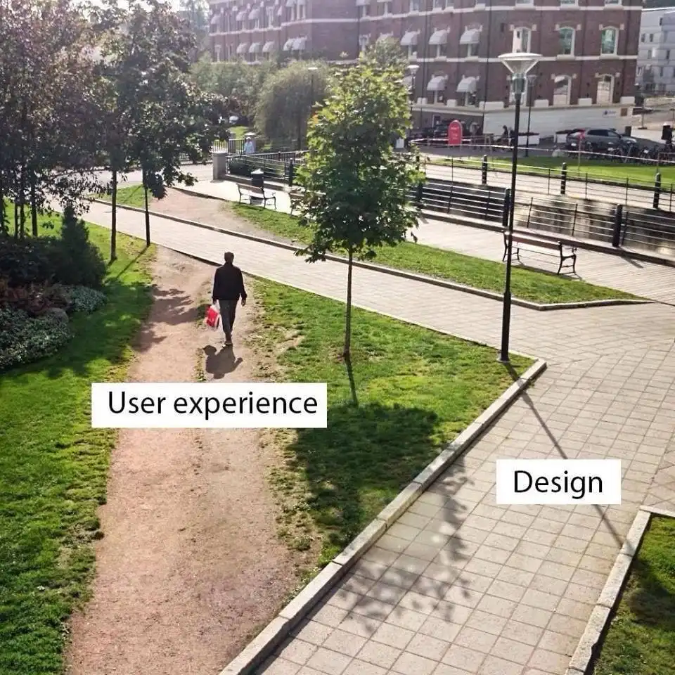
Retrieved from https://miro.medium.com/max/1200/1*pMk3h0dIYMb_I1iJCjriPQ.jpeg
What can you do as a UX designer to address this principle?
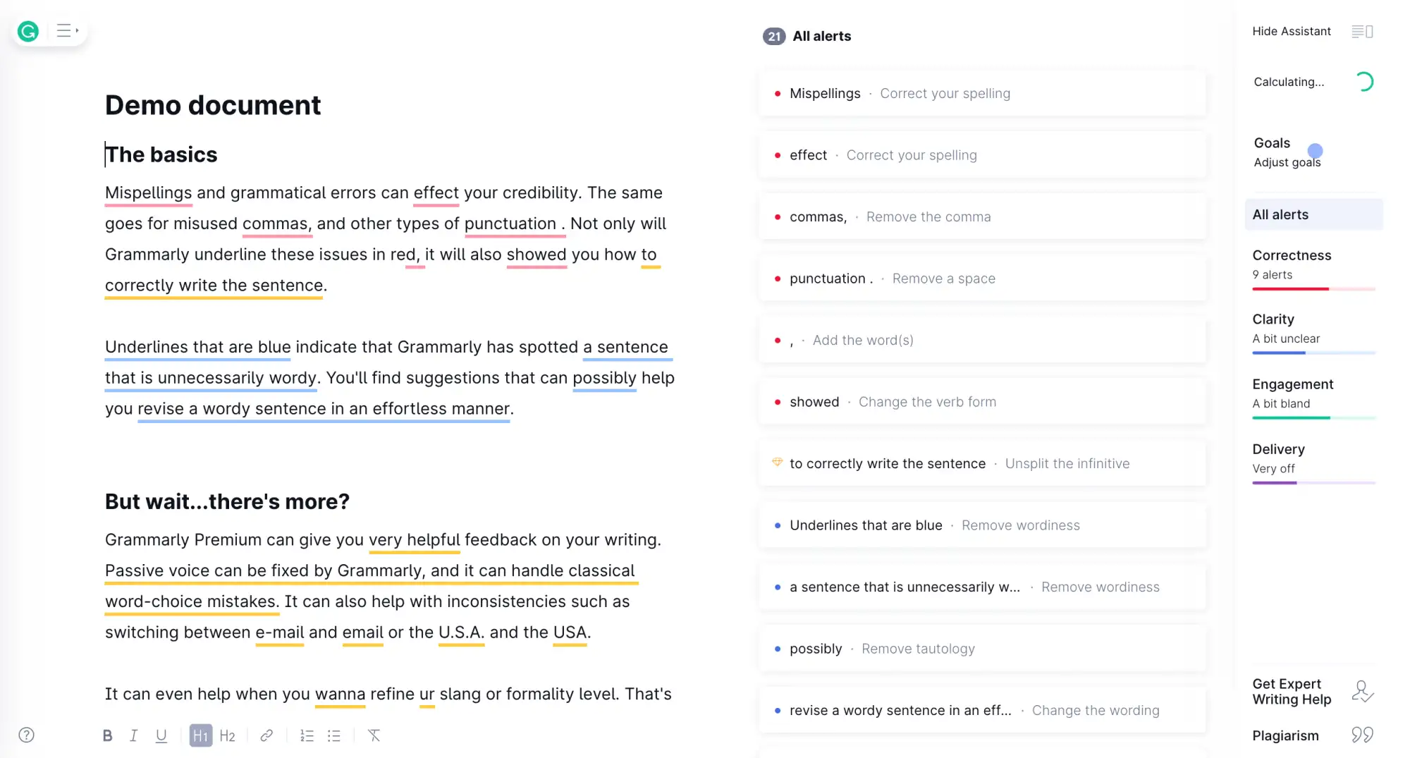
1. When you have to explain something to your users, for instance, when onboarding them, instead of telling about it in the text, show your users an example. The greatest example of such a web design psychology practice is the onboarding process of Grammarly. Instead of looking at endless guidelines about how to use Grammarly or learning to go around the system by oneself, the user opens a demo document and learns about how to use the system on a real-life example.
2. When you choose to explain something in the text, make sure that this text is as concise as possible, that all the information is meaningful and important. Do not clutter up space with unnecessary details or words.
3. If there is a lot of similar information, use grouping. If the groups are large, use sorting and filtering. It is also a good idea to have a Search Bar. For instance, if you have a Blog page on your website, and there are a lot of articles, try grouping them by topics. Also, consider implementing sorting or filtering by date. Besides, the Search Bar will also grant your users an opportunity to find what they are looking for easily and quickly.
4. Make sure that the users understand well what they can or cannot click. Buttons and in-text links should look like buttons and in-text links. If the images are clickable, show that they are clickable with the help of the hover effect. Honestly, the most annoying UX thing I have ever encountered were the buttons “download from the App Store” and “download from the Google Play” that were not clickable.

5. The opportunity to use a decorative font may seem very attractive, but make sure that this font is legible. For instance, look at the font below. Do you feel comfortable deciphering it?

Also, remember about the size, color, and contrast of fonts. If the text is too small to read without scaling the page — it is a problem. If the color of the text and the color of the background are not contrasted, if they do not interact well — it is also a readability problem. To test this factorial design psychology aspect, use such tools as Usecontrast and Colorsafe.
The Principle of Perpetual Habit
The principle of perpetual habit states that people greatly rely on their memory and habit when doing this or that task. For instance, if you are a frequent flyer, you know that you go to check-in first and leave your luggage, then you go through a security check, then through the customs and duty-free, and then you approach the boarding gate. If for some reason, you arrived at the airport, and the whole process started not with check-in but with customs, you would grow confused, perplexed, and angry. The same applies to website and mobile app users — they want the things to be where they should be.
What can you do as a UX designer to address this principle?
1. Do not grow too desperate in your effort to make the website stand out. Keep the things traditional where they should be. For instance, the footer should be at the bottom of the page, and the side panel should be to the left.
2. Keep the website layout and navigation simple so that the user could learn to go around your website in one or two sessions. All the essential pages have to be one click away from the home page. In fact, this is useful not only for user experience but also for SEO.
The Principle of Socialization
Aristotle once said,
Man is by nature a social animal.
The rule still applies in the twenty-first century, in the era of the Internet. It has translated into user psychology in UX. People want to be social, and they greatly rely on technology in order to achieve it. More than that, they use technology in order to feel accepted into society. Here is what you may make of it.
What can you do as a UX designer to address this principle?
1. You absolutely must implement buttons for social media. Here, users can access your accounts on different social media platforms. This is beneficial for both you and your users. You increase social engagement, and your users get a convenient for them way to contact you.

Also, if your website features a blog or a forum, implement buttons for social sharing. This way, if a user really enjoys some of your statements or posts, they can share it with their friends. They feel happy sharing something worth reading with their community, and you should be happy for reaching a broader audience.

2. Implement product ratings, app reviews, or client testimonials for the users to see that the product or service you provide is loved by other people. Subconsciously looking for social validation, your potential users will follow the example of your satisfied customers and take the action you want them to take.
The Principle of Emotional Contagion
Have you ever noticed that emotions are contagious? If a person you like is laughing out loud, you will be smiling. If somebody in a very well-made movie is crying, you will feel sad. This is the psychology of UX design and of human beings — we subconsciously take over the emotions and behaviors of other people, especially of those we like.
What can you do as a UX designer to address this principle?
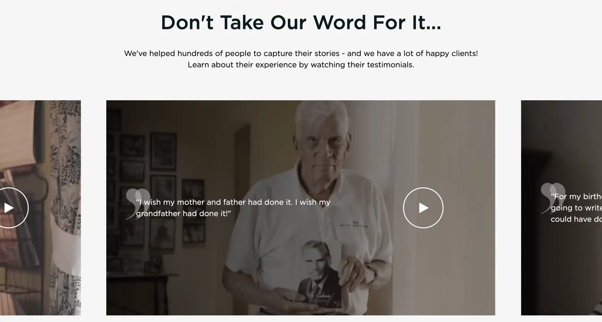
Target one’s emotional self by showing them emotional pictures or telling them emotional stories. For instance, StoryTerrace features the stories of their customers, but they are not just about how successful their experience was but about how happy and joyful and emotionally important it turned out to be. For instance, there is a story of an elderly man who wrote his biography with the help of StoryTerrace. He admits that he wishes his parents and grandparents had written about their stories as well. The video of the man telling the story looks very professional, emotional, and almost movie-like. By appealing to the feeling everybody is familiar with — love to parents and grandparents, — StoryTerrace shows how important their services may be.
The Principle of Identity
All people need a sense of identity, a feeling of belonging, an understanding of who they are. This is why applications and websites with wallpapers are so popular — people customize their devices to feel unique. This is why people collect awards and medals — to feel appreciated and recognized. This is why people make friends — to feel associated with somebody.
A similar thing happens with brands — people like associating themselves with brands because it gives them a sense of identity. “I prefer products from Google, so only Google Pixel and Google Home for me”. “I prefer coffee from Starbucks, so no Dunkin Donuts”. “I wear only Nikes”.
What can you do as a UX designer to address this principle?
1. Develop your company brand. Use unique colors, logos, messages, slogans in order to underscore the uniqueness of your brand. Use photos to show the actual people behind your service or product. Send out newsletters, digests, or email discounts in order to remind your audience about your brand. Most importantly, position yourself as a one-of-a-kind brand: what is the unique value that you offer to your users?
2. Show that you care about your users. At each stage of user experience, provide your users with feedback: “This picture has been successfully saved” or “Your request has been sent, and you will get the response in under 5 days”.

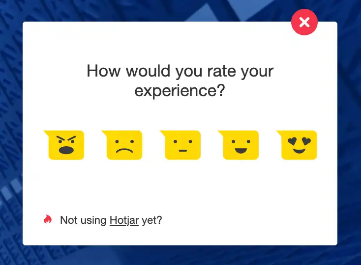
3. Do not forget to ask for feedback from your users. Create a form, which asks “How would you rate your experience with our website? How can we improve it?”. However, make sure that this form is not annoying — it should be easy to skip or close, and it should not turn out too often. In the best-case scenario, offer your users some kind of reward for their feedback, for instance, a free asset in your game or a discount in your online store.
The Principle of Beauty
Numerous psychological studies prove: beautiful people and beautiful things are always more loved and popular than unattractive ones. People choose books by their cover. Given the opportunity to choose, people choose beautiful places to travel to, beautiful houses to live in, and nice clothes to wear. Few people can stay away from pursuing beauty. The concept of “beautiful” is often associated with the words “expensive”, “successful”, and “high-quality”.
What can you do as a UX designer to address this principle?
In the psychology of web design, beauty is all about User Interface.
While the concept of beauty is quite subjective, there are some general tendencies to follow:
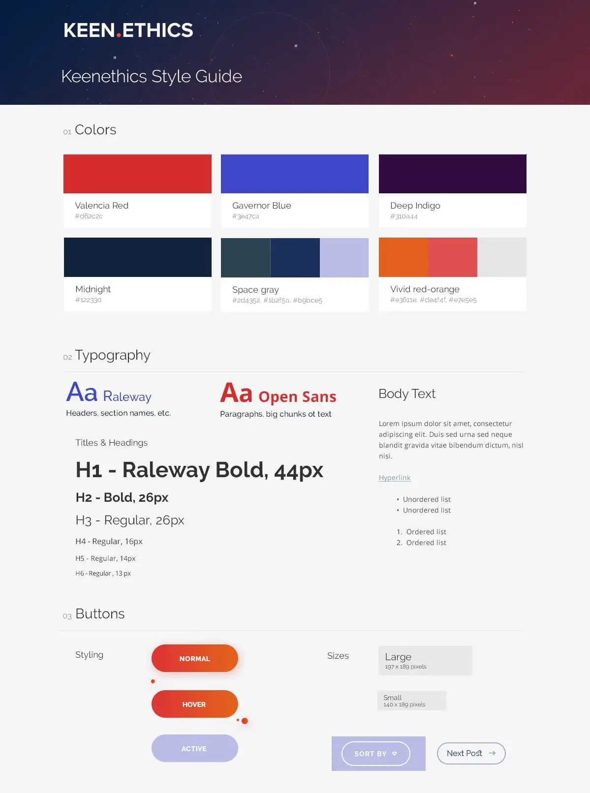
1. Create a design system, and follow it closely. Do not mix fonts, colors, button styles, navigation elements, icons — stick to the style guide. For instance, this is how the design system for the previous version of our website looked like:
2. Keep an eye on market trends. Have a look at the two dashboards below. The first one is from the 2000s, while the second one was designed in 2020. The one above could have been nice and popular two decades ago, but today‚ it is outdated. It does not make an impression of an innovative, fast, and functional product. The second one probably would not be perceived OK in the 2000s, but looks perfectly fine today. The bottom line is: make sure that your design is relevant and topical, that it faces the expectations of a modern-day user.

Retrieved from https://magora-systems.com/digital-dashboards/
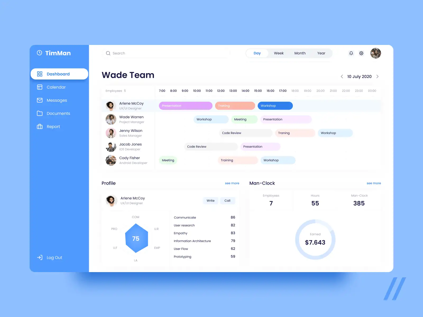
Retrieved from https://dribbble.com/shots/13793573-Project-Management-Software
3. Look for inspiration on such beautiful design platforms as Dribble, Behance, or Muzli.
The Magical Number Seven, Plus or Minus Two
“The Magical Number Seven, Plus or Minus Two: Some Limits on Our Capacity for Processing Information” is a psychological article published by George A. Miller — the cognitive psychologist at Harvard University. According to this paper, a person can hold from five to nine things in their short-term memory. The “Seven Plus or Minus Two” rule is also known as Miller’s rule.
What can you do as a UX designer to address this principle?
1. Do not make people remember more than they can remember. If your website is an online store, you should feature from five to nine products per page. If you develop a game, do not make people focus on more than seven things at a time. If for some reason you have to include many similar elements — group them.
Here is a good example from Trello. If you look at the action bar to the right, you will see that it includes sixteen possible actions. However, they are split into four relevant groups. So, if you are new to a Trello, and you would like to Copy this card quickly, here is what you do. You have a look at the first section, understand that the action you need is not there, and move down to the second section. You look through the second section, do not find the “Move” button, and go down to “POWER-UPS”. The button is still not there, so you have a look at the fourth and last section and see the button you are looking for. If the sixteen buttons were not split, you would be looking through the entire list up and down hectically looking for the action you need because you cannot focus at sixteen similar things at a time.
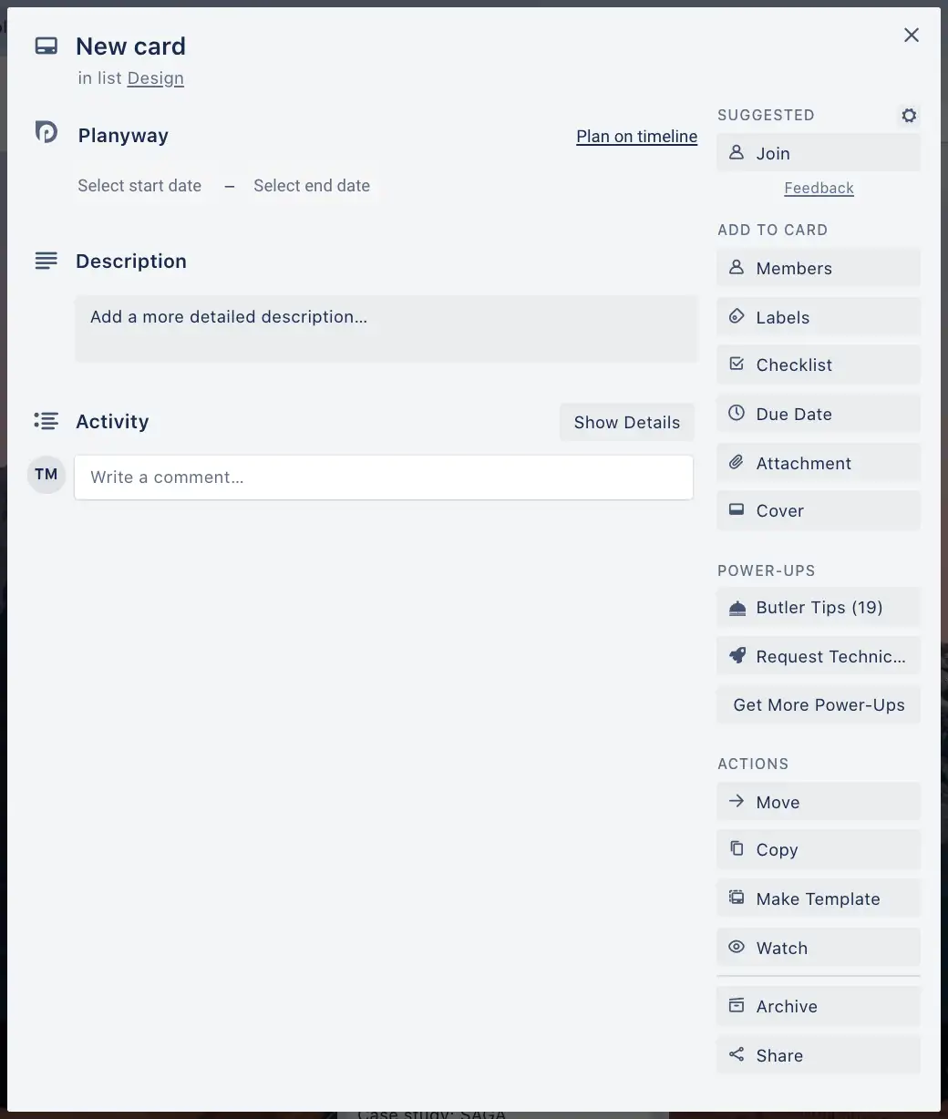
2. If there is a lot of information to be given to the user, disclose it progressively. Split a long process into phases, with each being supported with a relevant chunk of information. For instance, when onboarding you users, do not present all the info on a single screen — split the information into a few steps.
The Psychology of Mistakes
All people make mistakes. Mistakes spark a wide range of emotions in people’s minds, chiefly negative ones — from sadness and anxiety to procrastination and apathy. Regardless of its severity, a mistake is still a mistake, and it is annoying. What are the mistakes in terms of user experience design psychology? These are counter-intuitive, unclear, or misleading scenarios, which prevent people from achieving their goals with the software. For instance, there is an online store of eco-products I truly love, but every time I make an order, I face a certain difficulty. Once I proceed to online payment, I have to include the order number in the payment description, but this number is nowhere to be found. It is neither on the payment page nor on the check-out page — I still have no idea where to find it. As a result, I am struggling to make a purchase and looking for a different store.
What can you do as a UX designer to address this principle?
1. Try to predict where users may make mistakes, which function or flow may seem obscure or confusing, and eliminate such uncertainties. The easiest way to do so is to perform user testing.
2. In case of some serious actions, such as booking flight tickets or sending money, you have to implement action confirmation. It can be a simple pop-up with the words “Are you sure you want to proceed?” or email verification.
3. Do not neglect the “undo” button. The ability to cancel recent actions provides users with the feeling of being in control of your app — this feeling is a pillar of powerful user experience.
4. If a mistake happens, let users know about it. For instance, if there is an input form with data format validation, let the users know what they do wrong. It is particularly topical for phone numbers and dates since the formats of these may differ greatly.

Focus, Attention, and Concentration
Normally, the attention span of an adult is from ten to twenty minutes. After this short time, people tend to lose focus and concentration and get distracted by their own thoughts or the things around them. The job of a UI/UX designer is to grab users’ attention and to retain it for as long as needed. To do so, you have to reduce distractions and break the monotonous routine.
What can you do as a UX designer to address this principle?
1. Do not use random pop-ups, banners, or sounds in order not to distract your users. It is very annoying when you open a website and get attacked by multiple pop-ups, sounds, chatbot windows, cookie notifications, discount banners, and flashy offers.
2. Your product has to stand out — people are attracted to and interested in something new. This is why make sure that your UI is memorable and unique. However, do not outdo it — remember about The Principle of Beauty.
3. For customers to stay concentrated, they need to understand where is the beginning and the end to the process they engage in. It is a great idea to add some kind of a timeline, which would illustrate which step the user is currently at and how many steps are left.
To Wrap Up
Once again, UI/UX design is all about human psychology. You design not a product — you design interaction with the user. This is why you have to know your users, their human nature, their inclinations, weaknesses, strong points, and fears.
Keep the nine aforementioned UI UX psychology principles in mind, conduct thorough user testing, and remember that you are not a user.
Olga Boichuk is a UX/UI Designer at KeenEthics. She has a lot of experience building UI systems, with projects like a Marketing Solutions Platform, an HR platform for employee evaluation, a Recruitment app for searching talented candidate, designing a communication platform (web/iOS/Android), and designing several corporate landing pages.


