The Palo Alto Medical Foundation clinics in Palo Alto and Redwood City, California, are beautiful pieces of architecture. And both campuses confuse the goo out of new visitors trying to find their way around.
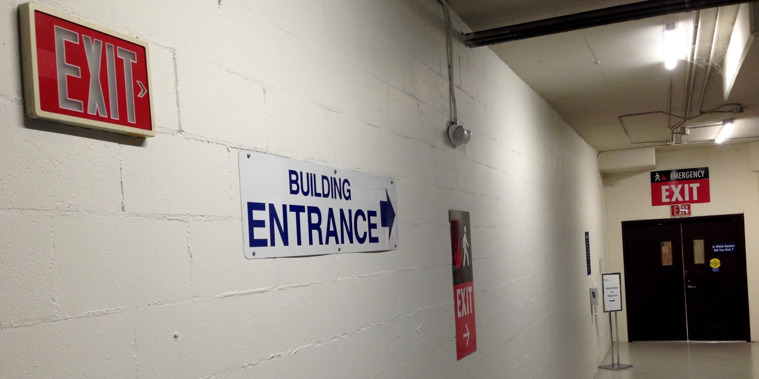
A case in point is this signage classic at—well, let’s call it a portal between the Palo Alto clinic’s underground parking garage and the clinic building. Is this an entrance? Yes. Is it an exit? Uhhh, that’s the rub.
These contradictory signs have been at this spot since the Palo Alto campus opened around 2000. At the time, I was busy trying to break into the business of designing wayfinding systems. Two friends separately called to say, “The Palo Alto clinic needs wayfinding help. Desperately.” I met with a PAMF administrator, who had shot her budget on beautiful signs and thus had none left to hire me. But she did walk me through the reasons, assumptions, politics, and compromises that had crippled her expensive signs’ ability to communicate.
Here’s the story of the entrance/exit.
The garage was full of exit signs, but any driver who followed one in hopes of finding their way out of the garage quickly came to grief. None of the exit signs pointed to the car ramps out to the street. They all pointed to the clinic building entrances. Drivers were pretty much left to their own devices to find their way out the garage. And visitors walking from their cars toward the building entrances would often halt at this spot, perplexed by exit signs marking an entrance, suddenly unsure whether they were going the right way.
Those exit signs, the administrator explained to me, had been required by the Palo Alto fire marshal. Curious to understand his thinking, I called him up.
The fire marshal explained that, in his view, exiting is not something drivers do. It is something only pedestrians do. Exit signs therefore apply only to pedestrians, not to drivers.
Oh.
If a fire broke out in that underground garage, the fire marshal did not want pedestrians departing it by walking up the car ramps. Instead, he wanted them to depart by walking into the clinic building. The entrance to the building was therefore the exit from the garage. So the many exit signs were not there to show drivers the way out to the street. They were there only to tell pedestrians how best to escape a fire.
Now, I wouldn’t argue with a fire marshal’s judgment about how best to escape a fire. He’s the subject matter expert. But as a UX guy, I would certainly argue with him about how best to communicate directions to the public. His exit signs’ specific and sole purpose was to tell pedestrians how to escape a fire, yet only a few of exit signs clustered around the building entrances (including the one in the center of this photo) go beyond the word “Exit” to give any hint that they apply to either pedestrians or fires.
We’ve all seen a thousand exit signs. They have instilled in us a mental model: “This way out”—not “This way in.” The mental model of clinic patients walking from their cars to their doctors’ offices is that they are entering a building, not that they are exiting a garage. However well meant, labeling an entrance as an exit contradicts that mental model, creating confusion.
Had I gotten the assignment, I would have commended the fire marshal for the signs that do include a silhouette of a pedestrian and flames. I would then have built on that, recommending
- one set of signs in color A with a silhouette of a pedestrian, flames, an arrow, and the words “Ped fire exit”
- a second set of signs in color B with a silhouette of a car, an arrow, and the words “Auto exit” (or, if the fire marshal wouldn’t budge from his peculiar definition of “exit,” then maybe “To street, auto only”)
I’m happy to say that something vaguely along these lines has evolved in the years since. White “Auto exit” signs now hang overhead near the exit ramps. Most of the other exit signs now include a silhouette of a pedestrian and flames.
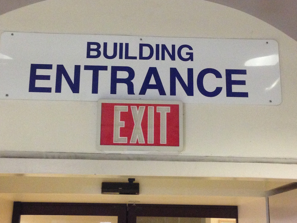
But these signs at the building entrances remain unchanged since the clinic opened.
Longtime PAMF visitors have gotten used to the place and learned to ignore the conflicting signs. But newcomers still stop and look around, puzzled.
Fire is the ultimate edge case, but helpful signs showing how to escape a fire are essential. Helpful signs. But even signs necessary for the edge case of a fire should not create confusion the other 99.999% of the time.
Regardless of what PAMF may have thought about the signage, the fire marshal could pretty much dictate what the signage had to be. In the tech world, might our own subject matter experts, lawyers, security people, executives, or developers ever force us to inconvenience most of our users most of the time for the sake of an edge case? Would they ever require language that confuses everyone but themselves?
No, that would never happen.
Keep these coming. Send them to us via Twitter or Facebook using the hastag #wtfUX or email them to: [email protected] with “#wtfUX” in the subject line. Include as much context as you can, so we get a full understanding of what the f%*k went wrong.