It’s hard to read anything about UX without finding a reference to the constant tension between simplicity and complexity. People have strong preconceived notions about the words, especially when it comes to experience design. You don’t have to be a UX practitioner to understand that simplicity is a good thing; no one goes around the office saying, “Alright team, let’s make this application really, really complex!”
Removing that layer of confusion to make the user’s goals easy to achieve means making things simple and clear. However, removing confusion doesn’t always mean removing complexity—it’s somewhat of a grey area. Sometimes complexity actually isn’t such a bad thing. In this article I’ll examine some of the many faces of complexity and explore the balance we need to find for successful solutions.
Is Simplicity Overrated?
Although most people would say they seek simplicity in life and products, our actions say something different. We actually enjoy, and at times prefer, complex things. Imagine looking at a sky that’s completely clear and compare that with a sunset with a variety of colors, layered with clouds, and the beams of sunlight striking the sky. One view would seem less interesting or not as photo-worthy.
In some cultures complex products are more appealing than products that appear simple. In South Korea, for example, products like refrigerators are designed to appear more complex than non-Korean ones, even when the prices and specifications are very similar, because that complexity is equated with sophistication and value, and is thus a symbol of prosperity.[1]
Think about how we compare products when looking to make a purchase—we examine the features. Can this blender do the same things as this other blender, and more? A “simple” blender might seem like it doesn’t do as much as a similarly priced one with fewer controls, making it perceptively less valuable to consumers. Even if the simplicity is intended to make the device easier to use, if it diminishes the consumer’s sense of the blender’s value and the manufacturer’s ability to sell it, then simplicity in this case is bad.
For example, Siemens released a smart washer with sensors that can detect the amount of laundry, the kind of fabric, and the soil level. There were only two program settings, and the machine would take care of the rest. This means the washer’s control panel could be very simple, but in fact Siemens designed it to have more controls than their other non-automated washers. Even when manufacturers find ways to simplify complex processes, it seems people don’t want to give up control and don’t necessarily trust the automation, and manufacturers don’t want to downplay the apparent sophistication of their products.[1]
The Appearance of Complexity
In design and UX, a simple-looking approach generally receives more praise than a complex-looking one. Google is often held up as an exemplar of simplicity. Even though the back-end workings of Google are incredibly complex, a search engine’s UI inherently lends itself to simplicity; the interface doesn’t require much in the way of controls or content. Simplicity of use sometimes is confused with taking a minimalist approach in the UI design.
Comparing the context and purpose to other sites reveals more about the apparent simplicity of Google. Google is a search engine whereas Yahoo! and MSN are Web directories—two different types of tool that require two different approaches to the UI.[2] Donald Norman explains why these other tools seem more complex than Google:
Why are Yahoo! and MSN such complex-looking places? Because their systems are easier to use. Not because they are complex, but because they simplify the life of their users by letting them see their choices on the home page: news, alternative searches, other items of interest.[3]
The appearance of simplicity in physical products can also be deceptive. Consider ice skates or a guitar; it’s obvious from their appearance how they’re meant to be used. But it takes years to learn to use them well. Their lack of controls and few moving parts decreases their apparent complexity, but actually means they’re more complex to operate. A jump in ice skating or strumming a melody on a guitar requires a complex range of actions on the part of the user.[4]
As John Gruber of Daring Fireball said, “If your UI even vaguely resembles an airplane cockpit, you’re doing it wrong.”[5] The cockpit of an airplane certainly is as complex-looking as interfaces can get. When we see an interface or product that appears complex, we assume it must be difficult to use. But to assume that a complex-looking interface means it is difficult to use disregards the goal and tasks involved that a user may require of the interface.
Presenting Information
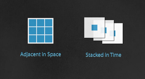
How information is presented in the UI is an important consideration. There are two important concepts presented by Edward Tufte that relate to how we present the visual layer of interface:[6]
Adjacent in space is taking elements of an application and positioning them all on the same screen. Depending on the information and number of features an application has, it can make the screen appear more, or less, complex. An airplane cockpit is an extreme example of this approach. It makes all of the controls readily available to pilots and keeps critical readouts and important data ready at hand to help pilots make quick decisions. The adjacent in space UI approach gives more immediate power and control. It also reduces the need for navigation between screens to reach additional functionality, speeding up interactions.
Stacked in time is splitting the functionality up into several screens or layers, like a story being spread across pages in a book rather than crammed into a single long page. This approach can reduce the chance of the users making a mistake by guiding them down clear path. It also offers a gradual engagement, showing and hiding controls so only the necessary UI/information is displayed, reducing the perceptive complexity of the UI. It can allow more screen space for feedback and guidance for the user, and can allow for a more aesthetically pleasing and/or branded experience. The stacked in time approach tends to make an application less intimidating and doesn’t overwhelm the user with choices.
The adjacent in space and stacked in time approaches each has its own trade-offs. In most cases placing too many elements on screen at the same time creates unnecessary complexity. Not all controls are needed at once, so they should only be presented when needed. However, a stacked in time approach also can become overwhelming to a user if not executed correctly. If the features aren’t mapped in logical paths or are split across too many layers, users might not be able to quickly find what they need. This is especially apparent on smaller screens for devices.
When Less is More… Confusing
The amount of data that needs to be presented affects the perceived complexity of applications. When creating a UI, generally speaking, having as few elements as possible on screen is usually the best approach. Simplifying UIs by removing unneeded navigation and UI elements is important to creating focus. But in some cases, it’s more important to keep a higher level of information density. As Tufte explains, “Small screens, as on traditional cell phones, show very little information per screen, which in turn leads to deep hierarchies of stacked-up thin information—too often leaving users with ‘Where am I? puzzles. Better to have users looking over material adjacent in space rather than stacked in time.”[7]
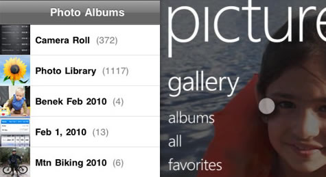
This need for balance was made clear in a recent comparison of the interfaces of the iPhone and the forthcoming Windows 7 Series Phone. Luke Wroblewski wrote up a comparison of the content resolution between the phones showing a significant difference in how much information each device displays at any given time. The Windows phone takes a more minimal approach with the UI, reducing the amount of content that can be displayed in one screen. In some cases, the Windows phone requires one or two extra steps (or taps) to get to the information, whereas the iPhone reveals it immediately because of its higher information density.
The navigation in an application should propel the user toward his goal rather than act as a barrier created just to satisfy an aesthetic requirement for a simpler-looking UI. Simplification in UI design should be focused on reducing “computer administrative debris” while keeping the focus of the interface on content and information.[8]
Using Training Wheels
Many applications are designed to cater to the first-time user by easing the initial learning curve (this is called “onboarding”). They offer a very guided experience, which is good for the beginning user. This guidance is typically presented by stacking content in time, which requires additional navigation interactions because fewer features and less information can be displayed on a single screen. There is also often contextual instructional content to make sure the path is clear.
But leaving these “training wheels” on too long makes the experience difficult or frustrating when users become more familiar with the application and require less guidance.
Consider the graphical user interface (GUI) of computers today. The GUI is an alternative to command-line interfaces, which power users are able to operate quickly but at the expense of having to memorize a lot of commands and parameters. GUIs, on the other hand, take advantage of users’ mental models to create applications that are intuitive and easy to learn. But this comes at the cost of efficiency and speed for power users.[9]
Recently, heads-up displays (HUDs) like Alfred and Quicksilver, which allow the user to skip window manipulation to quickly access files or applications, have become popular among power users. Apple has simplified the tablet OS by hiding much of the file metaphor on the iPad.
Using techniques like onboarding to simplify an experience are important, but should be carefully implemented. There should be consideration for the posture of the application or website. If the user is going to be using it often and for longer periods of time (sovereign), then the onboarding help should be able to be turned off or gradually be removed as the user grows. If users rarely visit and only for a short period (transient) this type of interface would continue to be helpful, rather than a hindrance.
Complex Tasks Are Complex
Simplicity allows many applications to be powerful. The UIs are not clouded with unnecessary controls. They are focused on specific tasks and don’t get in the way by forcing the user to do too much at once. There are some occasions, though, that the normal workflow for a particular set of users is complex. Therefore, it can be expected that the application that controls these types of tasks will be more complex.
In fact, a complex UI can sometimes be exactly what the user needs. For example, a dashboard that displays visualizations of large data sets can only ever be complex because its purpose is complex.
The cockpit analogy needs to be viewed from the perspective of a trained pilot. The complexity of this interface is necessary because the task of flying a plane is quite complex. One would not expect to be able to fly a 187,000 pound hunk of metal from one end of the globe to another with one button. Pilots would lose control of the system if it were heavily automated and the interface were highly abstracted. Removing all the controls and distilling them down too far for the sake of simplicity alone would come at a very high cost.
Living in a Complex World
As an interactive designer, my first instinct is to simplify things. There is beauty in a clean and functional interface. But through experience I’ve found that sometimes I can’t remove every piece of complexity in an application. The complexity may be unavoidably inherent to the workflow and tasks that need to be performed, or in the density of the information that needs to present. By balancing complexity and what the user needs, I have been able to continue to create successful user experiences.
In the end, simplicity for its own sake should not be the goal. Balancing the amount of complexity that we engage with is something that UX people deal with on a daily basis. A good experience should be the result of using UX design to find what is meaningful to that end user and present it in the best way possible. Donald Norman puts it best: “Complex things will require complexity. It is the job of the designer to manage that complexity with skill and grace.”[10]
References
- Simlicity is Highly Overrated – Don Norman
- Google Says “More is More” – Luke Wroblewski
- The Truth About Google’s So Called “Simplicity” – Don Norman
- The Psychology of Everyday Things
- How Bad Is Bad? – Daring Fireball
- Learning from “bad” UI – 37Signals
- iPhone Interface Design – Edward Tufte
- Information Resolution on the Windows Phone 7 Series – Luke Wroblewski
- About Face 3: The Essentials of Interaction Design – Alan Cooper
- Why is 37 Signals so arrogant? – Don Norman
Image Credits
- Airplane image: https://.check-6.com/gallery/heavies/B-2-Spirit-Cockpit-by-Chad-Slattery.php
- Blender Image: https://.flickr.com/photos/35006614@N05/3250917143/sizes/l/
- iPhone vs. Windows Phone image: https://.lukew.com/ff/entry.asp?265


