OVERVIEW
For this project, my partner and I were tasked with creating an online magazine to spice up the life of a busy, young, female professional. It was our aim to figure out what motivated her on the day to day and on a larger scale and to design a publication that fostered some excitement and self-development.
PROBLEM STATEMENT
How might we help Elaine, our fictional user, think rationally, discover new passions and achieve a good work-life balance?
USERS & AUDIENCE
Elaine and Friends! Our publication is geared toward a female demographic ranging from 30–45 years old. These individuals are likely professional urbanites saturated with a culture that feels inaccessible to them due to their busy and career-focused lifestyle.
Like many mid-thirty-something-year-olds, our persona, Elaine, is searching for calm and inspiration in a demanding world. She wants to focus on self-development from a whole-systems perspective, whether enjoying more cultured experiences or exposing herself to healthier lifestyles and decisions.
ROLES AND RESPONSIBILITIES
UI/UX Researcher, Designer, UX Writer
Scope and Constraints:
In only four days, we were tasked to acquire enough information to create an online magazine, for both mobile and desktop applications.
PROCESS
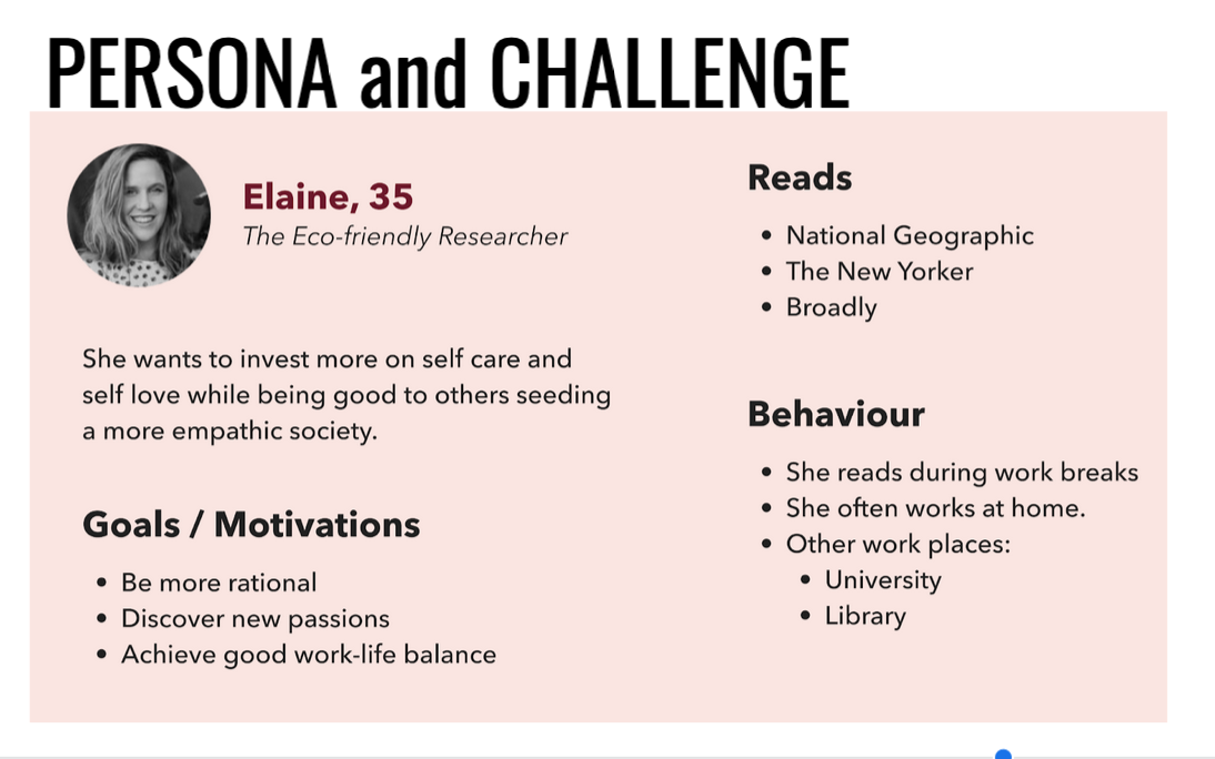
To start our process, my partner and I needed to deeply understand our persona. We gathered that Elaine was intelligent, driven, and kind-hearted. Based on her motivations and behavior, we deemed her to be an over-achiever, searching for more thoughtful ways to get out of her head and making better use of her free time.
RESEARCH
Qualitative Research
Competitor Analysis
To start our research, we performed an extensive competitive analysis of relevant online magazines to identify opportunities and threats in the current marketplace. We took notes on their content, tone, demographic, and aesthetic.
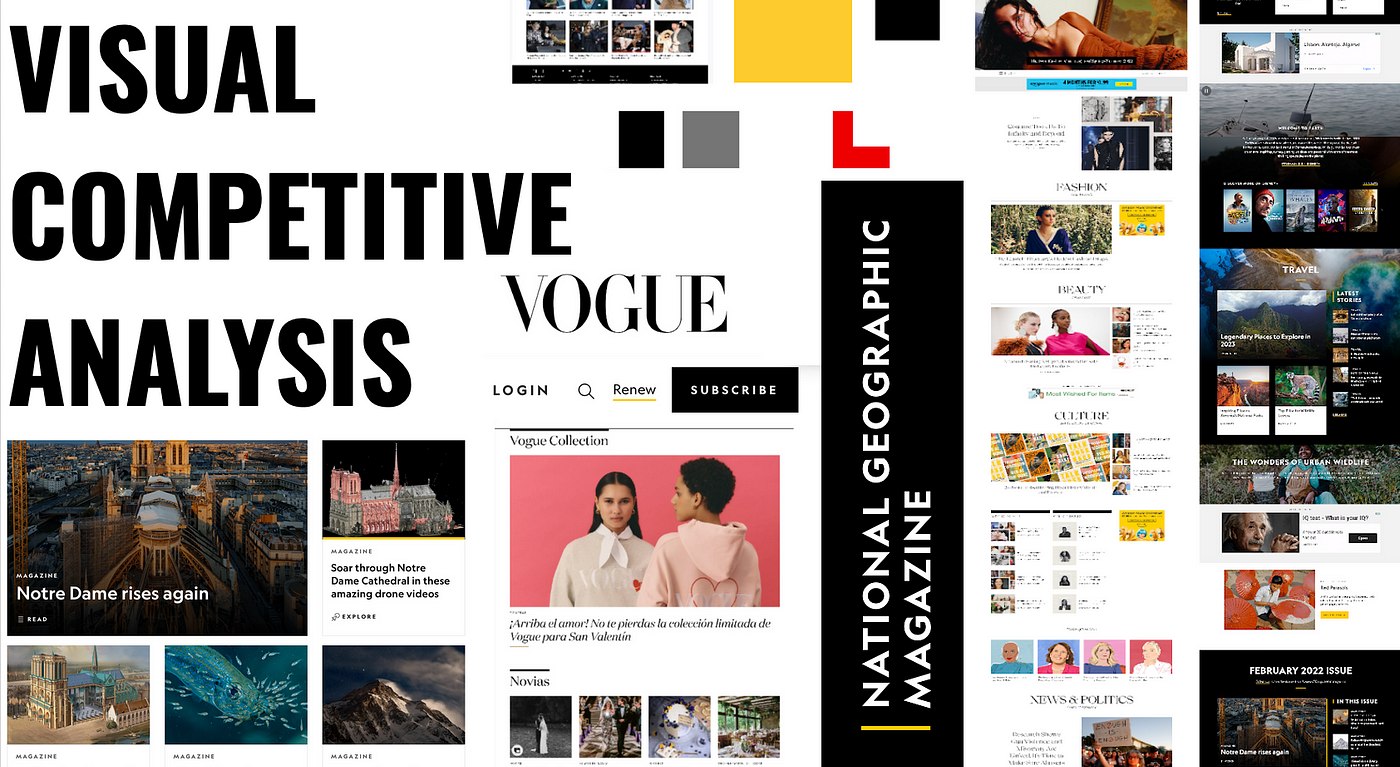
All exhibited a fair amount of contrast, rich tones and a variety of different sized columns and cards.
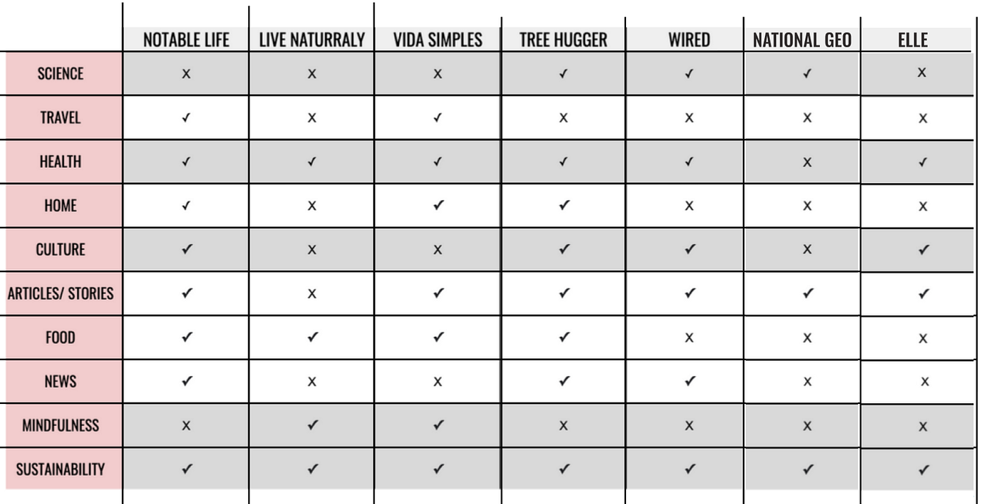
The following graphic pins how Elaine’s favorite magazines (National Geographic, The New Yorker, and Broadly) stood up against one another, and compared them to a handful of other publications, geared more towards the endeavors she wishes to pursue. These include Notable life, Live Naturally, Vida Simples, Tree Hugger, Wired & Elle magazine.
After much research, there were clear patterns and a definite niche that was looking to be filled.

Interviews
We then used this information to compose a series of interview questions in order to gain more clarity around our demographic’s general habits and preferences. We spoke with 5 individuals.
TLTR (too long to read)
What we discovered, overall, was that most people this age group consumed their media either in the morning, before work, while on public transit, or in the evenings before bed, in bed. Others would plug into a podcast during a midday walk or while exercising. This information led us to believe that people were merely sneaking in time to read online- which was why most of our interviewees admitted to rarely finishing the articles they’ve started. (Same, guys. Same.)
Our interview also concluded that users access online tools primarily for news, education, and information, reading up on healthy tips: lifestyle, food & exercise, and new trends: fashion, art, and music. And because (let’s face it) we are all a bit voyeuristic at heart, three of these interviewees expressed spending “an embarrassing amount of time” snooping on others’ “feeds” — be it friends or celebrities.
Quantitate Research
Survey:
These insights helped us compose a survey to cast a wider net, further aimed at better understanding what drives people to:
- look for information,
- search for a specific publication,
- figure out how to retrieve it and,
- at what time they generally find themselves consuming it.
This would give us more perspective on the patterns of human behaviors and how we might develop a site based upon those patterns.
We sent this survey out to various online platforms and social media sites, hoping to get as much unbiased feedback as possible (but there are only so many responses one can expect in 2 days’ time.) Here are the answers to only a few of our questions.
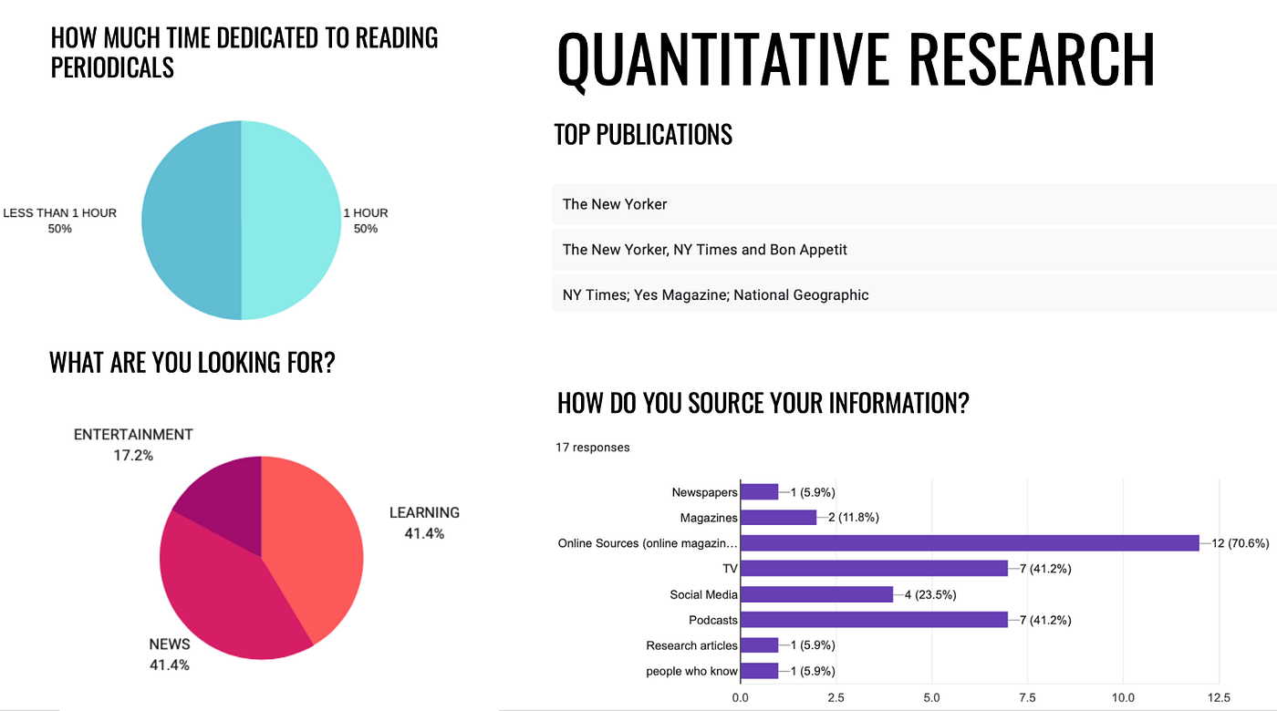
What we learned from the whole of this data was that our users were on-the-go, meaning: get information to them flashy and quick before losing their interest and readership. We needed to find a way to set our readers up for success by offering a shortened version of articles without losing the more intellectual aspects.
CARD SORTING
At this point, we used card sorting as a way to sort information gleaned from the survey and interviews and to develop an information hierarchy based on the most popular topics our users were interested in.
And because we wanted to keep it simple, we did!
Folks chose:
- Local Happenings (music, art, culture, etc)
- Current Events
- Podcasts (entertaining and educational)
- Health.
LOW-FI
Once we decided on our headings, it was time to begin our Low-Fi wire framing and sketch out five different pages from our publication.
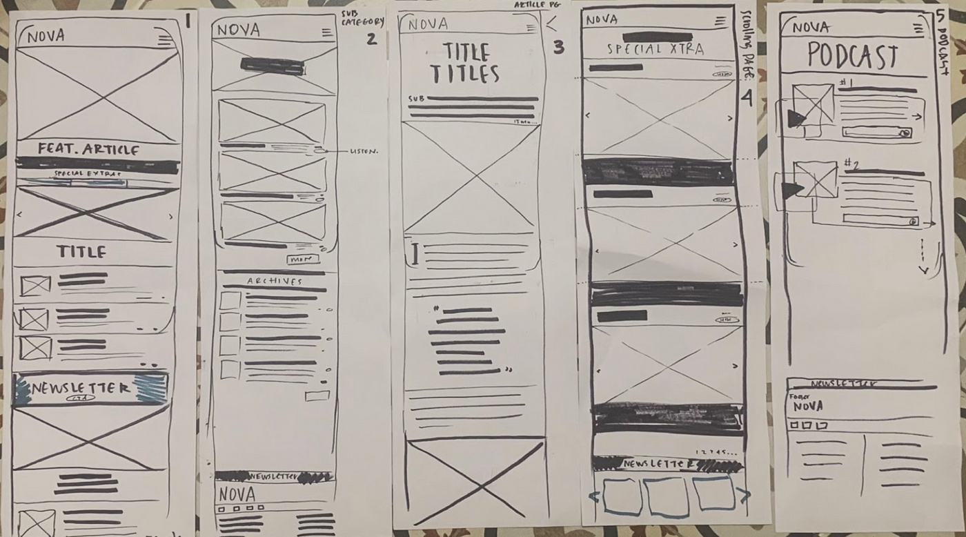
- Homepage: This would have a curated feature article (thanks, A.I.!) with an accompanying hero photo, a scroll-bar offering short, up-to-date articles and stories, with the option of reading on, and 4 Headings such as Science, Health, Eco Travel, and so on with related stories below. This design catered to a curious mind and hectic lifestyle.
- A Heading Page: [SCIENCE] with related articles and archives
- An Article: A full-page article or story about an important current event
- A SHORT article page, from the scroll bar.
- And finally a PODCAST page, for hands-free, on-the-go listening.
Now to test: [insert the clammering of users]
MID-FI
After some very helpful peer feedback, it was suggested that we rethink the “Special Extras” and “Podcast Page” — that we should condense some of our features and be mindful of redundancies. Sounds good!
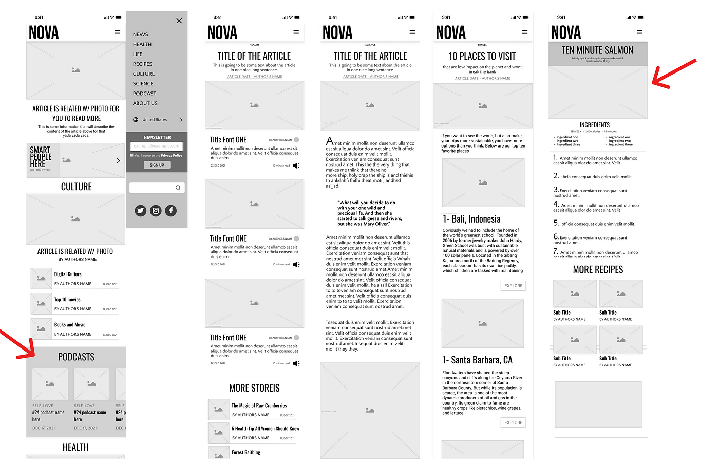
Edits
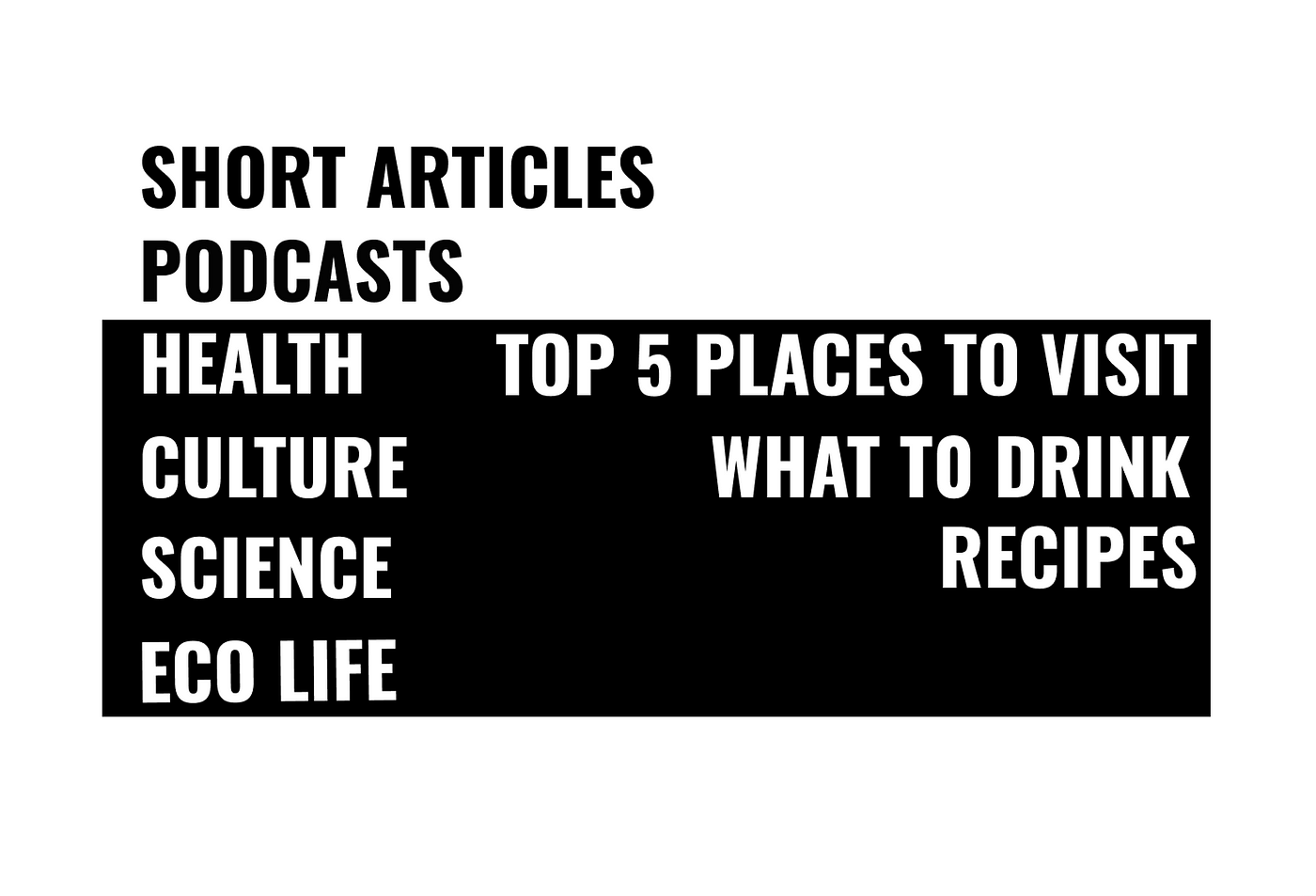
Our podcasts, which once had their own page had moved to a section on the Homepage for easy accessibility. We also got rid of our “short stories.”Upon reflecting back on our interviews, it was clear that Elaine’s demographic placed a lot of value on healthy living, so we added a “recipes” section for quick, delicious, healthy food.
In the end, here are some of the topics we chose:
BRANDING
Now for the fun part. What did we want the personality of our publication to FEEL like, keeping in mind that we wanted to create something that not only reflected the user but attracted and inspired them?
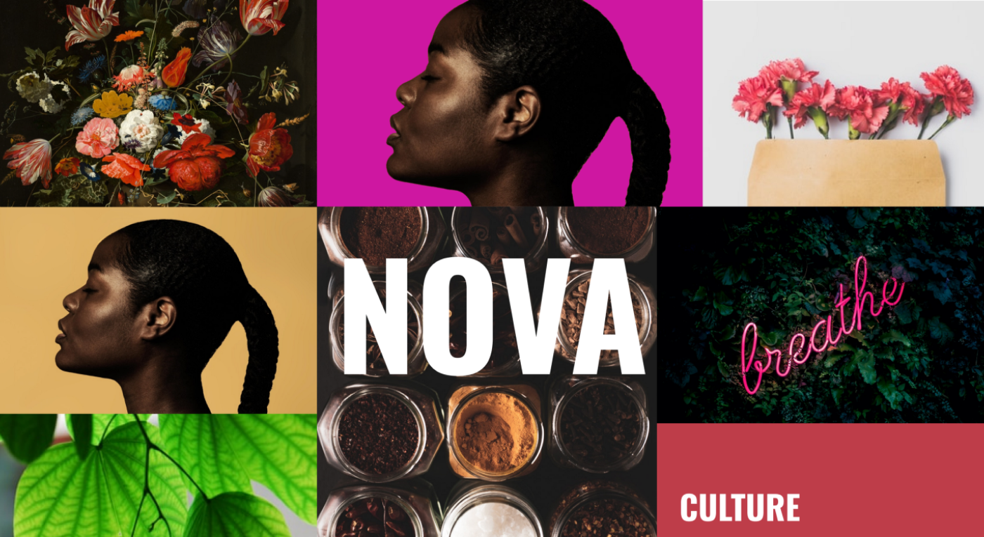
First of all, why NOVA?
NOVA (n):
A star showing a sudden increase in brightness and returning to its original state in a few months.
In Portuguese: “New.”
The surge of energy. Bold. Bisyllabic. Strong and feminine. We wanted to capture the eye of the user by developing a strong, welcoming aesthetic.
Creative, yet uncluttered. Friendly and intelligent.
Colors
We developed a rich palate with high contrast by combining rose and deep green hues. Our secondary colors were just as important to complete the look and feel and were expressed in the website’s image, further adding to its dynamism and contrast.
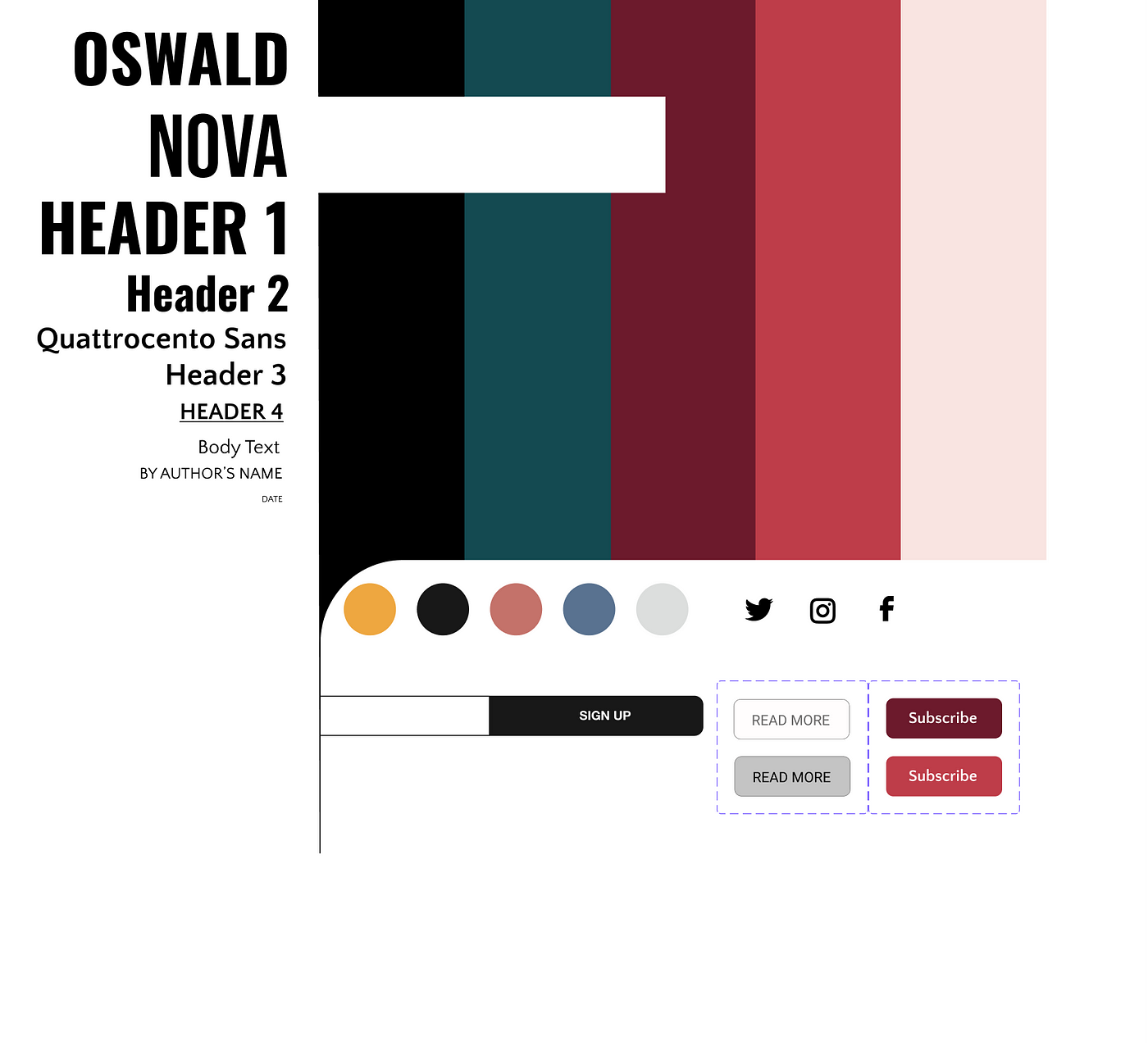
Font
For the typeface, we chose Oswald and Quattrocento Sans, using a variety of weights and cases. These complimentary fonts evoke a classic yet modern look that is easy to read for people scrolling on their phones at night or on the go.
Voice & Tone
Because our demographic is young professionals looking to explore and expand, we gravitated towards a personality that was intelligent and quirky — altruistic with an edge.
We chose the following adjectives to define NOVA’s Brand Attributes:
Intelligent, Dynamic, Easy-Going, Creative, Hip, and Inclusive. A look that was bold and feminine.
Mood Board
Based on all these attributes, we created a mood board that aligned with the style and concept of our magazine proposition:
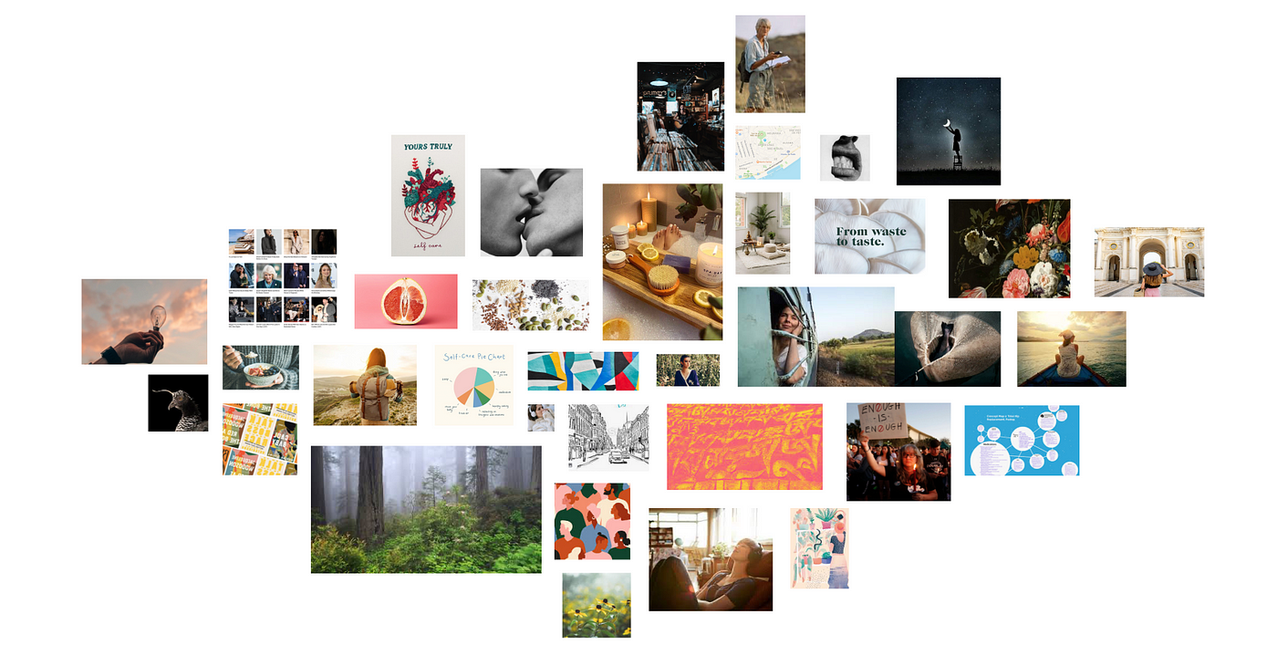
Again, our goal was to note what our users gravitated towards and to fill the niche left by our competitors, creating something fresh, smart, edgy, and fun.
After a few more bouts of user-feed back and edits, mostly concerning spacing, we felt confident in the final product.
Hi-Fi
Here are our HI-FI prototypes. Enjoy!
And screen shots of some of our frames.

Lessons and Learnings
- It’s important to be mindful of spacing, especially margins.
- There needs to be a good balance between creativity and function in every design.
- To know when enough is enough. Ha!
Next steps
- To make the pages more interactive.
- Clean up some more of the spacing.