Save
When users shop online, they use their basic store shopping experience as a frame of reference. They expect an easy and enjoyable process comparable to their in-store shopping experience. But instead, store shelves become visual grids of rows and columns; a hand touch is replaced by a mouse click, and three-dimensional packages display as two-dimensional thumbnail images.
Many websites today try to mimic the in-store shopping experience as best as possible, but lack an important fundamental practice: package presentation. If handled correctly, package presentation can enhance the shopping experience a great deal, giving the company a competitive edge as well as bring in additional revenue.
Package designers face a new challenge in their field: their packages now have to fit in a grid system on the Web. Packages of any shape, size, and color have to attract attention in the context of a constantly changing medium. Since a package now has to be displayed in a small area on a screen rather than a shelf, a package designer is faced with new decisions that have to be made early in the design process. Online brand competition is fierce, so the opportunity to differentiate by designing a package for online display should not be overlooked. Think of shampoo bottles, for example: small bottles are sold as travel kits, medium size bottles are sold at drug stores, and extra large bottles are sold in stores like Costco or BJ’s. Extending this approach, one would expect a fourth option: a package to be designed for online purchases.
Package Design Considerations
The key elements that make a package successful are its shape, color, label, and texture. Understanding the major differences between shelf and online presentation and following best practices for Internet package design helps ensure a successful user experience, and sales.
Shape and size
It is clear that packages will not display equally in all mediums. A tall skinny bottle will stand out on a cluttered store shelf for its elegance and height, but will nearly disappear and lose its essence when reduced to a webpage thumbnail image. In most cases, package designers have no control over how and where a package will display online. Resizing package images to fit into a website grid often causes the size, scale, and volume of packages to be misrepresented, creating false expectations for online shoppers. The inability to see, feel, and lift the package for a full sensory observation makes for a weaker experience and could potentially send users back to the stores.
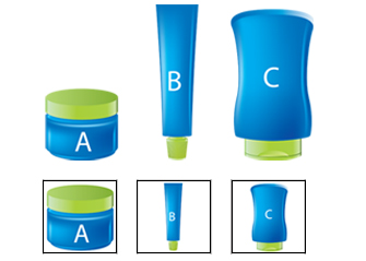
A survey of some of the largest e-commerce websites revealed that three out of four sites display square (1:1 aspect ratio) thumbnail images of products, so a recommended best practice is to design packages for that ratio for optimal display. A square image doesn’t necessarily mean a square package, though; note that package A below isn’t square but it photographs well for a square presentation.
Different shape packages A, B and C resized to fit a 1:1 ratio. Note the misrepresentation of sizes in a website grid.
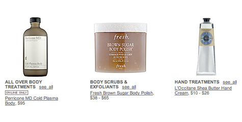
Screen shot from Sephora.com, Body Treatments page. Packages are resized to fit a 1:1 ratio. (Note the left package is sold online only!)
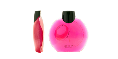
Furthermore, uniquely shaped packages, which require a three-dimensional view for full appreciation, will lose their edge when photographed and displayed as flat images. Besides not giving them the full effect of the package, this may present difficulties for users in identifying storage issues. Take, for example, a bubble bath bottle that needs to fit inside a shallow medicine cabinet. Without seeing the full view of the package, one cannot determine its dimensions and practicality. A recommended best practice is to include a multiple view image that shows the package from all sides. Package designers should include a package identity and guidelines document, which will describe how a package should be photographed and presented.
Sephora collection, Bubble bath
Color
Color is a powerful communication tool used by designers to convey messages, elicit feelings, and stimulate an action (a purchase). Color is often “read” faster then words, creating brand recognition and providing cues on package contents. A package designer who designs for busy store shelves takes into account the multiples effect: myriad packages displayed next to one another creating a colorful and powerful display. Online, the attractive and eye-catching color display is reduced to one standalone package, presented at thumbnail size. Further, its impossible to know which other products will neighboring it due to dynamic web searches, which makes it very difficult to plan ahead and gain competitive edge.
In addition, package designers need to be aware that white or any light-colored packages will have poor visual contrast when displayed on a white background. This gives them a disadvantage relative to colorful packages presented on the same page.
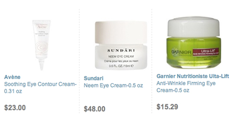
A recommended best practice to resolve color issues is to select a color that will stand out on the Web. A striking package color will jump to the foreground and will push the image into the user’s visual path. If white or any light-colored packaging is a must, photograph the package on a color background to achieve the same results and ensure the package is easily recognized. Further, delicate color changes, gradients, and patterns often don’t display well when presented on the Web. If patterns and color differences are essential to a brand’s presentation, package designers should consider using high contrast or bolder colors to enhance the online user experience.
Soap.com skin care products. Garnier package gains competitive edge using vibrant colors that jumps to the foreground.
Label
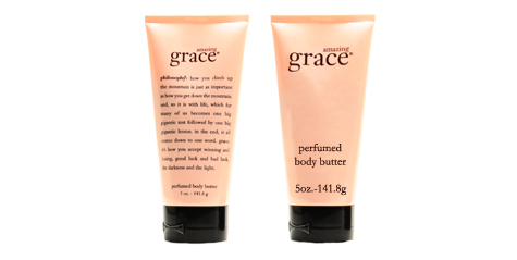
Package labels are communication tools that sell the contents of the package. More often than not, a label is a key factor in a package’s success and revenue generation. A label that is not seen will not sell. Taking store shelf packages and simply resizing for Web presentation doesn’t make for a good user experience; labels become small and unreadable, and they lose the essence of what a label is meant for: an informative selling tool. Web users cannot simply pick up a package and bring it closer to eye level or turn it around for more information. It is therefore essential to remove unreadable clutter from the label when presenting packages online. Designers should prioritize and present key selling points to help users make wise and quick decisions, keeping copy easy to scan by forcing horizontal orientation, and using high color contrast and larger font sizes.
Philosophy’s Amazing Grace Perfumed Body Butter. Left: current online package presentation. Right: suggested edits to enhance readability.
Texture
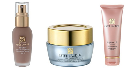
Like color, texture is a communication tool for designers. It can communicate a sense of quality and elicit certain emotions that will result in a purchase. Texture can also be a practical necessity; some textures are easier to grip while others feel nicer against your skin. If texture is what’s going to make a package stand out, it should be professionally photographed using angles and lighting that allow the texture to display well even in a small thumbnail images.
Estee Lauder products presented on Bloomingdales.com. Good usage of light in photography gives users a great impression of package materials and textures.
Final Notes
Following best practices for online package design and presentation will enhance the buying experience. To ensure their products stand out online, package designers need to create package identity and guidelines documents, similar to a company’s brand guidelines. These guidelines should identify how the package should and should not be displayed in any given situation. This allows package designers to have two levels of control over how their products look online: one is in the original package design, and the other is in its presentation.
Brand competition is fierce. It’s a challenge to present a unique brand to consumers and hope to be heard. Companies use their colors, logos, and short tag lines to communicate their nature of service, convey reputation, and “voice out” their commitment to the consumer. The image a company builds around its unique differences and its brand is a source of competitive advantage. That image needs to be clearly communicated on all products, regardless of the environments and mediums being used to make the final sale.
Tammy Guy
Tammy Guy is the founder of a visual design and usability consulting firm focused on strategic brand planning, creative direction and diffusion of user experience problems by applying design theory and usability best practices in a rapidly changing Web environment. Her firm provides consulting services (e-commerce solutions, mobile apps and tablet experience) to clients from various industries such as fashion retail, commodity retail, pharmaceutical, insurance, financial services, social networking and others. Services include product evaluation, strategy and planning, creative development and direction and usability consulting.
With more then 16 years of experience, Tammy previously worked as the Creative Director at LivePerson, Inc. and was a Design Group Manager at the Hertz Corporation where she art-directed all aspects of graphical application development for all customer facing websites.
In addition, Tammy has been a frequent guest speaker with the Nielsen Norman Group for the past few years, teaching visual design and usability workshops. She also teaches similar design and usability courses with General Assembly in New York City.


