For those of you who majored in philosophy, you know exactly what I mean when I refer to Thesues’s Paradox: when a ship (or object or tool) has all of its planks or essential components replaced, is it still the same ship?
Along those same lines, George Washington replaced the shaft three times and the head twice on his grandfather’s axe and, thereafter, wondered aloud if it was still his grandfather’s axe.
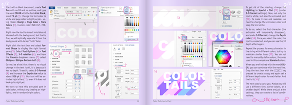
Posing a similar question in the context of design is the book 7 Best Text Effects in Microsoft Word by Václav Krejčí: Can we replace the complicated, more-expensive-after-every-release PhotoShop “ship” with the planks provided by Microsoft Word and essentially get the same results? For those of us who have spent decades using Adobe’s specialized tool(s), this immediately sounds like fools’ gold and undeserving of a second thought, but after reading the book, I’m not so sure.
Krejčí first enticed me with his viral video (approaching nearly 3M hits after appearing on Gizmodo) showing the recreation of the iOS 7 interface using Word. If you’re watching this for the first time, prepare to spend ten minutes mesmerized.
This video started making a believer out of me, but before reading the book I was still ready to say, “Sorry, folks, you cannot rebuild the same ship and Krejčí is better at marketing than he is at how-to books.” A couple of things quickly changed my view:
The Goal of the Book
Right off the bat, Krejčí explains that his objective is not to replace the ship. “This book is not an attempt to teach you how to work with Microsoft Word. Instead, it teaches you how to create [great visual effects] … you can reuse the gained experience in Photoshop, Illustrator, Corel Draw, Inkscape, or any other application. When you know the principles, the tool is not that important.”
In fact, Krejčí doesn’t tout Microsoft Word as the end-all-be-all. “Microsoft Word is definitely not the best application in the world. Like anything else, it has its pros and cons.” He goes on to explain that this medium is convenient since A) most people have Word, B) they are already basically familiar with it, and C) it evolves frequently, thereby making new use cases possible.
The Delivery
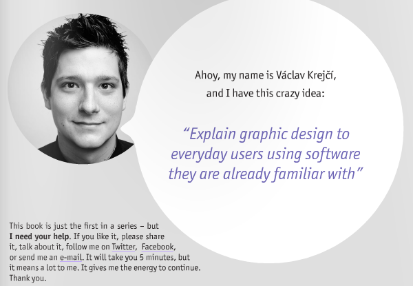
Krejčí takes what could be a boring, color-by-numbers book and turns it into an entertaining and informative read. The light spirit starts right from the very beginning with two pages facing each other: the first mostly says “Ahoy”—a commonly used greeting in the Czech Republic comparable to “Hello”—and the facing page shows Krejčí’s face with a talking bubble saying, “Ahoy, my name is Václav Krejčí and I have this crazy idea: ‘Explain graphic design to everyday users using software they are already familiar with.’”
Although bits of this playfulness are peppered throughout the book, they appear thereafter in support the lessons.
For example, while describing how non-digital calligraphic prowess requires 10,000 hours to perfect, Krejčí says “Google the 10,000 hours rule.” While describing why foreground and background objects away from the focal distance appear blurrier with better cameras, he includes “(that’s why this is more visible in macro shooting on cheap cameras).” These little supporting comments help make the lessons stick.
Conclusion
Does this book allows you to replace Photoshop with a new handle, akin to Washington’s axe? No. Will it allow you to replace a Masters in Digital Arts with a few targeted lessons? No again. But will this book give those without the time, money, or desire to spend five to six figures on education, some tools, practice, and fundamental graphical knowledge? Absolutely!
Krejčí delivers in this guerilla UX gem.