
Save
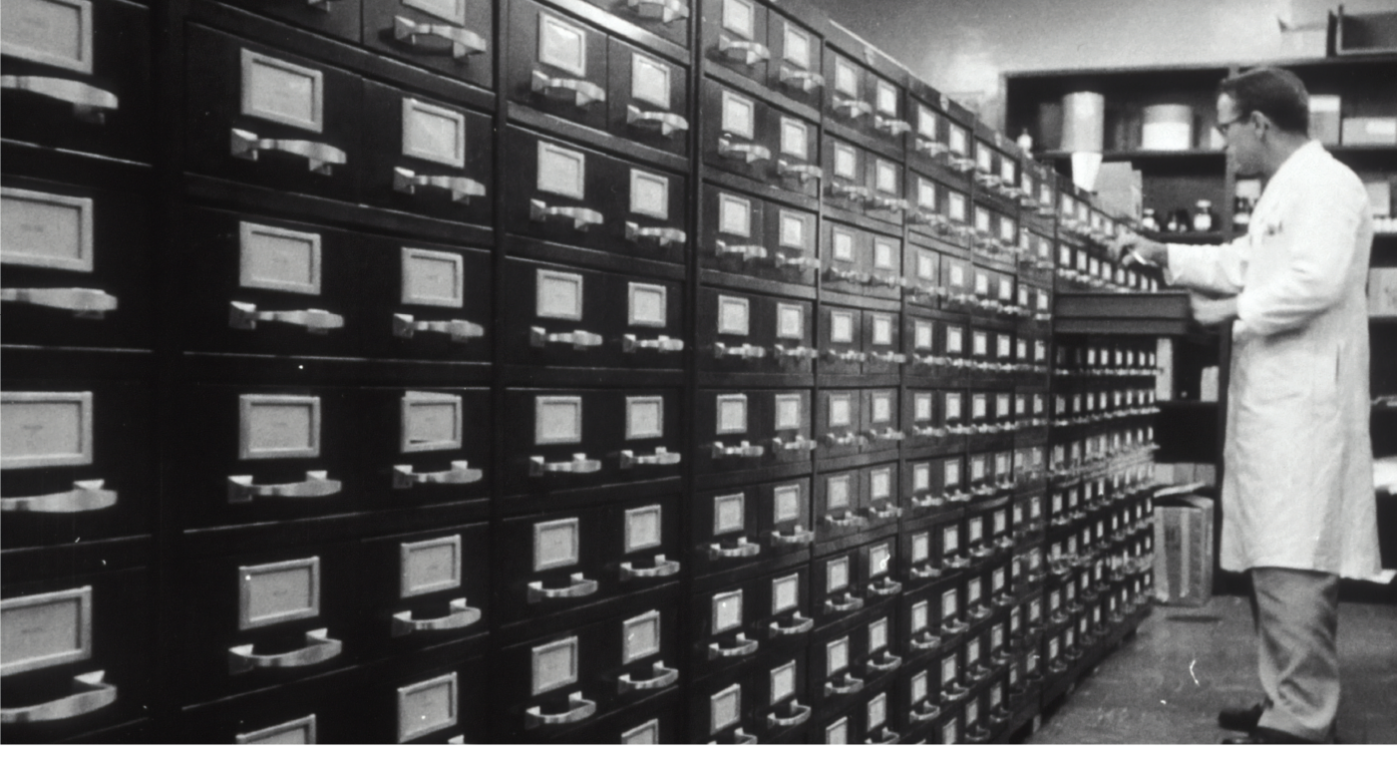
The Affordable Care Act brought more changes to the healthcare industry than making health insurance more affordable and expanding the Medicaid program. It also brought about guidelines and regulations for doctors to follow to help their patients save money on their medical costs. It also allowed doctors, specifically primary care physicians, to receive incentive payments if they submit documentation that they are providing quality care to their patients. One requirement of these incentive programs is that the doctor must have and use an electronic health record (EHR) to document their patients’ health and visits.
An EHR can be a desktop or web-based software where the doctor keeps their patients’ medical records. Most EHRs, even the ones that are “free,” has the following features: documents (lab/blood work, ultrasounds, x-rays, referrals, etc. that you can scan in), schedule, patient medical records, and contacts (usually doctors you would refer your patients to). Other features also include a patient portal where patients can message the physician and access their medical records and electronic faxing where physicians can share patient records safely through their EHRs.
While working at an accountable care organization and helping physicians with their documentation for their incentive programs, I had to learn how to use three very different EHRs. I learned how to use those EHRs mostly through Google and trial and error, as the doctors and their staff did not know how to use some of the available functions. Some of these doctors were not as tech-savvy and were still learning how to use their EHRs, whereas the others only used the functions they deemed most useful. Almost all of the doctors I worked with found using the EHRs to be confusing and not the most user-friendly, especially for those who were a bit older.
So why didn’t the EHR designers design the EHRs for the doctors, their users?
The short answer to this question is that they technically did. They designed the EHRs to include all the functions the doctors would need to meet the requirements for the incentive programs. Doctors who were not previously exposed to the incentive programs and their requirements would not find all the functions useful, nor understand the importance of those functions. Long tutorials explaining how to use those functions would also take time away from seeing patients.
To create an EHR that is user-friendly to all doctors, the design team for EHRs interview doctors from various backgrounds (specialty, geographic, ethnic, age, and years of practice just to name a few) and ask them in-depth how they use their EHRs. The design teams should specifically identify the features that doctors found the most useful and easy to use, and those that they found least useful and difficult to use, and why. Understanding what was easy to use will help the designers know how to improve on the other features that were more difficult to use. If possible, they should conduct a contextual inquiry, and sit-in and observe how the doctors and their staff use the EHR.
Redesigning EHRs to ones that most, if not all, doctors find it easy to use will help doctors provide better care for their patients by keeping detailed documentation of their patients’ records.


Tiffany is a solutions-oriented healthcare professional turned empathetic UX Designer. She wants to bridge gaps creatively by designing ways for people to connect with each other with ease.


