Save
The human brain works in such a way that we try to make sense of everything we see. We unconsciously attempt to organise visual information by inferring meaning. Have you ever seen a cloud in the sky and thought that it resembled an animal, or some other object? This is the perfect example of your brain recognising patterns and creating order from the chaotic.
If we want to design and build things that are easy to understand as well as easy to use, we should have an understanding of how we, as human beings, perceive and organise the world around us.
One of the ways I have gone about doing this is to educate myself about Gestalt Priniciples.
What are Gestalt Principles?
In the 1920s, German psychologists Max Wertheimer, Kurt Koffka, and Wolfgang Kohler worked on understanding how the human brain creates meaning through the perception of the stimuli that surrounds us. This work resulted in the creation of the Gestalt Principles; 7 laws or principles by which the brain creates meaning.
Let’s take a look at each of them in turn, and see how they can be utilised in the design of your digital products.
The law of similarity
Elements that share superficial characteristics tend to be organised into groups.
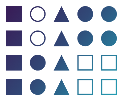
We are able to utilise the law of similarity, not only to group those elements that have similar meaning or function, but to enable us to make specific elements stand out from the surrounding interface. In a long form blog post, for example, we may have a great deal of text, but then add in a pull quote with different styling to highlight that piece of content. The perception of the user is able to identify that the pull quote does not belong to the main body of text, and should be regarded as a separate element.
The law of proximity
The effect that the visual proximity of a number of objects has in terms of our perception of grouping them together.

The law of proximity can have one of the larger influences on how we organise information in our brain from what we see on a screen. This will often be implemented in the use of white space, one of the most important features of an easy to use interface. Often white space is considered to be needed to give the elements on the screen “room to breathe”, when in fact, what we are doing is giving the brain less work to do in organising the information in front of us, and reducing cognitive load.
The law of familiarity
The unconscious process that our brain uses to form mental representations that should have use or relevance to us.

This is the kind of thing that happens when we see animals in the shape of clouds, or a face in the leaves of a tree, but this isn’t really directly useful when we’re designing digital interfaces. In order to take advantage of the law of familiarity, we should look to use accepted patterns for specific types of interaction. On an e-commerce site we would expect to see the shopping cart in the top right of our screen, and we might expect to find product categories listed in a menu on the left hand side.
These kinds of patterns are common, and the user benefits from them when the same patterns are implemented across the different websites and products that they use. They are already familiar to them, and your product can benefit from that familiarity.
The law of symmetry
Our brains unconsciously focuses on the centre point of elements that are recognised to be in a symmetrical arrangement so that it can extract the simplest form.
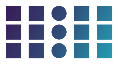
The most common use of symmetry in digital product is implemented using a grid layout. A simple 3 column grid can be found in a large majority of websites, and this law of symmetry is a psychological reason for it. We are able to easily navigate a structure that has symmetry and order in this manner, hence it’s commonality across so many digital products.
The law of continuity
The ability to perceive elements as a constant form in a particular direction, despite other possible bisecting, interlinking, or obstructing objects.

In digital design, the law of continuity can be found almost everywhere. With touch devices, we are all familiar with swiping to reveal more content, and — on the web as a whole — we are used to scrolling down to reveal more content. It is so prevalent that we probably don’t even think about our actions whilst we are interacting with an interface to reveal more content.
The law of common fate
The tendency for the brain to group elements together that are perceived as moving in the same direction.

Again, this law is so prevalent in digital interfaces that it is taken for granted. As we scroll down with our finger on a touch device, the page we are viewing will move with it. In the same manner, when we move a pointer on the screen with a mouse or a trackpad, we associate that movement with direct proportionality to our input.
The law of closure
The perceptual bias through which we are able to create meaningful, whole objects, despite limited visual information.

We can see the use of the law of closure predominantly in the design of logos, or purely visual design to create interesting interfaces that don’t make the brain work harder to interpret and understand.
Using Gestalt Principles in design
Each of these principles are apparent in what we would regard as good design, and by applying the Gestalt Principles when working on your designs, you are helping your user to more readily process the visual stimulus that they perceive. You are lowering their cognitive load by providing visual information in an easily digestible format, and essentially providing a better user experience to them because of this.
It’s always worth keeping these principles in mind as you design, so I’ve created a one page poster to help you keep these in mind, and you help you create digital products that are specifically designed for the psychological perceptions of the human brain.
Originally published at https://westleyknight.com on August 11, 2020.
With over 20 years experience working in web and digital, both as a developer and a designer, Westley helps teams to design and build user-centred experiences across any platform, and has done in almost every industry you can imagine. Westley has a passion for sharing his experience and knowledge directly by integrating with multi-disciplinary teams, or to a wider audience by speaking at conferences, and writing articles. His book "UX for Developers" (Apress, 2018) aims to close the gap between designers and developers and integrate user-centred practices in day-to-day development work.


