Flag

We stand with Ukraine and our team members from Ukraine. Here are ways you can help

Get exclusive access to thought-provoking articles, bonus podcast content, and cutting-edge whitepapers. Become a member of the UX Magazine community today!

Home ›› Content and Copy ›› Hey, How Do I Give You My Money? #wtfUX

Hey, How Do I Give You My Money? #wtfUX

by Daniel Brown
2 min read
Share this post on
Tweet
Share
Post
Share
Email
Print

Save

A hard-to-find “buy” button on iStock invites frustration into the checkout process.

Having watched the online shopping process evolve from the very beginning, it would seem that the “basics” elements were settled some time ago: search or browse, select, refine, purchase, and ship. The last two are sometimes combined in some variant of the “buy it now” button, but regardless of what precedes it, the ultimate goal of a shopping site (for both vendor and shopper) is to complete purchases.

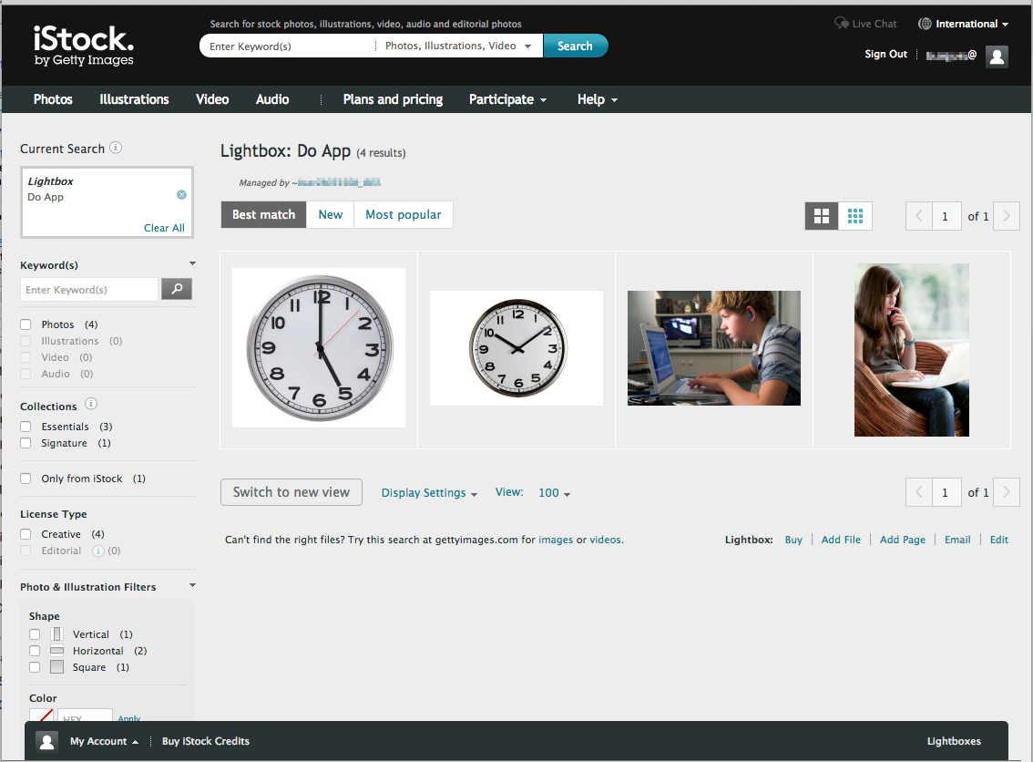
With so much research perofmed and so many existing examples of successful shopping sites, how did istockphoto.com manage to miss the mark so badly There I was, ready to hand them my money (a crucial and delicate moment in the shopping process) and it took me a good 15 seconds to find the “buy” button on this page.

Go ahead, take a moment (or 53) and locate the “buy” button.

iStock checkout page

It should never take more than a SINGLE second to find the buy button. Like a fire extinguisher, the buy/check out button should be available and visible at all times (without being obtrusive), ready for that crucial moment when you “commit.”

How could something so vital be so buried? In a brick-and-mortar store, this is the equivalent of putting the cash registers underground somewhere in the parking lot and requiring a secret knock to get to them.

Were the designers all locked away somewhere for the last 20 years? Have they been unable to see any known example of the “online shopping cart” mechanism? It’s not like the company or the notion of online shopping is brand new and Getty Images is not a small company without resources. [ED—The payment method on iStock involves purchasing credits that you can exchange for images, which makes for a slightly different checkout process.]

Whatever the cause, it was surprising to see such an integral piece of an established process go wrong.

Keep these coming. Send them to us via Twitter or Facebook using the hastag #wtfUX or email them to: [email protected] with “#wtfUX” in the subject line. Include as much context as you can, so we get a full understanding of what the f%*k went wrong. Image of man holding money courtesy shutterstock.

post authorDaniel Brown

Daniel Brown
Daniel has spent the past 20 years in software companies both large and small. From web design and development for a “boutique” web design firm to Evangelism for Adobe Systems, to helping budding startup companies get a foothold in the market, he’s worn a variety of “hats". Daniel has spoken at a variety of events worldwide including the Sundance Film Festival, Anderson Ranch Arts Center, Santa Fe Digital Workshops, and the Pacific Imaging Center in Hawaii on the topics of web design, digital imaging, photography, and user experience. Daniel currently serves as the head of the interface and user experience department at a small medical software company in Providence, Rhode Island.

Tweet
Share
Post
Share
Email
Print

Related Articles

Learn why authentic gamification is rooted in game genres rather than just collecting badges.

Article by Montgomery Singman
Gamification 2.0. Beyond Points and Badges: Designing for Players, Not Metrics. Chapter 5: Implementation
  • The article says that successful gamification is picking a game genre that fits your app’s core activities and user psychology, building satisfying intrinsic loops before adding extrinsic rewards, and iterating nonstop, and that without these foundations, you don’t have gamification; you have a progress bar that has a terminal point.
Share:Gamification 2.0. Beyond Points and Badges: Designing for Players, Not Metrics. Chapter 5: Implementation
5 min read

Reveal the three-part kernel that separates real problem framing from simple description.

Article by Morteza Pourmohamadi
A Problem Framing Kernel
  • The piece argues that if you don’t have these three core elements: broadly collecting raw material, connecting elements to surface real tensions, and committing to a point of view, you don’t have a problem frame yet; you have a description.
Share:A Problem Framing Kernel
4 min read

Learn why your badges and streaks won’t wow kids raised on Minecraft.

Article by Montgomery Singman
Gamification 2.0. Beyond Points and Badges: Designing for Players, Not Metrics. Chapter 4: Special Considerations
  • The piece explains that young users, trained by thousands of hours of expert game design, can smell fake gamification at a hundred paces.
Share:Gamification 2.0. Beyond Points and Badges: Designing for Players, Not Metrics. Chapter 4: Special Considerations
4 min read

Join the UX Magazine community!

Stay informed with exclusive content on the intersection of UX, AI agents, and agentic automation—essential reading for future-focused professionals.

Hello!

You're officially a member of the UX Magazine Community.
We're excited to have you with us!

Thank you!

To begin viewing member content, please verify your email.

Get Paid to Test AI Products

Earn an average of $100 per test by reviewing AI-first product experiences and sharing your feedback.

    Tell us about you. Enroll in the course.

      This website uses cookies to ensure you get the best experience on our website. Check our privacy policy and