Save
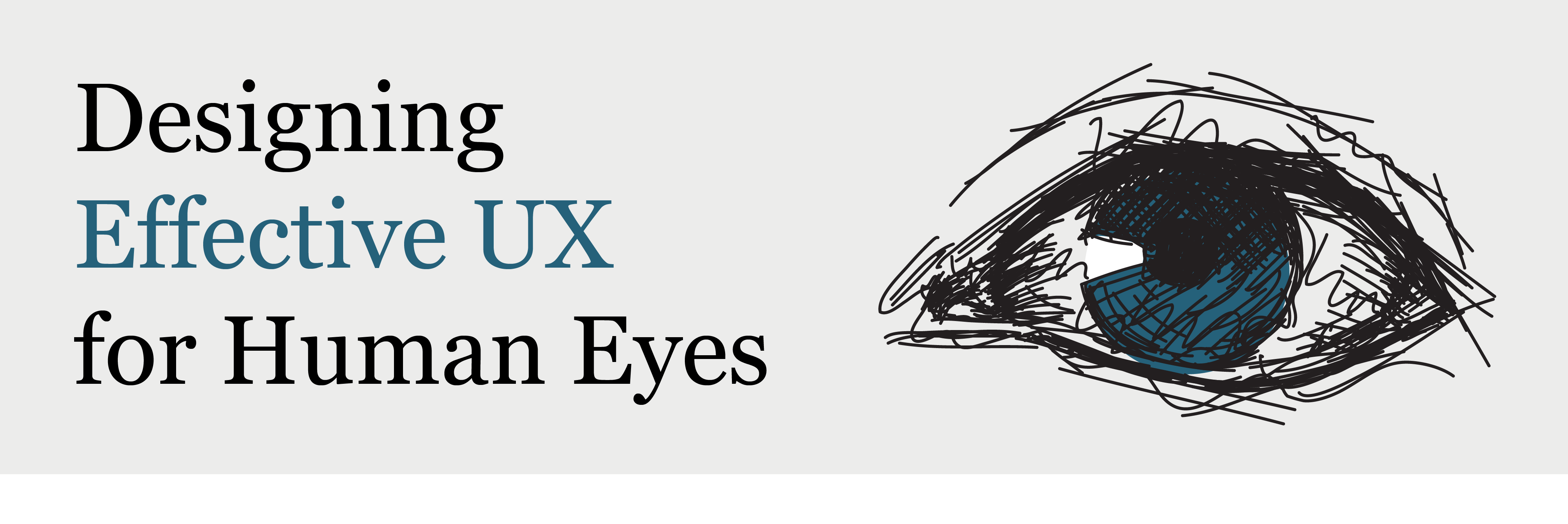
The success of a design completely depends upon how the users interact with it. The easier it is for people to understand and process their work, the more willing they will be to use the product. Thus, it is important for the designers to have enough knowledge of how a human will engage with the interface, especially the pattern of how his eyes would pick up the visual information so they can design an efficient visual hierarchy, i.e. the order in which users interpret the data on a page.
The more we design according to the visual processing of the human being, the more we design for a great user experience. It’s all about using human abilities to help them understand the interface in a better way.
Four major factors can help a dashboard designer in designing a better user experience:
First is Form, and has further properties like orientation, shape, size, line-width and line-height, and enclosure. As a designer, one can use all of these properties to differentiate between different types of information.
Second is Color. This feature can help us to design interfaces with colors according to the user’s requirement, like using hard colors where attention is required, using less opposite color combinations to decrease cognition cost or differentiating the type of information, etc.
Spatial location is another way in which people can perceive the importance of a location in the interface. For example, the top left is for the most important information. Moreover, a consistent location helps users to recall their prior exposure to the interface which can help them understand it in a better way.
Motion is the last factor and can be used to capture the attention of the user when required. This works because of the formation of the eye and peripheral vision which is very strong in detecting motions.
Gestalt Principles:
GESTALT PRINCIPLES are a set of rules that explain how the human mind perceives a view. Some of these principles include:
- Humans prefer complete shapes and see them first, hence when provided with spaces between elements, we tend to automatically fill in the gaps.
- Humans follow the lines and the same flows.
- Humans notice convex shapes before concave ones.
- Humans desire stability and avoid uncertainty, thus we look for stable objects. Our attention is always caught by the foreground until and unless the image we’re looking at is unclear.
- Humans relate those elements together that form a meaningful image.
- Humans group elements that are close to each other.
- Humans sort objects that connect to each other while forming a pattern.
- Humans look for balance and try their best to bring order in designs.
Hierarchy UI Design Patterns:
When viewing a web or desktop application, the human eye tend to
follow some specific patterns to scan the content. These eye-tracking patterns can help us design an interface or efficacious UI DESIGN PATTERNS. The most common ones are described below: F Pattern:
F Pattern:
In applications having more textual content, the F PATTERN is mostly applied to interpret the eye movement of users. It is seen that after viewing the topmost horizontal line or heading, the readers first scan the screen vertically looking for important words that would catch their interest. Upon finding them, they start reading the lines horizontally in a normal reading way. This practice, when repeated, makes a pattern like a letter F.
A few of the things that could be learned by this pattern are that the readers will barely read the complete text. So the most important part of the text should be in the first two or three paragraphs of the whole content and significant keywords should be highlighted by using headings, bold words and bullet points.
Z Pattern:
The Z PATTERN is used for applications that consist of an equal amount of mixed content types like images and text. In such situations, the readers first view the first horizontal line (which is usually the main heading and/or menu bar), then move their eyes to the left bottom corner scanning any images or other media placed in the center and repeat the process. Such eye movement traces a Z shaped pattern.
For this pattern, it should be noted that the background and foreground should be clearly distinguishable. Also, it can be seen that the topmost line is the most suitable place for the significant identifiers of the application; the left side best for the logo and title and the right for important action calls by using a menu bar. The center should consist of such images or visual media that describe the services and are able to separate the top and bottom text areas.
Eye and colors:
The Opponent Process theory says that color perception is controlled by various receptor systems in the retina of the eye. These systems reside inside the cones cells and each has two opposite colors like black and white, red and green or yellow and blue. Each system stimulates two types of chemicals yet two opposing colors cannot generate the same chemicals simultaneously. For example, systems having red and green colors cannot transmit chemicals for both of them at the same time.
These explanations help us to understand the importance of the use of colors in the dashboard. We cannot use random combinations of colors to try and make the dashboard beautiful. Hard colors should be used less and only in important sections of information. Opposite colors should not be used a lot too because they increase the cognition cost in the user’s mind.
Points To Remember:
To design an effective visual hierarchy and design, a few factors should be kept in mind by the designers. These are explained briefly as follows:
- The size of the elements should be large enough for the users to see them easily. Larger elements attract more attention than smaller ones as people tend to ignore objects they can’t clearly see.
- Bright but calming colors should be used as they compel users towards them. Also, the color scheme used should be contrasting, especially between the background and foreground elements to help the user distinguish easily among them.
- Extra decorative fonts make it difficult for the users to interpret the words. Simple fonts should be preferred such as Arial, Roboto, New Times Roman, etc. Also, the font size should be at least 16px for it to be easily visible on all kinds of devices.
- Similar content should have the same alignment so the users can relate them together. Also, an element that breaks away from the alignment pattern tends to grab more attention from the user.
- Margins are one of the most essential factors when it comes to the domain of design. Despite closely placed elements give the impression of being related, all elements should be organized and distanced in such a way that they are clear and can be easily found.
- Standard shapes should be used for each kind of element, although style variations can be added to them. The
the beautiful and complex design of an element won’t matter if the user can’t
recognize its use. - It is important to see whitespace not as an extra space, but as a significant design element. Properly placed whitespaces enable the users to perceive each of the elements without much
effort. - Important elements and content should be placed at places where the human eye scans first or more often as compared to others. They should also be emphasized by using larger font sizes, bold styles, and contrasting colors and alignment.
- Consistent style themes such as shapes, icon packs, colors, and fonts make the users recognize the content as a related body.
Habil is an IBM certified Design Thinking practitioner and a member of the Interaction Design Foundation. He has been working as a UX consultant and User-Centered designer across the web and mobile applications for almost four years. His areas of expertise include UI/UX Design, UX Research, Visual UI Design, Prototyping, Information Architecture, Agile Scrum, Branding as well as HTML/CSS, UX Writing, Research and Analytics, and Strategy and Planning.


