Save

Patient Experience is complex
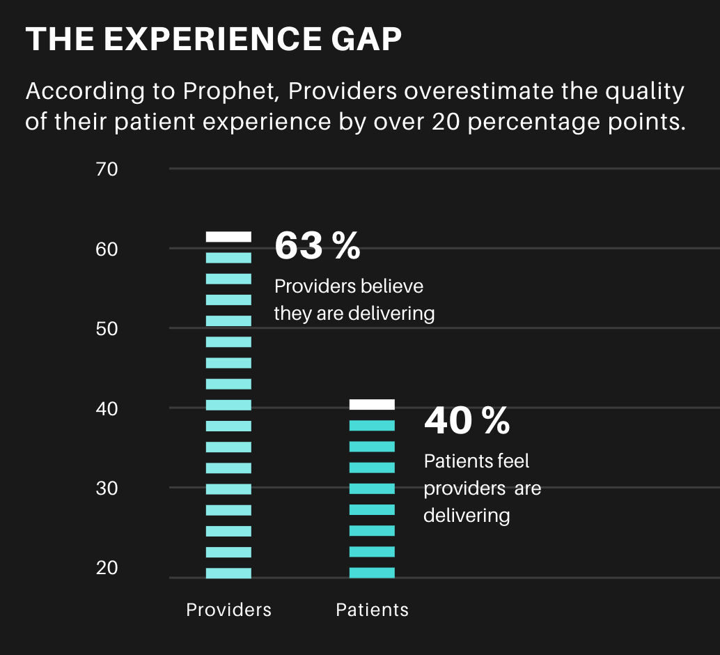
It’s affected and influenced by so many different variables both inside and outside of the hospital or clinic. We typically assume that the medical team or the immediate facilities dictate the patient experience. Is the doctor friendly and reassuring? Kind words do improve outcomes, as Stringer discovered from US patients in 2018. Are you included in the conversation or do they rattle off medical jargon and leave you sitting with confusion on top of worry. In the United States, there is often a gap between how the doctor perceives the interaction and the patient does; 63 % of providers believe they are delivering, while only 40% of patients feel the same way.
How do the nurses treat you? Are the facilities clean and up to date? Do they make you feel safe? And do they make you feel as if you will leave the facility healthier than when you arrived?
Is healthcare accessible for you? 59% of Millennials would leave a doctor who wasn’t available online. Does it empower you? As early as 2011 patients favoured online access, with 81% of US survey respondents willing to book and complete forms online beforehand and a similar 78% wanting to access their histories the same way. And finally, in US-centric research by Prophet, 81% of patients were unhappy with their health care experience, and the less they interacted with it, the happier they were.

How an air conditioner impacts form design
The metrics above are easier to survey, measure or track from analytics. But other seemingly disconnected or removed variables affect the patient experience as well—things we don’t often take into account in our thinking of patient UX. Particularly when we shift from a high-income country to a lower-income country, one story always reminds me of this – the second-order effects on patients in complex systems such as public health.
Second-Order Effect refers to the idea that every action has a consequence, and each consequence has its own consequence. First-order thinking is simplistic and superficial, looking simply at cause and effect. Second-order thinking, thinking in terms of these knock-on effects, is done in terms of systems, interactions and time. Before taking action it asks the question “and then what?” It looks through time at the effect of an action in five minutes, five months or five years. Every change we make to a system will have second-order effects. Something to consider, to ensure our interventions do not cause more harm.
I was interviewing data capturers at a rural HIV clinic in Southern Africa. We were redesigning a creaking decade-old system, with convoluted navigation so confusing, so torturous, we joked it violated the Geneva Convention. Towards the end of our conversation, I asked the senior data capturer the number one thing that would enhance his work. I expected him to say a new software feature, but he caught me off guard by saying “an aircon” (air conditioner).

Contextual assumptions are dangerous shortcuts
At first, it made sense, sitting in their small office, maybe nine metres square, two burly men, each with a heat-generating desktop for data entry. That heat all builds up. He noticed me looking around and shook his head. Pointing at the walls and window, he said their donors had sent these prefab buildings from Europe. They were not built for African summers.
I nodded, I was sweating, and it was still mid-morning. As much as he’d love an air conditioner in this office, he says, they needed it in the pharmacy to keep the medication cool. I frowned. “Because hot drugs expire, their efficacy drops”, he added. He glanced at my clipboard and said it didn’t matter if we captured data through better forms if it’s based on unreliable medicine.
Now it’s worth mentioning that expiring medication is another complicated area of medicine, some medicines can survive decades in proper storage, and routinely throwing out expired, but stable drugs cost the US billions.

Hot drugs must move
They couldn’t let life-saving antiretrovirals expire. So they kept them moving. They reduced prescription amounts and increased the frequency of patient visits, which, in turn, created a knock-on effect that vastly impacted the patient experience. Instead of a monthly visit, patients now had to come to pick up their medicine twice a month or weekly.
He explained that, as a result, they had to deal with the associated frustrations; negotiating time off work, travelling long distances, finding childcare multiple times a month. It also doubled or tripled the usual queues.
As a humble UX researcher, I scribbled this all down. I raced to tell my superiors, who empathized but in the end couldn’t do much. Our ambit was strictly the software — just the screens.

Look wide before zooming in
It’s a common narrow focus, either by the client or the designer. With the client, it’s often low resources, with the designer, it’s limiting thought to the boundaries of their screens. Don Norman lamented that designers misuse the term “UX”, considering only these screens, these devices or the app.
He argues that instead, it’s everything. It’s the way the person (or patient) experiences the world, their life, or the service. “It’s a system that’s everything”. And it’s this broader thinking, this zooming out to see the other influences on Patient Experience that I believe matters. The examples in this article aim to show the interconnected elements within the patient’s system or life. Be they the second-order effects of our own actions or the cause that is the cause of the effect our research measures in our users or patients. What are the elements on the periphery that could be affecting our work, that could hold the key to our desired results.
There’s an episode of the podcast 99% Invisible, called Missing The Bus, that talks about the walking experience being crucial to having a successful transit. In places like Austin, Texas, home to South by Southwest, there’s a billion-dollar backlog in sidewalks. When we as designers first think about how to improve bus travel, do our first thoughts go to missing sidewalks and appropriate curb ramps? We need to zoom out and think broadly. The journey starts earlier and ends later than we first think.

Beware the tools of your provider
Prophet suggests that we must “recognize the patient experience goes beyond just the clinical aspect.” The experience of patients can be negatively affected by the software they hardly even see, never mind touch. The same software that is meant to empower doctors receives a lot of the blame for their burnout. One study from the University of New Mexico (UNM) estimates 40% of the stress doctors experience is related to Electronic Health Records (EHRs).
“We are losing the equivalent of seven graduating classes of physicians yearly to burnout and, as they leave the profession, they point their finger at the time now required for them to document their work and how it has led to the loss of quality time spent with patients and families,” says Philip Kroth, MD, director of Biomedical Informatics Research, Training and Scholarship at UNM. Kroth says that for every minute spent with a patient, doctors spend double that entering data.

Patient experience is dependent on doctor experience
If the doctors providing care are frustrated and exhausted, it’s easy to see how this may negatively impact patient experience. There is in fact a proven correlation between physician burnout and poor patient experience.
The typical scenario, according to Dike Drummond MD, is that doctors leave their charting to the end of the day. Then they head home, feed the kids, put them to bed, and log back on from home to do a few more hours before bed. Even with these extra hours, doctors seldom get on top of their backlog.

Less is more for busy doctors
A University of Notre Dame study found that when a hospital adopted an advanced EHR, it led to doctors moving to other hospitals. Conversely, basic EHRs increase a doctor’s tenure at a hospital. Less doctors is likely to mean a worse patient experience.
This preference for simpler experiences or smoother learning curves is good news for UX designers creating new EHRs because it emphasizes the importance of keeping it simple.
In our setting, I often wonder if a hybrid approach is better. Doctors write their notes, hand them over to data capturers who are cheaper to train while freeing the doctor up to give more patient care. Voice assistants or dictated records could be one solution, but different accents and noisy environments give me pause.

Learning from our potential futures
It’s because of the necessity to learn from the experiences of others that I’m very interested in the problems faced in high-income countries. It’s like a cloudy crystal ball for where low-income countries may find themselves if they implement the same solutions.
It’s for this reason that I’m looking forward to the upcoming UX Healthcare conference. It looks to be a treasure trove of hard-won lessons in digitization and a glimpse of what the future holds for us down south. Luckily, the reverse is also true, and wealthy nations can also learn from developing countries.

Journey Poster designed by Bianca Louw for Jembi Health Systems.
Repackaging an old story
One last example that’s a bit more positive, we had a project at Jembi, based in the border regions of Kenya and Uganda. It targeted mothers seeking immunizations for their children while migrating between family and homes separated by these borders. Historically, some parents were refused care as governments struggled to balance their books.
We devised an anonymous system that used de-identified data stored on NFC cards. Creating a way for countries to share data, arguably the first instance in Africa, without jeopardizing patient privacy. What we believe made the difference and increased adoption in the end, was that we focused on patient experience, their first impression in particular.
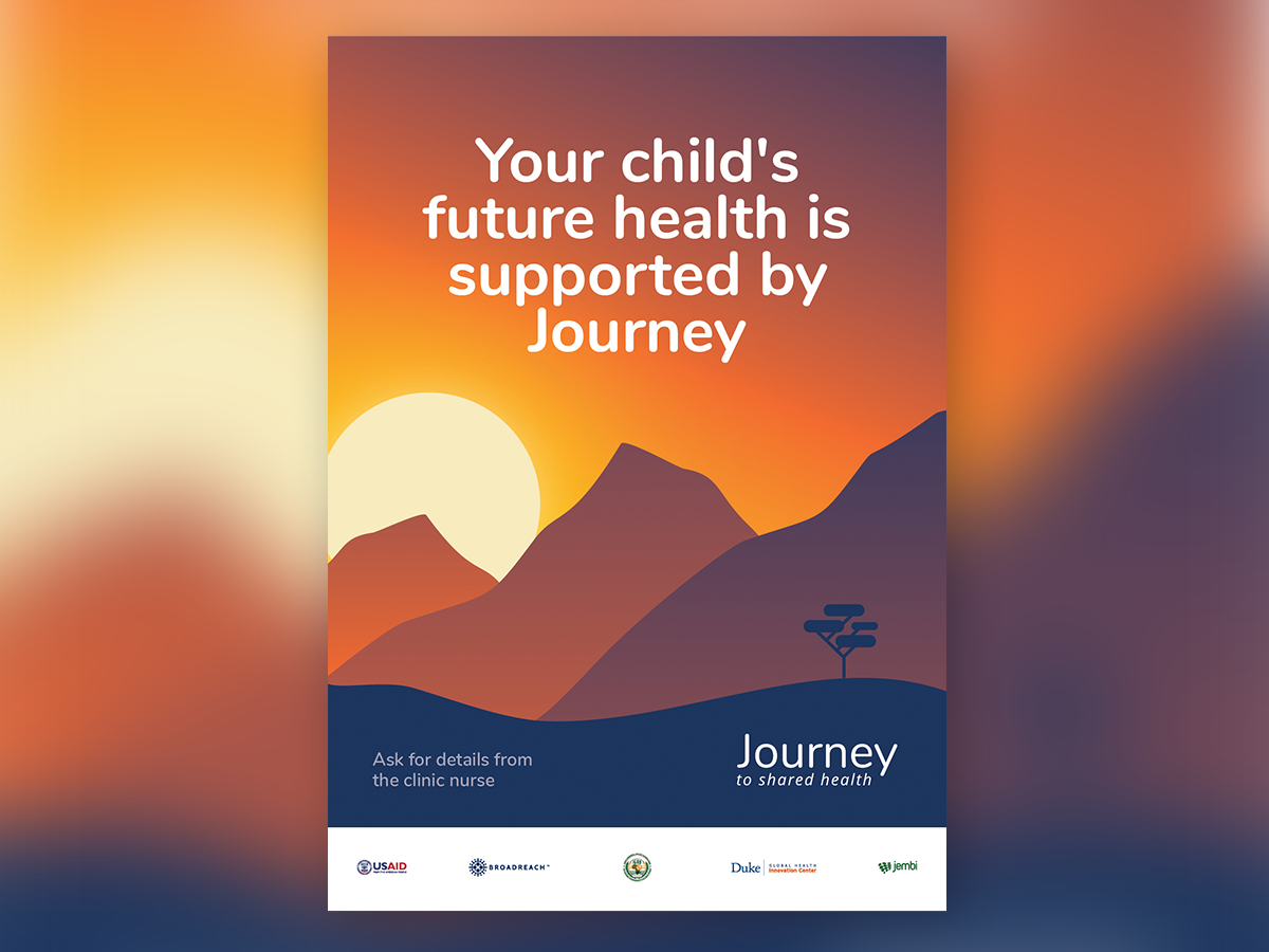
Journey Poster designed by Bianca Louw for Jembi Health Systems.
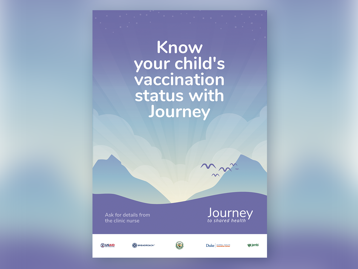
Journey Poster designed by Bianca Louw for Jembi Health Systems.
Instead of creating a donor-centric brand, we built a brand that spoke to their parent’s role as a Hero in their child’s health Journey. They steered their child towards a healthy start in life, often climbing literal mountains to get there. The nurses acted as wise mentors, offering guidance and sharing advice. We pushed to wrap utilitarian tech in a premium feel to elevate the Experience, to make the unboxing of a health intervention something special. And this worked.

Journey Caregiver NFC Card designed by Bianca Louw for Jembi Health Systems.
This brand story, encapsulated in an Apple-esque starter pack and glossy z-fold booklet raised the perceived value of these NFC cards we handed out. Mothers were proud of what they received — showing them off to other mothers behind them in the queue. From a business perspective, it drastically dropped the rate of lost cards and the costs of replacement. For nurses, it meant quicker capturing and restorable data for a quicker patient experience, especially for follow up visits, and less guesswork if a card was lost. For the donors, it ensured better data collection because mothers bought into the system and valued their cards enough in order to keep them safe. How do you improve aggregate data at a regional level? By making individual records something to hold on to and less likely to be lost.
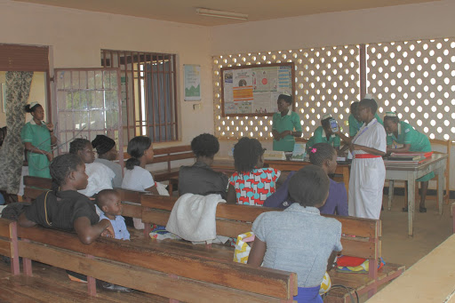
Head Nurse introducing Journey to caregivers and their children, Kenya 2018.
Prophet argues that “Patient experience must go beyond fixing what’s broken and focus on building unique, brandable experiences.”

Consider the interplay of elements in the Patient’s world
In this way, designing a Patient Experience should focus on creating win-wins, keeping the user at the heart of what we do while concentrating on the broader system within which they operate. And then, considering the effects, direct and indirect, that each of our interventions could have as well as what unseen variables may impact our patients.
UX Healthcare primary goal is to improve User Experience within Healthcare globally. Our primary focus is connecting likeminded practitioners and clinicians through our events and consultancy arm. With UX Healthcare we aim to make a difference, because better design is needed in the healthcare industry.
Zane Dickens is Lead Designer at Jembi Health Systems. Empowering team members and stakeholders to co-create impactful solutions in low-resource settings across Africa. He believes that generalists with their odd-bag of skills make the best designers and life raft companions.


