
In the previous article, I explored why mobile reading is fragile and introduced a cloze test as a way to measure whether users genuinely understand what they read on a small screen.
Now I’d like to move from theory to practice by using examples. What actually happens when we apply the cloze test to real mobile content?
A quick reminder: how the cloze test works
In “Mobile Usability,” Jakob Nielsen and Raluca Budiu describe the cloze test as a simple empirical comprehension test.
It works in three steps:
- Replace every Nth word in a piece of text with a blank. A typical test uses N = 6, although a higher value makes the task easier.
- Ask participants to read the modified text and fill in the missing words individually.
- Calculate the score as the percentage of correctly restored words. Synonyms and minor spelling mistakes are accepted because the aim is to measure comprehension, not spelling ability.
If users score around 60% or higher on average, the text can generally be considered reasonably comprehensible for that specific audience.
It’s also important to distinguish between readability and comprehension. Readability formulas estimate the education level required to process a text. Comprehension reflects the interaction between a specific text and a specific group of users. A text may have a high readability level and still be poorly understood by its intended audience.
Applying the cloze test to real mobile privacy policies
To see how this plays out in practice, I applied a cloze-style modification (removing roughly every sixth word) at the beginning of the privacy policies of two well-known mobile platforms: Duolingo and X (formerly known as “Twitter”). Below are excerpts with blanks inserted.
Example 1: Duolingo

Even with blanks inserted, you can probably infer several missing words. But notice what kind of text this is: abstract nouns, legal phrasing, layered clauses, repeated structural patterns.
Before inserting blanks, this paragraph likely scores somewhere around a Grade 13-15 reading level using standard formulas such as Flesch-Kincaid, roughly equivalent to early university level.
That level isn’t unusual for legal or policy text. But Duolingo’s audience includes teenagers, school learners, and casual adult users reading on a phone in short bursts of attention. The mismatch becomes visible when you apply the cloze method: many of the missing words are only guessable if you already understand the legal structure of privacy documentation.
Example 2: X

Again, much of this looks simple on the surface. Short sentences, familiar words. But notice how heavily it depends on implied structure: “certain information,” “our products and services,” “provide,” “required,” “account.” The text is repetitive but abstract. Without the missing words, meaning quickly becomes unstable.
In full form, this passage likely also falls around Grade 12-14. That places it well above the recommended reading level for mobile content aimed at general audiences.
Why the reading level matters
In “Mobile Usability,” Nielsen and Budiu demonstrate an example paragraph from Facebook that scored at a 14th-grade reading level. They point out that while a college-educated adult might complete the cloze test, this level is inappropriate for much of Facebook’s younger audience. Even university students, when online in casual contexts, prefer text that does not feel like a textbook.
The same logic applies here.
Privacy policies are rarely written with leisure or mobile conditions in mind. Yet users encounter them on small screens, often under time pressure, and must make decisions based on them.
If a paragraph requires university-level reading ability to score well on the cloze test, it is already misaligned with younger users, international users reading in a second language, distracted mobile readers, or anyone scanning rather than deeply studying text, among others.
Mobile content should generally aim for something closer to a Grade 6th-8th reading level, especially when comprehension affects consent, privacy, or account creation.
What the cloze test reveals in these examples
What becomes clear from applying the cloze method is not just that the text is complex. It’s how that complexity manifests.
- Abstract phrasing breaks down quickly when context is interrupted.
- Legal repetition does not equal clarity.
- Structural predictability helps, but only up to a point.
- “Professional” tone often increases reading level without increasing understanding.
On a desktop, a motivated reader might persist. On mobile, comprehension collapses much faster.
The bigger lesson
The goal of applying the cloze test here is not to praise or criticise specific companies. These are only examples to demonstrate how easily meaning can unravel when text is even slightly disrupted.
Mobile usability is not only about whether users can tap a button. It is also about whether they understand what they are agreeing to, enabling, or providing.
If removing every sixth word makes comprehension collapse below 60%, that tells us something important. And if the original text already requires university-level reading ability, that tells us even more.
The question, then, is not whether users can read our mobile copy. It is whether they can understand it quickly, under distraction, and without needing to feel as though they are studying for an exam.
General AI disclaimer
ChatGPT was used to analyze the texts of the two examples and estimate their reading levels.
The article originally appeared on Substack.
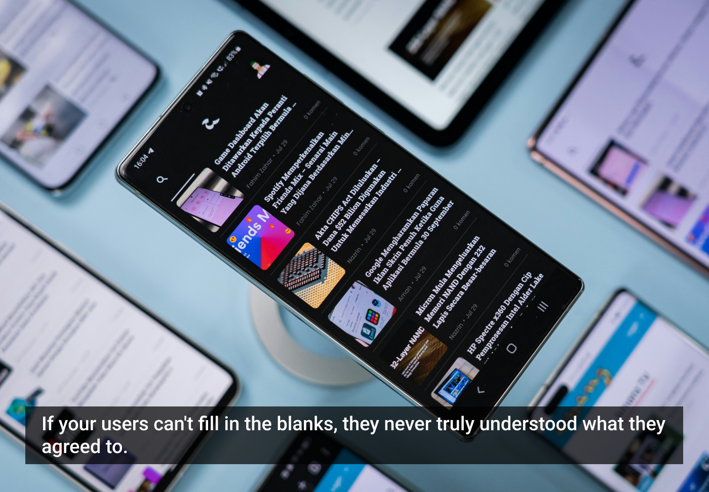
Featured image courtesy: Amanz.