Originally published by Stephanie Hagadorn on Indeed Design.
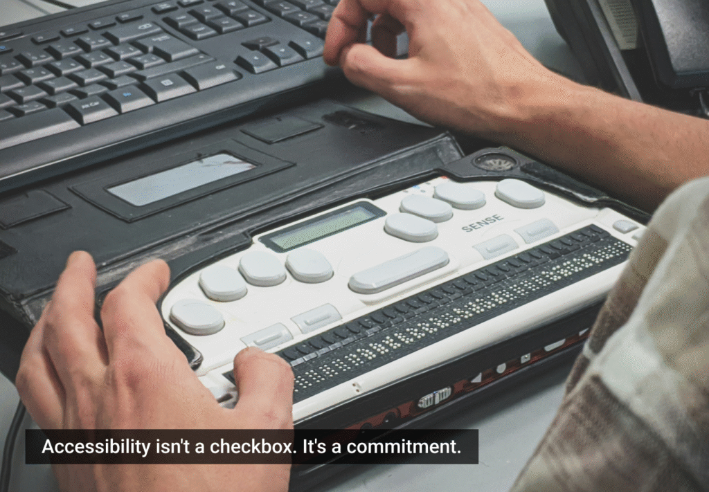
Helping people get jobs is a core tenet of Indeed’s ethos — it’s baked into all we do. In the past, we focused on getting all the jobs and optimizing the site for more hires. We’ve always put the job seeker first, and we’re committed to making our products accessible to everyone who’s looking for work. That’s especially true for people with disabilities, who experience joblessness at higher rates than the general population, according to the US Department of Labor.
Over the past year, accessibility has become one of Indeed’s top priorities, a massive undertaking. We now require teams to meet Web Content Accessibility Guidelines 2.1 ( WCAG 2.1) AA conformance, and go beyond those guidelines to improve the accessibility of the site. This new focus means reexamining our practices throughout the product life cycle, not only to help remediate accessibility problems but to help create genuinely inclusive experiences from the beginning.
This is the story of one tool we created that helped us speed up those changes: an accessibility library. Read on for the details and a link to the Figma file itself.
Making accessibility a feature, not a fix
As many companies do when beginning usability projects, Indeed started looking at the problem by conducting a site-wide audit. While we uncovered a lot of issues, we found that many of them were simple contrast violations or other visual and interaction bugs introduced by designers. It was easy to fix many of these issues, but we realized that we needed to widen the knowledge set of our designers to help them avoid making the same mistakes in the future. Over time, the cost to remediate these small bugs can increase exponentially. The price of addressing violations after release can be up to 30 times more than if they’re discovered while still in the design phase, according to a report from IBM.
So we drafted our own guidelines, translating some of the often cryptic or verbose WCAG wording into easier-to-understand checklists for designers and developers. The guidelines and training sessions helped increase awareness of accessibility. However, we started hearing feedback from designers that while the new guidance was helpful, it didn’t offer a clear way of applying accessibility concepts to their work. They knew what to do, but not how to do it.

Product designs marked up using the accessibility library’s standardized callouts for CSS and HTML elements.
Turning a reference into a useful tool
It’s said that a favorite expression of designer and writer Buckminster Fuller was, “If you want to teach people a new way of thinking, don’t bother trying to teach them. Instead, give them a tool, the use of which will lead to new ways of thinking.” By providing designers with accessibility tools, we’re helping them apply their knowledge and develop a greater understanding of accessibility.
At Indeed, our designers primarily use Figma, as well as a handful of libraries and plugins to streamline their work and maintain consistency across products. These are essentially reusable pieces of design that can be dropped into a file and reused or modified over and over. The WCAG 2.1 AA mandate requires designers to make sure their work meets these requirements before handing them off to developers. So we thought, why not make a Figma library that makes that handoff a little easier and simultaneously helps build an understanding of WCAG requirements?
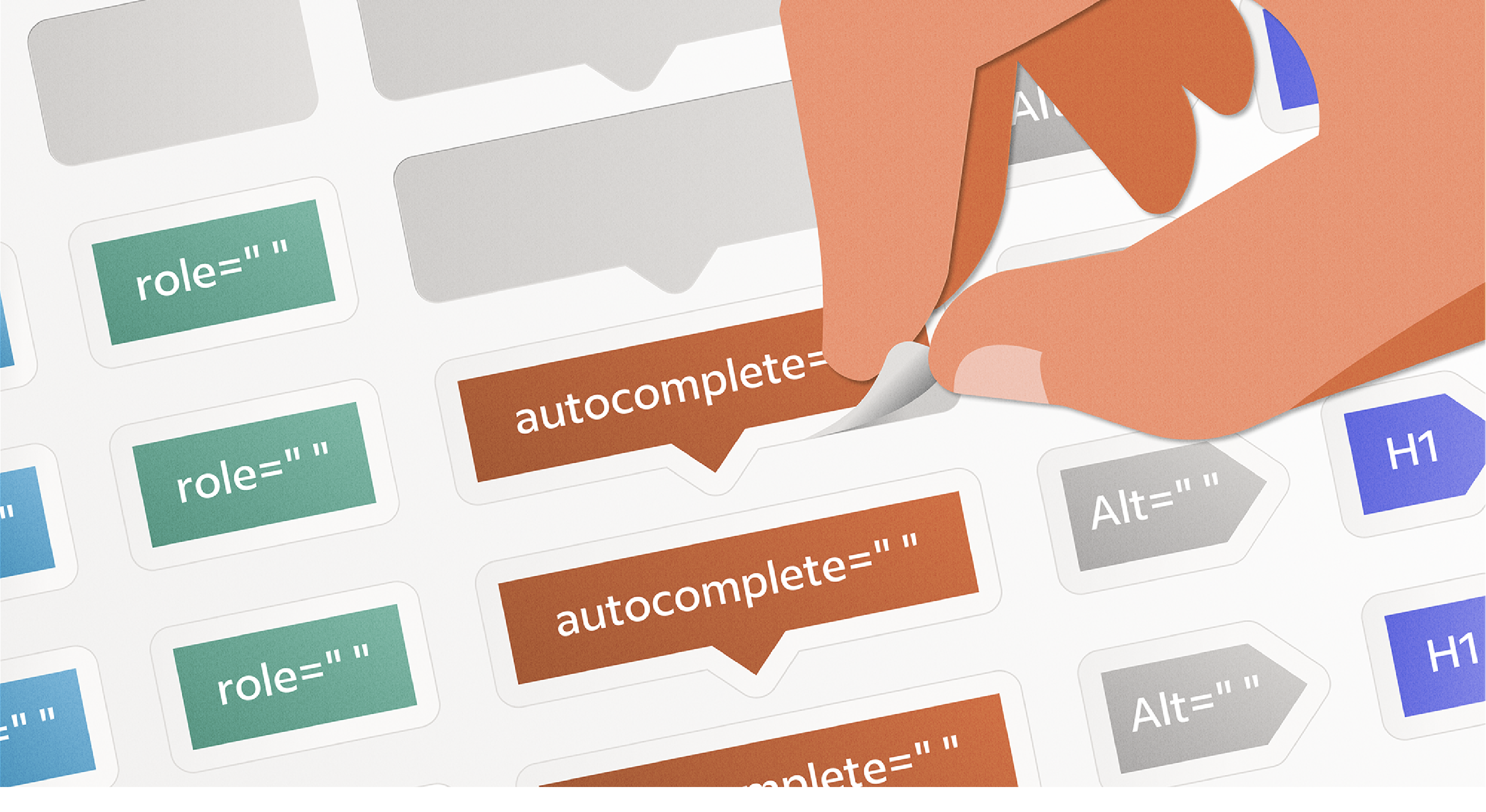
Often designers need to annotate their design files to communicate exact spacing margins and, in this case, accessibility considerations before handing off their work to developers. We created an accessibility library with a variety of components and callouts designers can use to highlight key parts of the page for developers.

Title, heading, and link callout labels designers can use to annotate their files before handing them off to developers.
Unlike WCAG, the library is organized by different elements or content types, like headings, images, buttons, and so on, making it easier to know what distinctions or callouts to make in a file. For example: If I have an image on my page, I know I should go to the image component to choose the appropriate label for my design. All components are prefilled with the correct CSS or HTML elements so designers don’t have to remember things like the autocomplete value for a street field (it’s “address-level1”) or the correct landmark role for a footer (that’s “contentinfo.”)
This helps developers use the right values as well — they don’t have to guess things like where landmarks fall on the page, or the intended focus order of a page or pattern. The library also includes a variety of components for indicating styling for states of elements and any keyboard mapping for custom elements.

Table components for communicating visual or keyboard specs for custom UI elements.
Along with the library, we included a handy walkthrough of all the components, how to use them, and links to the relevant WCAG guidelines. We also offered step-by-step examples of how to annotate a design using the accessibility library components.
To see how the pieces fit together and make a copy to start your own library, check out the full Accessibility Annotation Kit in Figma.
How teams are using it
We shared the library with designers across Indeed, not as a requirement, but as another tool for their design tool belt. It took off quickly, and soon more and more designers started coming to our office hours and Slack channel with questions about reading order, and considerations for custom UI patterns — things designers may not have really thought through before. Once they saw the different components and examples, they could easily examine their designs, element by element. One team working on a carousel pattern realized they needed to think through the focus order to make it more accessible for screen reader users. This led them to reference established ARIA patterns for carousel and create a pattern more consistent with accessible carousel functionality across the web.
In addition to making changes to new projects and features, many teams are using these tools as a way to see their existing product through a new lens. Our messaging team used the library to rethink the heading structure of the messaging page, creating a more semantic, easier-to-navigate page for keyboard users.
The library also works to reinforce the accessibility training and education product teams already receive at Indeed.
“My confidence in achieving a11y compliance is a little shaky. The library not only provided me with a toolkit of annotations and markers for communicating the accessibility guidelines with my engineering partners, it also gave me a constant refresher and summary of the a11y guidelines as I created my designs. While I also found the a11y training helpful, seeing the examples with the guidelines in place made it click really well for me.“
Diana Mendoza, Associate UX Designer
The impact of the annotation library goes beyond our product. It also shapes how we approach the design practice overall. Designers now think more intentionally about how their work impacts people with disabilities. Tools like the library enable them to reevaluate workflows to be more inclusive from the start:
“We adopted an ‘accessible by design’ initiative, using the library and other tools to design new ideas for Indeed that are accessible from the start. Each quarter, we’ll continue to evaluate and reconsider how we’re approaching accessibility with our designs and strive towards a goal of being accessible while still keeping the speed and flexibility that our product and engineering partners value.”
Kelli Johannessen, UX Design Manager
What this means for Indeed and our users
While having tools like an annotation library helps speed things along for designers and developers, creating tools, practices, and processes with an accessibility-first mindset has a far-reaching impact beyond getting a product to market faster. We’re spending less time and money remediating issues by avoiding them in the first place. The more we consider accessibility while we design, the more we challenge our assumptions and examine our biases, making us not just better designers but better allies. Design requires empathy, and designing for accessibility allows designers to work that muscle even more. The earlier we start thinking about accessibility issues, and the more conversations we have about accessibility, the more we begin to make it a normal part of our practice.
Most importantly, designing for accessibility helps the job seekers and employers who use our products, particularly those with disabilities. At Indeed, we have the opportunity to remove more barriers to employment and improve lives. An accessible Indeed means more jobs for more people.
Learn about Indeed’s user experience team at Indeed Design.